Software
Houzz Logo Print
collectorguru

Help me Re-Style the Mantle & Bookcases

12 years ago
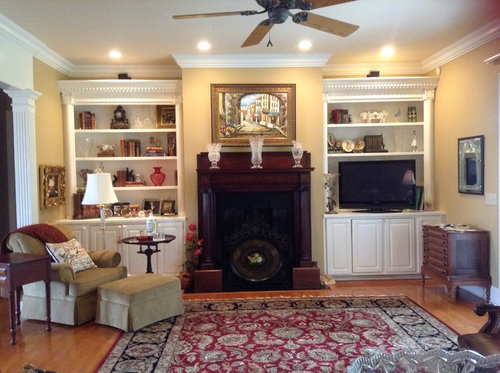
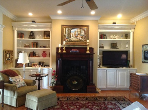
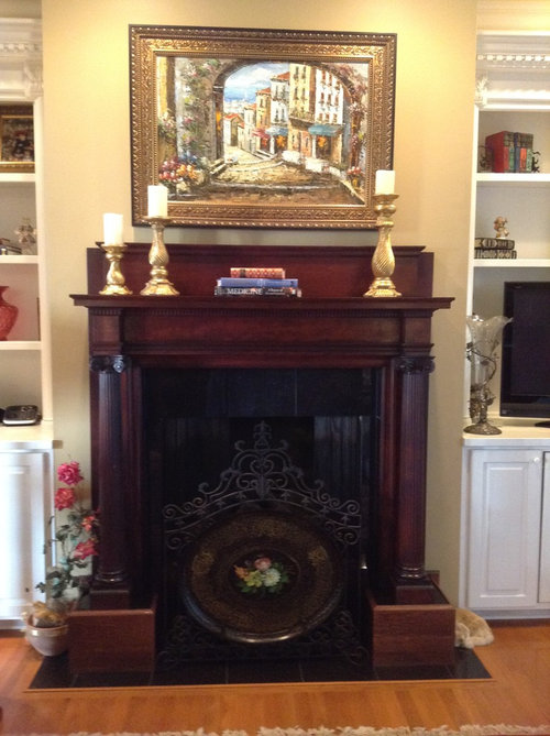
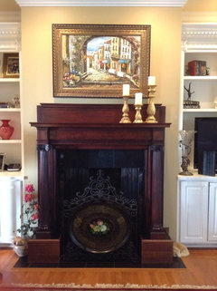
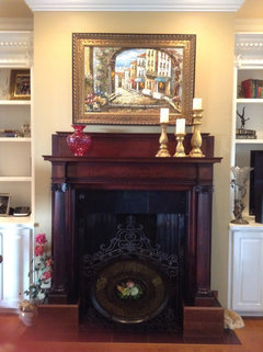
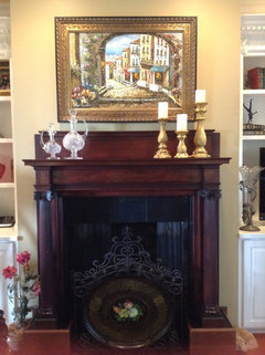
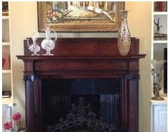
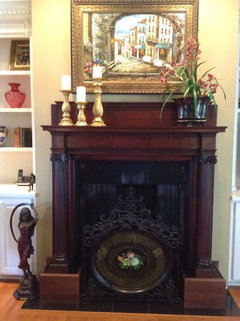
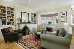
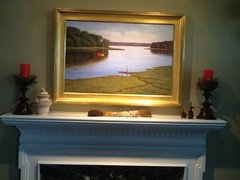
OK, it's the age old problem....the mantle and bookcases. I know I have toooooo much stuff and I am going to declutter but here I am starting with the mantle. In the first picture, I have 3 large Waterford vases on the mantle and those are going to rotate out. The second picture is my first attempt at a different arrangement on the mantle. I love books, but am on the fence about these books on the mantle. All suggestions/ideas welcome.

Comments (41)

  • 12 years ago
    You've got lots of books, so I don't think I'd put them on the mantle. I'd swap the med and short pillars (shorter towards middle). If you still want something in the middle, maybe one of your smaller pieces from the bookcase?
    Design2 girl thanked annmarie2
  • 12 years ago
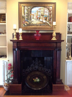
    Thanks, annmarie2. Yes, I like it better with the change in the height. I placed an antique cranberry vase in the center in lieu of the books, it is ~ 12" tall. Is that better or do you think I need a larger piece?
  • 12 years ago
    Cluster the 3 candles together on one side of mantle, and remove the vase. If you still think you need more on the mantle then you could place a small picture on the other side or stack similar size books with a small ornament on them.
    Design2 girl thanked Lori L
  • 12 years ago
    The books look a bit arbitrary on the mantle, as though someone has just left them there for a moment -- but you are absolutely right about the shape that you need there. A low, wide bowl would be perfect -- I manufactured this one from your red glass vase; it could also be a lighter colour, of course. I did one tiny bit of decluttering, too, removing the flowers to the left of the fireplace.
    Design2 girl thanked Rina
  • 12 years ago
    Pictures crossed ... :-)
  • 12 years ago
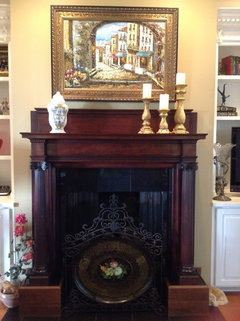
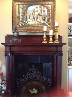
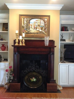
    ok, I clustered the group on the right side (pic 1), but it really seemed bare to me. I tend to agree with the first comment regarding placing the books on the shelves rather than the mantle, so I added the vase in the 2nd pic, and switched it out in the 3rd pic for an apothecary jar. I'm thinking no on the jar, but what do you think about an old french clock to balance this?
  • 12 years ago
    Ottawahouse, I really like the candles grouped together on the one side, thanks for that suggestion. And Rina! You're brilliant! I wish I could just de-clutter all this on the computer, LOL! You gotta know...I have a lot of "stuff"! More options coming, I am working, girls, stay tuned.
  • 12 years ago
    I removed the jar and replaced with the old French clock, it is dark, so not sure it's the best choice, and then I added 2 Waterford pieces to get a contrast. What do you like best? The clock always has a place in the bookcase, as my poor ole DH had to hand carry the clock and the matching candlebras back from the Paris flea market on the subway to the airport when we were traveling home. A story is there for sure. LOL!
  • 12 years ago
    Loving the clock there. Gosh, you have some lovely things -- the Waterford pieces are beautiful, and I love the way they look against the wood, but if you were to use those, then I would put a single tall piece -- as tall as the tallest candlestick, or a bit taller, but somewhat wider, like a vase or statuette, on the other side. Not glass, it would compete with the Waterford. Illustration below.

    I'm a bit of a clutterbug too. I get away with it by using small groupings and not putting pictures of my living room on Houzz. :-)
  • 12 years ago
    I don't believe you're considering the piece of art as you arrange the mantel. From a distance, the perspective of the artist places the focal point of the piece on the right and the left side of it has little presence and nothing to focus on other than the flowers in the foreground. They're not really holding their own, so that's where your decor item(s) should go so they fill that void, counterbalancing the right side of it and filling the picture frame somewhat with their presence. The flanking bookcases need 1/3 books (standing, lying, propping, lifting) 1/3 large decor items and 1/3 open space. Think about painting the backs of the shelves for interest You could go with a darker shade of your wall paint or an accent color from the rug. Rotate your decor items in two categories - warm season, and cool season. That way you can change out and refresh twice a year.
    Design2 girl thanked decoenthusiaste
  • 12 years ago
    Rina, I agree, this clutterbug feels very vulnerable putting these pics up, but it is worth it to get a fresh eye and new ideas as I have definitely gotten a bit lazy.

    Thanks so much for the comments, decoenthusiaste! I agree, I had not given proper consideration to the painting, so I have moved the large candleholders to the left.

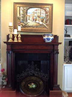
    With the candleholders placed on the left side of the mantel, which do you think works best, the taller Waterford vase or introducing the Flow Blue piece?

    Now, I am ready to work on the bookshelves with the property of thirds. (yikes) But I admit, this is really hard for me to do. Away with the ancient Hummels!

    I always love seeing the bookcases styled with darker backgrounds, just can't bring myself to actually paint them. I have seen wallpaper type panels used in bookcases, but I have so much pattern in my sofa/rug, not sure I could do this without getting dizzy! LOL!

    And what a great idea to do this exercise for warm/cool seasons, that is very doable. Thanks for your help.
  • 12 years ago
    I REALLY like the picture with the white and blue urn. It pulls out the blues in the painting.

    As for painting the back of the bookcase - we did it in chocolate and loved it. If you don't want the commitment, what about tacking a solid color fabric up behind the shelves, at least to see if you like the effect. That also kind of forces the editing of the shelves themselves!
  • 12 years ago
    Rhonda, it's people with courage like you that make Houzz the lovely place it is.

    I agree with Annmarie that the back of the bookcase doesn't need to be in any kind of pattern -- solid fabric would work, so would solid-colour wallpaper. And if you paint and don't like it, repainting is not that major a job. However, I would choose the wall colour for the back of the shelves as there is enough going on, I think, not to introduce a new element with another colour. But I'm not 100% sure of that ... just a thought.

    Not so keen on the candles to the left-- I actually think there's more interest to the bottom left of the painting than there is to the bottom right. The artist put the flowers to the bottom left to balance the architectural interest that is more to the right centre of the painting, and left the bottom right corner quite plain, as a quiet place. You're in the room, and will be in the best position to say yes that feels right or no it doesn't. What are you liking best?

    (Getting to be night time here; hope to pick up on comments in the morning.)
    Design2 girl thanked Rina
  • 12 years ago
    Love that flow blue piece, but might want it to take center stage in the center of one of the shelves - maybe on the TV side where you may not want too much busy-ness but a solid decorative statement in the shelves. I like the candles on the left - they look like they could be sitting on the same table as the floral arrangement. If you have some interesting bookends, I think 3-5 books standing on the right end would look nice. If you feel it needs more than that, a low bowl that repeats one of the main colors from the painting could go in the center.
  • 12 years ago
    Okay, here is my first attempt at working on the bookcases, and before considering painting the back, I want to get placement of "stuff" so I feel a bit more organized.

    Thanks Annmarie2, flow blue is so fun to collect and the painting does have a hint of blue. I am really impressed that you painted your bookshelves chocolate, I'm sure it's bold and such a statement. I may tackle that in the future.

    And Rina, I can tell that you are an art girl! This painting has no significant meaning for me, except that it was the right size, right price & I enjoyed the colors, but you and others are certainly make me look at it again. As a matter of fact, I wish I was there, enjoying a holiday instead of cleaning these darn shelves! LOL!

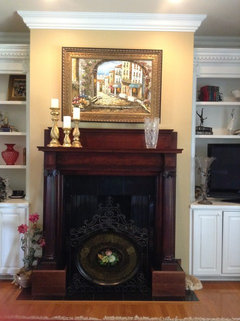
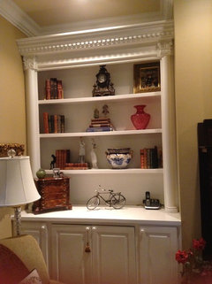
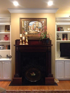
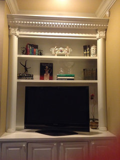
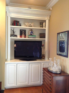
    And, yes, Deco, I have an extensive collection of Flow Blue, but since I need color on the shelves, I did end up taking it off the mantel. Here is my look now. Pic #1 is with the candleholders still on the Left and a Waterford vase on the R, Pic 2 is the L bookcase and Pic #3 is the mantel again with a ginormous orchid just for fun, I don't love it, but thought color might help as the Waterford vase didn't seem to be anybody's fav. Pic #4 is the R bookcase.

    Hopefully, this is pared down, but let me know what else you think needs to go, and thanks for the comments. This is helpful to me.

    Alas, I removed the fake rose from the floor and even if it doesn't appear so, I have a ton of stuff to stick in the closet. Don't hold me too close to the rules....you know they were meant to be broken! Let me know what you think.
  • 12 years ago
    You're doing a good job, and don't worry about they rules - they're just a helpful direction and you can break them when you have a better idea. I like the orchid and advise leaving that end of the mantle for changing out seasonally with different floral arrangements.
    Design2 girl thanked decoenthusiaste
  • 12 years ago
    Well done! Now I can see things individually and would so like to explore those shelves close up. I'd so enjoy finding out about the history of each thing there, too. The groups are so well balanced. I like orchid too -- a moment of inspiration. It echoes the flowers bottom left of the painting, too, which are still visible.
    Design2 girl thanked Rina
  • 12 years ago
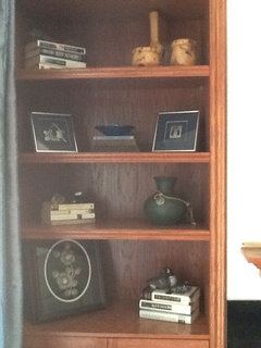
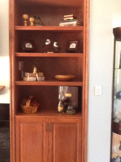
    Rhonda, you truly have some beautiful pieces! I like the mantel pic with the candles and flower; something harsh balanced with something soft. The bookcases look good, but you are the one living in the space, so whatever 'feels' right will be right! These are my bookcases; I have the same thought as you; to paint the backs or not to paint the backs. In both our cases, I think we should paint or put up temp. panels. You go dark, I go light.
  • 12 years ago
    I recently had a designer rework my den/mantle. Try one item on top of books on one side and another item on opposite side.
    Design2 girl thanked ginime
  • 12 years ago
    Ginime, would love to see a pic.
    Design2 girl thanked Lori L
  • 12 years ago
    Ok, after a brief hiatus...a girl's gotta get her hair done, right!? Thanks Deco, my DH came home last night and honestly, he loved the orchids on the mantel, and I really love the idea of changing that out seasonally, so thanks for the great ideas.

    And, yes, Rina...it's so true, the older we get, the more stories we have, and I have reached the point where I am only truly inspired to purchase something that I really like.

    And thanks so much Ottawahouse for sharing your bookcases, you are quite organized. I am toying with the painting idea also....hmmm, maybe a hit of Red for me....just on the back wall and probably will be a removeable panel type application. What colors do you like for yours?

    And ginime, Yes...please share a pic of how you arranged your books on the mantel as well, I love truly gorgeous antique books with lovely leather spines.

    I did change the right sided bookcase to remove the Waterford pieces as you all are right, it is sooo hard for that to show up on white built-ins, so I added another Flow Blue vase to somewhat balance the other piece in the left side and after giving up the rose bush sitting next to the fireplace (which, truth be told, disguises a flaw in the wall :( ) I added the bronze.
    What do you think of that?

    Also, ladies, I am choosing fabric for new window treatments and would love your eye on that project as well. Thanks again for all your help.
  • 12 years ago
    Very nice - I think all your hard work paid off.

    Here's a picture of our old place - just as it went on the market. I had already pared down the shelves, but would probably be more ruthless now! You can see how the dark brown doesn't really take over, but pulls from other colors in the room.
    Design2 girl thanked annmarie2
  • 12 years ago
    annmarie2, I love the dark background on the bookcase! It looks great and adds depth for sure. Thanks for sharing, you are definitely inspiring me! I also notice that the shelves are different heights and that lends interest as well. My shelves feel very large and I have to work to make the books and things have the correct scale. I like the variety you have.
  • PRO
    12 years ago
    Paint the back wall of the book cases a darker paint color or grass cloth and fill with more books and larger objects instead of so many smaller objects that lack focus. This will also minimize the TV.
    Consider painting the book cases and trim more of a cream color rather than bright white.
    Design2 girl thanked Tres McKinney Design
  • 12 years ago
    Hi Tres McKinney Design, thanks for your comments. Yes, I am considering this option. What color would you suggest? My wall color is Benjamin Moore Wilmington Tan and the ceiling is 1/2 formula, the trim is decorator white and consistent throughout my house. What do you think about red? I would be more inclined to paint a panel that could be popped in/out for a change rather than a permanent job.

    I actually am okay with the TV as this is our casual space that we hang out in on a daily basis. My shelves are very large and yes, it is tough to find books large enough to fill these shelves. I have quite a few very large Waterford pieces, but they really don't show up, but I could try the larger sizes.
  • PRO
    12 years ago
    A burgundy red that compliments your rug for the back wall of the bookcases would look great. My comment about the TV is that it is so much larger than other items on all the other shelves. If the lower shelves of the bookcase on the other side of the fireplace were filled with books or weightier objects such as large baskets or boxes they would balance the TV on the other side. Take a leap of faith - you won't regret painting out the back walls of the bookcases..
  • PRO
    12 years ago
    If painting the back of the book cases red is too daring then paint them a few shades darker than your wall color or look for grass cloth a few shades darker than the walls. Either will be a great back drop to your collections and add warmth and polish to the tableaux's. If you have a really large collection of flo blue then consider filing the shelves with that collection with smaller items mixed in. Platters are generally large and can be propped up to fill wall space with other pieces in the foreground.
  • 12 years ago
    I do like the blue urn on the mantel. It does pull blue out of the painting. I also like apothecary jars as you can see in my picture. Maybe the painting is too detailed for placing a lot on the mantle. A different painting or an edited mantle would be the way too go. You have such beautiful things and a lovely home!
    Design2 girl thanked bunnyllg
  • 12 years ago
    Thanks Tres McKinney Design for your comments; my maiden name is McKinney as well!
    I am seriously considering painting the back of the shelves, but may do a panel that is removable to mock up this idea before truly committing to a permanent change. I would like to incorporate the flo blue, but certainly don't want to look like red/white/blue if I use red on the background. Yikes!

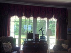
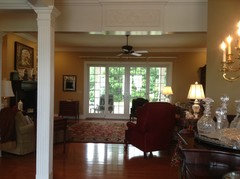
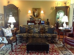
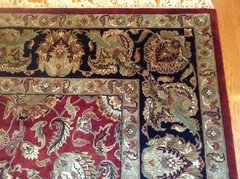
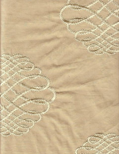
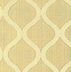
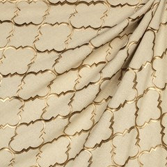
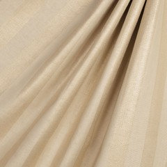
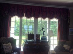
    I am posting a before/after picture and would love to hear comments regarding window treatment ideas. My wall color is BM Wilmington Tan HC-34 and the sofa pattern is large and the rug is busy as well. This room is a nice size, and gets nice light, but choosing the fabric has been a bit of a challenge as the before picture shows the red dupioni silk draperies that have recently been removed. I am also including a few pictures of fabrics I am considering.
  • 12 years ago
    Hi Bunnyllg! I love the painting over your fireplace, it is so serene.

    My mantel is old, I actually found it in a barn, had it restored and I love the old dark wood, but to have it installed, it had to be raised up and because of the 12" back, I think it actually calls for something slightly tall to communicate with the art above. I am going to leave the mantel as is for now.

    And try to consider some fabric for the window treatments. I know I have a lot of pattern and I actually enjoy layering of patterns as long as I am not dizzy! LOL! Suffice it to say, I have been looking for weeks and have taped scraps and scraps on the wall, so I am desperate for some opinions. Take a look at these and let me know your thoughts.
  • 12 years ago
    last modified: 12 years ago
    I read through this thread, but excuse me if someone has already said this. I think the picture above the mantle might be too busy and adding to the clutter, and I think the heavy gold picture frame is adding one additional weighty element that is detracting from all the wonderful potential you have. I would chose something simple and beautiful, with a simple frame, maybe in the color of your mantle or the color of the bookcases.

    Maybe you can take everything off the shelves and the mantle and decide how you can create a single, fantastic focal point that you love, and then only add back in the elements that support it. I would start with the space above the mantle rather than the mantle itself. And if you paint the inside of the cabinets, a color that supports it also.
  • PRO
    12 years ago
    i like the gold linen fabric in the upper right hand corner for the drapes. A narrow two tone gold low luster silk or silk linen (1/8" or 1/4" wide stripes) ticking stripe would also be handsome. I would eliminate the valance and hang interlined lined, tacked top double or triple pleat curtain panels with a center opening and stacked back on each side of the window. Mount a bronze finished curtain rod or dark stained wood rod and rings just under the ceiling.
    Design2 girl thanked Tres McKinney Design
  • 12 years ago
    Thanks Tres McKinney! I can't wait to see the metallic linen stripe fabric sample, it should arrive this week. Hopefully, the stripe will add some dimension, as the previous metallic linen samples just didn't do it for me. I also am wondering if this is a bit "trendy" and I will be tired of it in a short while. My DH thought it looked like burlap and wasn't dressy enough for this room.

    Do you think the calligraphy piece is a huge No-No? I think it will read as a solid, but still have a bit of interest.

    Draperies usually stay with me for quite a while, so I want to make the right choice. Thanks again for all your help.
  • 12 years ago
    Rhonda, personally, I think a drape, without a valance, that mimics the colour of your leather chair and other dark elements in your room would look smart. I think the gold toned materials you have shown would make that wall "less dressed' than the rest of your space. A space that I am truly envious of. :)
    Design2 girl thanked Lori L
  • 12 years ago
    Although your painting is lovely, it seems to be too small for the space. I thought maybe you could try a pretty mirror that that fit from the top edge of the mantel to the bottom edge of the crown molding with a pretty and tall urn on each side with wispy foliage spilling into the mirrored area. Maybe smaller objects on the shelves toward the mantel moving to larger ones on the opposite ends to carry the visual line outward leaving more focus on the mantel. Just my thoughts, hope it maybe works for you.
    Design2 girl thanked bjune
  • 12 years ago
    Thanks for the comments.

    Lori, I agree that a drape without a valance will be in order this time. I just removed a ginormous amount of red silk dupioni traversing draperies with swagged valence and all the tassel trim you would ever need...Take a look at the previous "Before" picture that I posted in the upper left hand corner .LOL, I am ready for something a bit simpler, but I agree, a few of the metallic linen samples I have looked at did feel a bit "less dressed", so I definitely understand what you mean..

    Bjune, I had not considered that the art was too small for the space over the mantel. My ceilings are 10 ft. and I have a large vertical oil painting that I could try over that space, not sure if it would be too large, but that's an interesting thought, and one that I could try.

    And Potchiemagoodleberry, thanks for your comments also. I have lots of books, but truly my shelves are really big, I did restack some of the books and actually found an oversized red book with gold lettering today at the antique store, so I am going to add a few more books.
    But, the mantel is original and painting it is a no-go for me, as I love the old dark wood and the white bookcases were built in when we planned the house. I agree, over the FP is a place of honor, and I have a few other paintings that I can try there, so that is an idea.
  • 12 years ago
    I have to agree with redpoint on the picture. My very HO is that it is a little busy and fights with the rug, so the eye doesn't know where to look. A simpler, yet elegant picture needs to be in its place and perhaps a less busy rug as well.
  • 12 years ago
    Well, last night I attempted to place a mock up red background on my bookcases, and truly it was laughable! Looked awful, and it will be a great project for someone else, LOL! I can't even imagine an oil painting in a white frame over the mantel, redpoint. But I so appreciate the comments.

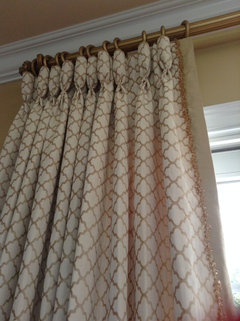
    And after lots of shopping and comparing and agonizing, I have the fabric chosen for the draperies and it will be ordered today. Hazelton Fawn, a smaller scale, but updated quatrefoil is the winner. I have attached the picture of the 1 yd sample thrown over the soon-to-be-gone traversing rod so I can't wait for those to be completed and hung. I am planning 2 widths of 5 in goblet pleated stationary panels to be hung on a custom finished wooden pole.

    Thanks so much to all the houzzers! It has been fun hearing all the opinions and understanding that ultimately, we all have to be happy in our spaces/places. I, for one, now know that I love texture, depth, and patterns! My bookcases are more decluttered, and I love the mantel without the Waterford vases, and I am more willing to rotate much loved antiques in and out seasonally. I am looking forward to an upcoming landscaping project. (After these drapes are finished!, LOL)
  • 12 years ago
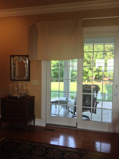
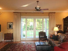
    And so, yesterday, my new drapery panels were installed. Here are the before/after pics. I love them.
  • 12 years ago
    Very nice!
    Design2 girl thanked Lori L