Software
Houzz Logo Print
cdncutie

Help with color palette!

14 years ago
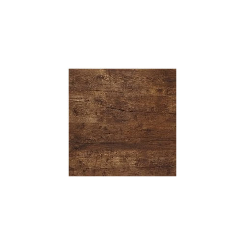
I recently installed barnwood oak floors throughtout my house and love them! problem is I don't know what to colors to paint the majority of my house and what accent colors to choose. My eyes usually gravitate to the spice tones. I hired a interior designer and her solution was 90% of my house to be painted in sherwin williams ecru color... boring! I want some life in my house. Any help would be appreciated!

Comments (28)

  • PRO
    14 years ago
    I find this walnut toned color works well with blues and yellows. Keep the colors light if you are going for drama, as the floors would get lost next to a brick red, or pumpkin orange. You can always add drama with artwork and furnishings. Try Sherwin Wiliams Jersey Cream SW6379 for a warm effect, or Aviary Blue SW6778.
  • PRO
    14 years ago
    last modified: 14 years ago
    I just used SW Green Earth with walnut cabinets & it looks FANTASTIC!!! I think anyhting in SW's Fundamentally Neutral Palette would look great, but stay in the mid-tones ~ anything too light will look washed out & anything too dark will be too oppressive. Then, once you have the tone you like, you simply follow that tone to each strip of the color deck & choose colors for adjoining rooms. That way the whole house has flow. Accent colors, if needed or wanted, can be used at the darker end. Ceiling colors & trim are at the lighter end.

    I LOVE that floor!!!
  • PRO
    14 years ago
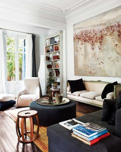
    I would go light walls with accents of colors, which is easy to change out with the seasons and styles but it really depends on your style. I love the picture attached.
  • 14 years ago
    I am not a beige, tan, ecru fan...but it might work here as a background with which you can layer artwork and other colors over. White, grey, ecru...pick your favorite (do you have anything in your wardrobe that works and makes you feel good, that will also work on the walls, times 10). Neutrals are more sophisticated, but some color will add some fun. Use the color in your accessories. We have some single walls throughout the house in some bright hues, the rest is very neutral, but definitely not boring. Good luck and remember, it's only paint! And try a sample...you'll never regret the small expense.
  • 14 years ago
    I would suggest you paint the majority of your walls a warm mid-tone neutral (Glidden Brown Bag), when picking accent colours think of autumn, rich colours like Glidden Pecan Tree,Glidden Autumn Blush and Glidden Red Maple
  • PRO
    14 years ago
    May I add that SW's Fundamentally Neutral Pallette is not just browns & grays ~ it's a variety of blues, greens, yellows, purples. Just about anything but red in there to choose from. Any of those hues compliment each other & your beautiful wood. Go to your SW store & ask to look at their paint fan & you'll see what I mean. Their Color Visualizer on their website is a help also.

    You will also want to define the feeling that you want in your home ~ sophiticated??? Fresh??? Warm??? Etc. Do you like brights or earthy??? Do you want the color to be on the walls or in your accessories??? What colors do you like to wear??? Your closet is often the clue to choosing colors you'll feel good with on your walls. Start collecting pics of rooms you like (if you haven't already) on houzz. You'll discover a common thread running through all of them.
  • 14 years ago
    How lucky you are to have barnwood through your whole house! Gotta say, I love a light neutral color with med. or dark wood floors, then you can add color through artwork, upholstery and rugs!
  • 14 years ago
    I love medium blues with this wood. And the now very popular blue-greens would look great too. I think using reds or spice-inspired colors as accents would pop against a blue/ green-blue wall. Try BM Wedgewood gray or Wythe blue. I love SW Oyster Bay as well. Good luck.
  • 14 years ago
    A light sage green - grey green/ blue grey-green would look amazing with your floors.
  • PRO
    14 years ago
    blue is a contrast but rather too cool! a grey would be my choice,with a darker tone grey
    as an accent wall
  • PRO
    14 years ago
    woodcliff lake benjamin moore
  • PRO
    14 years ago
    Hi, Since you tend to love the spice colors, I would suggest the golden tones for the walls, and accent wiith tomato red, plum and warm green. I'm with you, I am not a big fan of beiges or any really light colors. Those floors will pop with saturated color on the walls. One of my favorites is call Brown Mustard. I think that is an Olympic color, but I did it in Valspar. Definately not for those who are scared of color, but everyone who came to my home loved it.
  • 14 years ago
    No one has asked what part of the country you are in -- I mean lots of light or dark days? In Michigan, if we painted the walls gray and you didn't have large windows -you'd go crazy in winter (normal winters with the "gray" days.) What is your style? I could see some blue and white pottery pieces with the wood for accents but maybe leaving the walls and warm neutral would be more versital.Vestadesign had a nice suggestion on the Oyster Bay color. The floor does remind me of driftwood and the coast.
  • PRO
    14 years ago
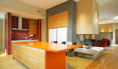
    I would use this picture for color inspiration.
    For the curtains I would suggest sky-way blue color, you can find them in https://beddingandtoys.com
  • 14 years ago
    Thank you for all your ideas! I think I want to go in the yellow tones for the majority of the house... just haven't found the perfect shade yet. Also for my fireplace accent wall can't decide on what to choose. I am thinking of getting a red sectional or couch to bring a splash of color. My husband really likes the blue tones with our floors. I don't know how to combine his love for the blue tones and mine for the spice tones.
  • 14 years ago
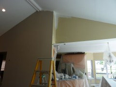
    We just stopped the painters in mid stroke and paid extra to remove the SW Ecru. We have lots of windows in the living room and the color reflected the trees so strongly the entire room radiated green. It is a very yellow beige. We switched to SW Versatile Gray and absolutely love it. It's a warm beige gray. We have a nice bright white on the trim, DutchBoy Designer White and the room looks fresh fresh fresh. The painter decided he liked it so much he was painting his own bedroom this color.
    I'll try to attach an image of the color change. Ecru on right, Versatile Gray on left. You can see the trim out around the windows too. You can also see how badly the old color would have gone with the maple cabinets.
  • 14 years ago
    Love the floor! I'd go with a relatively muted paint color (camel/tanish color slightly lighter than the floor) but definitely accent with an orange or a lime green color....it'll look fantastic!! Occassional chair, curtain panels, pictures, and pillows will give you that missing color you are looking for!
  • 14 years ago
    I think your designer was right...when you have this much wood throughout the home..you need to ensure it doesn't start to look heavy...by bringing in the light colour, you can use accents to bring in the excitement you are looking for...that way, you aren't married to anything in particular...as you already married the floors...which is a large expense. :) Good luck.
  • 14 years ago
    Where did you get the floor? They are AWESOME!
  • 14 years ago
    "I don't know how to combine his love for the blue tones and mine for the spice tones"

    Many blues look awesome with spice tones. Something in the "Turkish Tile" family or the not-quite-navy (teal undertone) pairs wonderfully with terracotta and all the warm spicey tones.
  • PRO
    14 years ago
    Hi, I think you need to pick three colors, I like working with three colors. One, is my bad, two is my trim and three is my accent. If the first picture is your home, I think corriander is a good accent color on one wall, Sherwin Williams has some good ones.
    I would then go to my base color, by cutting the corriander with 50% white and trying a patch to see if the corriander is still there and we have not added too much white, but corriander is pretty dark, and once lighter is stunning, this would be all other walls and ceiling, I never do white ceilings, The bounce from corrianders from the sunlight makes rooms look like Tuscany at sunset, it is truly stunning, my porch is this color, but it is a large part of my home and makes the living room dining room and a bedroom glow are sunset. Amazing color. The third color is trim and here you have two choices, refrigerator white as I like to call it, just bright white, or a beige tome from the historical colors in Benjamin Moore, sometimes in the ceikings I add a touch of a metallic white in the mist to get the color bounce, a droplet, not a lot.
  • 14 years ago
    Soft blues or mid green with accent brick or clay. Perhaps an entire wall in brick with a fireplace, that would be neat.
  • 14 years ago
    SK Interior Concepts, LLC

    Your designer was absolutely on the mark with the neutral color choice for the walls to highlight such dramatic, old world floors Since there are hundreds of neutral beiges (for warmth) and grays (cool spectrum) to choose from, try looking at some similar tones from other manufacturers such as those from DunnEdward, PrattLambert, etc. to see if their tones are more to your liking. Since each company has there own base colors, they will all have slightly different shades. You can add your pops of color all over the room if you choose but then can also switch the accent colors when you tire of them. In the end, however, do what feels right for you and your husband, it is your home and yours to enjoy!
  • 14 years ago
    last modified: 14 years ago
    I have tung oiled original oak floors in my house and we've decorated with white and gray and then painted the dining room with blue lake from Sherwin Williams. The blue looks fantastic. This shot kinda shows then color- our xmas card this year
  • PRO
    14 years ago
    get samples and put them up, thru this. method there lies an answer.
  • 14 years ago
    I too have dark wood floors and love the spice colors. I currently have Grand Canyon (Dulux paints) on the walls and decorate with terracotta, browns, greens (lime in spring and summer and sage in fall and winter) caramel, and brick red. All these colors look fantastic next to the dark wood. Grand Canyon is a spicy mustard color that I don't believe they carry anymore but a paint store should be able to match the formula: BLK 0P 27 / YOX 4P 31 / OXR 0P 16 / WHT 2P 55. Think of the colors you see in the Grand Canyon and you'll get an idea of how all those colors will look mixed together. Good Luck! .....you could even throw in some teal blue to make your hubby happy.....mother nature is never wrong!
  • PRO
    11 years ago
    Here is an article I wrote, with suggestions about how to choose a color palette: http://bit.ly/1u1TOb5 I hope it helps!