Software
Houzz Logo Print
sissymarie11

Help My Living Room!

12 years ago
last modified: 12 years ago
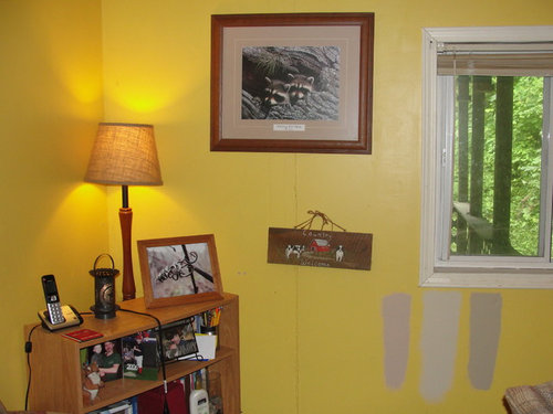
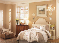
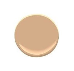
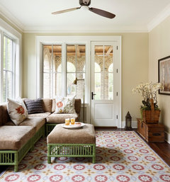
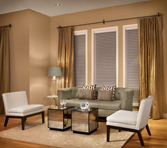
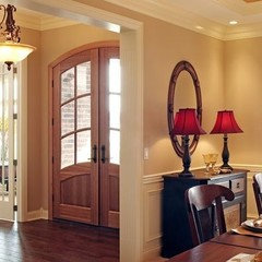
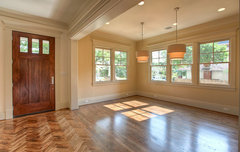
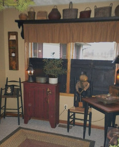
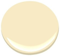
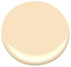
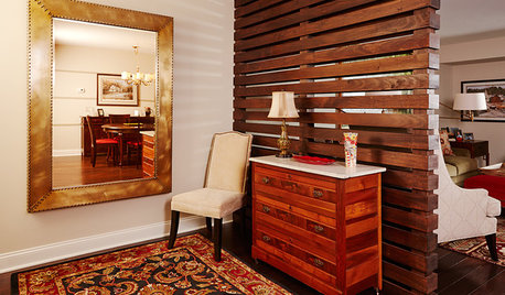
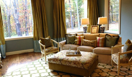
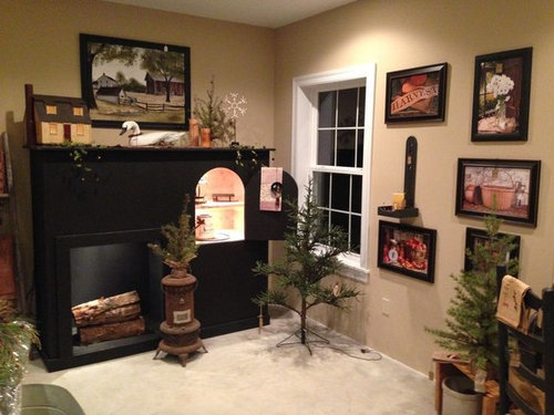
I feel like I have been trying paint colors since I moved here almost 10 years ago, and I'm ready to actually love one color and keep it. I have yellow in the living room and it looks great for Fall but ugly during Christmas. I am wanting a golden tanish beige color but really lost on what shade. I am posting below my living room with three awful paint samples that are way too dark/ugly... the third is a photo of what I would like to see in this room only I have no idea what color it actually is... or what undertones ect.... I had been told to get yellow undertones which the sample in the middle is and EW! not what I imagined. .. so please any input would help. I'm so ready to be done with painting.

Comments (41)

  • 12 years ago
    I love SW Nomadic Desert;))
    Master Bedroom and Bathroom · More Info
    Marie thanked User
  • 12 years ago
    ciscomom- Marie said she was looking for a *golden beige* I think the Nomadic is just a tad richer. I do love that Kilim beige tho;))
    Marie thanked User
  • 12 years ago
    I've looked at shaker and bleeker just worried about lighting and it looking grey like Gobi Desert did. I wish I had something to paint on besides the walls lol that would help to hold it up. Nomadic Desert looks pretty in certain pics.
  • 12 years ago
    Ciscomo- I think the pic you post is a bit too light for me or not golden/warm enough. I want to be able to decorate with country not exactly prim but the same colors. I love plaids and old looks.
  • 12 years ago
    last modified: 12 years ago
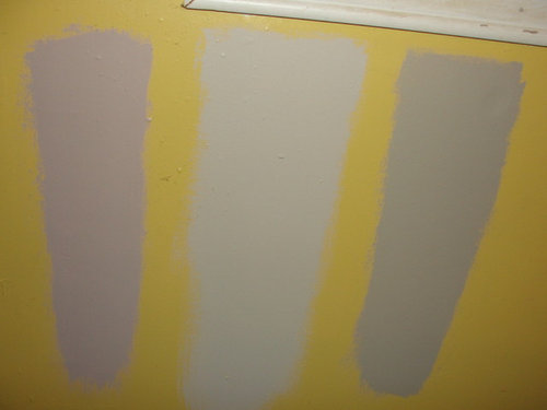
    See how grey Shaker looks in some pics?
    Wicker Park Historic Restoration · More Info
  • 12 years ago
    Marie, buy large sheets of foam core and paint one color on each piece. It will help comparison and is cheap to do, and can be moved around the room.
    Marie thanked Patty Scott
  • 12 years ago
    Ben Moore Roxbury Caramel?
    My Houzz: French Country Meets Southern Farmhouse Style in Georgia · More Info


    Ben Moore Bar Harbor Beige?
    Ben Moore Toffee Cream?
    Marie thanked User
  • 12 years ago
    I like Toffee Cream but the caramel is way too dark and so was lenox tan.
  • PRO
    12 years ago
    last modified: 12 years ago
    Take a look at BM Carrington Beige. It is very flexible.
    New Traditional Family Residence · More Info
    Carrington Beige HC-93 · More Info
    Marie thanked JudyG Designs
  • 12 years ago
    Yeah, I can see they are more yellow than your inspiration photo. I'm hoping someone recognizes that color.
    Marie thanked User
  • 12 years ago
    This is pretty...
    Northwest Hills Remodel · More Info
  • 12 years ago
    might be too dark though. I'm so confused lol!
  • 12 years ago
    I would like to accent with orange/brown and during Christmas reds and greens.
  • 12 years ago
    I am obsessed with Wheeling Neutral by Benjamin Moore. It is such a great tan, no hint of peach or green. Looks good paired with anything. If you go back to yellow, consider Barley (also BM). Good luck! Great space.
  • 12 years ago
    I went to Sherwin Williams Historical collection. Found Colonial Revival Tan?
    Marie thanked User
  • 12 years ago
    Another pic

    Heights Craftsman Project 5 · More Info
  • 12 years ago
    The lighting is great...what are they?
  • 12 years ago
    last modified: 12 years ago

    Marie, can I ask where you found your inspiration photo? I can't find it through a google search.

    estrelkat, I pulled the last photo from houzz. If you click on it, it should give you the designer name. You can ask a question about the lights from that page or try to contact the designer through email. I've had good luck with getting answers to questions, though it can take a little bit of time.
  • 12 years ago
    Marie, the pretty photo you posted says its Bar Harbor Beige, one of the colors I posted. Might be worth a look. You can always ask the paint store folks to lighten it for you, by reducing the colorants they add to the base.
  • PRO
    12 years ago
    The darker one
  • 12 years ago
    SW colony buff?
    Marie thanked anne dee
  • PRO
    12 years ago
    last modified: 12 years ago

    Wow, chosing paint colours on the internet?! Here is a no fail rule that will stop you from spinning.

    Take a step back and start with the "message." That is - what you want the space it to feel like, or appear to say when someone walks in the room. All the suggested colours have different subtle messages - shaker beige is a brown and green, a "cool" biege. Does not evoke as much warmth. There is no quick fix way of just picking a colour, its a science. You have to know the psychology of colour - what it says.

    "I would like to accent with orange/brown and during Christmas reds and green"
    The science is that the contrast of red and green create gold to the eye - a gold you may be trying to reproduce in your home. And you are getting frustrated not being able to get that gold figured out.

    Get out the paper and write it down. Your message might be: "I want it to look like a cottage in Italy" "warm and cozy country". Paint may not be the only thing to get this message across. Go through magazines or Houzz and look at photos with the viewpoint of "What is the message? and "Does it fit the message I want to communicate?" when you have a number of good examples use these photos as your guide. Then choose the colours in your home from the fan deck- in your home day and night.
    For details on this go to 8 Mistakes when choosing a paint colours is http://shelleyscales.com/2014/03/8-mistakes-when-choosing-paint-colour/
    Marie thanked Shelley Scales Design Associates
  • 12 years ago
    Thanks Shelley! I'm pretty sure I've made every mistake possible lol!
  • 12 years ago
    /
  • PRO
    12 years ago
    You'll get it, or get a trusted adviser to help you! Good Luck!
    Marie thanked Shelley Scales Design Associates
  • 12 years ago
    Formal Living Room · More Info
  • 12 years ago
    I found out from the lady who owns the shop that the color in the pic is Mushroom Bisque! I'm going to look into it. Hopefully it isn't just the lighting.
  • PRO
    12 years ago
    Yes, it is the lighting...here is mushroom bisque:
    Marie thanked JudyG Designs
  • PRO
    12 years ago
    Marie, the light in the room...from what direction is it coming? And, is that deck outside the window a covered deck?
  • 12 years ago
    Benjamin Moore HC-39 Putnam Ivory. Would like to see more pictures of this room.
  • 12 years ago
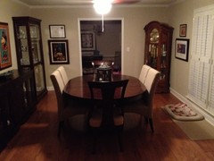
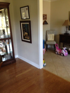
    Pic 1....My dining room with Benjamin Moore Natural Linen (CC 90)....Looked great at Christmas with greens and red, spring with blues/minty green/pink and oranges in the fall......
    Pic 2....a closer look at the Natural Linen with daytime lighting from the window behind me while taking the horrible cell phone pic.

    Sherwin Williams Accessible Beige....leans more gold to me....
    Benjamin Moore "Coastal Path" and "Hush".....both yellow/gold tans
    These three just seemed to close to the gold I was trying to get away from:
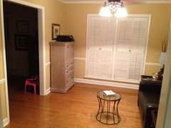
    Pic 3 is the old gold/peachish color I painted over...I think it was Ben Moore 1110
  • 12 years ago
    @bamamom I'm likin' yr minnie mouse pic in the DR ;-)
    (paint colour is nice , too)
  • 12 years ago
    Thank you Anne Dee....
    Have Manchester Tan in the sitting room (room with the old gold color) and foyer.
  • 12 years ago
    @JudyG yes it is covered and the light comes from that window mostly. but it isn't a bright room. Needs new lighting.
  • 12 years ago
    Love the way this one looks.
  • PRO
    12 years ago
    Sorry, Marie, I wasn't clear...north, south....?
  • 12 years ago
    last modified: 12 years ago
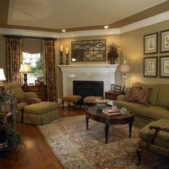
    I'm not certain but pretty sure it's north because colors tend to look grey in this room. In all honesty I had no idea how to tell so I googled it and I believe it is a south or southwest facing room... but it is dark.
  • 12 years ago
    It's probably actually north west, which would make sense.
  • PRO
    12 years ago
    last modified: 12 years ago

    Okay, then for a north facing room, made even darker with the roof over the porch, look at:

    BM Goldtone OC-119 or BM Secluded beach 899. These two may work in your space and get rid of the grayness you get from north light. Just don't use a bright white for trim...too beachy for these yellows. Try BM Acadia white for the trim as it is creamier.