Software
Houzz Logo Print
eljaymom

Kitchen tile disaster!

11 years ago
last modified: 11 years ago
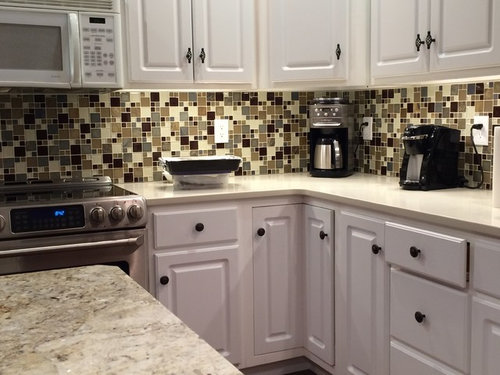
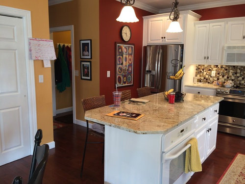
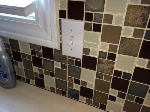
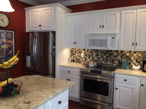
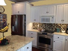
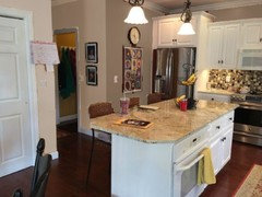
New tile backsplash and I hate it!! I picked out the new island granite and quartz countertops and they were done first then about 3 weeks later the tile backsplash was installed. I didn't remember it having so much tan and grey in it (I have neither one of those colors in my house right now). I am going to repaint a light khaki color throughout the kitchen/family room area and get a stainless steel microwave to match other appliances but I still don't think I will be able to live with the busy backsplash. I have redone the kitchen in stages and it was coming together nicely then the tile backsplash went up and "Bam - instant transformation into a hot mess!" Any other suggestions would be greatly appreciated. I am considering painting it. I talked to my handyman and he quoted me $950 for him to tear it down, fix drywall and put up new tile, then I still have to buy the new tile, which I paid $500 for this!!! I can't believe I got myself into this mess. My family all say they love it and everyone who comes over says it looks nice but I think they are just trying to make me feel better. I need your help!

Comments (43)

  • PRO
    11 years ago
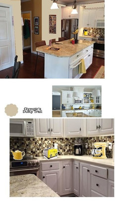
    the wall color change with lelp alot. i agree its busy! but its very nice glass tile. i think with the help of some color pale yellows.. on the counters to give a focus, now everything is stainless and black and white, and the tile is running free with distraction lol. [houzz=
    Traditional Kitchens · More Info
    ] i added some in, im not saying alll of them but you can get an idea....
  • 11 years ago
    It's actually quite fun! If you want to tone it down a bit, maybe add a piece of stainless over your stove up to microwave ? I might change out the outlets a cream or brown so they aren't as visible...

    Live with it for a month at least.... It's a lively, fun, energetic space...enjoy!
  • 11 years ago
    The tile is nice but I think the black and chrome appliances are doing them no favours,also the white switches need toned down why not play around with a few different items on the counter top to see what colour looks best with your tiles.if you can post a picture when you have this done maybe we can advise.
  • 11 years ago
    The first thing I noticed when looking closely at your new tile were the shinny pieces in cream. I love how they shine in the light! I'm assuming not all the tiles are as shinny. So how about painting only the color of tiles you don't like. This would give you a less busy look. Maybe even help out on that crazy re-do price tag.
  • 11 years ago
    last modified: 11 years ago
    eljaymom, I am not a fan of busy backsplashes, but I have to admit I like yours. So while I wouldn't have chosen it, I would keep it if it were my kitchen--at least for awhile. Here's why I think it can work:

    1. You didn't put it next to a busy granite pattern, so it takes center stage rather than competing with the counters it immediately adjoins.
    2. While it is certainly participating in the "busy multicolored glass tile mosaic" trend, its pattern isn't one of the ones I see most often and thus it looks fresher.
    3. I find its busy pattern whimsical and fun, which is nice for a kitchen.
    4. The colors are all neutrals, even though they have a high contrast with each other. This makes it easier to pick up the tones in nearby paint and furniture.

    So why not live with it for awhile and try to make it fit into your color scheme with paint (as you are already planning) and then see how you feel in a year or two? It sounds like your family and friends like it (I really don't think they are lying about that), and I suspect you may come to enjoy it, despite it being busier than you wanted.
  • 11 years ago
    last modified: 11 years ago
    This problem shows up on Houzz a lot. Hopefully others will learn from the repeated mistakes. Home centers are full of these mosaic glass tiles and people don't realize that a little goes a long way, especially when paired with a busy granite counter pattern and other surfaces. Your best bet is to remove the tile and replace it with a solid, or mostly solid color, perhaps a dark gray that matches one of the tones in the counter.
  • PRO
    11 years ago
    The problem, as I see it, is that the cabinets are too white for the tile. Since you already have all the other expensive things in, the cheapest and most effective thing to do would be to paint the cabinets a tan color or something to go with the backsplash and the quartz counters. Then it would work.
  • 11 years ago
    I'm torn because I think your back splash is happy! On the one hand, it IS busy and nothing like the soft colors in your cabinets and granite (which are both beautiful) but that is why it works. It is not fighting with anything. You have not made a "mistake," (it does not clash) ---except that you have chosen something that you just don't like. And so, for that reason alone, it does NOT work. And that's enough-- you are the one who's going to have to live with it.
    I think you should try painting it if you are certain you just don't like it. After painting over it, (should you decide to do so,) there is no way you will like it less regardless of how it looks after painting it, and the "busy" will definitely go away. Live with it for at least a while. You may decide you love it painted, or you may end up tearing it out. But at least if you do change it out you will have given the budget a chance to breathe for awhile. Good luck, and again, I think it's cute. I don't think people are just trying to make you feel better!:)
  • 11 years ago
    last modified: 11 years ago
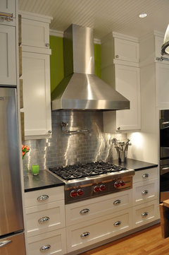
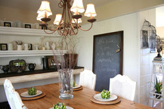
    Try painting the walls the light grey that is in the tile (or granite) so walls are not competing. I would also change your hardware to brushed silver as they are too busy with the tile. If after that, you're still not happy, you could add a stainless steel panel behind stove to break it up a bit, or cover completely with peel and stick stainless steel subway tiles. I would also remove your art under the clock and add a blackboard so as to make it fun (which the tile is) and to tie in with the black in tile. I'm sure you will be fine with the outcome.
    houzz=
    Knight Frank LTD · More Info
    ];[houzz=
    Queen Anne - White Painted · More Info
    ];
    houzz=
    Traditional Dining Room · More Info
    ];
  • PRO
    11 years ago
    The kitchen wallos aren't the problem.
  • 11 years ago
    Weatherwife has a point. If you paint it, the worse that can happen is that you don't like it and want to rip it out...which is where you are now anyway.

    Instead of painting the whole thing, how about just painting the large cream squares white? As someone else mentioned, your eye might be struggling to reconcile the cream tile against the bright white cabinets. Just do a small area to make sure you like it before totally committing. Since you have several different types of tile squares (slate, glass, ceramic) it might blend in well.

    Or the other option is to put a coat of antique white on the cabinets so that it is a warmer tone to compliment instead of competing against the cream.

    Good luck!
  • 11 years ago
    If I had a choice, I'd use white appliances in this kitchen, not stainless. The first thing that caught my eye was how nicely the microwave blends into the cabinets. Also, your counters go a long way toward harmonizing the white and cream tones. The backsplash is original and fun! I agree with feeny that you should give it a try for a while, at least until you get the walls repainted. If you still really hate it, you can always change it later.
  • 11 years ago
    Ps...love the stove. Search for GE stove on houzz and one of the manufacturer photos shows this stove with a very busy backsplash...and looks really nice. They have dark cabinets, but kind of the same basic design as yours, just in dark colors.
  • PRO
    11 years ago
    GI Joe tile strike again! That's tongue in cheek - just so you know. Sorry to see your choice has upset you so much. If you don't like it, then change it out. You have a calm kitchen with (relatively) calm counter tops. This backsplash would look great with dark cabinets because they would help tone down the appearance. It is an attractive tile but I'm with you, I feel it is "too much" for the space. If your house is still a jumbled mess from the renovation, it might be worth your while to do it now and be done with it than to have the installer come back in 6 months and put you through the dust/discomfort of more demolition.

    If the choice were mine, I would remove it and start again. I too like the white appliances rather than the SS. That might change depending on your new b/s.
  • 11 years ago
    OMG that is the same tile I just had installed in my new kitchen BUT mine is all 1" squares. I love it. My counters are Cambria "Bradford" Quartz which is darker than both your quartz and granite. My cabinets are not stark white either. Get rid of the gold & rust paint. I would chose one color such as sage green or a greige. If that is Cambria quartz Benjamin Moore has a page on their site with coordinating paints for Cambria that is how I chose my paint color. Paint whole area same. Can you post other end of room? Curious, why granite & quartz usually its one or the other or a combo with wood. As you can see in the lower right corner of my picture I used walnut stained butcher block on my island, which I also love. I do have to have the outlets changed from white to beige. It took me months after kitchen was finished to choose the tile so the electrician put the standard white. Hope this helps
  • 11 years ago
    Could jck910 send me pick of your kitchen? I don't ry know why I did quartz, I knew I wanted island different than counters, wanted island to b highlighted piece but I ruined that when I chose that tile.
  • PRO
    11 years ago
    last modified: 11 years ago
    I really think you can make this kitchen great with new paint on the walls. Before you start painting, bring home various paint chips - all taken from the palette of the back splash and the counters - and stick up on the walls to see which works best. Stick with neutrals of green/grey for all the walls and if possible don't divide the colours as you did before. Good luck form Montreal!
  • 11 years ago
    Maybe paint the island base a darker color as well...to coordinate with the tile...
  • 11 years ago
    I don't think it is a disaster- just paint your walls the cream color from one of the tiles. It will give your kitchen the cohesiveness it needs and will work better with your creamy granite counters. I have done a very quick paint job- please excuse the dodgy execution !!
    Now it looks great, and you wont have a white kitchen with plain subway tiles like everyone else!
  • 11 years ago
    Thanks for all of the help so far! Today I actually taped white paper I've tile is I could substitute paint covers over it virtually, my family came home and they all thought I was nuts!!! I appreciate all the help and am pleasantly surprised how many of u like the tile. I think I also can't seem to get past the harsh design of the tile, up close it looks nice but from distance it starts to look like that digital camo print, you know?
  • 11 years ago
    I am one of those dull subway tile backsplashers but I actually really like the look of your tile/kitchen and the only thing I would change is the paint...needs something neutral.
  • 11 years ago
    Once you paint those kitchen walls, you're gonna end up loving that backsplash.
  • PRO
    11 years ago
    what Flair Lighting said about the yellow accessories was genius! Transforms it.
  • 11 years ago
    I totally agree with absolutely everything feeny said in her comment and I like grover's paint color options. I also like calm backsplashes but this one does work (once the paint is changed). No question, it does "own" the kitchen and everything else will need to remain calm. The cost to replace it isn't super terrible, but I'd live with it for a bit and see how you feel. If you keep it, I think I'd replace or just remove the rug.
  • 11 years ago
    I think your backsplash is awesome . feeny and groveraxle rock!
  • 11 years ago
    The black hardware is what catches my eye. I like the backsplash and countertops. I would consider brushed nickel hardware to soften the stark white/black. With some tweaking, this is going to be the beautiful kitchen you have in mind.
  • PRO
    11 years ago
    What happens when you put on the 3D glasses?

    I agree it would help to change the wall colors-you have zero red or gold in those tiles.
  • 11 years ago
    Khaki walls look GREAT!
  • 11 years ago
    Also change the outlet covers
  • 11 years ago
    Bite the bullet and tear it out. It's busy and takes away from the lovely kitchen you obviously put more than $1,500 into. It's not worth it to look at something you don't like. That is ALL you will see. Here is a thought, do it yourself. Home Depot gives classes sometimes.
  • 11 years ago
    last modified: 11 years ago
    Hi---don't rip it out until you paint! Nothing too dark... Check Sherwin Williams colors: 6088 Nuthatch (pictured), 6087 Trusty Tan, 6081 Down Home, and 6080 Utterly Beige. I think the backsplash is quite nice---my eye actually goes to the dark finish of the hardware. :) The color pictured, softens the dark hues... Try the paint first---then go from there. Good Luck!
  • PRO
    11 years ago
    last modified: 11 years ago
    Hi Mom...

    We often tell clients about the 48 hour rule...if they come home during the project and see something upsetting, just let us know it bothers them but don't lose the faith for a couple of days. In this case I would extend that to a couple of months. It won't cost any more to change this finished work out then, and as you fill the space with "life" the BackSplash will not be the only focus of your attention.

    Just take the best suggestions from all of these nice folks and blend things in...add some coordinated canisters, cooking tools, a bowl of fruit or vegetables and the rest of what kitchens are really designed for. Remember you have an extra $1500 in your pocket. And...dim those under cabinet lights a bit!
  • PRO
    11 years ago
    Please do not paint the cabinets. Do change out the outlets. Lowes has some beautiful options (not inexpensive, but worth it) I would clean off everything off the counters, as every piece makes it even busier. And give it a little more time, as it is not an unattractive look.
  • PRO
    11 years ago

    There is no paint colour that will make that backsplash look better. I agree with you, it must be changed. I would suggest a backsplash tile that looks like this: http://www.mariakillam.com/whiteandcream/. Do NOT paint brand new tile, that should always be something you do before you're about to rip out your kitchen and ANYTHING will make it look better in the interim.

  • 11 years ago
    I like it! I would have all stainless appliances and repainted the red and yellow walls.
  • 10 years ago

    I would just paint the walls. The kaki or greige colors that were suggested are great ideas. The kitchen looks great to me and I wouldn't tear out that backsplash but rather work with it. You may really enjoy it after you paint the walls. Besides, what did you have in mind to replace it with? I think you've done a great job.

  • PRO
    10 years ago

    You know, in looking at it the following things stick out to me: the dynamic wall color ( I love it but not with your competing tile) paint is the lease expensive item you can work with. Also when you look at the whole hallway it is yet another strong shade - perhaps if you lighten all those visable walls (from the kitchen) and lessen the high contrast, you will find it much easier to live with. Also a wall color change will tone the whole picture down and that will make for a lighter, larger looking area, and less contrast for your white cabinets (which look great). As to the tile; the switches - right now scream at you. So definitely change them out to a dark shade (not expensive) that blends in, check our your electrical supplies company that will be a big help. I think the tones of your island surface are ok with your exciting tile but keep what you have on your counter simple and sparse - the tile makes the statement. Perhaps the charcoal/or black items on the counter - pull a color from those tiles if possible so it co-ordinates not contrasts. How does your floor fit in with the picture? I am so hoping it is a plank or hardwood floor - not busy floor. Something plain around your kitchen it allows it to be a positive feature rather than a negative. It is certainly quite striking but not as bad as you think. You can work around to make it a hidden gem without breaking the bank.

  • 10 years ago
    I agree that it often takes a few days to adjust your eye to a big change. You're used to seeing plain drywall there, and the new tile understandably looks very busy in comparison. Give it a couple of weeks and see how you like it. If you still don't like it, bite the bullet and change it. You should love your kitchen. As much as I like the tile, I suspect it will read as very 2010's in about 10/15 years, and you'll end up changing it then. So if after a few weeks you don't love it, and if it doesn't make you smile...change it. But I'm guessing that once your eye adapts that you'll end up loving it.
  • 10 years ago

    august 2014 dilemma...

  • 10 years ago
    I know this is an old post, but I'm wondering whatever happened with eljaymom and her backsplash? She's had a lot of time to "learn to live with it." Follow up on some of these dilemmas would be great.
  • 10 years ago

    "where are they now".

  • 10 years ago

    The tiles look great, the red walls are what is putting it over the top. I would paint the walls a creamy neutral.