Software
Houzz Logo Print
heidi_zagori

Help choosing a rug to complete my LR!

11 years ago
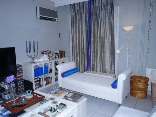
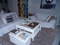
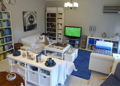
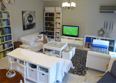
I need rug help in a little city apartment... I am going for a light and airy look, as we live in a hot climate. We take up the rugs in the spring and put them back in the fall, so I'm looking for a rug that will take the living room from light and summery to cozy and warming for the winter months when it gets pretty dreary and cold with all the white. (Especially because we don't really have much in the way of heating beyond the occasional space heater, I actually need the rug to help warm it up literally as well.)

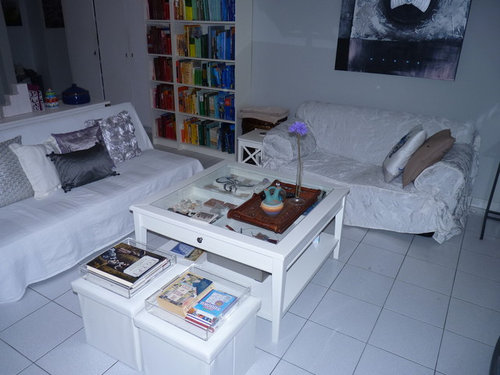
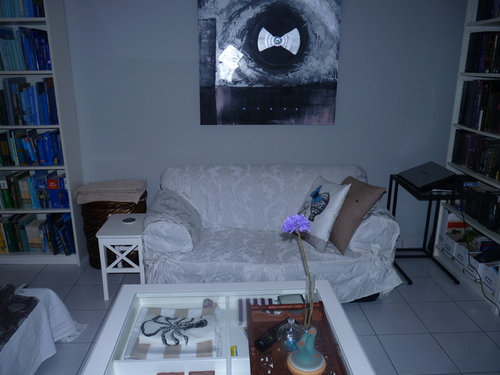
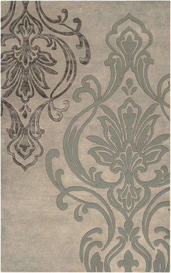
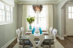
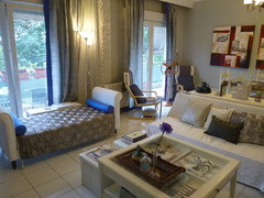
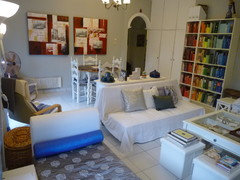
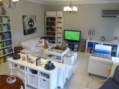
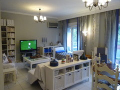
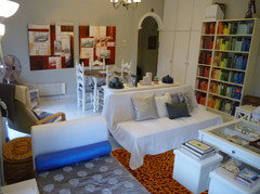
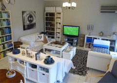
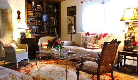
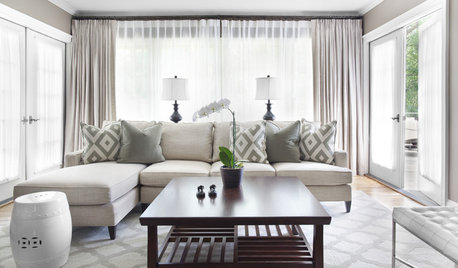
What I'm really hoping for here are suggestions for the colors and motif size of the area rug that I should be looking for. I live in the middle of nowhere in Greece so it's not likely I'll be able to order an exact rug, but I can take those suggestions to the stores here and get something in the right colors I hope. I have no problems using white (obviously) as we are very gentle on the furniture, but I suspect that we need something darker to pull it together and keep it from looking too much like a cloud.... the floors are white tile also. I'm including one photo without flash, doesn't show so well but you can see that the accent color is purplish blue (I call it periwinkle) rather than blue. Walls are light gray. Curtains are silver with periwinkle border. All furniture is white (except gray TV table). Some pillows are periwinkle, the throw blanket is silver. (I do not like the painting but my husband loves it so it stays.) So should I get gray? I am really attracted to a very LARGE but traditional motif in keeping with a transitional style like in the photo from Houzz below (which I am in love with!). This rug (1) http://www.ioakeimidis.gr/productdisplay/mihanopoiito-hali-viskozi-senyl-11 is available here in my town... So is this one: (2) http://www.ioakeimidis.gr/productdisplay/mihanopoiito-flokoto-hali-1 and this one: (3) http://www.ioakeimidis.gr/productdisplay/monterno-akryliko-hali-17 and this one: (4) http://www.ioakeimidis.gr/productdisplay/mihanopoiito-hali-viskozis-senyl-anaglyfo-pelos-11

I can take better photos of the room tomorrow (it's night here now).

Comments (30)

  • 11 years ago
    oops! don't know what happened to the rug from Houzz that I love! It's this one:
    Modern Classics Area Rug, Rectangle, Ivory, Pigeon Gray, 2'x3' · More Info
  • 11 years ago
    thanks groveraxle - I will post some better photos here when the sun comes back around :) and yes that rug is a shag. that store is 2 blocks from my house so I may run over there Monday to see if they can show it to me and I will see if the color is the same as the photo.
  • 11 years ago
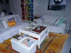
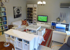
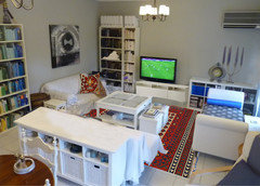
    The second rug you linked, and a great old Turkish kilim:
    Heidi Zagori thanked groveraxle
  • 11 years ago
    the Turkish rug is an idea... I only live a few hours' drive from Turkey, just spent a long weekend in Istanbul 2 weeks ago, I'm sure I could arrange for a rug from there as well. (And I can't believe I got the groveraxle treatment on my first advice thread :D :D ) It really does warm up the space, that's for sure. I'm not sure if I'm ready for orange... but maybe I need to stop being so afraid of color. I was afraid the blue might be too colorful, "over the top"....
  • 11 years ago
    (I don't want to feel like I'm living in a black and white film either...)
  • 11 years ago
    My first thought when you said you were in Greece was Turkish kilim... That one was just a google image I found, but I imagine you can find one a bit more muted. I also noticed you have an array of books arranged by color. I think you need to carry that a bit further in your space.

    (Not sure what the groveraxle treatment means, but I'll take it as a compliment. ;-))
    Heidi Zagori thanked groveraxle
  • 11 years ago
    please look at Turkish rugs - your room needs some pattern and more color for winter.
    Heidi Zagori thanked bgfuqua
  • 11 years ago
    Try Flor. This will be perfect for your needs. They ship anywhere, have stores where you can view samples in person, as well as ship samples directly to you. You can mix and match patterns. This will allow you to adapt the rug for different seasons by just changing out a few tiles! All are rubber backed, as opposed to fabric backed. Super easy to clean, and stain resistant. I am attaching a link to their site so you can check it out. I have several rugs from there, all different styles and colors. They work great and I get lots of compliments on them. Good Luck!

    http://www.flor.com/color/blue-1.html?limit=all
    Heidi Zagori thanked keesra01
  • 11 years ago
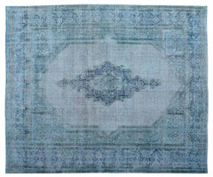
    Hi---dark overdyed rug---I'd paint the walls. The gray is very cold looking. I'd go with a warmer, deeper gray. Hope this is helpful. Good Luck!
    [houzz=
    Overdyed Worn Old Persian Kerman 100% Wool, Hand-Knotted Rug · More Info
    ][houzz=
    Kellogg Road Residence · More Info
    ]
    Heidi Zagori thanked Natalie
  • 11 years ago
    Natalie - I love the overdyed Persian rug! That's funny you say that about the gray because I've been thinking about repainting a darker gray (not sure if that's what you mean by deeper) - I don't like grays that have brown in them, and I want to keep the cool feeling for the summer, but I was thinking something even darker than in the Kellogg Rd photo (which is actually very close to what we have now - I think it will show up better in the new photos I'll take today).
  • 11 years ago
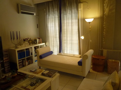
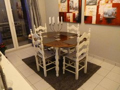
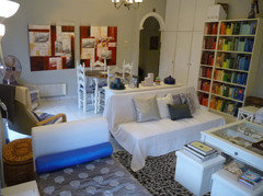
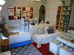
    Here are some photos without flash. Unfortunately it's pouring rain and cloudy today but that may be closer to actual winter lighting anyway. The dining area is in the same space as you can see and I have a nice sage oriental rug for under the dining table (it was a gift from my husband's grandmother, despite the sage, it works somehow. It will probably go in in October).
  • 11 years ago
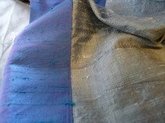
    this is the curtain fabric. I used the same blue fabric on the bolsters. Pretty much all the other textiles are just stark white.
  • 11 years ago
    The new photos give a much different perspective on your space. In natural light, even on a rainy day, it looks much warmer than it does at night. And I can see that this is the perfect look for hot summer weather.

    For your winter rug, I would not go for the bright kilim now. Either a medium-dark shag or a thick overdyed rug would be in keeping with the serenity of the space and give you the warmth you look for.

    Two other things I'd do: lower the art in the dining area about 8", and add a bit of red--perhaps just red tapers in the candelabra--on the other side of the space.
    Heidi Zagori thanked groveraxle
  • 11 years ago
    Groveraxle, any color suggestions for the rug? Would that blue (same as on curtain border) work, or should I try a completely different color? I like the idea of a deep / intense color but I'm second guessing myself on the blue. I can tell you that I used to have a plain dark gray rug there, it's in poor condition now and I don't have a photo of it in the living room, but I do have a photo of it from several years ago when it was in the dining room. I liked it okay though I want something considerably larger. I liked the intensity of the color but I'm not sure I really want to do gray again. Also - do you think it would be a bad idea to introduce a pattern on the rug? I don't have any patterns so far except a white-on-white damask on the loveseat slipcover and a silver-on-silver damask on the throw on the recamier. I am mostly attracted to filigree patterns (and I've used them in the bedroom too). So I'm attaching a photo of the old gray rug to show how it looks on the tile.
  • 11 years ago
    The carpet can be brown, or dark tan.
    That colors can put the blue in a lighter level.
  • 11 years ago
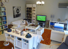
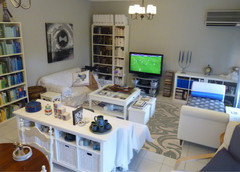
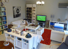
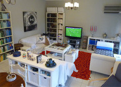
    I've lowered the art, then inserted three rugs. I chose a deep thick shag in three different colors: charcoal, deep red (like the art), and orange because it's the complement to blue. I quite like the warmer colors in the space, but I would keep the rug plain--no pattern--because the area where the rug shows is small and you seem to have quite enough going on in the space.
  • 11 years ago
    Heidi, our posts crossed, but it appears I answered most of your questions anyway. I will insert the rugs in the view of the room from the other direction, but FTR, when I was working on your rugs, I tried a blue overdyed rug and it looked awful. It was too much pattern and too much blue.

    I think a big block of warm color on the floor will warm and liven the space. Back in a few minutes with another view.
  • 11 years ago
    I never thought I'd say this but I love that red. The charcoal looks very familiar because I used to have that; I think the orange would need to then reappear elsewhere in the form of accessories or something ... maybe I shouldn't have chosen blue since I really don't care for orange that much! But the red is really something.
  • 11 years ago
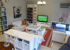
    A few different looks: charcoal shag, rusty orange shag, the rug you liked from houzz, a blue overdyed rug.
    Heidi Zagori thanked groveraxle
  • 11 years ago
    Red from the other direction:
    Heidi Zagori thanked groveraxle
  • 11 years ago
    now I'm really not sure... out of those options, I like the print best... the red I think doesn't make a lot of sense from that angle... I think the blue looks off. The charcoal does look smart... am I falling into the monochromatic trap again? Hmmm.... this is hard!
  • 11 years ago
    A few things to think about. Your room has lots of white and hard edges. Even your pillows are smooth. For a monochromatic look to work, you really need many shades of the same color and lots of different textures. You don't have any of that here.

    The contrast you have is all with color: blue pillows, red art, colored books. Everything else is either white, gray, or silver. It's why I suggested a block of color for the rug. (And I do think you need a thick, cushy rug for this room.)

    The room is also busy with stuff which leads me to prefer the plain over the patterned rug.

    Here's the red rug with red candles in the candelabra:
  • 11 years ago
    "many shades of the same color and lots of different textures" - that is something to work on for sure. I am currently knitting a large blanket for the couch in a pretty heavy wool knit so that will add some texture ... but ... white, gray, beige, with a bluish border! It's too late to change that because it's almost done. On the plus side though the yarn is very soft and textured. I've had my eye on a red glass candelabra here that I may spring for if I go for the red color. I've never used much red although I really like it in the dining room.

    I agree about the busyness... it's a small apartment and this our main living space, and it's just kind of all out there. We entertain fairly often and we spend most of our time in this room. I want to get all those DVDs into boxes so they're not visible, as well as maybe using baskets like the ones in the buffet for the half-height bookcase on the back wall to hide some of the stuff in there and cut down on all the visible storage. Even the coffee table looks cluttered because of the glass top, I could declutter the drawer so that the table looks less busy. The reason that the books are arranged like that is to make the room look less chaotic; I purposefully put the colorful ones in the dining area and the neutrals in the "serene" living space, and it is more visually restful than it was. In any case, I'm open to any other suggestions about the room in general; I think that the buffet, which stores all my handmade ceramics (no space for a china cabinet/hutch, nor do I really like them) can get cluttered looking. I tried to declutter the back bookcase a little compared to the earlier photos by removing the books that were on top.
  • 11 years ago
    If you declutter, you can get away with a lot more color. Here are three different looks for you with a proper media cabinet (to hide your little stuff), some bigger stuff in its place, and three different color rugs. (TV console is from Ikea.)
    Heidi Zagori thanked groveraxle
  • 11 years ago
    last modified: 11 years ago
    Well, as you can see, I cleared the buffet off. I was going to keep the big blue pot and put it in the center, but it would have been easier for me to fly to Greece and do it for you than to do it in Photoshop. ;-)

    I think your bookcases look great, and I love the color-arranged books. It has become an objet d'art on its own. You really don't have to do much to this room...except decide which way you want to go colorwise.
    Heidi Zagori thanked groveraxle
  • 11 years ago
    Haha! No worries, these visualizations are great. The blue pot is actually something that gets used very frequently in the kitchen so I don't want to hide it away too much (and there is nowhere to put it in the kitchen).

    I've now removed a good amount of stuff from the coffee table under the glass. The big white thing that you took off the back bookcase is meant to hang on the wall and I just haven't figured out how I want to deal with that yet. (It's a wooden map of Virginia which is supposed to help me feel connected with "back home" but I'm not sure where to put it ... maybe the home office and out of this room entirely.)

    Some of the stuff that was on the buffet is indeed rehomeable (if that's a word) but it will take some shuffling. I think I started putting things there to make some height for the "room divider" function of the buffet, also because it's a flat surface and stuff accummulates on flat surfaces around here. I very much like the idea of a new media cabinet... the gray thing is completely the wrong style (cheapo Euro-contemporary) that we bought when we first moved here and I stopped liking it years ago. It would get rid of a lot of the stuff on the shelves to the right of the DVD tower also. All those blue books (those are notebooks) can also go to the home office and I can put some of the stuff from the buffet top in those cubbies.
  • 11 years ago
    The wooden map of VA is too small to go on that console or on the wall. Stand it up on one of the shelves of the bookcase to the left of the TV.

    Any of Ikea's white TV consoles will match the rest of your furniture, a good thing in this case. If you get one that fills that space, the TV wall will be more cohesive and less busy.

    Some of your more colorful pottery might go on the unit to the right of the TV. I think you need a larger piece or two, though, for the top. You might notice, I enlarged your candelabra and clock. One large thing always has more impact than a bunch of little ones.
  • 11 years ago
    If I surrounded the map of VA with a large empty frame, and hung them over the console/under the AC, would that work scale-wise? I don't have a lot of options for book overflow so I don't know that I can sacrifice a shelf to put any non-book stuff on. I don't have a lot of large-scale things to display, because most of that stuff is from traveling, where space is especially precious. Of course I can get something locally. I agree with you that something more sizeable is needed in that space. Imagine a large rectangular ornate frame with no glass surrounding the VA map centered over the console on that wall... like it or hate it??
  • 11 years ago
    How about grouping the map with other items, or just setting it in front of one of the rows of dark books?