Software
Houzz Logo Print
bevballew

Need help finishing spare guest bedroom.

11 years ago
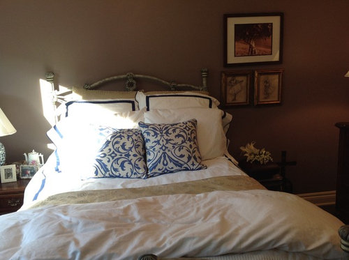
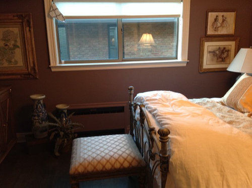
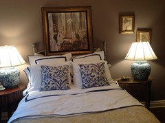
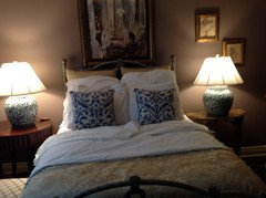
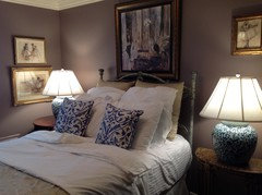
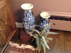
I am not sure if the Pottery Barn bed linens cut the mustard. Need suggestions and what pillows to add. I love the wall color, just recently painted. The lamps are Ralph Lauren and I want cobalt blue or dark blue accents. I have two collectible blue and white vases. The prints are degas ballerina sketches. Would like suggestions how to complete the room. Drapes forthcoming, probably in a white background with blue trellis or chain like pattern, the style pretty popular now.

Comments (95)

  • 11 years ago
    Angelagk, I can look for a fabric as you suggested to see if I like it. To be honest, the pillows are meant for my outdoor patio furniture. With winter approaching I brought them in and just put them on the bed and was trying to see if they work. I have been tempted to go to Calico and see what I could find and perhaps at least for now just cover those pillows. I am glad you made the suggestion. I will try it out and see if I can find such a fabric at Calico Corner. Thanks!!
  • 11 years ago
    The room looks great Bev, but I do like Jill's suggestion about the art going over the bed.
  • 11 years ago
    Thank you Jill! Thank you for your suggestions. I will try it out and add the photo so all of you can offer your thoughts! Not the dresser yet of course!:))
  • 11 years ago
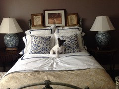
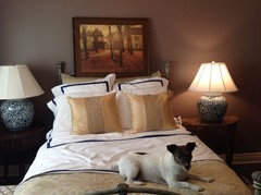
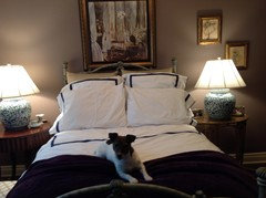
    Here is with pictures leaning over bed. Raised lamps. My darling dog wanted in. I think I like. Not sure. Don't want to nail pictures to wall yet.
  • 11 years ago
    Oops. Here is photo.
  • 11 years ago
    I like it! A lot! And the dog, too! LOL
  • 11 years ago
    I don't mind a pictures or pictures above bed. Just not sure I like those. Thank you Abbyjean. Hope you had fun on Halloween.
  • 11 years ago
    last modified: 11 years ago
    We did have a good Halloween! Had the kids and grandkids that live here over for a chili supper before they put on costumes and headed out. We had one Dennis the Menace....and it soooo fits his two year old style right now....and a Spider Man big brother.

    How about you? Good one?
  • 11 years ago
    Hi Bev, ... sorry I should have been more specific about the art. I was picturing (the sketch-up) the two larger degas sketches (hanging to the right of the window) & the two smaller ones hiding behind the right side lamp. They are beautiful sketches and all are framed in gold... Would be awesome together! I have four similar ones in my home. You have good taste ;))

    ... of the 3 propped up I the headboard, I can't quite make out the images of the piece that is the middle. Initially I saw a tree but perhaps not... Is it a degas sketch as well? If so, the framing isn't right for the grouping IMO.

    I really like your porch pillows on the bed. Makes we want to be a guest :)
  • 11 years ago
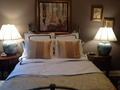
    Ok last word today, I promise. The gold pillows are great touch and allow the eye to flow from the bed skirt up to the four gold framed sketches - fingers crossed they end up over the headboard. And the pup looks like a great snuggler!
  • 11 years ago
    Yes I like the dog too. Keep him lol :)
  • 11 years ago
    Thanks Mhusar. Lol! :)). Jill. Thank you. My designer actually put the two degas pictures to the right of the window. To be honest I don't care for groupings. I usually like one large picture or two or three pictures in a horizontal direction or grouping of four equal sized pictures, two up two below. I like symmetry. Also you are right about the middle picture. It is a picture of my daughter. She gave it to me as a gift and a few years ago she asked where it was because I had not yet hung it in my former house. So I made sure I hung it in this house although she lives in California and I am in Michigan. I do agree and thought from the start something above the bed. I appreciate your input.
  • 11 years ago
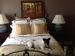
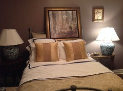
    So here is with the gold pillows and a larger picture which is in my basement normally. Along with my baby!
  • 11 years ago
    Better pic
  • 11 years ago
    I like pillows but sorry not crazy about the art for this room...the one above the dresser is more of a sketch right? so to me they seem so different in mood and tone...just my thoughts.
  • 11 years ago
    Yes, you are right Mhusar. If I put artwork above the bed I need to go buy something. Thank you for your input. I did not think it looked good. It was suggested the gold pillows so I threw the picture up. The one piece of art is like a sketch with no distinct color. Also it was asked if I have a mirror in the room. Opposite the headboard is a very, very large mirror. Thank you for sharing.
  • 11 years ago
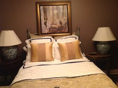
    How about this picture?
  • 11 years ago
    Another picture
  • 11 years ago
    Much better I like it and the frame goes nicely with the new gold pillows :)
  • 11 years ago
    Yes, I was going to say that the other painting would look good if it had a gold frame. But this works.
  • 11 years ago
    I could now assume I can go two ways as some have agreed on the blue and white pillows and others with the gold pillows. I like both!! Further comments and ideas appreciated. I love the last picture posted but I always like to exhaust all ideas before making a final decision.
  • 11 years ago
    I prefer the blue and white pillows. Your room is lovely.
  • 11 years ago
    Good job, bev! The repeated gold was the goal.
  • 11 years ago
    Ok. Two different pictures for the wall. Comments please. Bed is a little messy.
  • 11 years ago
    last modified: 11 years ago
    bevballew, what are you thinking about the framed pieces behind the right lamp if you place something over the bed? I like the colors in the smaller art (although I don't believe in matching art to surroundings) but maybe the scale of the larger. What would happen if you used those two small pieces, set above each other vertically, to the right of the smaller art, I.e. a 3 piece effect? As for the pillows, I am definitely a fan of the blue, sizewise and colorwise, no matter the art.
  • 11 years ago
    Thank you ciscomo. I appreciate your input. I will try that. I decided I like the blue pillows. Then I became frustrated with the art. So when you say smaller art you mean the painting with the blue. I got that picture from a street artist on the island of Capri, Italy and have an affection for it along with the memory.
  • 11 years ago
    Hi, bev. I apologize, I missed the ENTIRE pillow/ art comments posted above and just saw the last photos. I really do love your Capri art and love the backstory. Do you have any of those sticky, removable hook thingys? I'm wondering if the capri art might even be fine on its own, but I don't have the kind of eye that can judge without seeing it actually up.

    If you want more gold, I wonder if placing the little gold framed pieces with the capri might accomplish that?
  • 11 years ago
    I still like the art on the right. I agree with another comment it fits the scale and grandness of the room better. I like the blue pillows but like you said can do both. The gold pillows have a nice texture. BUT...now I think you need two small gold pics on the left side like the right side. You have so much symmetry going on with the lamps and pillows the left wall looks blank now...what does everyone think?
  • 11 years ago
    I mean I like the art in the right 2 photos.
  • 11 years ago
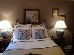
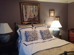
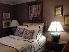
    Thank you so much for your suggestions. I have made a vast improvement thanks to all the ideas offered. Attached are two pictures now of the room. The two degas to the left were placed there by my decorator. At this point I do not need her services but the room was driving me nuts as I wanted more completeness until she would come back after the holidays. Focusing my money on a kitchen project. The art above my bed is one of my favorites and I thought the colors went with the other artwork. So since the degas artwork is on the other wall to the left I could not see adding more to the left of the large art work on the large wall. But I did think the large art was needed over the bed. Furthermore when you walk into the room the balance is there. So what do you think? Probably down the road replace the large piece? I loved the suggestion of both lamps where they are now. I was able to being up a table I love that was my moms and it seems to work. I am trying to use what I have for now to see if they work in this house. I moved and downsized last year. I loved the suggestions and am so appreciative of your help. Look forward to comments.
  • 11 years ago
    How about this with no blue stripes?
  • 11 years ago
    Blue stripes are better--gives more definition.
    bevballew thanked Nancy Walton
  • 11 years ago
    I like the blue stripes also, Bev, with the blue pillows. The room is really warm and inviting! Your guests may never want to leave now!
    bevballew thanked Depo
  • PRO
    11 years ago
    I think the color on the wall has a purplish mauve color tint to it that might be clashing with the blue and brown (which on the color wheel is orange). Find something that pulls all those colors together or you may want to take out a color all together.
    bevballew thanked User
  • 11 years ago
    What color do you suggest Mcmanaway? You are right with the purplish mauve. I saw it immediately once painted. I have those two blue lamps and two Chinese vases I tried to work around. You can see the vases in the attached picture. Maybe add coral if you say orange?
  • 11 years ago
    Another vote for the stripes! And other than that, I don't think you have to change a thing. I think it is neat that you used furniture and art you already had to devise such a rich look.
  • 11 years ago
    Thank you so much and thank you for your input. It has made SUCH a difference! I love what I have and that is why I don't want to buy new things if I don't have to. Plus my decorator yells at me if I want to buy something.
  • 11 years ago
    LOL. That's what's so great about houzz....virtual shopping for other people!
    bevballew thanked User
  • 11 years ago
    :))
  • PRO
    11 years ago
    You can do Purple, Green, and Orange or Purple, Blue, Orange, and Yellow avoid red and green. I would go with the second option. Just bring in some more Purple and Yellow to bring it all together.
  • 11 years ago
    Bev, you have been awesome with your willingness to try all the suggestions posted... Very nice improvement with the little table and moving the lamp. Also, the bench is a needed piece for guest belongings and the upholstery works. I recall earlier in this tread that the blue pillows had been outside and when you brought them in they went to the guest bed, and I think that's when the struggle between two design elements began.

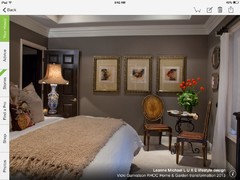
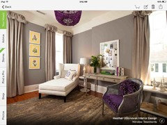
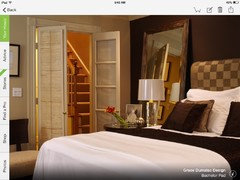
    Your decorator created a relaxing french inspired room with the muted purple walls, the khaki/white linens and the use of your art with gold frames (like in the photos below). The delft blue lamps work in the space if that is the ONLY use of it. Delft is a very strong design element that overpowers the relaxed feeling that was initially created. So, when the pillows arrived, they and the lamps, took charge. The blue stripe in the linens is so small it works in either design but if more blue comes into the space - I.e. curtains, art over the bed, blue vases- then the the other design elements probably need to change.

    Question is, which look do you want in your guest room? The look your decorator initially created or the blues?
  • 11 years ago
    last modified: 11 years ago
    Hi bevballew, I have mused about jillbertsch's comment and photos. I came into the thread late... with your blue linens question but I'd vote for a plain linen natural tone curtain, rather than the patterned fabric, which I felt to be a bit casual and sun porchy, if that's a thing.
  • 11 years ago
    Thank you ever so much Jill and Cisco. Yes, yes. I agree completely. I am extremely open to he change I color. It has bugged me. I think my decorator picked the wall color with a purple tone is because much of my house has eggplant which is the color brought from my other home. I have two small Schonbeck chandeliers that have eggplant color crystal pieces. They are now in the master bedroom bath. I have two side chairs with an eggplant/purple and gold ikat fabric. The blue and white pillows came from outside so they can stay with my things in the basement stored for the winter. I agree re the window treatment fabric. I had a sunroom that had the delft lamps with the pillows and paid a bit more money for the Ralph Lauren lamps and I love them so that is why they are in the room. My decorator also chose a beautiful fabric close to the wall color in a solid color with a weave encompassing muted colors. So I am so happy for your input. My decorator worked from a picture I showed her that worked with blue and white with dark walls. Thank you so much Jill for the pictures. It gave me great direction. The delft just being used as a small accent now!!! Pillows gone. Now I just have to decide the accent. Love the plum, which is scattered around the house. Hmm!
  • 11 years ago
    Tres Bien, bevballew!
    bevballew thanked jillbertsch
  • 11 years ago
    Your home sounds lovely with touches of aubergine and bling! Would like to see what takes place in your kitchen as well.

    I think you mentioned not being a big fan of art groupings, and they can be challenging; however :))... the two small groupings in the guest room could be brought together for an amazing display over the bed and would bring height and impact. The room will have order (eliminating multiple groupings) and the bed wall becomes the focal wall without competing elements?

    Your decorator's fabric choice for curtains sounds beautiful, so let the window treatment stand alone as the decor for that wall. Think less is more.
  • 11 years ago
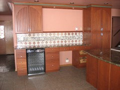
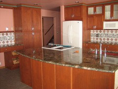
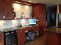
    Thank you Jill. I will work on the grouping. Painter comes Tuesday to start on the cabinets in the kitchen. Here are photos before I moved in. Here is today. I will post when kitchen cabinets painted. Need new pendants also. Thank you for your interest!! You are very kind!
  • 11 years ago
    Wow! I am always amazed at what the right paint color can to in a space. With minimal change your kitchen looks totally different. Can't wait to see the finished cabinets! Thank you for your kind words.
  • 11 years ago
    :)
  • 11 years ago
    Thank you Talianko. Your suggestions are always welcome. Your site is great!
  • 11 years ago
    For now this is it. I decided to eliminate more blue and add the aubergine color to the room. Other parts of my house have aubergine and a light green. I once saw a picture of the cobalt blue and aubergine together and loved it. So I am very happy with this color. I will at some point try out another picture arrangement but I do like this and don't want more holes in the wall. I will need to add a drapery treatment and pillows for the bed. Thank you all for your great suggestions that moved my room in a beautiful direction. Other comments are still always appreciated and welcomed.my by jack Russell seems to want to be in the picture. She's my bud and girlfriend!
Sponsored
Bella Casa LLC
Average rating: 5 out of 5 stars17 Reviews
The Leading Interior Design Studio in Franklin County