Software
Houzz Logo Print
jdemarcodesigns

SIMPLE changes = BIG impact

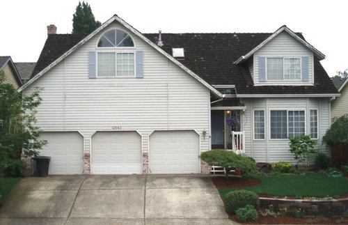
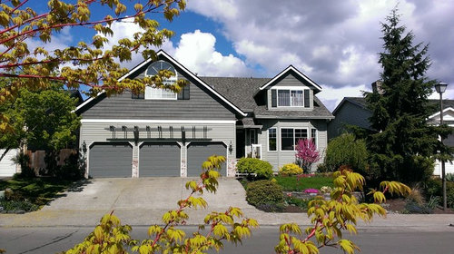
Our task was to update the exterior of this moderate home and give it some much needed curb appeal and yet keep the budget in mind at all times.
Our solution was fairly simple;
1. Replace a very worn out wood shake roof with Architectural composition shingles.
2. Redesign and replace window grids and shutters.
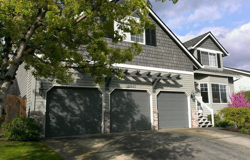
3. Add composite shingles to the two gable ends.
4. Repaint existing horizontal siding, fascia and trim with subtle yet bold colors in order to reduce the impact of the garage doors and garage gable dominance of the front elevation.
5. Add an arbor above the garage doors.
The project was completed on time and on budget and is now an extremely beautiful home in the neighborhood.
Jerome DeMarco ART.chitecture Portland, OR.

Comments (62)

  • PRO
    11 years ago
    Great choice of color
    Jerome DeMarco ART.chitecture thanked Dawson & Clinton
  • PRO
    11 years ago
    Nicely done!
    Jerome DeMarco ART.chitecture thanked Tracey Stephens Design, LLC
  • 11 years ago
    Can you share what brand shingles you used? They look great, and I am in the market for the same product. Thanks.
    Jerome DeMarco ART.chitecture thanked Carol Pearson
  • PRO
    11 years ago
    Hello Carol, The product is a Cement Fiber composite panel that is available from different manufactures. Check with your local home centers for detailed information on their products that are available. Best of luck on your project. Jerome DeMarco ART.chitecture
  • 11 years ago
    This should be in an ideabook with a budget, since people are always asking in the Advice section how to turn their boring house into something great.
    Jerome DeMarco ART.chitecture thanked Sigrid
  • 11 years ago
    Personally, I think the shorter arbor helps to detract from the expanse of the three garage doors, along with the addition of the shake shingles above and the fabulous color palette.
    Jerome DeMarco ART.chitecture thanked Deborah Dionne
  • 11 years ago
    Wow....looks fantastic. I like the size of the arbor. I think the shorter length was designed to bring the eye in so NOT to focus on the full expanse of the three garage doors. Had it been larger...that long expanse of doors would have been the focal point. As it it, the focal point is reduced and the door expanse is minimized. I love the colors. Well done.
    Jerome DeMarco ART.chitecture thanked carrie
  • 11 years ago
    last modified: 11 years ago
    I guess our eyes all see things differently. The short pegola makes the garage expanse seem larger to me.... go figure;) In fact, IF the intention was to reduce the garage presence, why have a pergola at all?
    Jerome DeMarco ART.chitecture thanked User
  • PRO
    11 years ago
    Hello Carrie,
    Your comments are exactly what we had on our minds at the time. To project a structure out away from the building in order to break up the mass of the entire gable end of the house. We also thought a shorter pergola would draw attention away from the 3 doors and allow us to install the light fixtures at the ends of the garage. And that's the long & the short of it. Thank you everyone for your great comments & have a fabulous day all.
    Jerome DeMarco ART.chitecture
  • 11 years ago
    Awesome transformation! I love the shingles on the gables. You really "dolled" this house up! Nice job!
    Jerome DeMarco ART.chitecture thanked mamabear2014
  • 11 years ago
    @Margo. The pergola adds also dimension and decoration to an otherwise large flat and rather plain surface area. That's why it was added. Besides, my eye went right to the pergola not the doors. That is the point.
    Jerome DeMarco ART.chitecture thanked carrie
  • 11 years ago
    Carrie- fair enough;))
    Jerome DeMarco ART.chitecture thanked User
  • 11 years ago
    It looks as if that's how the house was always meant to look. It's great!
    Jerome DeMarco ART.chitecture thanked Laurel Ennis
  • 11 years ago
    Looks great! PLEASE. Power wash the driveway!
    Jerome DeMarco ART.chitecture thanked dooders1981
  • 11 years ago
    Much improved. The balance brought by the addition of the darker color across the front upper is nothing less than magical. Great work! :)
    Jerome DeMarco ART.chitecture thanked zazfuzzroc
  • PRO
    11 years ago
    What an amazing transformation.
    Jerome DeMarco ART.chitecture thanked Susan Tiritilli
  • PRO
    11 years ago
    And I thought one large or two smaller garage doors facing the street looked bad....what a monstrosity!
    You did a fine job breaking up the place with color and texture.
    Jerome DeMarco ART.chitecture thanked User
  • 11 years ago
    Trellis is to small, make it bigger, go all the way across the front
    Jerome DeMarco ART.chitecture thanked masterdarrellduncan
  • PRO
    11 years ago
    The purpose of a trellis is for plats to grow o it. It doesn't make any sense ending in the middle of garage door, that's why it is to short. It needs to run end to end.
    Jerome DeMarco ART.chitecture thanked Susan Berry Design, Inc.
  • 11 years ago
    I think its perfect, quite an improvement, beautiful!
    Jerome DeMarco ART.chitecture thanked Deb Shellenbarger
  • 11 years ago
    Looks Beautiful!
    Jerome DeMarco ART.chitecture thanked Brenda Depratto
  • 11 years ago
    Better, but ( as an Architect there's always a "but"...) The Garage trellis ( not a pergola which is freestanding ) should be wider. It should also have a vertical trellis on left side connecting to ground level large planter of flowering vines ( to be a true arbor ). The vines grow up & over garage entry when flowers are in bloom. Kill the original "faux brick bases" at the garage columns & replace with dry stacked real stone veneer on garage base. Good job & street appearance / value has increased dramatically by your remodel!
    Jerome DeMarco ART.chitecture thanked User
  • PRO
    11 years ago
    Hello ART2ARCH, thank you for your comments.
    It's a funny thing about the" trellis, arbor, pergola " it is meant to be more of a shade rather than a vine holder. It's length was to de-emphasize the width of the garage front and I agree about the real brick, however the client loved it. I try to listen to my clients rather than dictate to much of what I was taught in college. I have found over the years that all that training tends to put a fence around creativity. Jerome
  • 11 years ago
    LOVELY!
    Jerome DeMarco ART.chitecture thanked Patricia Brooks
  • 11 years ago
    Another inexpensive improvement would have been to put backs on the entry stairs - would have made them look finished... Loved the rest and agreed
    with multiple posters, the pergola should have extended the full length of the garages.
    Jerome DeMarco ART.chitecture thanked Linda Anthony
  • 11 years ago
    Pergola is perfect. Bigger would have been too big. This is a stunning transformation. Wouldn't have looked twice at this house before. Well done. I'm local with a 60s looking home in need of curb appeal, and making a note of your service.
    Jerome DeMarco ART.chitecture thanked jjacksflynn
  • PRO
    11 years ago
    Love this transformation! I had to keep looking back at the "before" picture to see what wasn't there before as everything in the "after" picture looks like it belongs perfectly!
    Jerome DeMarco ART.chitecture thanked Elite Interior Staging
  • 11 years ago
    Stunning transformation!
    Jerome DeMarco ART.chitecture thanked 77cherry77
  • 11 years ago
    I love how you broke up the area above the garage. Beautiful job!
    Jerome DeMarco ART.chitecture thanked cpnielsen
  • 11 years ago
    You did wonders for the house- it looks great!
    Jerome DeMarco ART.chitecture thanked cliffordhome
  • 11 years ago
    I absolutely love it!!! The color choice makes a great different, I would have never chosen gray, but it actually looks amazing. The separation created in the space between the front window and the garage doors makes it look more symmetrical with the rest of the house, and the pergola is a great focus point.
    Jerome DeMarco ART.chitecture thanked migue27
  • 11 years ago
    The power of suggestion at work. Note how one person makes a comment and others pick up on that even if the comment is questionable.
    Jerome DeMarco ART.chitecture thanked Dar Eckert
  • 11 years ago
    Certainly looks freshened up, but a 3 car garage in front of your house is just that. Why builders have to show garages as a focal point in front of the house is beyond my way of thinking of how a house should look roadside. Beauty of the outside of a home should focus on the front, with a porch, beautiful entrance way, along with landscaping, lighting,decorative windows, stone work. That to me is eye appeal roadside, I like side load garages.
    Jerome DeMarco ART.chitecture thanked maryloufadden
  • 11 years ago
    Dar- lol, aren't ALL comments on Houzz suggestions? Aren't all comments questionable? Some agree, some disagree *shrug*...what is the point you are really suggesting?;)
    Jerome DeMarco ART.chitecture thanked User
  • PRO
    11 years ago
    Fantastic transformation! I would have to disagree with the others, I think the arbor is the right length. If it had spanned the whole front, it would have made the garage seem even wider and more dominate. Very well done, and the colours of your selections are spot on!
    Jerome DeMarco ART.chitecture thanked Gordon Tobey Developments
  • 11 years ago
    I agree with Gordon. The arbor helps draw in the width of the garage. I love the two tone siding...beautifully done!
    Jerome DeMarco ART.chitecture thanked coopster
  • PRO
    11 years ago
    Looks great!

    - Janis, GKB
    Jerome DeMarco ART.chitecture thanked Gilmans Kitchens and Baths
  • PRO
    11 years ago
    100% improvement!
    -Angeline, GKB
    Jerome DeMarco ART.chitecture thanked Gilmans Kitchens and Baths
  • 11 years ago
    Great job Jerome, no explanation needed, just my 2 cents, as we both know the client's satisfaction is goal number one. I hope they are happy as you transformed their house into their dream home!
    Jerome DeMarco ART.chitecture thanked User
  • 11 years ago
    Love it! So glad you didn't go with beige!!
  • PRO
    11 years ago
    Much improved, looks great!
  • 11 years ago

    Beautiful!

  • 10 years ago

    What a beautiful added appearance to this home. Everyone has an opinion of large, small, etc etc. Guess this is what makes our world go around. I do have to agree with the individual whom commented on garages being such a focal point to the front of the home. We are facing this dilemma with our lakehome. Looks more garage than our lake home. tsk tsk. Hey builders out there you need to take this into consideration and give your clients this option if viable with the land layout.


  • PRO
    10 years ago

    Beautiful! Love the color choices!

  • PRO
    10 years ago

    Great update! I love the new color scheme. - Shannon

  • 10 years ago

    WOW! Fabulous transformation! I Love it!

  • PRO
    10 years ago

    Beautiful - where did you purchase new window grids?

  • 10 years ago

    Love the color. This is a perfect example of a situation where the rule about painting garage doors to match the siding needs to be broken.

  • PRO
    10 years ago

    Hi Lisa, glad you like the update. The grids are sandwiched in between the glass of the window, so these are all new windows with grids. Jerome

  • PRO
    10 years ago

    Incredible transformation! Looks like a brand new house! Love it, especially the arbor above the garage! Great addition for excellent curb appeal!