

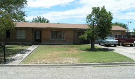
Help me guys...PLEASE!
11 years ago
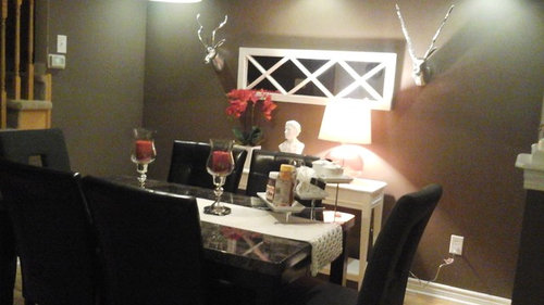
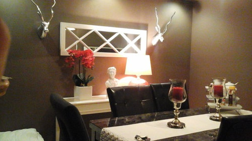
Featured Answer
Sort by:Oldest
Comments (19)
 11 years ago
- 11 years ago
Related Professionals
Sarasota Interior Designers & Decorators · Florence Interior Designers & Decorators · Somerset Interior Designers & Decorators · Baltimore Interior Designers & Decorators · Hattiesburg Interior Designers & Decorators · Athens Interior Designers & Decorators · Sugar Land Interior Designers & Decorators · Alexandria Interior Designers & Decorators · Guymon Interior Designers & Decorators · Great Bend Architects & Building Designers · Danville Architects & Building Designers · Stamford Architects & Building Designers · La Grande Architects & Building Designers · Kankakee Kitchen & Bathroom Designers · Lubbock Kitchen & Bathroom Designers 11 years ago
 PRO11 years ago
- 11 years ago
- 11 years ago
- 11 years ago
 11 years agolast modified: 11 years ago
- 11 years ago
- PRO11 years ago
 11 years ago
- 11 years agolast modified: 11 years ago
 11 years ago
- 11 years ago
- PRO11 years ago
- 11 years ago
 11 years ago
- 11 years ago



Related Stories

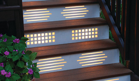
GARDENING AND LANDSCAPINGNo Fall Guys, Please: Ideas for Lighting Your Outdoor Steps
Safety and beauty go hand in hand when you light landscape stairways and steps with just the right mix
Full Story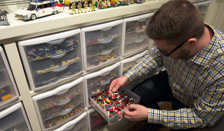
BASEMENTSHouzz TV: This Guy’s Giant Lego Collection Proves Everything Is Awesome
You may have seen our story about this architect’s Lego-filled basement. Now watch the video to see just how he organizes all 250,000 pieces
Full Story
PRODUCT PICKSGuest Picks: Sophisticated Bedroom Finds for a Single Guy
No black-light posters, please. These bedroom furniture pieces and accessories offer grown-up style with a masculine flair
Full Story

SUMMER GARDENINGHouzz Call: Please Show Us Your Summer Garden!
Share pictures of your home and yard this summer — we’d love to feature them in an upcoming story
Full Story
OUTDOOR KITCHENSHouzz Call: Please Show Us Your Grill Setup
Gas or charcoal? Front and center or out of the way? We want to see how you barbecue at home
Full Story
DECORATING GUIDESPlease Touch: Texture Makes Rooms Spring to Life
Great design stimulates all the senses, including touch. Check out these great uses of texture, then let your fingers do the walking
Full Story
DECORATING GUIDESHouzz Call: What Home Collections Help You Feel Like a Kid Again?
Whether candy dispensers bring back sweet memories or toys take you back to childhood, we'd like to see your youthful collections
Full Story



groveraxle