Software
Houzz Logo Print
aw2quit

Kitchen paint help

11 years ago
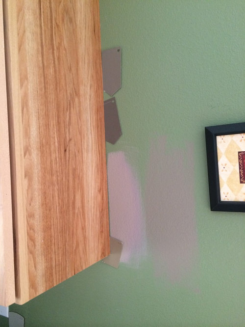
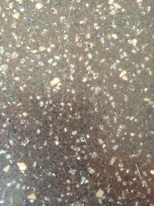
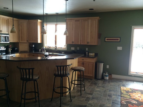
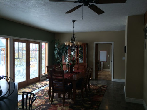
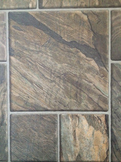
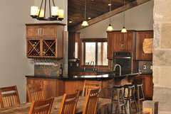
Painting this weekend and need help with paint colors. Wanted to go neutral with greige possibly but not sure if hickory looks good with that. Floors are gray and tan and countertop has dark brown, tan, green/gray. Please help.

Comments (71)

  • 11 years ago
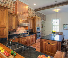
    Pale gray walls and a slate backsplash.
    Ricki Vaughn · More Info
  • 11 years ago
    I also really like this red brick accent wall with white paint, if you like a rustic farmhouse style. The copper hood looks great with it.
    Southern Farmhouse · More Info
  • 11 years ago
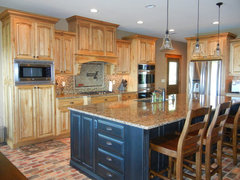
    I guess what I'm saying, when I see these two pics, is that you should embrace the rustic-ness of the hickory!
  • 11 years ago
    I do think a pale gray would be very nice and I would continue the color into the dining area. I think it gets too broken up to have the colors switch in that dining room corner. I think Thunder might work very well.
  • 11 years ago
    last modified: 11 years ago
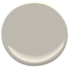
    In order to complement your cabinets, I would make sure the gray you choose has very slight green or blue undertones rather than red, pink or purple undertones. Please post an "after" pic.
  • 11 years ago
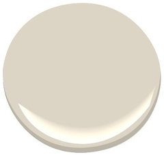
    A neutral taupe, like Thunder or Pashmina, might help to neutralize the busy-ness of the hickory. I like it with a black island. I agree that the whole room, kitchen and dining, needs to be one color.
    Hickory cabinets with black island · More Info
  • 11 years ago
    Also, the Elmira White is beautiful, but I'm thinking the Pashmina might be just a bit purple. I like Thunder and Elmira White.
  • PRO
    11 years ago
    last modified: 11 years ago
    I think the rug is really throwing things off. So many colors and patterns on the floor. Then there is the busy pattern in the wood cabinets.

    Would you be willing to consider moving the rug to another room and using something without a busy pattern and with a color more similar to the floor tile?

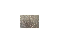
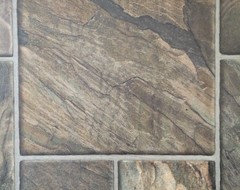
    Finally, could we please see a closer photo of the floor tile?
  • 11 years ago
    Thank you everyone for all of your input. The rug for now is staying. I have been looking at different rugs just haven't found one. I do. It want a solid colored one though as I have 2 kids---and a husband who drop things on the rug. Bar stools are going and possibly a possibly a new back splash later. We just remodeled a room off of the kitchen and I have primer spots all over driving is crazy so it is time to paint now lol. Thanks again. And the island is going to get a makeover also. Not sure yet with what lol, but it is starting to peel.
  • 11 years ago
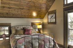
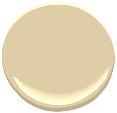
    Since you want to keep the rug, maybe a taupe with some yellowish tones would work. It would go with your warm wood tones and look great with your floor.
    Lower Hay Lake 1 Bedroom · More Info

    Powell Buff HC-35 Paint · More Info
  • PRO
    11 years ago
    It looks like the color in your dining room would be a good choice or the whole room....or


    [houzz=
    elmira white HC-84 Paint - Benjamin Moore elmira white Paint Colour Details · More Info
    ]
  • PRO
    11 years ago
    [houzz=
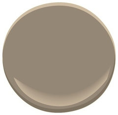
    Thunder AF-685 Paint · More Info
    ]
  • PRO
    11 years ago
    [houzz=
    pashmina AF-100 Paint - Benjamin Moore pashmina Paint Color Details · More Info
    ]
  • 11 years ago
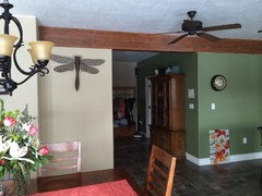
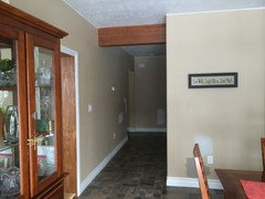
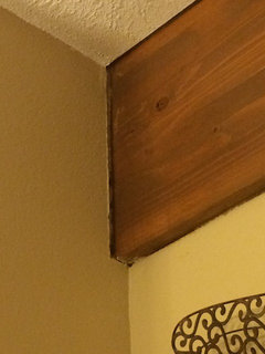
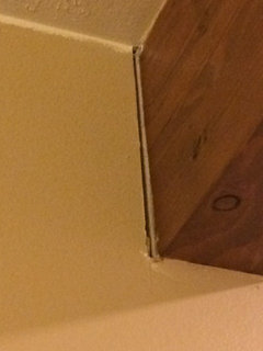
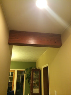
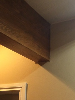
    Any ideas about what do do with the beam? Cover it up with drywall, leave it? The sheet rockers did not butt up to it so now we have a gap so I can caulk it and paint it or put a trim piece around it.
  • 11 years ago
    I agree, maybe just continue the dining room color.
  • 11 years ago
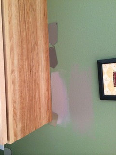
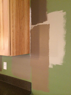
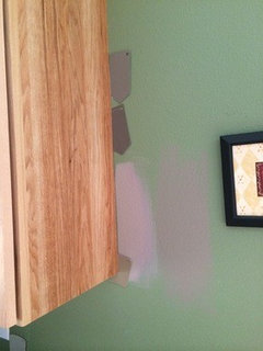
    Middle paint is the Benjamin Moore thunder and pashmina below it. Top is behr pure earth. Maybe thinking it needs to be darker?
  • 11 years ago
    We are using sherwin Williams paint so if there are any close paint colors that you would suggest that go well with hickory that would be great!
  • PRO
    11 years ago
    last modified: 11 years ago
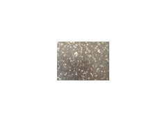
    I really like the BM thunder. It goes well with your granite, cabinets and floor. It is not too light.

    I guess it depends on what you mean. Too light compared to what? Most people are looking for a light, bright color for their kitchens. Dark is more dated.

    That being said, if, for some reason, you want dark, you should choose that, of course.

    2 SW colors close to BM Thunder. I think Requisite Gray is the closer of the 2.

    [houzz=
    Thunder AF-685 Paint · More Info
    ][houzz=
    SW7030 Anew Gray by Sherwin-Williams · More Info
    [houzz=
    SW7023 Requisite Gray by Sherwin-Williams · More Info
    ]
  • 11 years ago
    I like Thunder too, but would like one lighter shade. I think the requisite gray might work out well.
  • 11 years ago
    I also agree that lighter colors are more popular currently and the darker shades are a bit dated.
  • PRO
    11 years ago
    As far as the beams, it looks like there is more than one. They add a lot of character and I would hate to see them drywalled in, Can you show more photos of them and the drywall gaps of which you speak?
  • 11 years ago
    The last pic I have caulked in and was going to paint it to see what it looks like. The rest are still open. We would like to keep them so I was going to try caulking them and of that looked awful try trim and lastly covering them.
  • PRO
    11 years ago
    last modified: 11 years ago
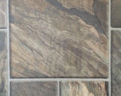
    It is hard to tell, but the gaps may be too wide to caulk. Although, it looks like you successfully caulked the one in the last photo. As long as you used paintable caulk, you should be okay.

    For areas wider than 1/8", put backer rod into the gap, prior to caulking. (Available in the caulking area).

    I am not sure they would look good trimmed. If you are not successful with the caulk, you could get a drywaller to replace the adjacent pieces of drywall, abutting them right up to the beam.

    I am not expert in this area.......just speaking as a homeowner.
  • 11 years ago
    CDR, the paint shades you posted look very lilac/purple. Is that my monitor?
  • PRO
    11 years ago
    Could be your monitor. But, you highlight the point that the only real way to know is to try a color on a piece of drywall and see if it works.
  • 11 years ago
    I can definitely see the lilac in anew gray. Not so much in the others. I do think some blue undertones would be nice with the wood color and I would lean toward a fairly cool gray.
  • PRO
    11 years ago
    I am sorry.....yes, I agree that Anew Gray is more brown (red-pink). It was an alternative, since aw wanted SW paint. I think the Requisite Gray is a better choice if using SW
  • 11 years ago
    I agree CDR. I could look it up and haven't, but I wonder what color is one shade lighter on the requisite gray strip? I really like requisite gray but it's a tad dark IMO.
  • PRO
    11 years ago
    last modified: 11 years ago
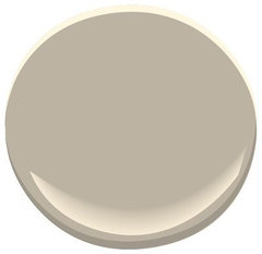
    Alpaca.. You could always customize the requisite gray by adding some white to it also.

    It seems aw likes the darker shades anyway, though.

    [houzz=
    Paint Color SW 7022 Alpaca from Sherwin-Williams · More Info
    ]
  • 11 years ago
    Oh, I had a sample of Alpaca (when choosing my paint) and I like that color very much!!!! I'd be very tempted to give that one a try, but it does sound like aw likes darker shades.
  • 11 years ago
    No wonder I liked requisite gray because I loved Alpaca:)
  • 11 years ago
    I like the dining room color. Or the lighter grays CDR posted.
  • 11 years ago
    Am I the only one that must like the name of the paint color in order to select it? Probably not, or names of shades wouldn't be given any thought!
  • 11 years ago
    That's funny pcmom1:) I'd never thought of that.
  • 11 years ago
    last modified: 11 years ago
    I once almost didn't choose a paint color because the name was awful. Think it was "Boring Browntone" or something close.
  • 11 years ago
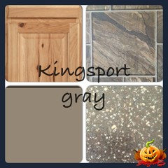
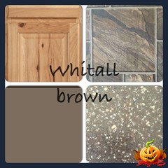
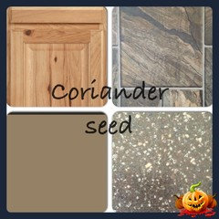
    Ok we are down to the final 3. Against some advice we are going to try a darker color as we have seen a hickory kitchen with them and it made the hickory really pop. The final 3 are all Benjamin Moore. Top is Whitall brown, middle is coriander seed, and bottom left is Kingsport gray. My husband wanted to try darker so if he hates it when I'm done I will make him repaint lol. The color they are painted over was the pashmina. He thought the cabinets blended to well.
  • 11 years ago
    Kingsport for sure.
  • 11 years ago
    Hi---Kingsport is best of those 3. I recommend looking at BM'sTiconderoga Taupe and Racoon Hollow. Keep us posted and Good Luck!
  • 11 years ago
    With a name like Raccoon Hollow...must look at that!
    Of the three, I like the Kingsport Gray also.
  • 11 years ago
    Me too - kingsport gray.
  • 11 years ago
    Caprinder seed looks great
  • PRO
    11 years ago
    So, just taking another look......when you grouped the paints with the tile, granite and cabinets, there was not a lot of differentiation in color. But, when you painted them on the wall, there was. Why? Could be a lot of reasons......the colors are not showing true on the paint samples and then there can be more changes through monitors.

    Colors painted on walls can be influenced by colors under them (if not a second coat). They are also influenced by other colors around them (in this case, the other paints you have painted on the walls ).

    That is why, I recommend never painting samples on the wall....always on a removable piece of drywall that can be viewed in isolated situations....away from other paint and can be moved to other areas of the room for different viewpoints.

    So, revisiting my conclusion from yesterday.....while Kingsport looks great in the quad you put together, I don't think it achieves your goal, which is to bring out the rich brown in the Hickory (if I am understanding you correctly).
  • PRO
    11 years ago
    Here is a color I chose that I think will more closely achieve your goal of bringing out the brown in your cabinets and is close to the photo that pcmom posted early on.

    [houzz=
    New Home Construction - Rustic · More Info
    [houzz=
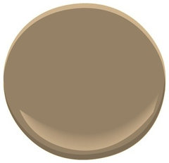
    beachcomber 993 Paint - Benjamin Moore beachcomber Paint Color Details · More Info
    ]
  • PRO
    11 years ago
    last modified: 11 years ago
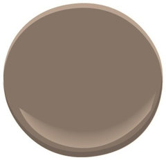
    Here are the 3 that aw posted above. Beachcomber is very close to Whitall Brown, but Beachcomber is a little more brown.

    [houzz=
    kingsport gray HC-86 Paint - Benjamin Moore kingsport gray Paint Color Details · More Info
    [houzz=
    whitall brown HC-69 Paint - Benjamin Moore whitall brown Paint Color Details · More Info
    [houzz=
    coriander seed · More Info
    ]
  • 11 years ago
    last modified: 11 years ago
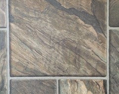
    CDR Design, I told you we could work together!
  • PRO
    11 years ago
    pcmom1....right.....I mentioned in my recent post that you posted the photo long ago.....and I think the paint looks nice with the hickory.

    But, the paint is dark and aw has dark countertops and most people today don't want dark paint in a kitchen. But, as long as she knows that going in.......
  • 11 years ago
    Lighter would be fresher...
    Michael Pierce · More Info
  • PRO
    11 years ago
    Ticonderoga Taupe is one color up from Beachcomber, but I don't think it will bring out the dark brown in the wood (if that is the desired outcome).
    [houzz=
    Ticonderoga Taupe 992 Paint · More Info
    ]
  • 11 years ago
    last modified: 11 years ago
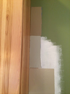
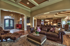
    Wow---I just took another look at your home, it's very dark and your existing elements make it appear even darker. Your best bet, might be a saturated hue with a with a yellow/gold undertone. Take a look at BM's Deer Path, Deep Ochre, and Mystic Gold---also---SW's Cork Wedge... I hope this is helpful. Keep us posted... :) [houzz=
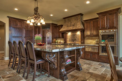
    Street of Dreams Tuscan Villa · More Info
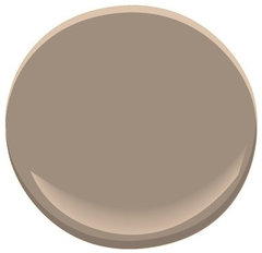
    ][houzz=
    Street of Dreams Tuscan Villa · More Info
    ][houzz= http://www.houzz.com/photos/367396/keys-renovation-contemporary-kitchen-other-metrohouzz=
    Street of Dreams Tuscan Villa · More Info
    ]