Software
Houzz Logo Print
interiordesigngr

Our Renovated Kitchen

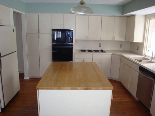
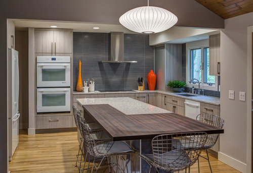
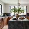
Hard to believe this is the same kitchen! With only a few layout changes our very own, Jennifer Butler, completely transforms her own kitchen in her family's 1980's contemporary West Michigan home.

Comments (42)

  • 11 years ago
    Looks great. My taste prefers the island be all wood but that top is interesting
    Jennifer Butler Design thanked jck910
  • PRO
    11 years ago
    Interesting island/countertop combination
    Jennifer Butler Design thanked Custom Design & Construction
  • 11 years ago
    So...are white appliances coming back?
    Jennifer Butler Design thanked Shirlyn Makar
  • 11 years ago
    Are these new cabinets?
    Jennifer Butler Design thanked bizkelly3
  • 11 years ago
    am i wrong in thinking the wooden part of the island collapses?
  • 11 years ago
    Nice and modern- love the mix of colors and textures but I feel the whole kitchen is let down by the white appliances. I just feel that stainless steel appliances would have been so much better. JMHO
  • 11 years ago
    All that cabinet space lost. No way!
  • 11 years ago
    I like the mix of appliances. I would have done black with the stainless range hood, I think....but I don't have a problem with mixed appliance colors, it's the real world after all.
  • PRO
    11 years ago
    Fantastic reno! Who made the cabinetry?
  • 11 years ago
    No, the white appliances TOTALLY ROCK this design. Totally.
  • 11 years ago
    I love the new look white appliances look great and I think they made up for the cabinet space by placing it on the left all around the fridge.
  • 11 years ago
    Sorry, don't get it.
    Functionality wise, storage space / cabinetry reduced, no usable work surface by the stove, fridge to sink path circles around the island (although that was the case before renovation as well).
    Appearance wise, lowered ceiling and smaller window make the space claustrophobic.
  • 11 years ago
    Great job!!!!
  • 11 years ago
    where are the cabinets?
  • 11 years ago
    what is the back splash material
  • 11 years ago
    Agree with gella81.
  • 11 years ago
    I like it. Love the use of different materials on the island. I'm not bothered by the reduction in cabinets so much. I find that most people have way more "stuff" than they actually need, myself included. I think I threw out a garbage bag size of Tupperware type containers when I got new cabinets. Much nicer on the eye. Great job! :)
  • 11 years ago
    last modified: 11 years ago
    what happened to the cabinet doors and space....where do the dishes go.......?
  • 11 years ago
    Great transformation!
  • 11 years ago
    Sometimes, you can only afford to do so much at one time. If the appliances are functional, why go into debt to replace them? Maybe that's the case here. Either way, nice job!
  • PRO
    11 years ago
    What a vast difference! I love the stylish island. Overall, your kitchen looks stunning. Amazing work.
  • 11 years ago
    I love it!
  • PRO
    11 years ago
    Beautiful kitchen, everything is beautiful: the Quartz counter top, the color combination, the George Nelson Bubble lamp, the white appliances ( yes they are back!), everything! And I agree the wall of cabinetry around the refrigerator makes up for the lost around the stove and makes the kitchen airier, less oppressive. Great job!
  • 11 years ago
    too modern for me but it is very nice improvement.
  • 11 years ago
    like the grey and white...I happen to have white appliances.....where's the storage space now and who wants to walk around that table each time something is needed from the fridge if you are at the sink or counters? It's very pretty, but not functional. I can't see preparing the Thanksgiving meal in this kitchen. My husband and I would be climbing all over each other and there's no room for anyone else. Beautiful backspash.
  • PRO
    11 years ago
    Amazing what a professional designer can do! Congratulations!
  • 11 years ago
    Wow - love it. Well done.
  • 11 years ago
    White appliances will never leave.
  • PRO
    11 years ago
    Looks like ceiling heights are the same just a slightly different perspective in the before / after shots. People always want more storage but agree myself included that we accumulate way too much. Good opportunity to thin things out. Like the white soffit above the sink wall ties in the white appliances. Nice job.
    Jennifer Butler Design thanked Remington Construction Services
  • PRO
    11 years ago
    Thank you for all the comments and questions! Here are some responses to your remarks and inquiries:

    We went with new white glass appliances as a better fit than black or stainless for the 80's contemporary style of the home (we did not re-use the existing appliances), plus they aren't as easily smudged as stainless.

    The backsplash is a grooved Italian porcelain tile that when grouted creates the ombre effect.

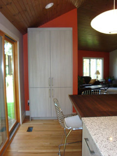
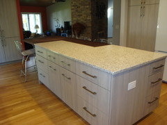
    We didn't lose any storage space, we actually gained some. Not pictured on the opposite side of the island is a floor to ceiling cabinet unit we added for items we don't use every day. The ceiling was not lowered, in fact, we removed the existing bulkhead above the stove and refrigerator, again gaining us more storage in the added height.

    The U Shaped layout of the kitchen works well for our family, so it didn't make a lot of sense to rework the layout other than extending the length of the island into the existing dinette area. We did add more width around the island by pushing the fridge back about a foot. We have more counter space around the stove now than we did before. For our context, our house, our family, we believe this is a fitting improvement.

    We did lose about 4" of window height, but we opted to do this in order to create a splash behind the sink that we didn't have before.

    For more before and after photos, check out the whole project: http://www.houzz.com/projects/760756/jennifer-butlers-kitchen-renovation
  • PRO
    11 years ago
    Magnifique!!
    Jennifer Butler Design thanked Monique Castonguay Design
  • 11 years ago
    The kitchen looks 1000% better. I love the white glass appliances. What a fresh look... Plus you did not cave in to the stainless craze
    (Which I did in my makeover)
    This is a great example for your own design talent.
    Jennifer Butler Design thanked sunnydrew
  • 11 years ago
    Looks fabulous and the island is lovely and much less weighty than the previous monolithic block! Beautiful job.
    Jennifer Butler Design thanked Catherine Hata
  • 11 years ago
    Where are the cabinets from? LOVE this look!
    Jennifer Butler Design thanked mandolindesign
  • PRO
    11 years ago
    The cabinets are Shiloh Cabinetry and are available through kitchen designer Todd Wiley at TruKitchens.
  • 11 years ago
    Fantastic! Love everything about it! We too, have a West Michigan home with a huge amount of 90s flair! Our kitchen is a very similar layout and I'm wondering about this island/eat in option... Could you share the dimensions of your space? And what does the room look like where the slider is? I'm assuming you have a more dedicated table space there but with these chairs around the island - have you replaced a separate dining table?
    Jennifer Butler Design thanked lauravanslyke
  • PRO
    11 years ago
    Also, to answer an earlier question, the wood part of the island made of Peruvian walnut is fixed, it doesn't fold down or detach.
  • PRO
    11 years ago
    lauravanslyke, Thanks for the shout out from West Michigan and Thank you for your kind comment! I'll verify the dimensions, which will also help you understand the other end of the space. The area where the slider is used to be a dinette area which we never used. It acted more like a foyer or a work station than a place to eat. Instead, we use an adjacent dining room for all our meals.
  • 11 years ago
    I'm liking the hi gloss white apps-may do in new home.
    Jennifer Butler Design thanked Steve Manning
  • PRO
    11 years ago
    lauravanslyke - The kitchen is now 15’ wide (it used to be 14’) from the wall behind the refrigerator to the window wall at the sink and 10’-9” from the hood wall to the bulkhead above the middle of the island.

    The eating area space is 15’ from the sliders to almost the fireplace and 10’ from the bulkhead to the wall behind the pantry cabinet. There are some angles here so the measurements are not exact.

    Don’t mind the opening without a vent cover. These personal photos were taken shortly before completion.
  • 11 years ago
    wow. Love it! What is the material and finish of your cabinets?