Software
Houzz Logo Print
kimberlysc

Help!

11 years ago
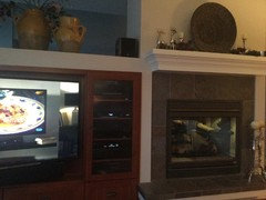
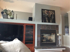
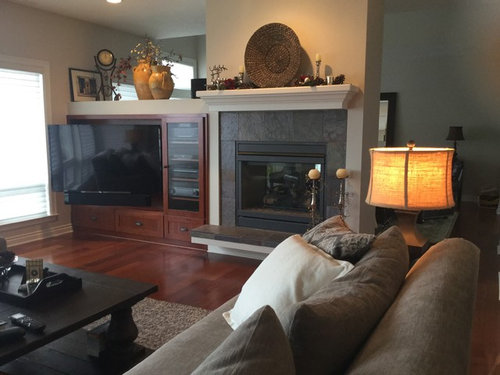
I need help with my mantel. I don't think the white looks right. The walls are edgecomb gray. It look a bit busy right now with some Christmas, I usually just have the basket on mantle.

Comments (22)

  • 11 years ago
    No worries! I think the "white" is beautiful.
  • 11 years ago
    That's a cool set-up. I wonder if theres not enough contrast between the white of the mantel and the area above the entertinment center. Is the entertainment center flush with the fireplace or off-set a bit?
  • 11 years ago
    It's flush, what do you think should happen?
  • 11 years ago
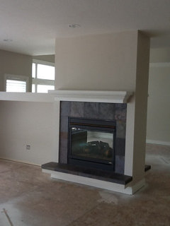
    It was a big whole when we bought house!
  • 11 years ago
    Oops! Hole
  • 11 years ago
    Tricky to decorate for both rooms in the hole - good job! I think the white is fine but you might want to pull the color of the urns over to the mantel, possibly with a pair of candlesticks on the far right. Then sprinkle it in both rooms - pillows on the sofa, a throw, etc.
  • 11 years ago
    There are so many squares and rectangles in the fireplace and television unit. I think the circular basket is a good choice but I would want more soft edges. Personally I would want the basket to be a color and then I would hang it. Or I would find some beautiful ceramic plates or art and hang them. Then, the colorful objects would be the focus, not the mantle. Pretty room by the way.
  • 11 years ago
    I think I would consider taking the trim color to more of a cream that worked with both the woodwork of the television cabinet and with the fireplace tile. The white looks a bit stark to me.
  • 11 years ago
    I wonder what a dark, dark gray or black mantle would look like. It would provide contrast, that's for sure. I'd also like to see some pops of color....a large abstract painting or print above the fireplace perhaps?....with a couple of pillows or a throw with a couple of the colors in the painting.
  • 11 years ago
    I like these suggestions!
  • 11 years ago
    last modified: 11 years ago
    My eye goes to the brown entertainment center. If it could be painted white, then it would look unified.
  • 11 years ago
    I actually agree with everyone, if not with the hows, the why's. For me the white mantel looks good and is probably the starting point when looking at the picture. I do see the stark contrast with the brown but don't mind as it sits in the background as sort of a built-in. Was that custom made or were you just lucky. I like all this because you don't have room to build up the TV as a focal point so you it just goes low profile.

    The brown works for me because of where the TV is and how it's separated from the fireplace by a bold line. If anything you should add like a similar in height and close-enought to that brown media cabinet to the right of the fireplace. Now the contrast that could be distracting turns into contrast that adds more focus to the fireplace with the magic of symmetry and it framing-like effects. With the TV unit, that TV is popped out a good deal and I'd want curtains on that window to lower the contrast with the skewed TV shape against that wall. Plus I like curtains in rooms where I might manage to watch a daytime movie.

    I think people have touched on the arrangements with the decor atop the TV and mantel. For my approach, I'd take it all off the mantel. The urns atop the mantel, maybe offset to the left. I doubt the color on the light is totally accurate but that side would balance those warms. I'd move the clock to the right of the TV mantel (heh) and switch places with it and the speaker. What I think is a silver reindeer to the front and right of the speaker, his back legs crossing a bit in front of the clock base. Put the basket laying on it's back atop the TV close to centered with the TV, not the stand and the candles on each side.

    So for me, it's about the white trim. That moves me eyes away from the TV and toward the mantel. It's only then that the mantel looks wrong. I think that's because it's meant to be seen all at once, not as as a sudden appearance of an overpowering focal point. I was hoping you could go a darker shade but that was thinking it was offset, so there'd be a shadow like effect. The light color between the fireplace and TV unit should stay to balance out the other side. It's the TV unit upward. I wonder if you could use fabric laying atop to drape and conceal the trim. Indoor vines? I can't tell if there's enough green nature stuff on the mantel to get an approximation.

    It took me a bit to respond back because my approach would be to just keep moving things until something clicked a new idea, solution or workaround. It was interesting approaching it online. I have drawn similar things I've liked in fixing my own cohabitation TV and fireplace dilemma. The more rooms I found that I liked, the more I noticed certain similarities and drew different ideas shared by the people doing them. A lot of my approach was in working with my tendency to catch images in my peripheral very easily and get distracted. Just as a matter of what's important to me, I think your fireplace if rocking but wouldn't want it to come to mind when I was trying to relax and watch a TV show about TVs.

    I hope I didn't lay too much out. The room is really just fine. I just had a few days to compulsively workout arrangements in my head. Oh hey, I actually just thought of another thing - what about that recessed light above the TV unit. Wonder what would happen if you put a cooler temperature bulb in there, or even a colored one.
  • 11 years ago
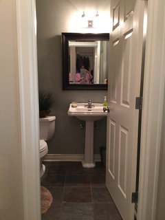
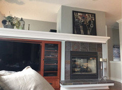
    Also painted powder room same color.
  • 11 years ago
    I like it - it really helps pull it all together with the fireplace. Looks good in the powder room as well.
  • 11 years ago
    Thanks, I think it helped!
  • 11 years ago
    the white matches but I would take off the mantel
  • 11 years ago
    Beautiful wall, and you've done a great job of styling it. I would either remove the mantel or carry it all the way across.
  • 11 years ago
    Did you changeout all the Edgecomb Gray? That is my favorite color. And I like having the mantle and the top of the entertainment center gone. Very chic and modern that way.
  • 11 years ago
    I love edgecomb gray, I kept it everywhere else!
  • 11 years ago
    I like the mantle ideas.. Extend or get rid of it, thank you!
  • 11 years ago
    Have you gone any further with the mantel situation? Looking past the color, I now wonder if the mantel standing out is more due to its ornate edges where everything else has right angled corners. If it were white and squared, or that design extended out like others recommended. I like the darkening of the wall but think it accentuated why the mantel might have been the thing that's not like the others.