Software
Houzz Logo Print
kimberlysc

How can I improve this kitchen nook?

11 years ago
last modified: 11 years ago
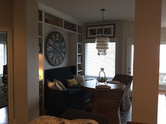
Ok design enthusiasts, what would you do with this space to make it better?

Comments (115)

  • 11 years ago
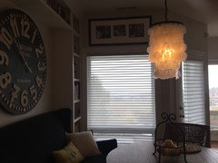
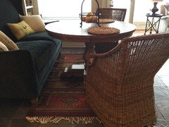
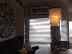
    I am so glad you showed us the room from another angle. I totally get the light fixture now! At this point, I would suggest removing the current rug. It appears a tiny bit too small and I can see there could be a trip hazard going through the opening on the left if you used a larger one. Unless the rug is more evident in person than in the pictures, I don't really feel it's needed. You've accomplished making quite a large statement in what appears to be a fairly small space. Great job!
  • 11 years ago
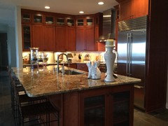
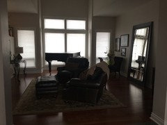
    Hung pic above window? And here are pics of space nearby
  • 11 years ago
    You are right, a very small space!
  • 11 years ago
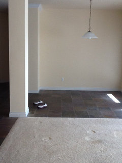
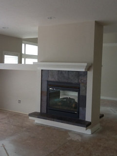
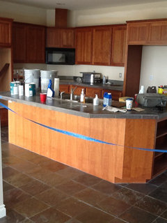
    This is what it looked like when we bought house
  • 11 years ago
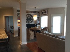
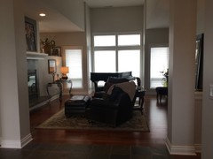
    Part of family room of same area, the space with clock was a boring little kitchen nook
  • 11 years ago
    More
  • 11 years ago
    Wonderful transformation!
  • 11 years ago
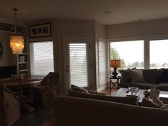
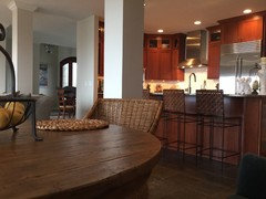
    Other side of room
  • 11 years ago
    View from settee
  • 11 years ago
    last modified: 11 years ago
    hi kymberlysc. I agree the only angle the chandelier and clock "compete" is standing in one spot! This angle shows how lovely it is. I also agree you do not need window treatments if privacy or light control is not an issue. I do like the suggestion of painting the alcove a color of your choice and the minor rearrangement of the bookcase items would step the design up a notch. Nice job! Again, I think it looks wonderful. Sometimes we all get caught up on "perfect" design and our own personal tastes instead of seeing how lovely it looks as is.
  • 11 years ago
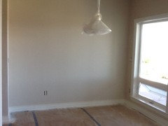
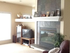
    Just for the fun of it, other pics before we made some changes
  • 11 years ago
    last modified: 11 years ago
    I vote no on the art above the window. I'm not a fan of art above doors and windows. You can't really see the art properly anyway and it makes a room appear "cluttered" IMHO.
  • 11 years ago
    Thank you Darzy, that is really helpful, and pictures never seem to catch the true feel. Do you like picture above window or is it too much? I like to mix things up without a total "theme" the Capiz is jus fun! The rug is alpaca wool, hand made in Mexico, I do need to work on the shelves.. Not that Christmas is over, I will try to improve on them.
  • 11 years ago
    Thanks, I will take it down
  • 11 years ago
    It's such an open concept.. Color in that one spot?
  • 11 years ago
    I would use an accent color for the clock wall including the back wall of the builtin shelving - a midtone would make your accessories stand out and create more interest in that part of your dining space. Add a brighter center piece to the table and carry your accent color to the toss pillows. I love your clock! I like the idea of a black lighting fixture.
  • 11 years ago
    I love the pic with the blue "crime" tape! That's soooo funny! And what a lot of work you've done! At this point, everyone is having to nitpick to find something to change (me included) so relax, be proud, and enjoy the success all your efforts have brought!
  • 11 years ago
    The walls really get washed out in pictures, but they are a very light soft warm gray, revere pewter is next shade up, would you o with a darker gray or a fun color?
  • 11 years ago
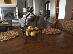
    I have really struggled with centerpiece, tried lots of stuff and can't seem to get it right!
  • 11 years ago
    Now that I see how open it is, I agree with you that color behind the settee would also mean painting the FP wall (front and back) the same color to add balance to the spaces. Plus, the color would needto complement the slate of the FP and wood tone of your entertainment cabinetry. Carolins blue/gray walls on Dec 21st would look nice even though the settee is the "same" color, it may look quite dramatic.
  • 11 years ago
    I like your centerpiece very much. You can do more color with red or green apples too. There is red in one of your pillows?
  • 11 years ago
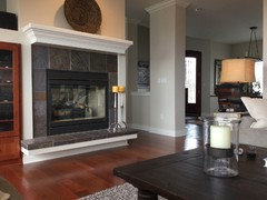
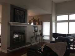
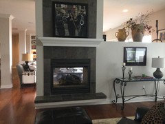
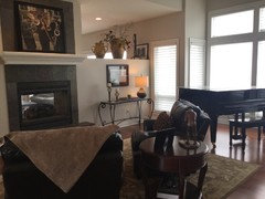
    Here's other side of fireplace...
  • 11 years ago
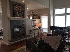
    With some lights on..
  • 11 years ago
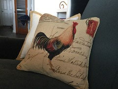
    Yes, but didn't know if rooster pillow was too "cheesy"!
  • 11 years ago
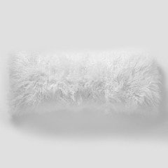
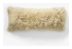
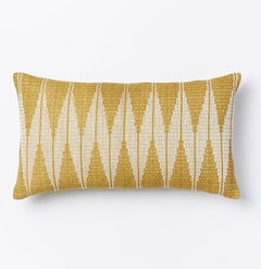
    Here's a couple from west elm.. The sheep one is a larger bolster size
  • 11 years ago
    14x36
  • 11 years ago
    Thank you so much for allowing us in to see so much if your home. Great improvements, all in good taste and very livable spaces. Not that you asked but I'm not sure of the entertainment cabinet colour. Seems to compete for attention with the fireplace. I don't know which one is the main focal point. But TV's seem to do that anyway. Lovely home.
  • 11 years ago
    I thought it was a rooster pillow but wasn't sure. No! It's not cheesy at all. I like the whimsy of it.
  • PRO
    11 years ago
    A window valance and some pillows and maybe even a texture paper behind the clock.
  • 11 years ago
    Kimberly - you mentioned not liking your centerpiece. What exactly is your concern with it? I've been running that through my mind and am wondering if you just removed the placemats whether that would help. Maybe just place one under the centerpiece to give it a bit more importance?
  • PRO
    11 years ago
    Wow! You got a lot of responses. I didn't read them, so if I'm repetitive, I apologize in advance. I would go after the wall behind the clock and at the backs of the bookcases. It would be great to add a grasscloth (you will always see the seams with grasscloth) to give some softer (but similar to the chairs) texture to the wall. I'd lose the big clock in favor of a series of three tall thin mirrors - nice to reflect and amplify the chandelier. Replace the throw pillows at the banquette with some that are a little more "industrial chic" : )
  • 11 years ago
    I THINK ITS PERFECT and excellent use of design principles. leave it alone! and I will be over for dinner soon LOLOL
  • 11 years ago
    @Kimberlysc ... Have been following .. first of all let me say "beautiful home" & a great makeover!
    Noticing the shelves in the nook ... clock is LARGE but lovely. Need items that are larger than the items there now (less items but larger & some with round shape ) to relate to the clock.
    Would suggest that the books all be within arms reach.
    As someone had mentioned previously add another wicker basket to the top middle shelf for symmetry.
    Could the table be turned 1/4 turn so that the feet of the table will allow the chairs to be pushed in between them allowing for chairs to be closer to the table when not in use?
    Hope you had a Merry Christmas & wishing you all the best for the New Year!
  • 11 years ago
    Just had to pop back in to say...... your home is very pretty and very warm looking. :) Great pictures. :) Again, have a great new year! :)
  • 11 years ago
    last modified: 11 years ago
    I would remove that huge clock that seem to be a bit much for that space , it will improve the view of the light fixture too.
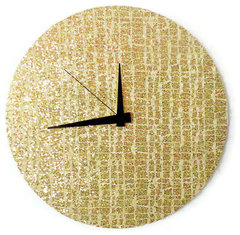
    Modern Wall Clock, Art Deco Decor · More Info
  • 11 years ago
    Thank you everyone, for all the time and thought that went into your comments! So many great ideas, with the new year I will make some changes and post!
  • 11 years ago
    Oh, no! Is there a possibility of moving the piano? Pianos should be not placed on exterior walls, as the moisture can destroy them.
  • PRO
    11 years ago
    You have a lovely home, kimberly.
  • 11 years ago
    last modified: 11 years ago
    You have done an amazing job with your home, transforming a nice house to a beautiful one! I revise one of my comments after seeing the rest of the space, a yellow in the alcove probably won't work, Still, an accent color in there would be really pretty.
    Happy New Year!
  • 11 years ago
    I still think the nook is great as is the rest of home. Suggest you remove the big pots from above the TV. It should take attention away from that area and make the fireplace the main focus.
  • 11 years ago
    Nice space. Two fuchsia pillows, change the light fixture to the one suggested by a commenter and maybe a mirrored piece instead of the clock.
  • 11 years ago
    I just saw the pics from other angles. Don't change a thing.
  • 11 years ago
    I like the changes you made. I think it looks great now. My biggest issue was with the frilly pillows. DONT do curtains and mess up that gorgeous window. LOVE it now.
  • 11 years ago
    Looking great, you've done wonders
  • 11 years ago
    This is an eating nook. Unify the whole room. A great open simple iron light fixture would add height and drama. Keep two pillows each with a different rooster design. The shelves and the way they are accessorized make it look like a reading room/library. Get a beautiful Country French set of rooster dishes and use them mixed with plants and pottery and possibly some old pewter pieces on, the whole unit. The dises should be in the same color pattern as the pillows. Plantation shutters, to match color of built in, would be simple, but dramatic. Rich looking. Keep the center piece simple, maybe a collage of low chunky candlesticks or a short topiary, or hand made basket full of ivy. Love your table and chairs, they are warm and inviting, and have Key West look. A simple wallpaper inside the wall unit would also be nice. Keep the scale small and it won't fight with your accessories. Good luck!
  • 11 years ago
    Looks great love it as is!!
  • 11 years ago
    It is what you loved and it is perfect. Leave it. It looks warm and inviting not too cluttered just perfect. Enjoy, for I do not see the need to do more.
  • 11 years ago
    Love it. Very eclectic. No to window treatment. Yes to lose a pillow or two for roomier seating. Love the wicker contrast with velvet. Well done.
  • 11 years ago

    It is as perfect as it should be before start looking that it does not belong in a home. leave it.

  • 11 years ago

    I love it!!!!!!!!!!! I would toss the rug and it would be perfect.