Software
Houzz Logo Print
brenda_lopez231

Kitchen - Living Space Renovation from 90's to Now!

11 years ago
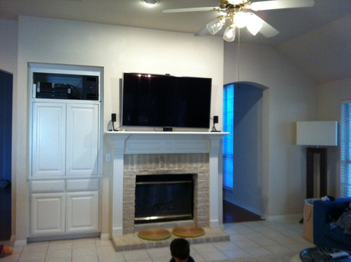
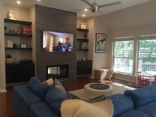
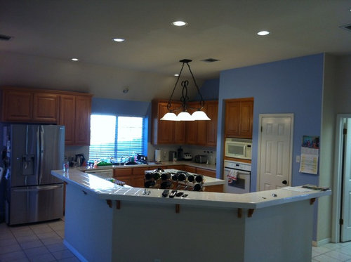
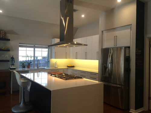
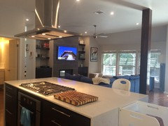
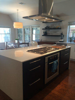
While looking for a home in Austin, my husband and I quickly realized that modern design wasn't something we were going to find. At least not in our budget. So we opted for a fixer upper. Took a lot of work but we think we got there in the end. We moved the giant divider wall that was giving us the 90's double island and created more flow and a larder space. Taking out the traditional mantle on the fireplace and tiling to the ceiling shows off the ultra high ceilings. Closing off one of the entry ways really gave the fireplace more of an identity also allowing us to add shelving on either side for some much needed storage. We used a contractor but all of the design was done by myself and my husband (mostly me ;)) Not bad for a novice.... if I do say so myself! :)

Comments (39)

  • PRO
    11 years ago
    Its very relaxed and clean. Love the colors, so pretty! Your kitchen is amazing! I would say you are above novice!
    Brenda Lopez thanked Spiral Stairs of America
  • 11 years ago
    Love the new fireplace room- great design!
    Brenda Lopez thanked cabingirl13
  • 11 years ago
    Very impressive, are you for hire!
    Brenda Lopez thanked Sue Vahaly
  • 11 years ago
    Beautiful. I love the fireplace and shelving.
    Brenda Lopez thanked grobby
  • 11 years ago
    Beautiful! Where did the door/hallway go that used to be to the right of the fireplace?!?
    Brenda Lopez thanked acm
  • 11 years ago
    I can not even imagine how hard you worked on this space, but it IS WORTH IT! WOW!
    Brenda Lopez thanked abbyjean
  • 11 years ago
    last modified: 11 years ago
    ONE tiny tiny thing.......I think you would enjoy the art by the windows even more if you would lower it so the top of it is not higher than the top of the windows. It looks like the perfect art for your room!
    Brenda Lopez thanked abbyjean
  • 11 years ago
    last modified: 11 years ago
    @acm we filled it in with the shelving to give the room some symmetry. The doorway wasn't actually needed or used, in fact it just gave people in the living space a direct sightline to the master bedroom so it wasn't a big loss.
  • 11 years ago
    @abbyjean I lowered the picture to the same hight as the windows a few days after taking this photo. :)
  • 11 years ago
    Both rooms are outstanding! Great job!
    Brenda Lopez thanked Judy Kelly
  • 11 years ago
    So how do you access your master bedroom? Did the home original have two entrances?
    Brenda Lopez thanked surovec
  • 11 years ago
    Brilliant reno Brenda, you must be SO pleased with yourselves.
    Enjoy your lovely new home :)
    Brenda Lopez thanked magada
  • 11 years ago
    Very tasteful.
    Brenda Lopez thanked Nitin Joshi
  • 11 years ago
    So we just close in a doorway? I's a nice update, but closing in a doorway might restrict the flow of the home. Just saying....homes have a flow to them.
    Brenda Lopez thanked Debbie George
  • 11 years ago
    "Brenda Lopez :
    @acm we filled it in with the shelving to give the room some symmetry. The doorway wasn't actually needed or used, in fact it just gave people in the living space a direct sightline to the master bedroom so it wasn't a big loss.
    0 Likes 11 hours ago"

    Just saying … reading comments helps.
    Brenda Lopez thanked magada
  • 11 years ago
    1,000% Better.
  • 11 years ago
    You did a fantastic job!
  • 11 years ago
    do you have to climb out your bedroom window now? did you close off a doorway on the left too?
    looks beautiful!!!!
    what are you using for doorways now?
    Brenda Lopez thanked Teri Couture
  • 11 years ago
    last modified: 11 years ago
    very nice. i love the floating cabinetry flanking the fireplace. most people would have had it going to the floor. Floating it makes the room feel bigger; good choice.
    Brenda Lopez thanked renovationbloviatrix
  • 11 years ago
    and I am usually in the "hang your artwork lower" camp, but you have aligned it with the TV, so I think it looks fine as is.
    Brenda Lopez thanked renovationbloviatrix
  • 11 years ago
    @surovec the fireplace is double sided on the other side is a "formal" living space (which is pretty much a giant empty hallway). So there is plenty of room to access the bedrooms. The door was pretty useless well at least to us my son and his friend really enjoyed running around and round it. We successfully turned the formal dining room into an office for my husband I plan to eventually turn that second space into a sitting/dining flex space. That will be phase 4! :) For now it's my sons bike room and the biggest foyer ever.
  • 11 years ago
    What a great eye you have! Congratulations! One small detail I LOVE is the tall, thin chalkboard wall. Brilliant!
    Brenda Lopez thanked patatas
  • 11 years ago
    Well done. One thing that I am not a fan off is cooktops on the island with a large vent hood...takes away from sidelines.....I would have moved that or left it and used a pop up vent. Also I would have taken cabinets to ceiling.....
    Brenda Lopez thanked kailuaaloha
  • 11 years ago
    Just wondering where you placed the oven and microwave. BTW, you have great vision to get to this beautifully soothing modern feel from the predictable traditional of before.
    Brenda Lopez thanked Jean
  • 11 years ago
    last modified: 11 years ago
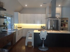
    @kailuaaloha; It wasn't really an option to take the cabinets to the ceiling since the ceilings slant in from the roof line. It would have been more work and more money than it was worth. At some point you have to make compromises. Same with the hood vent I would have preferred a glass thin hood but my husband loves the look of the massive viking hood vents. This was a good in between for the two of us. It doesn't interrupt the view at all. Here's a better photo. As you can see the sightline are completely open and uninterrupted.
  • 11 years ago
    last modified: 11 years ago
    @jeananncs The oven is under the cooktop in the island and we moved the microwave since we don't really use it into the new pantry. We really wanted a high end look and to get a microwave that would fit the rest of the appliances and build it in would have cost us more than we were willing to spend on an appliance we use to pop popcorn. So it was a good move for us. This way were were able to save money on the microwave the cabinetry and have it out of sight. The fridge is currently in the location of the old pantry we stole that space and built a laundry room and walk in pantry through the door just to the right.
  • 11 years ago
    AWESOME!! looks great...what did you do for food storage now that you have taken the pantry and put your fridge in there? I don't like to use my cupboards to store food in I LOVE LOVE my pantry :)
    Brenda Lopez thanked Annalee Stallman
  • 11 years ago
    You did a wonderful job, and I'm sure increased the value of your home!
    Brenda Lopez thanked tammythiesse
  • 11 years ago
    last modified: 11 years ago
    @annalee we have a tall pantry built into the wall that isn't shown in the photo that is physically in the kitchen for everyday food items like seasonings, cereal, bread.... then we have a massive built in pantry just behind the refrigerator for the longer term storage items.
  • 11 years ago
    Great room is beautiful....not to fond of the kitchen. Looks very "institutional" and not welcoming.
  • 11 years ago
    i think you've done a fantastic job! i'm wondering about the backsplash tile - is it matte glass subway tile?
    Brenda Lopez thanked melbajo
  • 11 years ago
    @melbajo it's matte glass subway tile but it's straight up and down not in a subway pattern.
  • 11 years ago
    last modified: 11 years ago
    @msgander I can see why you would say that. It is a lot of white. We added the dark island for a little color I really would have loved to have two toned cabinetry (dark on the bottom white on top) but alas my husband was not a fan he's is very modern and not a risk taker so it was hard to inject a lot of color. The backsplash was about as wild as it was going to get. There is also some glass in the counter that gives a bit of sparkle. A lot is lost in photos. We also took this photo right after the reno so the counters are pretty bare.
  • 11 years ago
    Brenda...the space is great and I totally get what you said in your reply. When things get posted on this page, everyone has an opionion and your patience with all is admirable. You did a terrific job...the vent hood is just my person issue, not that it's wrong. Enjoy and love that great new look you have!!!! Cheers!!!!!
  • PRO
    11 years ago
    Wow!!! Time to relax and enjoy the fruits of your labor
  • 11 years ago
    You did a beautiful job!
  • 11 years ago
    Great design choices! Did you find it difficult to choose white for cabinetry? In this part of the country, seems everyone does stained. We purchased a 12yr old home with stained cabinets & have debated painting white or staining grayish darker brown but don't want to affect resale down the road, but want transitional style.
  • 11 years ago
    Congratulations on achieving such a beautiful modern space. Well Done!