Software
Houzz Logo Print
carlyabbey

Help with Entry Way Foyer Table

14 years ago
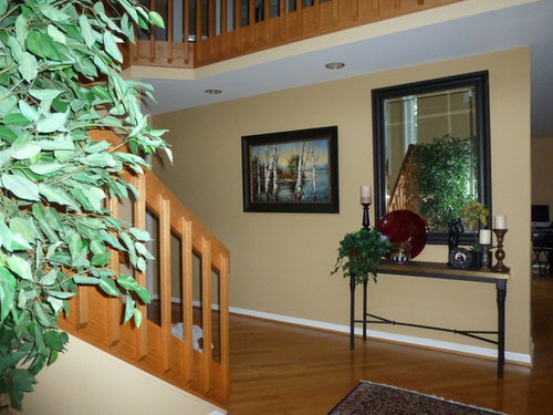
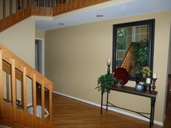
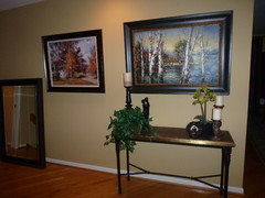
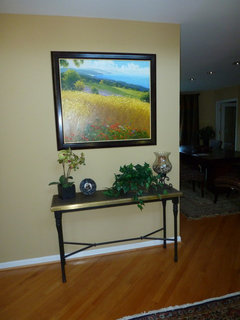
Okay, so I know that decorating a foyer table is not rocket science, but I have been working on this for hours. Tried many things from around the house books, pictures, plants etc...and several arrangements. I am going crazy... This really is the first thing you see when you come in the front door..I want it to look great. any suggestions. also, there is ficus tree by the front door. are they out???? thanks for your help.

Comments (44)

  • 14 years ago
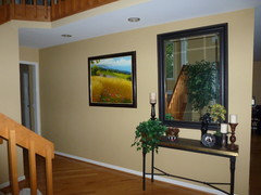
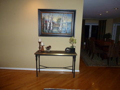
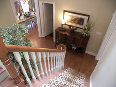
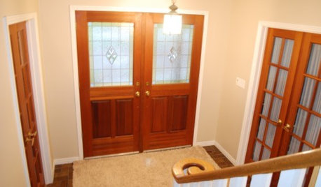
    Two more views. It's kind of a narrow hallway. Not room for something to put under pic. P.s. This isn't the door we use to come in and out of regularly but our main entryway.
  • 14 years ago
    The mirror seems to overwhelm the table. I've seen where some designers use a buffet cabinet or a dresser without the mirror. The nice thing about them is that you'll also have additional storage. We bought one to use in our entryway but ended up putting it in the family room for the TV (it works great there too) :)
  • 14 years ago
    last modified: 14 years ago
    I actually like the painting better with the table than the mirror. And then you would have some distance between the two for the items you want to set on the table to style it. Need some negative wall space between the painting and the table. i like the painting showing a big expanse of sky.
  • 14 years ago
    Mary which painting? You don't think I need a mirror?
  • 14 years ago
    Try the paintings seasonally. Warm tones for fall, cool for summer - switch them out and maybe even find others so you can change them every season. I like using mirrors where they will reflect something special. If they just reflect the opposite wall and you don't need one to check yourself out before exiting the house, use something more interesting. Were you able to see my ideabook for the FP surround in the dining?
  • 14 years ago
    OMGoodness dec! Thank you so much for taking the time to do that for me. so very kind of you. So when you walk into my house you see the table and the mirror if you look straight and THEN to the right is the dinning room and fireplace all in one view.. So much to do.
  • 14 years ago
    I liked the painting with the open field and the blue sky because it "reflects" an out door image to mimic what you see when you go up your staircase and look out that window. I don't think that you need to have that mirror to style this table. It is out of balance with the table.
  • 14 years ago
    Here's a video on styling a mantel that can help with styling your table:
    #
  • 14 years ago
    thanks mary! My husband is at a meeting and I took down that mirror myself! Which do you all think would look better?
  • 14 years ago
    pictures seem a bit high, yes?
  • 14 years ago
    last modified: 14 years ago
    You are a rock star to take that large mirror down on your only! Lower your pictures a bit and you can do either painting with the table. They each look good!
  • 14 years ago
    is this too much for the eye? They are similar and fill the wall a bit. The mirror on floor will only be there til my husband gets home to move it..
  • 14 years ago
    I would suggest to put the mirror back exactly the way it was. Next, I would suggest that you remove all that is sitting on the table to the right. Use 1 tall candlestick left, maybe a long narrow tray for keys and mail. If there is an outlet nearby, eliminate the candle and get a buffet lamp. Next, I would leave one of the paintings to the left, but further down the wall. In between the painting and mirror, look for something unique like metal, or something textural on that wall. Also because the floor is a hard surface, and the base of the console is leggy, maybe something unique, a couple of weathered clay jugs, under the console would anchor the piece.
  • 14 years ago
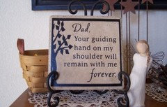
    What worked about the mirror was that it was tall and not wide (portrait oriented) the table is wide it needs to be balanced out. Try an art piece that isn't landscape. Short vinyl quotes on stone tile on an small easel are great for decorating tables like this!
  • 14 years ago
    I really like the table with either of the paintings, what I think you also need is a garden stool or a big floor vase on one side of the console to give length to the vignette.
  • 14 years ago
    Ok you have all that oak railing and wonder why the plain iron table does not look good.
    Since it is oak and I am a guy painting all that oak is a bad idea. Put an oak table there with some weight and a mirror.
  • 14 years ago
    I too like the field with the blue sky because the ground picks up the color of the oak stairs. I would ditch the ficus as it calls attention to the 90's stair rails. I also like the idea of a large floor vase to one side like Gina said.
  • 14 years ago
    Center the mirror on the wall and hang the paintings either side with the table beneath the mirror. Do you have to have things on the table, I would really leave it empty and use it to put your keys and mail on when you come in the door, otherwise put small things like the round frame and little urn vase thing.
  • 14 years ago
    Although the field is a beautiful picture, I decided to go with the other as it flows better with the colors in that area. I don't need a spot for mail or keys because that is the door only guests come in, we use the side door . i will however need to work on placing things correctly on the table. thanks.
  • 14 years ago
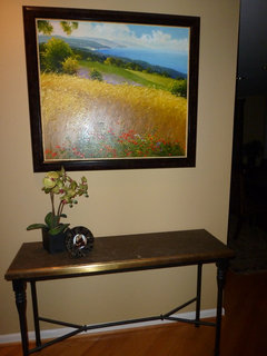
    Ok... So fickle me... I changed to the beautiful field pic. iT is an even more beautiful oil painting in person. Any tips on how to decorate the console on top. Once again we don't use this doorway to come and go.
  • 14 years ago
    thanks so much
  • 14 years ago
    Also no outlets in sight.
  • 14 years ago
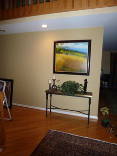
    Since you've gone with the painting which is much smaller than the mirror, you can put things on the table that are a little taller. Make sure you have a space between the painting and items on the table, too. That plant is too tall, it is touching the bottom of the painting.

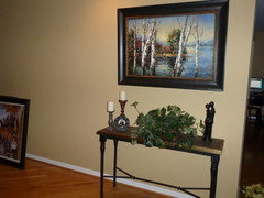
    In your photo with the trees (second to last photo) the table looks just right minus that plant. I still think you should try centering the painting and table along that wall. Also, if you center the table and painting you could place your fiscus to the right of them instead of removing it altogether.

    Anyway, please post some photo's of your final layout.
  • 14 years ago
    I like the colors of the plant with the field painting. I don't think the plant is too tall, but rather it needs to either be taller or shorter because of it's proportion to the entire vertical space from table top to top of painting.

    Think of the area you are styling as if it were divided into thirds. You want to place tall objects one third of the height and horizontal arrangements one third of the width. And in the instance of using a painting, you have to play with colors, textures, and "bigness" to compliment the painting. By bigness, I mean visual weight.

    You are doing great with experimenting!
  • 14 years ago
    Thanks for your advice on centering the table on picture. spacialy this would not work because of the distance between the bottom of the stairs. And the wall. I am going to home goods today to purchase some accessories to put on console. Any suggestions?
  • 14 years ago
    I would use items in the colours of the picture, particularly the red as it draws the eye and guides your guests into the home. In terms of materials, ask yourself what it is you like about the painting and try to carry that sense to the table. For me that would be nature, light, air. So maybe a flower arrangement - red flowers in a black vase, alongside a large, heavy Scandinavian style glass bowl (simple) - green or blue will add a sense of air and water.
  • 14 years ago
    antje 121 wonderful suggestions. The airy feeling from this painting is very inviting and it draws you in. Choose items that tell your story, your personality. That is what your guests will pick up on when they see this table. You can try a number of items and return what you don't use.
  • 14 years ago
    If the distance from the bottom of the stairs does not allow you to center the table why not remove totally. You could use several paintings on this wall due to its size. The table makes the balance wrong. If you decide to go with the table remember table decorations always work better in three's
  • 14 years ago
    Table works there great. There are some angles which would prevent it . This is what u see right when u walk in.
  • 14 years ago
    Don't like the table, it is too small for the space. Why not a long bench with a back and pretty cushion and/or pillows. The bench would be great for people to sit on when putting on shoes or boots. Because of the wood on the railings I could see an old church pew. Also a long narrow piece would be good with a variety of pictures above it. I don't like the big pictures.
  • 14 years ago
    If you're worried about color flow remember to do things in 3's! like add 2 other yellow items in the room to go with the yellow painting /place 2 other cast iron pieces within sight of the table.
  • 14 years ago
    Good idea mom 2lala
  • 14 years ago
    thoughts ? need an interesting glass or ceramic bowl maybe?
  • 14 years ago
    I like bowls, or an interesting plate on an easel (to go vertical) or a picture frame with a seasonal subway word print:
    http://eighteen25.blogspot.com/2011/09/subway-art-halloween.html
  • 14 years ago
    With the exception of the small blue plate all of your items are around the same height.
    Create an interesting table scape with varying heights. I like the look of nicely bound books, brass bookends to match your table top and a tall vessel in a color to coordinate with your art. If possible try to stick with live greenery.
  • 14 years ago
    You're a real sport for trying all these suggestions! Your painting gives the area a fresh look. To keep your tablescape from stealing the stage, I think fewer items (maybe stick with 3) and larger scale items would help. IMO less is definitely more when accessorizing entry tables. Give your guests a place to rest their eyes when they enter your home. Also, try positioning your curios at least a few inches from the edge of the table. I'm not a fan of fake plants but grasses might be nice if you don't have luck with real plants. Here's a nice look.
    Hallways and Entry · More Info
  • 14 years ago
    That is beautiful
  • 14 years ago
    Agree the picture looks much better than the mirror ... I like the pic of the field a lot more than the trees too.

    I'm not liking the plant on the table. How about a beautiful bowl/dish with wrapped candies? Like an Orefors ... or pretty reflective, colorful bowl of some sort?

    Liked the candle on a holder better than the hurricane ...
  • 14 years ago
    last modified: 14 years ago
    Good point on using odd numbers of items or groupings. 3, 5, 7 is more interesting to the eye.

    lotz, that tablescape works beautifully as the items meet the rule of dividing the visual plane by thirds. The two taller pieces hit at 2/3 of the height and the shorter 1/3 of the height.

    carlyabbey you are going to need pieces that are minimally 1/3 of your visual plane and best if you can have something 2/3 also.
  • 14 years ago
    I love the table but would replace items with a small jar for keys and 2 letter holders for in coming mail and outgoing items
  • 14 years ago
    I know we're all going crazy on this one, but you can play with this area throughout the year and try all these different combinations. My last suggestion is to think about putting the whole vignette under one or centered between both of the downlights so they will highlight the table, art and accessories. You can buy bulbs that are "wallwashers" to sweep the light over the art piece. I know that moves it away from the stairs but it seems crowded toward the end of the wall when there is plenty of space for centering it which will give balance to the entire effect, also eliminating the desire to fill in that blank end with another painting which is really overkill, in my opinion.
  • 14 years ago
    last modified: 14 years ago
    thanks all so much. I am loving all of your suggestions. So the dilema with moving it is this.. As it is now.. it is visible right when you walk in the front doorway. If I do move it over it will be bam , right at the bottom of the stairs. I do like the effect of having something right there when you walk in to catch your eye. does that make sense...Today is my bday and my hubby said to go ahead and get some new accessories. thanks again to all who are giving this so much attention.
  • 14 years ago
    Good man. I would keep him. And the painting. Happy birthday.