Software
Houzz Logo Print
amandaisthebest

Any advice for photo collage

14 years ago
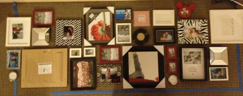
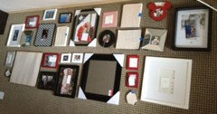
We are going to hang this photo collage in our living room but before we do, I wanted to get any advice/tips that I could to see if I should move anything around. Please let me know if you have any suggestions!!! Thanks

Comments (22)

  • 14 years ago
    To unify all the frames, perhaps you could paint them all the same color? Black? This would also help the pictures themselves to stand out. Any chance you can spread them apart a bit?
  • PRO
    14 years ago
    Its very confusing , wont come out nice , why not seek a Professional , as these pictures must be Priceless to you .
  • PRO
    14 years ago
    I love that you are doing a grouping, but I have a few comments.

    First, where will this hang in your living room? It seems to be a long, narrow grouping, and I am wondering if you have taken the widest and tallest measurement of this grouping and mapped it on the wall where it will go, to see if it fits nicely. (would help to do that, and to snap a pic for us to see, maybe you can fill more wall space if we see where you plan to hang this?)

    Second, I find the arrangement is really close together, there is no breathing room between the photos. I try to leave about 2-3" between each picture when I do groupings, as a general rule.

    Third, though I am a fan of mixing things up, I feel there is too much going on in this arrangement. Spacing it wider should help, and if that makes the arrangement too big, then remove what doesn't fit, as my eye is all over the place on this one, and the frames are demanding more of the attention than the images, but again, that might be because they are all too close together.

    Search "art arrangements" or "rogues gallery" in the photos on Houzz. Some are well done, others, not so much, but you'll get some idea of what you like.
  • 14 years ago
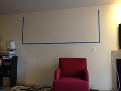
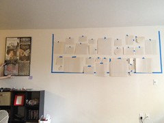
    Thank you for the comments! I spaced them out and took out the big zebra print one and arranged the top half to be a little more symmetrical. We have a really huge white wall that we need to fill, I will add a few pictures to show. I also like the mish mash of colors and prints :\ So hopefully the spreading out will help make it look better. We did keep a pretty clean line along the center and then a vertical line towards the right side of it to try to make it look a little cleaner.

    picture1: collage after being spaced out a little more, without the zebra (still on the floor)

    picture 2: blank wall with taped off section where the pictures will go. also with chair showing that we probably shouldn''t go much lower than that without risk of people's heads hitting the frames

    picture 3: we cut out pieces of paper to put on the wall for an idea of how it will look. pretend there are two arm chairs under it :) see how huge our white wall is!
  • PRO
    14 years ago
    Now, my eye goes immediately to the horizontal blank line down the center of this arrangement.

    Don't worry too much about what is happening in the middle of the grouping, focus on spreading out the larger pieces, fill in the blank spaces with the smaller frames, and there should not be defined lines directly through the arrangement (I should not be able to draw a continuous line right through this grouping, if I can, then it needs to be mixed up some more.

    Next, I would absolutely lower the entire arrangement The center of the whole grouping should be at about eye level, which is 60" off the floor, but you can for SURE go lower, especially if there will be only one chair on that wall!

    Try sitting in the chair...when have you ever leaned back so far as to hit your head when seated in an armchair?? People tell me this all the time, and when I hang art over a sofa, I always hang it about 5-6" above the back of the sofa, which in some cases is actually a little LOWER than standard eye level!

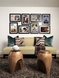
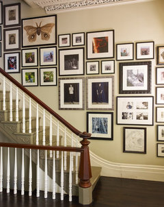
    If you are not planning to add a second chair, then start hanging the art outside the rectangle, down next to the chair! (Even if you ARE planning a second chair, the art can still come outside the box and fill space....here are two examples from our own site:
  • PRO
    14 years ago
    And this one too....no horizontal line through this collection.....
  • 14 years ago
    last modified: 14 years ago
    I like the zebra print frame, and didn't think it needed to come out, but my first thought was that it should be in a different row than the zig-zag patterned frame. And I would paint any coloured ones black, keeping only the silver, black, and black-patterned frames. It will look more cohesive, but not be as 'boring' as all black.
  • 14 years ago
    i have one large mirror in my arrangement. Should I hang it at eye level standing or since it is in the living room, slightly lower and closer to eye level for sitting?
  • PRO
    14 years ago
    I'd do it more around eye level when standing, so it is a useful mirror, since you likely wouldn't need to see your reflection when you are sitting across the room (nor would you turn around to look at yourself if you are in that red chair)
    I hope you'll keep us posted as you go!
  • 14 years ago
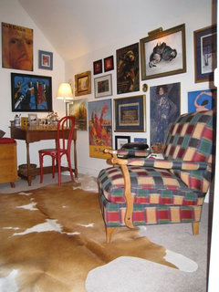
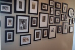
    Some examples...
  • 14 years ago
    DUMICAN MOSEY Architects - Fillmore Street · More Info
  • PRO
    14 years ago
    last modified: 14 years ago
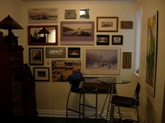
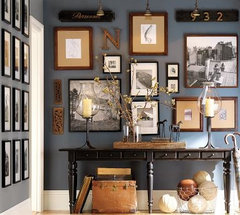
    I would eliminate everything you don't love, and begin again. Agree with all that this is very cluttered with so many different types of items. What is on the wall opposite the collage, and what is your ceiling height? I'm more interested in overall height of your collage initially and how it relates to the rest of the room. Then you can draw the rectangle and begin with your outside edges and work your way in. I've pasted the perfect photo wall where everything lines up on the outside edges. Also, you need to be very clear that this is a photo collage and not a little of this and that, therefore, I would eliminate the mirror.
    Pulp Design Studios · More Info
  • PRO
    14 years ago
    Don't be afraid to hang these pictures lower on the wall. I actually like to look right at art, photos and objects or eye level. Especially with family photos, you don't want to strain to see the details of the faces. Hope that helps. Charmean Neithart
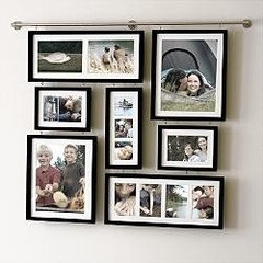
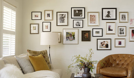
    Photo collage · More Info

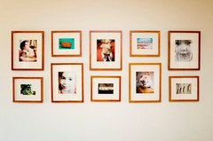
    blue wall with photos · More Info
  • 14 years ago
    Only suggestion is to add some space around the frames instead of grouping so tight. Negative space is just as strong as positive space, it will help the eye flow around the pics. Also, would move them down some and work around light switch, don't worry about keeping in a uniform line. Have fun!
  • 14 years ago
    I would drop it from the ceiling a little bit.... loos odd hugging the roof!
  • 14 years ago
    ok i will have the mirror at standing eye level. that's what i originally was thinking but wasn't sure so wanted to ask to get another opinion. also yes, i will lower it.

    i definitely want to keep the different color frames- red, black, and white (and mirror), i like it this way. the walls are boring so i want to add some patterns and color.

    I really liked the horizontal line but by lowering the whole arrangement, it messed up where the mirror would go, since below the line would be too low and above the line would be too high. SO i will try without the line thru the middle! I like the idea of making the outside lines match up into a square with so I will try that next.

    More pictures to come after I've played with it a little. thank you all for trying to help

    more details about my space: we have a living room/dining room combo with two huge white walls with nothing breaking them up. so what i'm doing is sort of separating the dining room section and the living room section with a shelf in the dining room half, and a poster above that. then the collage on the same wall as the poster. below the collage is going to be two arm chairs. across from this wall is our couch and our dining table. above the couch will be 3 large paintings and then above the dining room table is a poster and a few photos next to it.

    this much white space has been so daunting! all the "how to fill huge white wall" type how-to's i have found have had half the amount we have. or maybe it just feels that way :)
  • PRO
    14 years ago
    Much much better!!! Now, hang all the paper versions on the wall, stand back, and add some so it trails down the wall beside the chair, so almost like a tail outside the box.....but this arrangement is leaps and bounds better! Well done, Grasshopper!
    (and for the record, I always liked the hits of red!)
  • PRO
    14 years ago
    I like that you stayed "within the lines" for your collage since you have so many elements you are dealing with. Seems as though you did some elimination and that's great. As for your zebra not fitting...take out the items you can live without so you can put back the zebra. It seems important. Anything important to you on a personal level is more important than anything else, and most especially if you have already done a lot of editing. How about you placing it and we will critique it! :)
  • 14 years ago
    You have alot going on. "Olgahoney" posted some great looking ideas. When the frames are the same color then you can play around with different sizes. Also, I think you need to drop it from the ceiling at least 8-12. Aim for starting your collage 6 inches above the sofa back working your way up. If you find yourself getting to close to the ceiling you need to either edit or spread out your design wider. Good Luck!
  • 14 years ago
    last modified: 14 years ago
    Curious - what are the round rings? Are they frames? I think the zig-zag print needs to go on the bottom somewhere, just not sure where yet. Try switching places with the mickey mouse ears and the two small frames beside it (and possibly the small frame to mickey's left).
    I think I would like to see those 2 small frames grouped with the 2 small red frames so that they actually appear grouped, rather than having bits and pieces scattered. And I would keep that 'group' inside the collage, not along an outside edge.
    A note on why I think zig-zag should go on bottom, apart from separating the pattern from the other pattern (damask?) - for my eyes, there are too many small frames along the bottom row, and it doesn't feel anchored. It may just be personal preference.
    For the record, I really like the top row now; I like the way my eyes go 'up, down, up, down', ie. big frame, little frame, big frame, etc. And I do like your left and right edges. I think it's just the bottom that needs adjusting. As well, you might try grouping the rings together, if they are frames, not just decor or filler.
    More pictures please!! :-)
  • 14 years ago
    Here's another suggestion to try and fit in zebra frame. This involves getting rid of the two round rings for now, and also the two small white frames (currently to right of mickey). You may be able to fit them in after re-arranging.
    1) move mickey ears to where round ring is on right side of collage (beside red-patterned frame).
    2) move black circle frame to where round ring on left side is now (beside small black rectangle).
    3) take out 2 small white/silver frames for now.
    4) insert zebra frame into blank space. may need to play with bottom frames now that black circle has moved.

    Just some thoughts - good luck!
Sponsored
Buckeye Restoration & Remodeling Inc.
Average rating: 5 out of 5 stars7 Reviews
Central Ohio's Premier Home Remodelers Since 1996