

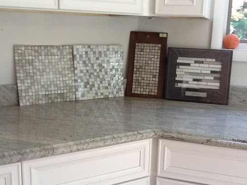
Pick backsplash.
13 years ago
Featured Answer
Sort by:Oldest
Comments (56)
 PRO13 years ago
 13 years ago
Related Professionals
Fayetteville Interior Designers & Decorators · Somerset Interior Designers & Decorators · Clarksdale Interior Designers & Decorators · Bartlesville Interior Designers & Decorators · Kissimmee Architects & Building Designers · Miami Architects & Building Designers · Chambersburg Architects & Building Designers · Lynchburg Architects & Building Designers · McAllen Kitchen & Bathroom Designers · Grand Island Kitchen & Bathroom Designers · Eau Claire Kitchen & Bathroom Designers · Clearlake Kitchen & Bathroom Designers · Fort Collins Kitchen & Bathroom Designers · Helena Kitchen & Bathroom Designers · Fairbanks Kitchen & Bathroom Designers 13 years ago
- PRO13 years ago
 PRO13 years ago
 PRO13 years ago
 13 years ago
 PRO13 years ago
 13 years agolast modified: 13 years ago
- PRO13 years ago
 13 years ago
 13 years agolast modified: 13 years ago
- 13 years ago
 13 years ago
 13 years ago
- 13 years ago
 PRO13 years ago
- 13 years ago
 PRO
PRO 13 years agolast modified: 13 years ago
- 13 years ago
- 13 years ago
- 13 years ago
- 13 years ago
 PRO13 years ago
- 13 years ago
- 13 years ago
 13 years ago
 PRO13 years ago
- 13 years ago
- 13 years ago
- 13 years ago
- 13 years ago
- 13 years ago
- 13 years ago
 13 years ago
- 13 years ago
 13 years ago
- 13 years agolast modified: 13 years ago
- 13 years ago
- 13 years ago
 PRO13 years ago
 13 years ago
 13 years agolast modified: 13 years ago
- 13 years ago
 13 years ago
- 13 years ago
- 13 years ago
 13 years ago
- 13 years ago
Related Stories
PRODUCT PICKSGuest Picks: Beautiful Backsplash Tiles for Every Budget
Explore 20 tiles curated by a pro interior designer, ranging from everyday affordable to art for the kitchen
Full Story
KITCHEN DESIGNHow to Pick a Kitchen Backsplash That Wows
Design your ideal backsplash with help from these Houzz guides and inspiring ideas for every kitchen style
Full Story
KITCHEN DESIGNSubway Tile Picks Up Gray Grout
Heading into darker territory, subway tile offers a graphic new look for kitchens, bathrooms and more
Full Story
PRODUCT PICKSGuest Picks: Details for a Classic White Kitchen
Check out these white tiles, countertops and accessories, plus a few stainless steel touches, for a pristine-looking cooking space
Full Story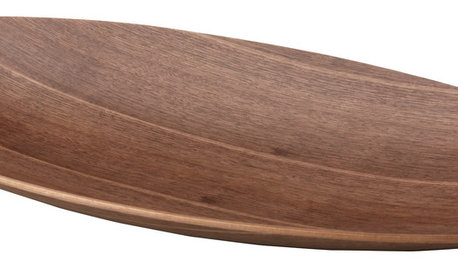
PRODUCT PICKSGuest Picks: Scandinavian-Chic Kitchenware
Go for minimalist cool with dishes, serving pieces and more in snowy white and warm wood
Full Story
WHITEHow to Pick the Right White Paint
White is white, right? Not quite. See 8 white paint picks for 8 very different effects
Full Story
PRODUCT PICKSGuest Picks: 19 Kitchen Upgrades for When You Can't Afford an Overhaul
Modernize an outdated kitchen with these accents and accessories until you get the renovation of your dreams
Full Story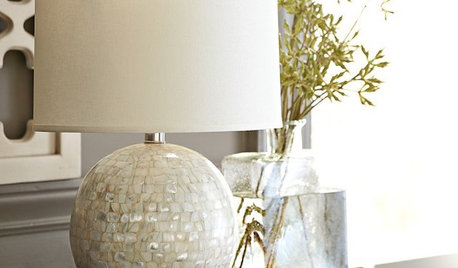
PRODUCT PICKSGuest Picks: Pearls Come Out of Their Shells at Home
Scatter these pearl-inspired pieces around for shine, elegance and more than a bit of glam
Full Story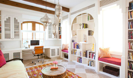
PRODUCT PICKSGuest Picks: Rock the Casbah Look
Evoke an exotic escape with furniture and accessories styled in the spirit of Morocco
Full Story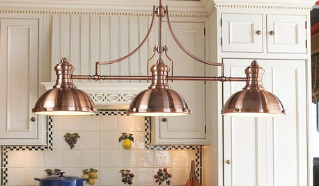
PRODUCT PICKSGuest Picks: Dashing Lighting for Over the Kitchen Island
These single-connection pendants and chandeliers will cover your island lighting needs no matter what your kitchen’s style
Full Story




Custom Home Planning Center