Software
Houzz Logo Print
brightbelt

General feedback on Dining Room

13 years ago
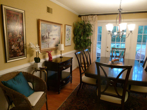
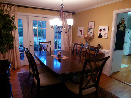
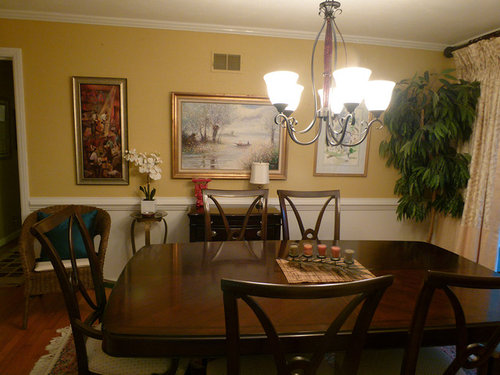
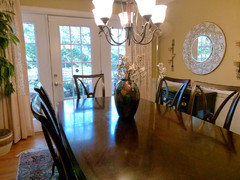
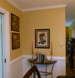
Hi All, I thought I'd share my dining room for general feedback and suggestions. I'm new to interior design but I am enjoying learning. Thanks,...Frank B.

Comments (82)

  • 13 years ago
    I think it is too small, Frank. That was why I suggested the square vase with the white orchid. The flower provides enough height to make them similar without being the same... BUT it is your house and all that really matters is if you like it. :-)

    I think your rooms have come a long way and look great over all. :-) You have been a kind and receptive soul to all the varying ideas and opinions...and there have been oodles of them. Thanks for allowing me to play a small part in your updates.
  • 13 years ago
    Oh...one more little thing. Pull the alli ficus away from the wall a little bit. :-}
  • PRO
    13 years ago
    Awesome. Love seeing the progression of your rooms. Houzz is so much more fun than trying to do it on your own. You've got a nice team of advisors here. Glad I can follow along!

    Lyvonne
    www.essentialsinside.com
  • 13 years ago
    I join with others in complimenting your receptivity to feedback, Frank. I can see you are really enjoying this adventure in decorating.

    The most difficult part of any creative task is always the editing. I'm a writer and I find that I often have to sacrifice a fragrant phrase...you see, 'fragrant phrase' is just too much! 'Phrase' will do. It is the same with decorating.

    Use fewer vignettes, no small tables in corners, fewer pictures, lamps, candles and flower arrangements. Decide on your focal point and let that shine! Store away some favourite things and bring them out to change things up yearly or seasonally...yes, even pictures. If you are doing a vignette of objects, say a lamp, art piece and pile of books, place them close to one another and arrange them so that they relate to one another and read as 'one.' Happy rearranging.
  • 13 years ago
    last modified: 13 years ago
    Constancemary you're bang on comparing it to writing. My husband (writer/editor) says the same; write then read then rewrite because in the first flush you may do too much. The same with decorating step back, cool down and take a minute to re-evaluate. I have hung in here with Frank because as you say he's receptive and has good ideas of his own. I also thinks it's great how he puts up new photos for us. As with writing you want substance to your story not waffle. You can say so much with a well crafted sentence that many lesser authors lose in overwritten paragraphs. Keep it simple. I should follow my own advice here!
  • PRO
    13 years ago
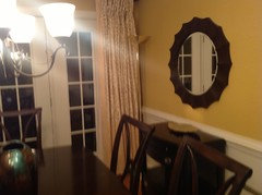
    I bought a new mirror which has changed everything ,,,,,
  • PRO
    13 years ago
    I did some decorating ahead of time here - trying to apply what I've learned - so maybe I can be further ahead.
  • 13 years ago
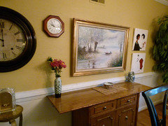
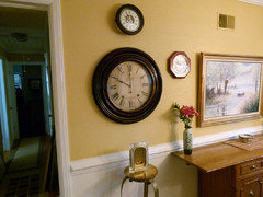
    I would say that one wall with all the clocks needs editing. Too much going, nothing matches. I would move the dark large round clock over the darker credenza on the opposite wall. Then eliminate all the other stuff. Maybe just keep the rectangle gold frame picture. Its hard to mix all those wood tone colors you have going on. Start with the dining table and match or coordinate from there. Nothing seems centered with the table ...
  • 13 years ago
    Frank, I would suggest removing the third fruitwood clock. The other 2 have an aged, vintage look whereas the octagon clock just looks like a standard kitchen variety.
  • 13 years ago
    I had hoped to see the scones in the living room. :-)

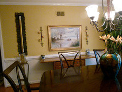
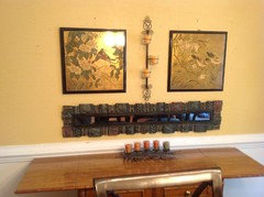
    I like the winter secen over the buffet, but that is really all that is needed there. Remember less is usually more. Maybe with th escones on either side of it. Right now they are not in an optimal place. The outside edge of the piece of furniture below them is as far out as they should go. Right now they are 'off the chart' so to speak.

    Anyway...this room is getting better and better!
  • PRO
    13 years ago
    Thanks - you all are 'Betsy on the Ball' ! (Just my attempt there to feminize 'Johnny on the spot')

    Michigammemom, I was just ahead of you. I realized I needed to remove the fourth clock (the fruit variety) above the flowers to have just 3 in vertical style. The fourth clock was too much.

    Janis, I have hurricanes now with the mirror in the living room, and I didn't think it was necessary to have both sconces and hurricanes there so I wanted to try the sconces in here.

    I noticed after posting that they are too far out, so I'll move them in. I really need to try them in that location because I have nothing else that could compliment the space around the mirror.

    Thanks for all your feedback...
    M
  • 13 years ago
    I love the color of the dining room. Classic. Is it possible to remove some of the drapery panels on the windows, just enough to frame the windows making it less bulky, and allow more light in? I like seeing more windows and the beautiful view outdoors. Also, just my opinion, but I think less on the walls would look cleaner, less cluttered. From your collection, pick out the pieces with same color frames for a more cohesive look. I like the round mirrored frame, paired with artwork on either side. Not a fan of the clocks - more of a family room decor. Keep it simple, less cluttered and the elegance will pop. Go for drama with a spectacular center piece on the table. Lose the little plant stands, guests might bump into them. Beautiful dining set...love the dark wood against the yellow/gold.
  • PRO
    13 years ago
    OK, a little bit of everybody's suggestions. Janis you were right about the sconces, so they're now where you suggested.

    I know it's possible that the vertical mirror on the left now might not work, BUT I think it's also possible that it balances out the tree on the other end. I don't need to say 'you be the judge' because I know you will anyways !!

    Btw, Sharyn, thank you for your helpful ideas - The vase I have is pretty large so I do think it makes a dramatic statement. I put it upfront to see better in the photo.
  • PRO
    13 years ago
    Maybe I could keep the vertical mirror and just remove the clock and stand - that would work better maybe....
  • 13 years ago
    last modified: 13 years ago
    You really have improved things! I was wondering if you might include the colors of your drapes into a table runner so they look like they belong . I think the room would look more color coordinated if the drapes were yellow (color of the walls) and white or a plain white or offwhite.
    Just looked at your inspiration rooms and noticed you are from Savannah. I go there quite often to see family. Very lovely place!!
  • 13 years ago
    What is that wonderful butterscotch paint color?
  • 13 years ago
    Glad to see someone having fun and playing with their room! I think the biggest change you could make for the better would be to replace the chandy. Love the vase on the dining table! Would like to see you drop the leaves on the bamboo piece and take it to the corner where the light switch is, stacking the two orientals on the wider wall above it (where the demi-lune was in your post 2 weeks ago) and the funky long mirror on the more slender wall. When are we moviing on to the living room?
  • 13 years ago
    decoenthusiaste..we have been working on th eliving room for weeks now. We were there yesterday as a matter of fact. :-)

    Frank...the long mirror doesn't balance the tree. The tree doesn't need to be balanced anyway. Have you tried the long mirror over the doorway to the kitchen? Or maybe in the studio over the sofa? OR...what if you put it on the buffet and placed a long row of votive candles on it? I think that would be imaginative and gorgeous. Even on the table (if you add a table runner) The vase (which I really like) could go left of the buffet on that plant stand ~ to balance the tree! (laughing as I type that)

    Oh...and pull the little vase and basket intoward the center so they are between the scones and the picture frame ~ visually forming a triangle. That is if you don't put the mirror there. :-)

    OH...and the vase..well, it doesn't need flowers. It is gorgeous and needs nothing else. It can stand on its own.
  • PRO
    13 years ago
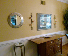
    Ok, I tried a couple of unexpected things -- I went to silver frames on that main wall.

    And I reworked the plant stand and put a (silver-framed) clock in face-up where the gold plate used to be. You see, this balances the tree ! (LOL)
  • PRO
    13 years ago
    I see the mirror needs to come down a few inches.
  • 13 years ago
    Everything looks great, my only comment is your accessories need to be BEEFIER, BIG, HUGE. If it feels to big buy it, bring it home and see how it looks.
  • 13 years ago
    I like the silver frame. Ties in with the chandelier nicely. Fun watching this room go thru the transformations.
  • PRO
    13 years ago
    Hi Rivers300...
    I felt you had good point about size and impression etc. So I went for something different. I think this works Ok...

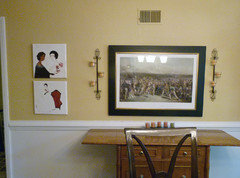
    The main print is of an on-the-green putt at St. Andrews Golf Course in Scotland. Everyone is hovering and crowding around the putter, so much so that he should have claustrophobia. I admit this print has a darker edge but it is also very elegant I think.

    I should pose a question here first - I wonder if I'm kind messed up from the beginning with this room because of a clash of styles. The rug (probably more visible in the first photos of this thread) is a classical style while the dining room table is modern - modern with classical lines maybe, but still modern.

    Anyways, here's my latest scenario....
  • PRO
    13 years ago
    Another scenario would be to keep this but substitute the earlier boat/landscape painting for the golf print.

    That would, however, completely feminize the room decor, which is not bad necessarily but maybe not what I would want.
  • 13 years ago
    Wow, Frank! You are a good sport! I love the color of the walls. Can you tell me what paint you used?
  • 13 years ago
    Frank...before you riddle the walls with any more holes, try laying the art work out on th efloor as I suggested you do in th eliving room.

    The theme and the colors of what you have over the buffet right now do not work together.

    The winter scene with the scones looked best. Nothing more. The entire wall doesn't need to be covered in pictures/paintings. Allow the eye to rest so it can appreciate what you do have.

    My 2 cents and then some. (sigh) Sorry. I think perhaps I will bow out for a while.
  • PRO
    13 years ago
    Hi ya'll,
    Peacomb, that is a yellow, stitched-style wallpaper in the dining room, so it's not painted at all.

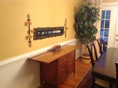
    Ok, since you guys don't like more than one piece of art per 15 square feet (lol, just joking there), I went the other way here.

    And actually, since this is wallpaper, I think this works pretty well...

    See what you think....
  • 13 years ago
    LOL...the long mirror is too narrow. You need something more proportionate.

    I was thinking about the empty space and music. It is the same with decorating. The rooms purpose would be the timber, the furniture the dynamics, the structure is the arrangment of the furniture, the artwork is the melody, the harmony is how the artwork and other accessories are arranged, and the rhythm is the balance of the arrangement. Without all of these components the room falls flat, just as the music does.

    Give the room some harmony...
  • PRO
    13 years ago
    Hi Janis,
    With the sconces, I think the effect is fine - the narrowness is actually the point.

    I mentioned problems about inferring spacial dimensions from a 2-D photo in the kitchen thread. It's just a cautionary point I'm putting out - I don't mean to offend anyone because you all have given me so much time and help.

    I do appreciate all your time and feedback.
  • PRO
    13 years ago
    I should clarify this.... It's not that one can't tell spacial dimensions from a photo at all. It's just that I think one should allow a notable margin for error.
  • 13 years ago
    Yes, agreed, but the height of the mirror should excede the height of the scones. You could hang a picture over it...
  • PRO
    13 years ago
    Ok, this is my wall and I'm sticking with it I think. It's what I had decided on before but now with all the peripheral clutter removed.

    Thanks you all ! On to the guest rooms....
  • PRO
    13 years ago
    You are such a trouper Frank! Very nicely done. Thanks for letting me follow along.
  • PRO
    13 years ago
    Thanks Peggy!
  • PRO
    13 years ago
    Janis, your expounding on the music analogy to decor was very original.

    There is the accepted truth, especially in harmony, that if you are creative, you'll make your best music when you break the rules.
  • 13 years ago
    LOL...Frank...waaay back up in this thread you had that exact same layout. I think most everyone thought it looked lovely. I know I did and said as much. The only thing different was changing thetaller lamp and a short squatty flower pot to something that was similar in height. I never figured out why you changed it. It is perfectly balanced and proportionate.

    In decorating there is a similar axiom, but surely it would depend on where ones talent lies, would it not?

    My apologies for offending you.
  • PRO
    13 years ago
    Hi Janis,
    I didn't say I was offended! Maybe I'm frustrated with the process right now but that just comes from doing all this online.

    I did say in my comment just above that I was going back to "what I had decided on earlier", hence the waaay back stuff you mentioned.

    Talent is the thing - that's for sure.
  • PRO
    13 years ago
    Some thoughts about this process for me -

    I think there can be a fine line between pushing to the next level and chasing your tail. I've done both - with the living room, everyone (even my local decor friend here in Savannah) told me "you're done. Leave it alone !"

    But I kept pushing and voila, I found the perfect art piece that pulled it together. I got to the next level.

    Here,... maybe not. I've tried different things but I perhaps got impatient. I'm trying a new mirror now but whether there's a way to pull it all in like the living room, I can't say.

    I am learning some of the "rules” right now and hopefully, some of the craft of decor.

    Whether I have a talent for decor remains to be seen. I can learn some of the craft, but craft and talent are two different things. One can do the mechanics, stick to the rules and do good work. But it doesn't excite you when you see it.

    My fascination lately is looking at a living room decor in a magazine and after seeing that NONE of the items on their own do Anything for me, the room as a whole pops and jumps out as one unit and I go "Wow!!"

    That's what blows my mind about decor lately.
  • 13 years ago
    Good Job Frank! When are you inviting us to dinner????
  • PRO
    13 years ago
    I don't have enough room for everybody!

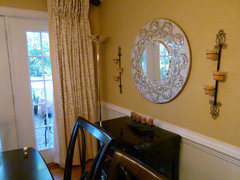
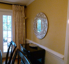
    Anyways, here's a new mirror - please tell me this works...
    (The other one is over the fireplace now).
  • PRO
    13 years ago
    I love the new mirror!

    You make some great points about craft & talent. I think (in this country at least) that we have an expectation that someone's "talent" is immediately recognized both by the "talented" person and others. While I think that is the case for some, I also think talent can sit below the surface for a long time and can only emerge with practice. So keep practicing. You're doing a fantastic job so far.

    Remember too that there is no real "right" and "wrong" way to decorate & thank goodness. Otherwise, everything would look the same. Forever.

    See you in the next room!

    Lyvonne
    www.essentialsinside.com
  • PRO
    13 years ago
    Thanks Lyvonne! Your words are very encouraging. I appreciate your compliments especially.

    It is time for the next room, as you suggested. See you there !!
    PS It'll be titled 'guest room - general feedback'
    Thanks!
  • PRO
    13 years ago
    Frank - Saw this in Lonny Mag, thought of you. http://lonnymag.com/issues/43-lonny-october-2012/pages/1#p27

    Lyvonne
    www.essentialsinside.com
  • 13 years ago
    Try switching the plant for something more leafy such as a palm tree. It will let light through the leaves. Also a neat idea would be to paint the drapery rod same color as the crown molding. Good luck.
  • PRO
    13 years ago
    Thanks Lyvonne and Marsten1 !
  • PRO
    13 years ago
    My pleasure!

    Lyvonne
  • 13 years ago
    What are you thinking. How do you live with that in your home. Although the table is nice I dislike the lights right above the table
  • PRO
    13 years ago
    last modified: 13 years ago
    I didn't think anything. Those lights were there when I moved into the house. I'm not overly thrilled with them either, but I live them fine.

    I'll change them if and when things get more defined.
  • PRO
    13 years ago
    Hi Frank! I thank that commenter is a "spammer." The other comments by that commenter are similar to the one above (but actually worse). I notified Houzz.

    Hope you have a wonderful Thanksgiving!

    Lyvonne
    www.essentialsinside.com
  • 13 years ago
    Hi Lyvonne and Frank. Again nice work Frank. I still love the table and chairs! I was very new myself to Houzz when I came across your thread Frank and I am only now beginning to recognize some trolls/teasers! Never mind them, too many good people out here to keep us right. I'm glad you kept the curtains and wall colour - very warm.