Software
Houzz Logo Print
nothing2it

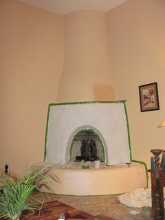
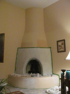
Need paint help for my Kiva fireplace

13 years ago
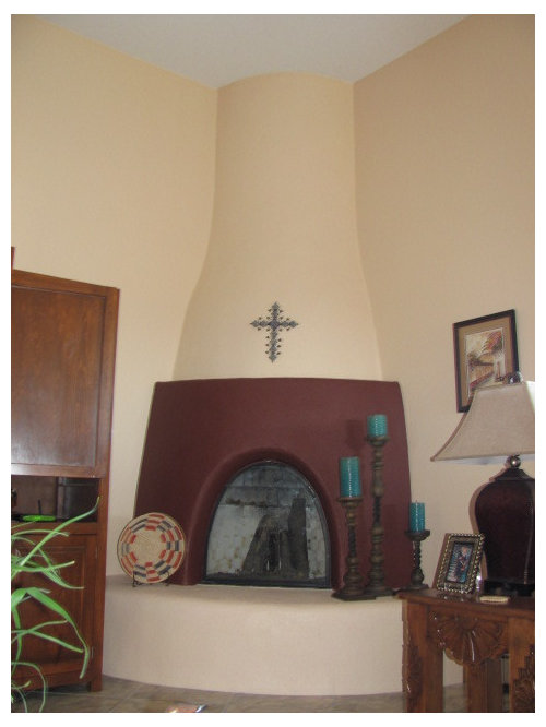
I painted my kiva fireplace but am not happy with the results, thinking I should paint it another color but don't know what color? The wall paint color is a peach and the overall colors in my southwestern home are orange, blue and maroon with grey tile that has specks of brown and blue. I have an orange and maroon southwestern rug in the living room with carved mexican furniture with orange suede cushions.

Comments (30)

  • 13 years ago
    Hmmm, I think change it back to the wall color...
  • 13 years ago
    I think the problem is you've chopped up the design. Paint the chimney and hearth the same color. You may have to go a bit lighter than the current color when painting the whole thing. A turquoise and terra cotta Mexican tile band on or around the hearth may add some interest, but the curves make that a tough project. Nice fireplace!
  • 13 years ago
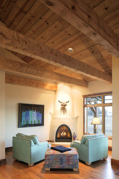
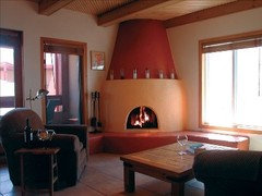
    I prefer a more authentic, single color look for your kiva fireplace.
    O'Banion Residence · More Info
  • 13 years ago
    I agree that the traditional single color looks best on a kiva fireplace.
    You could use the same color as your wall color, or one shade darker.
  • 13 years ago
    Hey - I don't see anything wrong with where you have painted this - I have seen them done all kinds of different ways - I don't know that I would have pulled the Maroon color out of the rug - it is a bit dark - but it is very dramatic!

    What about a soft natural brown - the thing about NM, and these areas - are the play of light and the incorporation of the natural world into these spaces. People made their homes from what they saw around them - and so . . it becomes very naturalistic. I would suggest trying the softer LIGHTER - ADOBE brown - I don't think you would like the blue - it would be like an Easter Egg, and the orange - wont really go with your peach walls. Grey against this, is going to end up looking blue; and a slate grey will be too dark - find a REAL adobe - somewhere - and take it to match the paint?????

    Please let us know - what you decide and show us - we will be waiting? :-)
  • 13 years ago
    Many kiva fireplaces are the original adobe brick color. Others are plastered white.

    I have changed my mind about painting the fireplace one shade darker than your wall color. It would make the fireplace "recede" into the corner of the room, and also be a bit too intense in terms of color.
  • 13 years ago
    last modified: 13 years ago
    Few options, depending on your taste…. Although I like the idea of the “White” (If it were painted properly, of course!) I do not think by your photo and description that this would make much sense for your décor. Have a peek at these; it may give you some inspiration….
    With such a beautiful piece, is there any possibility of rearranging some of the pieces you have in the area? Just a thought…. It would expose the Kiva Fireplace to its full potential! Can’t wait to see how you make out!
  • 13 years ago
    Nice photos, justdebi!
  • PRO
    13 years ago
    I agree with the use of tile around the face of the hearth. Smaller tiles will work on a rounded surface, but I recommend incorporating a design with the tile. Bring in the wall, fireplace, and tourquoise colors of the candles to make the room flow. I would open up the space as well by pulling back that large piece of furniture on the left (entertainment center?). Things look a bit crowded in there...
  • 13 years ago
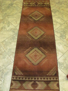
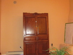
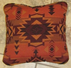
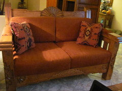
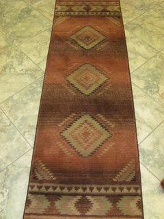
    Okay I have primed out my maroon colored fireplace and of the advice I could either paint it the same color as the walls one shade lighter or go into the brown spectrum as someone else suggested. Attached is a picture of my hall rug which is just like the living room rug and a picture of my pillows and my love seat which is exactly like my sofa. As suggested I also took out the two matching side panels of my TV cabinet to make more room on that wall but of course now I am left with two big blank spaces which ads to my questions as now I don't know what I should put next to the cabinet to fill in the spaces, pictures a plant???
  • 13 years ago
    Here are a few more pictures to show you with the colors I am dealing with in furniture
  • 13 years ago
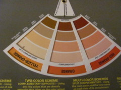
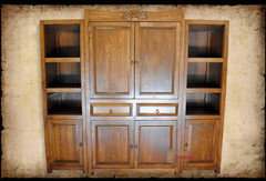
    This is what the TV cabinet looked like before I took out the side panels if I put them back then I have to move the cabinet all the way to the left and it throws the couch placement off??? By the way I am thinking of going into one of the browns on the above color spectrum the one that is kind of in the rug???
  • 13 years ago
    This is what the TV cabinet looked like before I took out the side panels if I put them back then I have to move the cabinet all the way to the left and it throws the couch placement off??? By the way I am thinking of going into one of the browns on the above color spectrum the one that is kind of in the rug???
  • 13 years ago
    I leave 36 inches of floor space from my kiva fireplace before placing furniture. I have matching light and airy-designed wrought iron plant stands (to go with the custom fire screen) no closer than 18 inches from the fireplace.
    On one wall just above the second section, I have a landscape orientation painting to pull the eye away from the strong vertical line, as there is the additional vertical line of a sliding glass door on that wall.
    On the other side, alas, I had to hang a trailing plant to hide the crack in the wall where the fireplace joint meets the wall.

    My fireplace has a hearth made of plain colored tile on the floor, with the center tile cut in the shape to make the "keystone." 8.5 inch tiles.
    I do not suggest you add tiles to your kiva fireplace. You have enough pattern in your rug and carved furniture.

    Furniture options:
    Leave the television cabinet where it is, and return the side panel to the left side only?
    Is there enough room to put both side panels on the left side of the television cabinet?
    I am guessing that the carved table is near the seating for reading? The little bit of it that I can see in your most recent photos look like it is a nice distance from the fireplace.

    What color have you chosen for the middle section of the fireplace? I am eager to hear your decision.
  • 13 years ago
    Wow, perfect!
  • 13 years ago
    I like the color you chose for your fireplace. Very nice!
  • PRO
    13 years ago
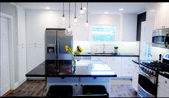
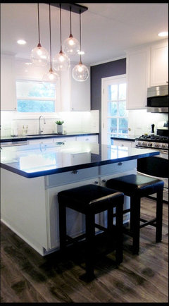
    I think the space looks beautiful but it needs something to ground it. I would try to add some darker tones to make it more rich and pull in the dark fireplace screen, candle sticks, and stripes in the rug. I love these colors that I just did in a kitchen remodel. The dark color we used on the accent wall is Benjamin Moore Stormy Sky. The white is Benjamin Moore Pure White and the other walls in the kitchen (not shown) are Benjamin Moore Barren Plain.
  • 13 years ago
    Thank you I will take your advice - love the kitchen, beautiful clean lines.
  • 13 years ago
    Great Job! Bet you are loving the space!
  • 13 years ago
    Just a thought--I would consider angling the rug toward the fireplace and rearranging the turniture a bit accordingly. I don't know if you would want to do this, but painting the entertainment center to match the walls would deemphasize it a bit--even a light wash might help.
  • 13 years ago
    You have done a superb job; and as a "stranger" to the space your "finished product" (one is never finished I learned) seems to be so warm and inviting. My comment though was to be a suggestion to angle the rug on a diagonal line out from the fireplace. I see that victorianbungalowranch has also suggested this. So it's out there now and with luck, the professionals will have a thing or three to say about that. One last thing: I really liked the crucifix above the fireplace as shown in your original photo. This is a beautiful room! Good luck with the final details. madeline
  • 13 years ago
    Dear Nothing2it: I really like what you have done. However, I do not agree with madelinesdreaming suggestion of white-washing the cabinet - I was going to suggest that you perhaps change the candles to a really rich brown - and also rub a darker stain onto your cabinet. I too liked the crucifex on the front of the FP.

    I am thinking you live in N.M.? IF so, have you taken a weekend in Taos? The Mable Dodge Luhan B&B - which was her orginal house - is a complete jewel of what folks were actually doing who lived there. Everything is NOT S.W. in nature, moreover included a bit of that PacificRim/California Ranch - feel. I love your colors - but do not be held back by them. You CAN add what you like. Rich traditional draperies - layred with confortable pillows - lots of textures and colors on top of colors - fabulous. Do not be afraid to add what YOU really love and not feel like you cannot draw outside the lines.

    A beautiful spindel floor lamp in a dark/black brown? Add a fabulous shade? Go staining the cabinet a darker color? Mixing of woods and textures layers the room and adds a lot of warmnth.

    What I am not feeling are the cold looking grey tile floors - you can also layer carpets - this has been done historically. Perhaps for your room, a larger (so your furniture can sit on it) darker brown carpet to ground your room and then your beautiful rug on top? A textured Berber?

    I like your finished Kiva - lovely - but - having spent a LOT of time in N.M. - I would not overdo. For this style of living - rich simplicity is the key.

    :-) keep us posted. Great job!
  • 13 years ago
    Your room is looking great! You might add some contrast in textures and color. Look at how those turquoise candles pop! Add color and texture with a bigger rug, a coffee table made from an antique carved door.. a large old painted cross or statue of St. Francis to one side of the hearth the.
  • 13 years ago
    Just for the record I did not suggest white-washing the cabinet as fife2 mis-stated in her helpful note above. I think it is great with the other furniture in your room. As to your floor tile I wonder if our monitors are picking up the correct shade, or I should say the shade/color as it is in person. It seems if the tiles were a true gray some of your decisions would have reflected that and at the very least you would've mentioned this. madeline
  • 13 years ago
    I would also go back to one color and possibly accent tiles around the opening or on the hearth top; keeping it simple
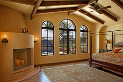
    [houzz=
    Spanish colonial · More Info
    ]
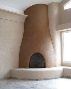
    [houzz=
    Humel Straw Bale Home with Clay Plaster · More Info
    ]
  • 13 years ago
    So sorrry madelainesdreaming - I totally misread that comment - SORRY!
  • 13 years ago
    So sorrry madelainesdreaming - I totally misread that comment - SORRY!
  • 13 years ago
    Please, no problem, fife2. I just don't want to take credit for ideas I couldn't come up with on my own!
  • 6 years ago

    Don't know if anyone will pick up on this since this is such an old original post. I have no Kiva but am trying to find a paint that will be that soft tan/brown that I often see on Kivas when I visit Taos/Santa Fe. There are so many tans or browns and I just love the softness of that color on the Kivas. I realize it won't look exactly like that...I've been told that is waxed and buffed to get that softness? This poster's room looks amazing. I'm wondering if anyone has suggestions for a paint for me to use...a process to use on my walls? I have another post on the site that I'm trying to get a Southwestern vibe going and I need to update that. Anyway, any ideas on the paint or finish would be amazing Thanks.