Software
Houzz Logo Print
shay02_gw

Tile color help

15 years ago

I would love all opinions on tile color choice.

My cabinets are shaker style maple with a medium to dark cherry stain. I have glass inserts on 4 cabinets above my counters for more light. My kitchen is small however it does have natural light. My granite is black with shades of dark greens& browns and some gray, appliances, stainless. I have looked at ceramic tile floors and I am at a loss. I don't want a dark floor however I don't want it too light. I like a slate look however most of the slate is gray and very dark. I get confused about colors that go with cherry cabinets, beige can have pink tones therefore according to what I have read don't do beige, or any shades that have red as they don't go with cherry cabinets therefore that leaves me with golds, greens, grays, browns. I looked at a sample the other day and the sales person said it was too gold and gold did not go with cherry cabinets, no golds with cherry cabinets?

Here is a link of a sample I like and would love all opinions

http://www.fastfloors.com/lp_36351,0,271613/Daltile-Tile-Stone/_/Franciscan-Slate-18-x-18-Woodland-Verde/product.htm#NAV

The two colors I like are Woodland Verde and Desert Crema however I see shades of gold... I wanted to ad that I enjoy this forum, GardenWeb is one of my favorite online sites and I'm very thankful in advance for any and all reply's.

I don't know if my link will work until I post therefore taking the chance it works

Here is a link that might be useful: tile color

Comments (9)

  • 15 years ago

    I like the woodland verde at first glance. Do you have a picture that you can post so that I can see the lighting of the kitchen and visualize the tile?

  • 15 years ago

    Hi Shay02,

    First off, gold colors are beautiful with Cherry stained
    maple. There are 1000s of shades of gold, yellow, golden
    brown... A statement like that is so final and not always
    true. Every room is different and lighting plays a huge
    roll in how colors interact with one another. If you find
    a tile that has a bit of gold in it, it will look lovely.
    Don't let gold shy you from something you love.

    The Dessert Crema and Verde Woodland would be perfect!
    Maybe since you love slate the Verde would be the way to
    go. It has that soft blue and bits of green that look
    gorgeous. I wish I has some images of kitchens similar to
    as you describe but here is what I do have which may help
    you think about your own space.
    ~boxer

    Woodland Verde Fransican Slate Daltile

    Desert Crema Fransican Slate Daltile

    This could be called gold. Too much gold? Not at all I love this look.

    A few links from past GW posts. Maybe these can help too.

    Kitchen Tile floors GW
    http://ths.gardenweb.com/forums/load/kitchbath/msg061811134809.html

    GW show me your tile floors
    http://ths.gardenweb.com/forums/load/kitchbath/msg091530396408.html

    Owners of tile floor??? GW
    http://ths.gardenweb.com/forums/load/kitchbath/msg052256173492.html

    Here is a link that might be useful: GW tile floors

  • 15 years ago

    There is quite a variety of slate out there. I see no problem with warm golden tones and cherry stained cabinets. I would recommend grabbing a bunch of slate samples and bringing them home to try out next to your cabinetry and countertop samples.

    Daltile's Slate Selection

  • 15 years ago

    I'll be interested in what you choose. We are also looking at the Daltile Franciscan collection for our entry way. I like the Woodland Verde and my DH is leaning toward the Coastal Azul. We are having a hard time getting samples because it is a new tile collection. Of course the Slate Selection link that Pricklypearcactus will distract me some more....

  • 15 years ago

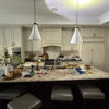
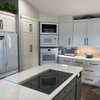
    Don't know if this will help, but when we were adding a "mud room" entry adjacent to our kitchen remodel, we wanted to match (as much as possible), our "formal" entry's quartzite. It is called Goldensand quartzite and is made by Emser. The tile we went with in the new entry is by Daltile-I can't find the name exactly but it is something like golden sun, or some such name with golden in it. Although the quartzite/slate isn't in the kitchen directly, our kitchen is not all the big, and the two sides of it, from the two entryways, are clearly visible and have to "go". Also-our cabinets are natural cherry, so a little different than what you are describing, but I'll post 2 pictures anyway to give you some idea.

    Also-there is so much variation in color (even in the ceramic tile-we looked at that as well), that I would think it would blend just fine. (IMHO)

    This is looking at the kitchen from the new "mudroom" entryway"

    This is looking toward kitchen from existing "formal" (LOL)
    entryway:

  • 15 years ago

    Leela4,
    I love your tile. Beautiful.
    ~boxer

  • 15 years ago

    Ahh, thanks boxer. That means a lot coming from you, as I know you see many beautiful kitchens. (well, we all do, when we look at all the wonderful photos you post)
    The great back story to our tile in our mud room entry is that we originally ordered it from Emser as we wanted it to match our other entry tile. But when it came in, it was too thick to butt up against the already installed maple hardwood. So we returned it, and looked at samples of Daltile's ceramic tile, like Shay02 was talking about above. But we couldn't agree on any of those, so our tile guy proposed getting Daltile's version of the quartzite/slate. when it came, it was also too thick! Arghh!! So our tile guy had a friend, who lives in Arizona (we're in WA state), plane it down for us, for FREE!!(we did pay for shipping, which wasn't too bad). We were ecstatic with it when all was said and done. Persistence (and patience) pays off.

  • 15 years ago

    Persistence does pay off but the fact you waited until you
    found the perfect tile. And it is perfect. The colors are
    subtle that give off a soft warmth to the room. I love
    wood floors but I like your tile even better. And how
    sweet two rugs that mimic the colors. Great kitchen
    with your rich cabinetry and subways gently lining the walls.
    I can not see your countertop but it looks like it has
    some colors similar to your floors. I love it.
    And the books at the end of the island. I think LavenderLass
    was looking for an island just like it.
    Beautiful space!
    ~boxer


    Sorry to hi-jack this thread.
    Any more ideas Shay02?
    I will keep looking for some Daltile images in the
    Crema and Verde. If you love slate colors but do not
    want it too dark maybe the above tile could work for you.
    ~boxer

  • 15 years ago

    Sorry it has taken me so long to respond. I brought home a 12/12 sample of the Franciscan Slate (Porcelain) tile. I loved the Woodland Verde in the store however after I brought the samples home and looked at it next to the cabinet and granite and moved the sample around to the flooring in the LR it was the Desert Crema that matched perfectly. Both colors are beautiful. My first post was confusing. I am remodeling my kitchen and have a sample of my cabinet and a good size sample of the granite I thought I was going to pick. I like a darker granite and now leaning to Angola Black, beautiful sample I brought home.

    Leela, gorgeous tile floor, thanks for the pictures!

    Boxerpups.. I come across many of your threads, you always go the extra mile for folks. Thank you for the pictures and comments
    Thanks to each and everyone for the responses.