Software
Houzz Logo Print
deltabreeze

DR Next Steps?

17 years ago
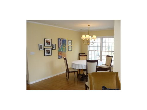
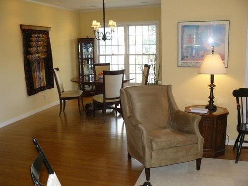
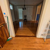
HereÂs my not-big DR before I made many of the suggested changes.

BEFORE

People thought the picture array lacked coordination and that the brass chandelier and large shades didn't work. The gold chair in the adjacent LR (bottom right of the pic) needed re-upholstering.

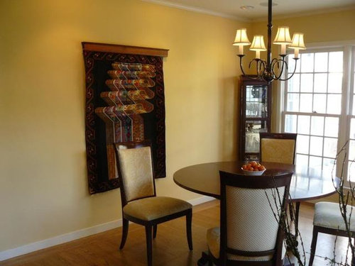
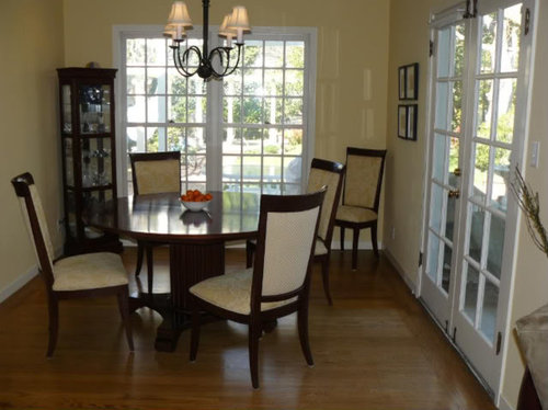
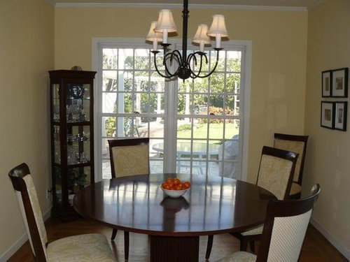
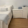
NOW

Note: the tapestry isn't really crooked -- it just looks like it in this pic!


Something is still off. Are the lampshades wrong? Should we move or ditch the skinny cabinet? Also, I need to keep a fifth chair in this tiny room. We could leave it in the corner or put it immediately behind the taupe (formerly gold) chair in the LR (like it was in the BEFORE pic). Your wise suggestions please. . .

Comments (25)

  • 17 years ago

    The new wall art and skinny cabinet really work well in the space.

    On my monitor your dining room look awesome! Since it seems "off" to you, I have two suggestions: 1. switch the extra chair and cabinet (that would spread the heigth and darkness around more), and/or 2. set the table with your linens and dishes (many staged dining rooms do this).

  • 17 years ago

    I would put two pictures with dark frames, perhaps even black and white photographs, over the chair opposite the cabinet, one over the other, in order to balance the heaviness of the cabinet. I would line up the top of the upper picture just below the top of the cabinet on the opposing side. If it were my room I would introduce a large area rug which has some of the colors in it of your marvelous tapestry. Because of the tapestry, which has a modern look, I wouldn't choose anything busy like an oriental carpet. I would try to find one that has brick red in it which would really give some drama and needed color to this area. I'm sorry to say that the chandelier is not what I would have chosen, but if you do buy a rug a lot of the attention will be directed toward that and also the tapestry. I would make sure that these two large pieces coordinate really well. I hope this helps and I'm sorry about the chandelier but that's only my opinion and in real life it may appear very different. A brick colored velvet pillow placed on the chair in the corner might also give added life and spirit to the room. It's a beautiful dining room with great windows and flooring.

  • 17 years ago

    I love the fact you have such great views of the outdoors from your DR.

    Why can't you leave the 5th chair in a bedroom? Assuming you can, then I'd add a tall plant where the tall cabinet is and place the cabinet where the chair is.

    I agree that a round rug under the table would be a plus and if you could lower the light fixture about 6" I think it might give a cozier look to the room.

    While the tapestry is lovely, I think something equal to that size, but hung horizontally might fill up that wall space better.

  • 17 years ago

    Did you measure the distance from the very bottom of chandelier and the table top? Just wondering what that number is.
    It's a pretty room.

  • 17 years ago

    I think the curio cabinet on an angle crowds that corner and it would fit on the wall on the other side of the windows where the fifthe chair. I would try it there.

  • 17 years ago

    On my screen the Right side wall space looks a bit wider than where the tall cabinet is now, and looks as tho the cabinet would fit perfectly there. That will also give height on both sides of the table. That wall hanging is wonderful, the color, texture and design movement! Your new armchair fabric makes a dramatic change from the gold. Love it! And your dining chair fabric is so perfect with the wall color. I agree, with an upright plant in the small corner, for the outside in connection. What a great space with all the doors and window. Love it. Oh what is that behind the arm chair, pussy willows? Perfect to try in the left corner! Well done!

  • 17 years ago

    Thank you everyone for your thoughts.

    Many of you, including Betty and palimpsest, suggested swapping the chair and skinny cabinet. ThatÂs how it used to be, but the feedback I got was that the tapestry needed something tall along that long wall. If I can figure out some other place to put this extra yellow chair, as monablair suggested, I will try putting a tall plant where the chair is currently. If not, I like IngridÂs idea for two extra pictures (I think I have the frames already) and a pillow on the chair.

    Many of you commented about the height of the chandelier. I think this is a quirk of the picture; the chandelier is 30 ½ inches over the table -- really a perfect length. And Ingrid, no worries about critiquing this chandelierÂit is just the old one refinished! I am thinking that if I could find more modern style shades, maybe drum shaped, it would be good. What do you think?

    A number of you mentioned a DR rug. I am open to the idea, but given the size of the room, I am not clear how it would work. Plus, take a look at the other side of the room. Do you think a rug would be a good idea?

    Finally, Bodica, I donÂt know what kind of dried stems these are. They were a mistake purchase that found a home in the DR!

  • 17 years ago

    Wow! Your home is just beautiful!

  • 17 years ago

    I remember your living room it is just lovely!
    The dining room looks like a conservatory to me, so gorgeous.
    I like it as you have now, but a rug would be nice too, probably similar to the one you have in the living room.
    And I need to ask- what is the arbor that we see out of the DR window? It is gorgeous and can we see pics of it? or point me in the right direction in case my feeble brain just can't remember seeing it before!

  • 17 years ago

    I too noticed your arbors through the window, and would love to see some pics!

    I think your tapestry is really great. And I love how your home is so uncluttered and elegant. It looks peaceful and like a place someone could think in! And I love your red print chairs and how the colors are picked up in the art above the piano and fireplace.

    As for the dining room, I would look for an interesting bowl to put on top of that corner cabinet to bring the height up, and I would hang those two pictures, one on top of the other, on the other side of the end window, over your extra chair to balance that, as I think someone else suggested.

  • 17 years ago

    I agree that a rug is needed, especially if you don't have WT's.

    About the cabinet: maybe the consensus was to move it, but now having seen it in the small corner, it looks a bit crowded.

    I think you should move the tapestry higher on the wall.

    The dining table needs something larger/wider as a centerpiece.

    Your LR/DR are awesome!

  • PRO
    17 years ago

    I love your house, the windows are great and your black piano looks so nice on the wall color. I think the dining room could do without the curio cabinet. It is too tiny compared to the wallhanging, they just don't look right, IMHO. Also the shades on the light fixture are just a little more traditional than the rest of the room. Maybe shades shaped like the large ones in the living room? Or just a different fixture?

  • 17 years ago

    Really really lovely room!

    Yes -- just a couple of artworks over the extra chair will balance out that view very nicely!

    Maybe a larger wood bowl full of fruit (great idea BTW!) might work a bit better.

    Perhaps "something" (maybe a dark box or urn) on top of the cabinet with some basic ivy might work?

    The tapestry is gorgeous! :)

    Jan

  • 17 years ago

    Thanks for your help.
    Skinny cabinet -- I will try to find a new home for the spare yellow chair and then experiment with either moving the skinny cabinet, or beefing up its top. If the chair stays, it should have a pic on top and a red cushion on the seat.

    Table and floor -- I like the idea of a larger bowl for the table. As far as a rug goes, I have some extra FLOR carpet squares leftover from the LR and will experiment with putting them down in the DR. The room does have a bit of a hard feel.

    Tapestry  I will photoshop this change and see if it would improve matters. (I know that this art isnÂt the perfect piece for the room, but it has sentimental meaning for my family.)

    Chandelier -- I think the silly, too traditional, chandelier shades are part of what is Âoff" about this room for me. I am looking for slightly larger ones in a drum style or (SallymoÂs suggestion) a style that mimics the shades in the LR. Do you think I should keep them off white -- or do a pattern?

    The yard-- Is small, but usually quite pleasant. Unfortunately, it is cold and rainy and barren right now. IÂd be happy to post pics later on.

  • 17 years ago

    Your home is absolutely beautiful and I think you did a great job with your improvements. Good for you for refinishing your lamp! I really like the tapestry too.

    I would put the DR corner cab in the righthand corner and then I'd put a tall plant where it had been. Or a medium plant and row of pretty plates hung in a vertical line. I'd put the spare chair somewhere else nearby.

    How about something a little beefier for a centerpiece? Here's some fun ones I found. Maybe they'll inspire someone...maybe me!

    Or maybe Michaels has a fun Easter or spring one? We deserve a treat, don't we?

  • 17 years ago

    deltabreeze- by any chance can you see your Front Door from the rooms you have posted here. If so, you would please post more pics....Asking to get a couple of ideas for my own home. Your home is very lovley!!! Thanks

  • 17 years ago

    i tend to think that the curio cabinet crowds the corner also..but the woods are great together..i would find a different spot for the curio..and some of your other furniture arrangements are a bit odd..esp blocking the fireplace with the table..not a good idea.

    the rooms are confusing me just a little bit..it seems you have a room with the piano adj to the room with the fireplace? and that the fireplace should really be the LIVING ROOM, and the other area..music room is fine.

    Myself i would center the rug in front of the fireplace and put the sofa and chair grouping in front of the fireplace..leaving the rocking chairs in the MUSIC room area..do you have a television in these areas? I didn't see one..try the sofa maybe facing the fireplace with the rug centerd..put a red chair on either side of the sofa..

    or place the sofa and 2 chairs facing each other on either side of the fireplace with the leather chair facing the grouping..

    or place the sofa facing the fireplace with the 2 red chairs on one side and the leather chair and a table and lamp on the other side (probably the french door side)..

    try the two rockers with a table between them and a lamp where the sofa is now..and maybe the leather chair on the other side of the room with a table and lamp for a reading nook, and maybe with the ottomon if it looks right with it.

    you might find a small empty wall to put the china cabinet on where it isn't so crowded..or maybe you could put it in the Music area on the right side of the piano wall..with the leather chair and a small table and make a reading nook like that..??

  • 17 years ago

    I love your DR chairs.....do you know the brand? I have been looking for something similar...Thanks....and your rooms look great.

  • 17 years ago

    Oceanna, I absolutely LOVED the centerpiece you posted by using lemons, limes, and sunflowers.....what a bit of freshness and could be done on a budget....thanks for sharing~

  • 17 years ago

    The homeÂs layout was unorthodox when it was built in 1940
    and has gotten more so over the years.

    In the pic below, I left the black front door wide open. The room to the left of the front door (used to be a bedroom) has red walls and a grey couch. It has the tv and many, many musical instruments.

    As you can see, the area in front of the fireplace is a major traffic zone and doesnÂt have any windows. As a result, we use this space for occasional reading, but use the area to the right of the front door (with the light colored rug) as the main LR.

    Here is the view from the LR up to the stairs.

    and here is the layout. The drawing looks odd, but it is to scale.
    The quirkiness of the house makes decorating difficult, but it does give us great light!


    \ src="http://i227.photobucket.com/albums/dd225/fromthebronx/P1030523.jpg"; border="0" alt="Photobucket">

  • 17 years ago

    Beautiful home!

    Red

  • 17 years ago

    phogie, the DR chair and table were from Ethan Allen -- but they are nearly 20 years old. (Actually, virtually everything in my LR and DR is at least 15 years old. The FLOR tiles and lamps are pretty much the only new stuff in the room.) Also I don't know if this is true, but I have heard that modern Ethan Allen furniture isn't quite as good as the old.

  • 17 years ago

    i see what you mean, have you ever thought of closing off the wall to the right of the front door that goes into the living room??? it is really breaking up that fireplace wall..it really looks like you don't need that opening there..and if you did close it off, you could use the opening on the hall side for a NICHE..of shelves..and just close off the living room side with drywall and paint it out..that would give you a better seating arrangement area around the fireplace..i have a corner fireplace and they are awkward anyway..let alone with a door on each side !

  • 17 years ago

    Your house is lovely; I especialy like your living room.
    Swapping the cabinet for the chair seems like a good idea. Alternatively, it looks like the wall the tapestry is on might be wider than the wall with your french doors; if so, is there room for the cabinet to the left of the tapestry (near the light switches?).

    Overall, trust your instincts; it's clear that you have good taste & a good sense for how to work with your space. Things that look 'off' in person may look good in the picture, and vice versa. So if the cabinet made sense in that corner before, that may well be the best place for it, even if the online photos made folks think otherwise.

  • 17 years ago

    OK, I stayed up way too late last night moving stuff around. I will post new pics soon. Thank you all for your thoughts and encouragement. This really, really, helps.
    Ronbre, your idea of walling up that space makes a lot of sense and I would do it in a minute except that the entry is already extremely narrow. In the pic below, you can see the solid front door and the glass doors that separates the hallway from the red room/den.