Software
Houzz Logo Print
singerslew

The kitchen is painted and I'm not feeling it...

15 years ago
Hi all... it's been a while since I've posted.

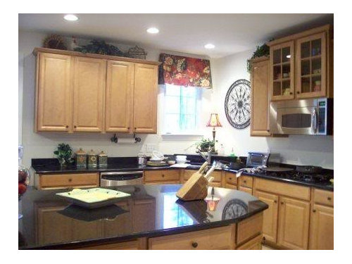
We recently put up a backsplash in our kitchen after almost 3 years of being in this house. We love the backsplash as soon as it went up, but it definitely made the walls look very stark. I had the owner of the local Benjamin Moore paint store come over for a color consult and she suggested powell buff as a good neutral color. I put the paint swatch up on the wall, but it was booed by DH, my in-laws and some friends. One friend suggested I go in a completely different direction and go for some color since my kitchen gets very natural light. She also said that since my furniture and accessories are all muted colors, a brighter color on the wall would liven things up. I went back to the Benjamin Moore store and got a few greens on the wall and finally settled on "sweet daphne." My breakfast room is painted BM "currant red." It's only been up on the wall for 24 hours and I know paint has to "cure" for at least a week, but I am not loving the color. I wonder whether I should have gone with something more neutral?

Here is the kitchen before the backsplash and paint (I've posted this before):

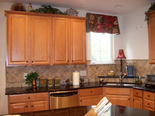
Here is the kitchen with the backsplash:

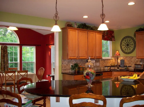
Here it is with the paint:

View with the breakfast room:

What do you guys think? Any suggestions?

Comments (37)

  • 15 years ago

    I like it a lot. It's quite a change so maybe you're in shock, LOL. Live with it a while.

  • 15 years ago

    I would live with it a while and try to analyze what you like about it and what you don't like about it before repainting. Sometimes it is just the 'shock of the new'.

  • 15 years ago

    Powell Buff is one of my favorites and I think it would look great. I'd give this a chance but if it just doesn't speak to you after a week I would give Powell Buff the nod.

  • 15 years ago

    I LOVE the addition of the backsplash - and I like the "daphne" color , but together I think they almost clash. sorry.

    I see blue in the backsplash and wonder how a a blue would look on the walls - and the cabinets seem to lean toward an orange tint - blue and orange colors together make each other POP.

    Now you may think blue in the kitchen and red in the eating area might look a little too patriotic - but I am talking about a paler blue color - my favorite new blue color is EK H2AHHH! I am using it in my den/eating area/sunroom (large combined open space) it is YUMMY!!

  • 15 years ago

    Lovely kitchen, and wonderful backsplash. What a great addition.

    I have no issue with green, but honestly, this feels too 'acid' to me. Is there a green in the valance fabric, or drapery fabric in the DR, that you could put on the walls? Not dark, but more brown-toned, or warm olive rather than acid.

  • 15 years ago

    gracie and pal - DH has asked me to live with it for a couple of weeks before doing anythings else.

    lisa- any blue you might be seeing is probably residual from the camera. The backsplash is very neutral.

    les- there are a few greens in the valance fabric, but they are darker than I would like to go. Honestly I have been looking at green paint chips for 3 years and couldn't make up my mind. Here are a couple of photos of the fabric:

    Any ideas?

  • 15 years ago

    I should mention that I had this same fabric in my previous kitchen, which had dark cabinetry. We painted the walls SW Restrained Gold and it all went *perfectly* together. The Restrained Gold does not work in this kitchen at all because of the poor lighting and lighter cabinet color. I am open to doing some sort of gold color, but was concerned that it would look to much like my flooring.

  • 15 years ago

    i like it!

  • 15 years ago

    I'm a HUGE fan of green and love it. I think it looks amazing. Like others have said, going from a neutral white to color can require an adjustment. I'm another who votes to live with it for a bit and see if it grows on you.

  • 15 years ago

    Remember, you don't have to match the color exactly, find the one that matches and then work up the card from that to a lighter shade of the same color.

    I would think either the lighter grey-green in the leaves, or the olive green that is the stems of the cherries, splotch on the one leaf by the cherries, and a long ribbon of olive green nearby.

    I would be a little leery of blues - they may bring out more orange tones in the cabinetry.

    Looking at the larger shot of the valance, it appears that you have a solid color on the ends - is it a green? What about a lighter shade of that green?

  • 15 years ago

    Hey Southernfrenchie!

    The backsplash looks sharp! I'm not loving that shade of green. It looks ok but I agree with Les about it's rather acid looking. The paint color looks more "fun" in your room and like it doesn't pair as well if that makes any sense.

    A color that comes to mind that would look nice is BM Hancock Gray (it's green not gray).

  • 15 years ago

    Our kitchen is somewhat similar to yours in several respects (wood cabs, travertine backsplash,and dark countertops). We just painted our walls SW "travertine", and like it a lot. Our travertine is Vino Gold. I've taken a quick closeup of it which looks quite blue, I have no idea why; it doesn't lok this way IRL. I included another photo taken earlier which doesn't show the paint but you can judge if our trav is a similar color to yours. Good luck with your color change, if you decide to change the green.

  • 15 years ago

    Lovely kitchen! On my monitor the green doesn't seem to go with the tile. It's hard to suggest a color because your cabinets are a totally different color in the first picture than in the rest of the pictures. I'd have to sit there with the color fan decks and see what would work with the tile and the cabinets.

  • 15 years ago

    I have never been a fan of green, especially that green, but I LOVE the way it looks in your kitchen, especially with the red.

  • 15 years ago

    I would give it a chance as well. If you truly don't love it, I would try the Powell Buff... doesn't that have a green undertone? Another good color is Laura Ashley Gold #2. I used that in a previous kitchen and loved it.
    Beautiful backsplash!!

  • 15 years ago

    It appears on my screen that the tile has pinkish/muddier undertones and the green has cleaner undertones - the two are fighting each other. I don't really like to use the term "muddy" but I think it is easier to understand. I think a green with brown undertones would work best. It will probably look very brownish/muddy on the paint chip but will look lovely and bright once up on the whole room. Try getting a sample and painting on several poster boards, then post them around the room so you can get a good feel. I think the backsplash looks really good with the cabinets and counters and you are well on your way!

  • 15 years ago

    Hi!

    My kitchen has similar elements to yours. I like your green. I would give it a week and see if it still bothers you. Here is my green, it is SW Bamboo Shoot. I love it.

    Elaine

  • 15 years ago

    i think i would have gone with a more neutral color---wouldn't compete with the red and would better complement the backsplash. i'm not familiar with powell buff. i probably wouldn't go too light with the color since your cabinets are so light...(or at least look it in the 1st picture...)

  • 15 years ago

    I really like it - the green and the combination with the red. But then again, I like bold colors.

    Does the tile backsplash have any green hues to it?

  • 15 years ago

    I think les917 & greenmtn are right on the color...but if DH doesn't want to go through painting quite yet, give it at least a couple weeks. During that time, you can be evaluating paint chips. Powell Buff could be good, keeping it neutral with your valances as the pop of color, but if you want to give green another chance, check out limesickle 2145-50, fernwood green 2145-40, and guilford green HC-116.

  • 15 years ago

    I have powell buff, but with white cabinets. It is a gold with a very slight green undertone. I think this suggestion was made because of your red breakfast area. Looking at the kitchen alone, the green looks fine. When you zoom out and see the red and this green together, there is something just a bit off about it. But, I agree, live with it. You can always repaint in the future. All is all you have a lovely kitchen.

  • 15 years ago

    Looking very, very closely at the colors in your fabric swatch pictured above -- I would pick the color of the pale taupey-brown leaf -- which is an exact match to the tones in your backsplash.

    Just a thought!

  • 15 years ago

    Take a look at SW universal khaki.

  • 15 years ago

    Totally agree with Les about the color. I have never heard the term 'acid' but I love how it perfectly describes the color!

    What I'm seeing is a very cool green next to a warm red, and to my eye, it's just uncomfortable. Also, IMO, I think the valance now looks out of place since it's the same tone as your red walls which does not go well with that shade of green.

  • 15 years ago

    Wow! Thanks for all your comments!

    Shee- i know what you mean about it being too fun. I think the green is pretty, just not in this kitchen.I will take a look at hancock gray.

    susanka- our kitchens are definitely similar. I love your backsplash - and the SW travertine is very pretty on your walls. How nice of SW to come up with no-brainer paint name like that : ).

    loribee - I will take a look at the laura ashley gold #2. I actually have it somewhere in my paint chip drawer.

    mom2seth- that green looks really nice in your kitchen. I think it works well because you have a more modern look.

    busybee - the fact that green competes with the red is probably what bothers me most about it.

    binsd- the backsplash tile is very neutral. It has no green, no pink and no blue undertone. Maybe some goldish tones, which is probably why it works well with my floor.

    jessica- I've actually looked at all those greens - they're beautiful. Unfortunately, they seem to fight worse with the backsplash than this green does : (

    ellendi - I might have to give powell buff a second look.

    teacats and kitchentime - thanks for the suggestions !

    So, what I've come to realize in all this is that this green gives the kitchen a more modern look. Obviously, I am a traditional french country girl at heart. I think I'm ready to put green behind me and go for some sort of neutral color. I am open to any cream, beige, taupe, gold suggestions ya'll might have.

  • 15 years ago

    I'd also be inclined to look at neutral colors for your kitchen.

    Green is a hard color to get right. We painted dh's new office BM Misted Green. It served as our temporary kitchen during the remodel and the green was beautiful with the white items in the room at that time and no window coverings. When we moved the office furniture in and hung wooden shades the color changed.

  • 15 years ago

    (I'm no expert, but) I agree with Greenmtn: It appears on my screen that the tile has pinkish/muddier undertones and the green has cleaner undertones - the two are fighting each other.

    1) undertones are mixed: I sense a pink undertone in the backsplash, and a yellow undertone in the wall color.

    2) watch the 'clean' vs. 'dirty' color shift.

    from Maria Killam's 'Colour Me Happy' blog: Colour, fundamentally, can only be described in three ways, it's either Light or Dark, Clean or Dirty, Cool or Warm, period. And it's the clean/dirty shift that causes the most disharmony in a space, it mostly doesn't work which is what I also teach my students.

    Here is a link that might be useful: What Everyone should know about Beige!

  • 15 years ago

    Take a peek at BM Desert Tan.

  • 15 years ago

    I love your backsplash, but I don't think I am feeling the paint color (with that backsplash) either.

  • 15 years ago

    We went with a travertine-look porcelain in our bathroom and found paint choices almost impossible. I had originally envisioned a green and spent a ton on BM green samples without success. Ended up with Powell Buff. It definitely worked best.

  • 15 years ago

    I went by the BM paint store today and talked with the owner. My heart is definitely pulled toward the strip with the cork and desert tan. Right now the cork seems to dark and the desert tan seems a tad light. She suggested I try samples of the cork 50% lighter and the desert tan 50% darker. Anyone done this before? I am also looking at golden tan, golden straw, barley and westminster gold (which I believe is concord ivory).

  • 15 years ago

    I agree with the clean-dirty shift especially in this case. I did post to live with it initially, but I also agree with the "acid" comment, somehow the strength or purity of it is "diminishing" your backsplash, unlike Mom2sethc's similar but "dirtier" green.

    I sometimes stay out of these color decisions because I have ways of thinking about color that are not easy to explain or popular, but one other way I look at color schemes are whether they are 'Paint-based" or "contents-based" and by choosing a strong color for the walls you shifted to a paint-based scheme, meaning that the wallcolor takes precedence over the other elements of the room. This can be done properly, but I think it often is notoo successful. If the furniture (or cabinets) are very neutral, there is a thought that almost any color (in theory) can work, yet I think when this happens the undertone of the neutral or the saturation of the paint are not taken into account and there is some loss to the overall outcome as a result.

  • 15 years ago

    pal - I feel honored that you are jumping into this color discussion then : ) Am I to look for a dirty yellow then?

    I probably wanted a contents based theme and didn't know it until you just said it.

  • 15 years ago

    I adore green and have it in almost every room in my house (in one way or another) but agree that that green doesn't compliment your beautiful backsplash. As a few others have suggested, I would look at more of a grey green/or a green with a brown undertone. Maybe something like LA Olive 2 or SW Grassland or even a golden color like SW Believable Buff

  • 15 years ago

    I am not usually a fan of the color green, but I really like that shade in your kitchen. You might want to try living with it for a while. It is a big switch from white and it might grow on you.

  • 15 years ago

    I think a dirtier green with yellowish undertones would work, yes. Too yellow and it might make the cabinets or tiles start to turn pinkish. I think the primary thing that *isn't working with it is the backsplash. The cabinets seem to stand up to the current green well. My primary coordination would be to get a color that works well with the backsplash. Even if it doesn't "match" something in the fabric, you still may be able to keep the valance, as someone said, because those colors interact with each other within the fabric anyway.

    (For example I have a rug that has an intense bottle/kelly green in it, and one that has pepto bismol pink-- matching either of those to a wallcolor wouldn't work because you don't "read" either of those colors when you look at the rug as a whole. The individual colors in the fabric leaves vary a lot upon inspection but they read as a leaf with highlights and shadows--a sum of individual parts rather than the individual elements themselves.)

  • 15 years ago

    SF,

    I have both the Desert Tan and Cork in my home. They are both great colors but the cork is much bolder. I really think that the DT will be enough color - I would definitely give it a try. Then, if not, try making it deeper as the BM guy said.