Software
Houzz Logo Print
sreedesq

Difference b/w BM Carrington Beige and Manchester Tan?

13 years ago

Hi,
Can anyone tell me the difference in how Carrington Beige and Manchester Tan read? They look very similar on my screen. I am looking for a nice light tan/khaki color to go with White Dove trim. I want something that doesn't read gold. TIA!

Comments (23)

  • 13 years ago

    I don't know the difference between the two but I just painted my kitchen Manchester Tan and it really cuts out the yellow that I was getting from the previous paint, which is what I wanted. It looks great with the White Dove that I'm doing on the trim. I may go even lighter still with the paint but I'm taking baby steps.

  • 13 years ago

    My laundry room is Manchester tan; when I initially started painting the room, it appeared gray, but after completing the room it is a very light tan (no golds). It's one of my favorite neutrals. Carrington Beige appears a little darker on my screen? When I'm undecided I ask the sales rep to tell me what colors are in the formula. I recently was trying to find a light blue (but to me it had a lavender hue?) When I asked the rep, it DID have a color in the mix that would have appeared slightly lavender once painted.

  • 13 years ago

    I think CB may be a little lighter than MT. I have Carrington Beige in my kitchen. It plays nicely with the other colors in my backplash and granite (very quiet) and doesn't look gold. I know CB is available in the small pint samples. I don't remember if MT is too, but that's a pretty inexpensive way to check the colors in your lighting.

  • 13 years ago

    How does Carrington Beige compare to Shaker Beige.

  • 13 years ago

    Shaker Beige looks a little more flesh colored to me. When I said the pint samples above, I actually meant the 2 ounce samples, the little ones that are already mixed.

  • 13 years ago

    The wall paint I intend to use is Regal Select Eggshell. I purchased a color sample of the Manchester Tan and we think it looks muddy and darker on the wall. When I hold up the paint chip to it, it reads more Carrington Beige (which looks slightly greener to me) than Manchester Tan, but darker than both. My issue now is: Is this really how Manchester Tan reads and should I try to find a lighter color OR is my color sample off again. The colors in the sample are Y3 (4.25), S1 (1.13), S2(.63), and R1 (1.69). Two blacks seems like a lot to me for this shade that I believe has a LRV in the upper 60s. Does anyone know if those same colors are in the full gallon? Or, can anyone suggest a great neutral shade that is lighter than Manchester Tan that goes well with White Dove trim? TIA.

  • 11 years ago

    Even though my comments are well past the initial posting of this question, it may be helpful for others who are interested in Manchester Tan. I just painted an entire house (for staging) in Manchester Tan with White Dove ceilings and trim. Depending on the lighting in each room, Manchester Tan can look tan or it can look grey. It really is a perfect color. No yellow, pink or lavender undertones. The only minor criticism I have is that it is very light and I might have preferred a shade darker. Fortunately, I picked White Dove as the trim so there is contrast. Also, regarding Shaker Beige, it does have pink undertones. It is a perfect match to Crema Marfil Marble. It's very fleshy looking and the only reason I used it was to blend a very thin wood trim to my marble walls.

  • 11 years ago

    We painted the open plan areas on our main floor Carrington Beige. That includes the kitchen, keeping room & LR. Also ran it up the staircase & through the 2nd story hallways.

    I'm really happy with it. Agonized for weeks over this color choice and tested samples all over the house in different light. My goal was to have a neutral that would look good throughout our 4 distinct seasons. It isn't too cool looking in winter yet has a fresh feeling in summer heat. IMO, it reads more green in tone than the beiges mentioned above.

    We used BM Simply White for our trim. Even though Carrington is a subtle shade, the mantel, wainscoting and wood trim do pop.


  • 11 years ago

    whiterabbit - What is your house like? Is it an open floorplan? Tall ceilings? I have an open floor plan with 12' ceilings and I've wondered about Manchester Tan. If you have 8' ceilings and a more closed plan and you think it's light then it would really look light in my house. If your house is similar to mine then it might still work.

  • 11 years ago

    I can't comment on Carrington, but I have Manchester Tan in a bedroom and I'd describe it as a neutral linen/putty color. No gold at all. It has the slightest green undertone, but it's almost undetectable. I really like it.

  • 11 years ago

    OP here 2 years later lol. Neither Carrington or Manchester worked for me. I used Muslin and couldn't be happier....

  • 11 years ago

    sreedesq - How did Muslin differ from Manchester? I actually just ordered a few samples and Muslin and Manchester were two that I ordered. If I had seen this post earlier, I would have order Carrington also. I have a feeling it may work better with the warm tones in my house.

  • 11 years ago

    Rose, it's hard for me to remember, but the Muslin was softer (and this may be an odd adjective) cleaner to my eye.

  • 11 years ago

    Oops, sorry I missed this was an old thread.

    Msrose - I don't have a sample of Muslin, but it's been on the paint todo list. I've read often that Muslin has a slight pink undertone and Manchester has the slight green. I believe Muslin is a tad lighter and has been described as 'linen' in color. You'll have to let me know what you think of them. I hope one of your samples works out.

  • 11 years ago

    Lori,

    As always, this is so helpful! Can I add one more to the mix.....SW 7542 Naturel.

  • PRO
    11 years ago

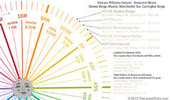
    Here ya go.


  • 11 years ago

    Thank you!

  • 11 years ago

    What a great thread as I want to repaint my Master Bedroom. Thank you!

  • 11 years ago
    last modified: 11 years ago

    Wow Lori, that is awesome! Can you comment on AF-80 Jute? I have to choose one for the whole house and don't want to make a mistake, my cabinets are Mascarpone AF-20 and Jute makes it pop very nicely, but Carrington Beige is a warmer tone. I find that Carrington does not make mascarpone pop as well... it kind of turns it more yellow, whereas Jute keeps it whiter and creamy. But my concern is that I won't know how to decorate with Jute. I am going from Ralph Lauren's Somerset yellow to very little color at all in comparison :-)

  • PRO
    11 years ago

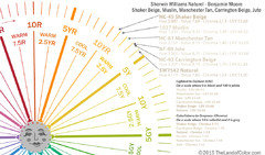
    Sure. Here ya go. You can find color notations for the entire Affinity color collection here: http://thelandofcolor.com/get-color-notations/.

    Also, if you're working primarily with the Affinity colors, you might find reordering the fandeck according to hue family extremely helpful. I walk you thru how to do that here: http://thelandofcolor.com/use-color-notations-create-color-schemes/

    ...and before anyone calls me out. :) I know I have in the past offered up some harsh criticism about various methods hinged on taking fandecks apart and putting them back together in some kinda whacky-ass order. When fandecks are arranged in spectral order (ish), ROYGBIV (ish), you should leave them alone because the spectral order does provide a certain degree of guidance. The Affinity fandeck, however, is not in spectral order to begin with -- so, that's why I suggest taking it apart and putting it in order by hue family.

    The Affinity colors all fit into a particular range of nuance. If they're "your kind of colors", it is possible to do an entire house inside and out, top to bottom just using that one fandeck -- especially easy to do if you put the chips in hue family order.

    Hope that helps.


  • 11 years ago

    Oh no! Now I'm wondering if I need to try Jute also :)

    I painted sample of Muslin and MT yesterday and I think I like MT best out of the two. I was trying to decide if I want to get a sample of Naturel today, but then I ready where a couple of people online mentioned it looking grayish and I definitely need a warm color without gray. Is there something above that would tell me if it leans gray. I'm looking at the Chroma, but MT is a lower number than Naturel, so I'm not sure if that's what I need to look at or not. MT looks warm to me.

  • PRO
    11 years ago
    last modified: 11 years ago

    Is there something above that would tell me if it leans gray.

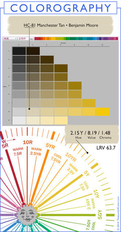
    You are correct. Chroma tells you how close to a neutral white, gray or black (the grayscale) a color is. It's called the whiteness, grayness or blackness characteristic of a color.

    MT's Chroma is 1.48 and Jute is 1.42. So Jute is just a snidge more grayed than MT. Or you could reverse it and say MT is just a snidge more colorful than Jute.

    Sometimes when people perceive a characteristic of grayness they'll call it a "gray undertone". When they perceive a characteristic of whiteness, they'll sometimes call it "chalky". Whiteness, grayness, blackness is not only technically correct, I think it's a lot more specific and simpler.

    As far as warm and cool, every color in context of its color system can be categorized as inherently warm or cool. In the example above, once you get to the 5Y mark in the yellow hue family, the colors start to shift to the cool side. Every color in a color system has a warm side and a cool side.

    With color temperature, odds are the inherent color temperature of a color will hold true. But context matters, the light matters. In situ with other contents of a room, a color that's warm in context of its color system could take on a cool role - or vice versa a color that's inherently cool could take on a warm role.

    Here's the Colorography for Manchester Tan. Puts the color in context of its hue family and illustrates chroma; maybe makes the whiteness, grayness, blackness scale I'm talking about easier to see/understand.

Sponsored
Haus Studio
Average rating: 4.8 out of 5 stars28 Reviews
Franklin County's Preferred Custom Cabinetry & Design Studio