Software
Houzz Logo Print
gena_hooper

Colors/countertop help (pics)

16 years ago
I'm getting myself all confused and cross-eyed so I'm throwing this out to you for feedback.

I started out wanting antique heart pine and soapstone counters. I decided against the pine. Despite others' success with wood, I'm too anxious about water damage around the sink. I considered soapstone everywhere, but I don't know. Worried about its being so dark for our narrow space. And Boston has so many gray days (like today).

My husband went to a granite yard the other day and fell in love with honed Imperial Danby. He brought home a sample, and I love it too. Especially love the texture. Yum! And it has some slight orange-y veins that pick up the antique heart pine (that we'll use as flooring) perfectly. I don't know. I never thought of myself as a marble person. It seemed so formal. Again confused. Too many choices.

Sweeby test: light, simple, warm, slightly weathered, touchable!, inviting, not contrived

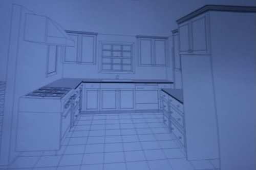
Here's the kitchen. Ignore the hood. Not right. The uppers flanking the window will have glass doors. The range is a black Aga Legacy. Sorry about the image quality. It's a photo of a drawing.

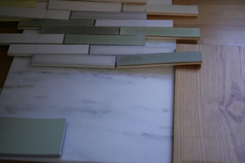
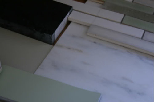
Here is the marble with my backsplash, the pine, and F&B Cooking Apple Green:

Here is the marble with backsplash, F&B Cooking Apple Green, and the Old White/soapstone we're thinking for the fridge wall. The marble would then be on the L run only.

Thoughts? Are my choices too...formal? precious? cold? I spread bread crumbs on the marble, and it looks fine. (We're a messy family, and despite my efforts to change, will be messy.) Suggestions?

We'd been thinking about F&B Ball Green for the base cabs on the L-run, but I think the marble brings the Cooking Apple Green back into play. It looks really fresh and crisp. But very green. The Ball Green is earthy and more muted.

(Caveat: We still have to do the sealer and stain test. If it fails, we'll have to move on. I don't worry so much about etching. The honed Danby already has kind of a texture to it. Just lovely! I did scratch it with a knife. It scratched about as much as the soapstone. The Monte Blanc quartzite he brought home didn't scratch at all.)

Comments (37)

  • 16 years ago

    Pickle,

    Love your ideas and especially the backsplash tile. Another paint color for you to consider for the cabinets is Benjamin Moore #480 Lilly Pad. I have just painted my cabinets - absolutely thrilled with the look. Fresh but subtle. I used Porter Paint's Glyptex semigloss oil paint, had them match the BM color. BTW, LILLY is the correct spelling. What were they thinking!

    The marble is wonderful - honed makes it even better.

    Rosie

  • 16 years ago

    I think your choices are timeless.

  • 16 years ago

    Thanks!

    Rosie, I appreciate the suggestion. I'm going to look the color up in my fandeck.

  • 16 years ago

    Lovely,
    I think it all goes amazingly well.
    Don't second guess. Go for it!!!
    Formal? Not at all. It is gorgeous, elegant, classic
    but the green pulls it down to reality.
    Definitley matches your words :

    " light, simple, warm, slightly weathered, touchable!, inviting, not contrived ."

    Again I say Lovely choices. Go for it.
    ~boxer

  • 16 years ago

    Doesn't seem too formal to me...The pine floors, I think, will set the tone for you. I love your mission statement/goal.

  • 16 years ago

    I love everything!!! Really!

  • 16 years ago

    I think it looks amazing. And just what your Sweeby test describes. And that backsplash, as I've said before, yum. All together, beyond yum.

  • 16 years ago

    Dear pickle2, I adore all of your choices. They are seem to work so well together. It looks classic, but not formal. The greens and natural textures of the wood, soapstone and marble give a warm feel, even if some of the tones are cool. (Hope that makes sense.)

  • 16 years ago

    Thanks, everyone. I'm feeling more secure about the marble. It was not a choice that I'd expected. We still need to seal and try to stain the heck out of our sample though. I hope my kitchen meets my mission statement. I guess this is the downside of flying without kitchen designer.

    Next up is final color choices. We have to go ahead and order paint. So...I'm thinking of doing the L-run base cabinets in a green and all the fridge wall cabs in putty (Old White).

    So which green? Cooking Apple Green leans pastel, but is cheerful and fits the 1930s era of the house. Takes the look more cottage/vintage. Ball Green is more grayed and takes the look English farmhouse. Pastel is bad, right? Or...not?

    Should the glass uppers flanking the window be the same green as the base? Or the putty of the fridge wall to bridge the sides?

    And the hood is going to be painted wood with an antique pine trim/ledge. Should that be the wall color? Sink upper cab color?

    So many questions. Maybe I need to flee to a decorator after all...

  • 16 years ago

    I love ball green so I would lean that way but Apple is
    fun too.

    Yes match those uppers flanking the window to the green base.

    I like the hood you describe. I think matching the cabs
    would look best.

    You are your decorator! Don't give up, you have done
    so much already and you have amazing taste!
    ~boxer

  • 16 years ago

    Boxer, you should be a motivational speaker. Thanks so much.

    Oh, and Rosie, I looked at Lilly Pad. Beautiful green, but I think it might lean a bit too blue for my backsplash. Would love to see photos of your kitchen!

  • 16 years ago

    Pickle, I think you are feeling "it". Doesn't it feel good? Sometimes it's so exciting watching the creative process happen here on the ole kitchen forum.

  • 16 years ago

    Do you show both greens up above? I only see the Apple Green labeled on each picture. I'm not much for pastels, so would always go with something described as grayer over a pastel, but in the photos above the paint looks sort of grayed? 'Pastel' to me is like wedding mint colors and the pics don't look like that. Can you show both, for those of us not familiar enough with the colors in those lines of paint?

  • 16 years ago

    Here are the greens. I hope you can see how the Apple looks...pastel...or clearer. I think it would look great with cut glass knobs or nickel pulls. The Ball Green calls for ORB maybe or wood knobs.

    I'd love everyone's thoughts on where the colors should go. I'm worried about looking disjointed. And if you think I need a different color, please tell me. Nothing is set in stone yet except the backsplash (white, gray, cream, and yellowed greens).

    Lots of photos:
    Cooking Apple Green:

    Ball Green:

    both together:

    Old White (putty):

    Cooking Apple Green with Old White:

  • 16 years ago

    pickle... I have to say that I much prefer the Ball Green. For my eyes, I find the Apple Green too "minty" with your other choices. LOVE that Old White (putty) color and the Danby Marble.

  • 16 years ago

    Remodelfla, I'm afraid you're right about the apple green. The Ball Green is pretty, but...I don't know...I guess I wanted something a cheerier? This is not coming together, and I'm finding it frustrating.

  • 16 years ago

    Below is a link to 175 pages of greens by every manufacturer there is. I found it by googling Halcyon Green which is a color that had come to mind. Halcyon Green by SW
    {{!gwi}}

    Here is a link that might be useful: hours of green perusal

  • 16 years ago

    Pickle, I'm not together enough to give you a good answer, but have two comments:

    1. Pretty!!!

    2. Not warm. You have an entirely cool color palette. With the antique pine on the floors it will look lovely and inviting. And you can use some peachy and goldy accents or accessories to provide contrast and warmth, but this is a cool, breezy look. I don't think it'll be cold or sad on a dreary day, but if you're looking for something that'll cheer a dreary day up, I'm not at all sure that this is it. But it sure is pretty!!!

  • 16 years ago

    pickle2 - Love the Ball Green and the Putty with your back splash and marble...As I am in the Boston area...know what you mean about gloomy New England days and the need for cheerful color ... but you can pick that up with prints/posters/artwork....Neutral colors are timeless and you can live with them forever. You can get some "punch" with accessories and wall art, etc. You have done a fabulous job designing your lovely new kitchen! Now stop fretting and pour yourself a glass of wine or curl up with a nice cup of tea...or whatever floats your boat!

  • 16 years ago

    I can't really get a good feel for how it goes with the Old White, but I really, really am preferring the Apple Green and the option of using glass or nickel hardware...Seems so bright (not too bright or garish) and cheerful. I think you could also use wood knobs and it would just add some warmth, while staying cheery. But I'm having a gray day, emotionally, so maybe I just feel the need for something more like the Apple, especially when you talk about gloomy and/or cloudy days, which we certainly have here in the Pacific NW. The Apple Green is like the spring we are craving and get teasing glimpses of lately.

  • 16 years ago

    Love, love the Apple Green. Very fresh and cheery. How much sun /natural light are you getting in your kitchen? Also, I am sure you know this...marble is going to scratch, it will etch...it will mar over time. But to me, it is so worth it. Marble is a timeless material, it has been in used for centuries in European kitchens. Honed is definitely a better choice than polished in a kitchen. Just know you will need to seal with a waterborne sealant say, every 3 to 6 months. After sealing your sample, use things like, ketchup, yellow mustard and any vinegar, and red wine. They will etch, even with sealing. But no color staining. There are kits that you can remove the etching. If you love the marble, go with it. Excellent choice and combo of materials.

    As to the balance of colors, I'm not sure what to say on that. It's hard for me to get a visual without the visual.
    Also, just a thought... Is there any way to move your range down on the wall toward the window so you can have at least 12 inches on the left of the range? To me, it looks unfinished and like it is 'dangling' from the rest of the design. My guess is that you are trying to keep that large set of base drawers. (Just my two cents for whatever it is worth!) BTW, what program did you use to create your layout?

    You don't need a designer, you're doing great on your own.

    I have some pix to share with you that could help, but for the life of me, I have yet to figure out how to post them on GW :(

  • 16 years ago

    I think I'm going against the grain here... I love Cooking Apple Green! Not that ball green is bad... it's lovely. But Cooking Apple Green looks incredible with all your other finishes. I wish I had the guts to go with such a brilliant color palette.

  • 16 years ago

    Thanks for all the feedback and support.

    kpowers, the layout posted here is from my cabinetmaker. We used the free version of Google Sketchup for our other layouts and concept boards. It works really well. There will be a freestanding piece on the other side of the range.

    If I get brave and choose Cooking Apple Green, should the fridge wall cabinets be something sunnier like a cream? Instead of the putty?

    Or maybe I should do the putty with the marble and cream with soapstone with Cooking Apple Green or some other pale green walls?

    For fun, here's Agatha (I know...obnoxiously cutesy):

    I was marching along and doing pretty well in making decisions, but I can't choose with this color thing. And I may be stressing a little since ordering time is getting close. Eek!

  • 16 years ago

    I'd want the fridge wall color to be quiet, and not too sunny so it competes with the green...But hard to tell from photos if the putty will look dirty in comparison to the apple green. You should be able to get a sense of that in person? What do you think? If you're not seeing it, I wouldn't worry about changing. The putty and the soapstone are so gorgeous together.

  • 16 years ago

    Apple green. Just makes me feel good with the other choices.

  • 16 years ago

    You guys are awesome. I'm driving my husband crazy by positioning and repositioning my color boards and staring and asking him what he thinks. I don't think the putty looks dirty, but I do worry about the putty/soapstone combo looking heavier/more serious than the apple green/marble side. Then again, the massive black range is on the green/marble side...

    Rhome, sorry about your gray day. Hope it's a sunnier outlook soon.

  • 16 years ago

    Thank you, Pickle2. DFIL passed away (suddenly and unexpectedly) last week...We were so busy for days in a row working with family, and time and the rest of the world almost seemed to come to a halt. Sad times but good in their way, too. Today was the first day back to 'regular life' and it felt odd to just go ahead with things as if it all had never happened, and it had me feeling a little off and blue. So for your case, I was really feeling the positive impact of the cheerier color choice, with the also cheerier options for hardware. The quest for an overall positive, uplifting feeling was what helped me choose the color scheme for my kitchen. We can all use a little extra sunshine boost sometimes! :-D

  • 16 years ago

    It's a tough call because I would be choosing based on what I see on my computer monitor. My main concern is how does it look to you in all kinds of light, with your other selections and, more importantly, how will each green look on a grander scale? It can be tough to get a sense of a color's impact from relatively small sample boards. If you can, paint larger boards of each color and put them in the room. It would also be a good idea to paint more than one board of each and set them at right angles to see what happens when the color is reflected off itself.

    I wish I had painted larger swatches before settling on a green for my den. I liked the cheery green on the paint chip. I thought it looked good when I painted a small board of it, too. And then I painted the walls. Yikes! The color suddenly was amplified from cheery green to lime sherbet! I couldn't paint over it fast enough! My second choice was a green that looked quite gray on the chip and on my sample board but ended up looking very lovely - and not really gray at all - on the walls.

    True confession: greens are the toughest for me to get right. I tested 15-16 greens before finding one I liked for our bedroom.

    Your colors and materials are lovely, btw!

    So sorry to hear about your FIL's death, rhome. (((hugs)))

  • 16 years ago

    Thank you, Lisa. Hugs are good.

    Oooh, I completely agree with Lisa about the green. Her story reminded me of the 'cheery spring green' our girls chose for their bedroom. YIKES, was it strong when up. Of course, I think doing walls makes things worse, because they reflect back on each other...but making big swatches placed in the location and orientation (vertical) the cabinets will be in, and viewed in all the different kinds of light and times of day will help a lot. But do decide whether you want something that will be cheery and go with glass knobs, or soft and go with ORB knobs. It seems that may be the dilemma here...Which atmosphere do you want? Then find it in the right greens. Lisa is also right that we'll never likely get a true idea by viewing things via computer screen. I can never even get any of my paint colors to photograph right, then the computer screens add another dimension of inaccuracy.

    I think I just wrote, "Yeah...What she said!" but in more words...

  • 16 years ago

    Rhome, so sorry for your loss. I hope that you and your children were able to build wonderful memories with your FIL before he passed.

    I think you nailed the question: cheery or soft. My problem is, I don't know!! My inspiration photos contain both vintage cheery and English soft kitchens. I rigged up the backsplash, counter, and cab color. I'm going to leave them up for a few days. You know how if sometimes you catch a glimpse of something unexpectedly, you get an ah-ha moment. I'm hoping for that moment.

    And Lisa, so right about seeing colors on a large scale. Do we all have a bright green story? We painted our little girl's room what I thought was a soft Pottery Barn Kids stem green. Instead, it glowed. Seriously. You could see the weird Martian glow from down the hall.

    Just because I'm going a bit nuts, here are more photos. The colors on my camera and computers read fairly accurately, but I know your mileage may vary.

  • 16 years ago

    Now that I see the larger piece of the backsplash, I definitely vote for the apple green. maybe it's the soapstone that isn't working for me. Seems dark compared to everything else. what about the wood you wanted, but only on the frig wall?

  • 16 years ago

    Is there a color in between the two? ;-) I feel like the grayer one connects to the grayish tiles in the backsplash better, but the apple is cleaner/brighter/cheerier. Really, I believe that either one would be fantastic, it's just hard when you're comparing.

    Is there one you've been more in love with and if you don't choose it will always yearn for it a bit?

    I like the Old White color in both pictures, so I wouldn't change that.

    I think you're on the right track, though. Just stare at them a few days and try not to be anxious about it. I think one will start to implant itself in your heart more than the other if you're calmer. When I couldn't decide between 2 looks for my kitchen, I printed out the 2 different renderings and posted them where I could see them throughout my day. I liked them both for different reasons, but I really began to know which room I wanted to walk into each morning and I've never looked back. I hope that happens for you, too.

    And thanks...I struggle with some fairly normal regrets and 'wish I would haves' since we weren't prepared for this at this time, but we are trying to concentrate on the positive and also use it all as a learning experience about how to live life from here out.

  • 16 years ago

    thank you for letting me know what program you have used for your own layout.

    Have you decided on the wall color yet? Also, have you mentioned what kind of fridge you are putting in? Is it stainless, custom panels? I hate to go against the grain of what others are saying, but my sense tells me that having just the L-run in the green (base and uppers), with a heavy black range on the left wall (facing sink) and having the frige wall in Old White, will leave the room feeling unbalanced. Is there a way you can do some color renderings in stetch up and post to see what it feels like?

  • 16 years ago

    *hugs* rhome.

    I wish there was a middle green too. I saw a BM color called Grasslands that looks intriguing, but wouldn't it be weird to do BM paint on one run of cabs and F&B on another? I think the texture/sheen wouldn't match...

    I do worry about color balance in the space. The black range is an Aga so while it's long, it's not beefy like pro-style ranges. It faces the fridge wall with the soapstone counter. I'm hoping that those two areas of black will balance each other. The fridge is a large stainless French door. I'm planning to have a panel of brushed stainless for the range backsplash and either have a stainless shelf or hang utensils on it.

    The wall color as planned is F&B Matchstick which is an unobtrusive, light, warm neutral. Cream enough to pick up the cream tiles in backsplash. Gray enough to blend with Old White.

    I need to ask DH to make more detailed Sketchup plans.

  • 16 years ago

    I really wouldn't worry about the paint sheen being different...Unless it's a totally different finish (semi-gloss vs eggshell, or something like that), I think the different colors will hide any difference in sheen. Plus, the point of the unfitted type of look would also allow a slight difference to be OK. BUT, can you do a color match and have the color you like made in the paint brand you want?

  • 16 years ago

    pickle, I haven't read all the comments or even most of what you explained you are trying to do. I am not a good one to advise about color, etc. Except that I think what is shaping up is going to be incredible and that you seem like you are on your way to loving it. (I do promise to go back and read ... I am very interested to see the effects of color and texture put together well. I read all of amberley's thread and realized how little I know, but was highly entertained.)

    Just wanted to say thanks for your comments on my thread.

    rhome, I am so sorry to hear about your father-in-law. Any loss is difficult to work through, but a sudden loss is especially so. I lost both my father and step father that way.Praying for you and your family as you work through the grief, and (((((hugs))))) to you.

  • 16 years ago

    Thanks, Jsweenc. (...Didn't mean to almost hijack things, Pickle2.) But sudden was sure nicer for him, so that's something that we can concentrate on. He wouldn't have liked to go out slowly and with loss of ability and maybe dignity, so we can be happy for him in that.