Software
Houzz Logo Print
deltabreeze

Making progress on narrow hallway--more feedback, please!

18 years ago
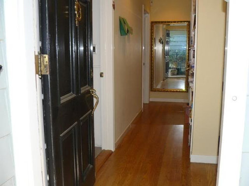
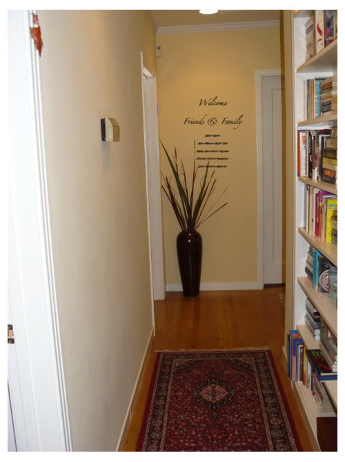
We made some progress. We took down the large mirror, weeded the bookcase, and added a floor vase, with green palms and branches. We plan to replace the hallway down lights with wall washer lights (trying to figure out a low cost way of doing this). Right now, we are playing with word art. My DH and I are thinking about the adding the words "Welcome Friends and Family," following by (in smaller print) the word "welcome" in a series of languages that have meaning to our family. Here is a couple mock ups. What do you think, oh wise ones?

BEFORE

MOCK UP NOW


{{!gwi}}

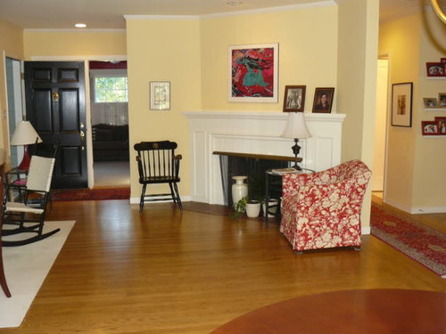
To give you a sense of the rest of the hallway and house, here is a long shot from the DR. I left the BLACK front door open to the left. The front hall runs behind the fireplace, turns right and then continues (with another red runner) to the kitchen.

Comments (10)

  • 18 years ago

    Love your wall words saying, and really like the idea of using a smaller font and different languages.

    You don't need the vase in the corner. It detracts from the word art, and just makes the space busy and cluttered. Less is more in this space.

    Good progress, though!

  • 18 years ago

    I like it. I like the font in the first one better. The second one looks like advertising slogan signage that a business would use.

    I like the simple narrow vase with the dried fronds. It looks serene and uncluttered and the perfect solution to a barren hallway corner.

  • 18 years ago

    That is so much better than before.
    I do not know how houstonmon can read the words, I can not see them after the first lines.
    What does it say.
    I am not sure if I like the vase there or not. I will let others chirp in.
    The rest of your home looks lovely.

  • 18 years ago

    I like the size of the second font but it's a bit to fancy. It's nice to be able to read it when you enter the door, so maybe making the first one just bigger. I like the vase but I wish the fronds are a little to tall as they interfere with the wording. You did a great job on the bookcase as well as the rest of your lovely home.

  • 18 years ago

    Thanks everyone. Sounds like we need to make part of the font bigger and maybe trim the foliage. Do others think we should take the vase away? (It hides an electrial outlet). I am thinking about arching the "Welcome Friends & Family" The rest of the wording is:

    Shalom * Salaam

    Vitejte * Wilkommen * Sveiki * Failte

    Witamy * Dobro pozhalovat * Zayt vikum

    Bienvenidos * Benvenuto * Pasaykamuy *

    Tistik * Irashaimasu * Sushri akal

  • 18 years ago

    I like it a lot, the whole thing: vase, words, edited bookshelves. I think it's looking great.

    And a non-decor-related comment: quite the polyglot family you are! Let me see how many of your welcoming languages I can get right, in order:
    Hebrew, Arabic
    Czech, German, Swedish???, Gaelic
    Polish, either Slovak or Croat but I'm thinking Slovak, next one I have no idea (vaguely like Yiddish in the "Zeyt" but otherwise not sure?)
    Spanish, Italian, Quechua
    no idea, Japanese, no idea...

    wow! (correct my errors, please?)

  • 18 years ago

    To vase or not to vase, hmmmm

    Part of the reason I was looking for a vase (or something) at the end of the hallway is that it needs of focal point. Here is the vase as you look out of the kitchen.

    The other reason for the vase is that it looks nice reflecting in the mirror kitty corner away (the wall behind the fireplace.)

    Languages -- walkin you are impressive!!!
    Shalom * Salaam (Yup, Hebrew and Arabic)
    Vitejte * Wilkommen * Sveiki * Failte (Czech, German, Lithuanian, and Gaelic)
    Witamy * Dobro pozhalovat * Zayt vikum (Polish, Russian and Yiddish, although I am not sure of this translation and need to ask my MIL.)
    Bienvenidos * Benvenuto * Pasaykamuy (Spanish, Italian, Quechua)
    Tistik * Irashaimasu * Sushri akal (Mayan Mexican, Spanish, and Pujabi Indian).

    Except for Gaelic, all of the languages in the first four lines were or are spoken by members of my immediate family or our parents and grandparents. (We have to go back further in my family to find a Gaelic speaker.) The languages in the next two lines represent places that my family has spent a fair amount of time in or (in the case of Punjabi India) somewhere where we are hoping to travel soon.

    By the way, if anyone can improve upon these translations, please do!

  • 18 years ago

    I like the overall effect very much. I think the the first font is better, but I would like it the size of the second. I would also make the Welcome largest, make family and friends just a bit smaller (and reverse the order from what you have, as I think family comes first, and the plural friends just sounds better second) and then all the other welcomes in the smaller text.

    As for the floral arrangement, I would like to see it angled a bit, with the tallest grasses to the left, into the corner more, and the other grasses a bit shorter. I would think about adding some hanging or draping elements like amaranth to pull the eye across the space and downward.

  • 18 years ago

    I agree with les. I think it would look good if you were to frame out your word art in black and paint the inside of the frame a redish color. It could be sponged painted if you like that look. An arched top would look nice with the body a regular box shape.

  • 18 years ago

    Les and Cam, thank you for your feedback. I want to try your ideas. I have never arranged flowers (maybe that is obvious. . . .), if you have any other thoughts please let me know. (Can anyone suggest a website to look at floral arranging?) I can get to a floral store tomorrow evening to look for amaranth. Cam, I THINK I could do your idea electronically. . .