Software
Houzz Logo Print
jkoebnick

Here are some more backsplash samples...

14 years ago
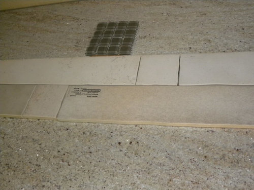
Ok, first of all, I know many of you are travertine haters, but...I think it kind of goes. The darker travertine is driftwood, the lighter ones are sandlewood. I could also do a mojave which is a combo of different colors and also with tiles with a lot of movement. The 12 x 12 tile is bottacini and the one next to that is a slate.

I was thinking if I did the travertine in a bigger tile, say 8 x 20 or 8 x 16, it would make it a bit more modern. The salesperson thought I should do 4 x 8's. He recommended rough because of the fireplace but I could also get it honed. Thoughts? I know, I know...I have been all over the map with my backsplash samples. I'm a woman, what do you expect. :)

{{!gwi}}


{{!gwi}}


{{!gwi}}


Comments (37)

  • 14 years ago

    hmmmm... it does kind of go and I like the idea of the larger size... maybe with that mosaic? I really like that one- rustic looking.

  • 14 years ago

    The salesperson told me that sealer wouldn't change the color of the tiles but enhancer would. I thought they both changed the color a bit darker. Does anyone know? Because I don't think I'd want the darker ones if they got much darker.

  • 14 years ago

    Sorry but I'm not a fan of any of these...too bland for the large area you have to tile and the large space the kitchen is in...I think something with a little more pop would be better.

  • 14 years ago

    Sealer without enhancer shouldn't change the color.

    The pattern in the travertine fights with the countertop, and isn't the contemporary look you said you'd wanted. I think I kind of like the colors in the mini bricks, but it's hard to tell because I'm not sure I'm seeing the counter clearly enough to tell in those pics.

  • 14 years ago

    I like the ones with more gold/tan in them....behind your faucet the one on the left and the one to the left of multi-colored slate. I think the whiter looking tiles look too stark next to the cabinets.

  • 14 years ago

    I would consider larger format ceramic or color body porcelain in something that is Not trying to mimic stone in any way.

  • 14 years ago

    I'm standing next to AnnieD on this. No wow factor with any of them for me.
    Sorry :(

  • 14 years ago

    Ok, show me pictures of kitchens with lighter countertops and stained cabinets with "wow factor" backsplashes because I'm just not getting it. Every time I step foot into a tile showroom, I am steered in another direction. I'm confused. What I have learned is I don't like the little glass "lined" mosaics. And I don't want 4 x 4 or 6 x 6 tiles. I am drawn to rectangles and mosaics with squares. I don't want diamonds either. I don't like a lot of color as you can see. I want a "calm" backsplash if that makes any sense. And I think it needs to blend well with my fireplace since you can see it from the kitchen.

  • 14 years ago

    I am such a novice and non-designer, but like most, I like to play with ideas.

    Here is a GW kitchen thread you may wish to read: "Is a backsplash really necessary". Please look at buehl's comments and lovely kitchen and cabinetry as it strikes me as somewhat similar to yours when viewed as a flowing open picture. http://ths.gardenweb.com/forums/load/kitchbath/msg010244472966.html

    Looking through all your photos, I am impressed by how the tranquil flow through rooms greets one's eyes. Your yellow/beige tone stone fireplace mantel (as seen in images five & ten in your photos) makes a statement of its own. Your kitchen windows reveal different hues on your green walls depending on time of day. Your lovely cabinets, some with height, adds to the tall fireplace and . If in your position, I might choose less as more in a BS by which I mean do a single focus piece behind your sink below the trellis like cabinet frame above (unless you're already planning something there), and let the BS walls remain as painted.

    Looking at your granite, I see hues of blue/purple tones, beige, white/cream and perhaps a bit of red/purple. I've linked a site below I like, and given a rustic theme I wonder if you might consider a simple Tile Mural with Wine & Grapes on Ceramic Tile behind your sink. To my eye, it integrates in colors your granite, your walls and your stone hearth. Tricky though to do this based on photos, so of course this may not meet in reality.

    There are paintable electrical covers as seen here:
    http://www.amazon.com/Masque-Paintable-Power-Electrical-Outlet/dp/B003UOADU0

    Just another consideration from many. Congratulations on your kitchen.

    Here is a link that might be useful: Link:

  • 14 years ago

    I am thinking something simple but with a crackle or variable glaze. (These all come in rectangular sizes)
    Look at Ann Sacks under Caliper
    Look at Complete Tile Collection.

    I am seeing green in that stone in my monitor so I leaned toward green. Some of these tiles come in dozens if not 100 colors.

    Ann Sacks Caliper in Woodland
    {{!gwi}}

    Complete Tile McIntones NSR
    {{!gwi}}

    Complete Tile Vermeere Botanical Green
    {{!gwi}}

    Complete Tile Fibri Porcelain
    {{!gwi}}

  • 14 years ago

    The busy-ness of most of those choices is fighting with your beautiful counters. I would go with a monochromatic tile with little pattern too it. My choice would be to highlight your favorite color in the counters and use that in a subway or some other tile you like. palimpsest gave some excellent examples of what I have in mind.

  • 14 years ago

    I say wow to every one of those that palimpsest just posted. Good eye.
    I hope you like them. It's so hard I know....I just spent 2 months looking for mine and hope I'm going to like it.

  • 14 years ago

    I like the Ann Sacks Caliper tile or even the other subway tile. Would you do a focal point above the sink then? Using trim pieces in the same color with either the same tile in the frame or a different shape but same color?

  • 14 years ago

    My sister just did a great backsplash (I will try to get a picture) mixing travertine and a crackle ceramic subway.

    She ran square travertine tiles along the bottom (first row)then put a rope pencil above it then put the subway tile above that. The mosaic was squared off above the range in travertine pencil.

    I think you can use your travertine (but maybe get 4 by 4 square tiles) and then use one of palimpsest's ideas of the glazed or crackle ceramic tiles in subway. You CAN mix the 2. It looks great. I think travertine is very pretty if used in moderation.

  • 14 years ago

    Your fireplace is gorgeous - could you go with some sort of stacked stone that might tie that in?

  • 14 years ago

    I can't find a showroom that has Ann Sacks tile or Complete Tile. Is there another brand similar to those?

    califkitchen, I looked the these at the showroom . . .


    {{!gwi}}


    {{!gwi}}

    {{!gwi}}

    And here is another picture of my granite...


  • 14 years ago

    I vote for any one of Pal's choices.

  • 14 years ago

    Me too, but if there are no showrooms that have those brands in MN, what are my other options??????

  • 14 years ago

    There was no show room especially near me that had Ann Sachs tiles either. But if you call the one closest, they should be able to send you samples.

  • 14 years ago

    jkoebnick--if no one has them try an online source. You can get samples shipped to you.

    I know we complain about the shipping charges, but what I have run into is that tile stores will charge you shipping too if they don't stock the tile you are looking at.

    Not sure if you are interested in this idea, but look at Daltile's Modern Dimension collection. The sizes offered in subways are great, from 2x8s to much larger format. The colors are great and might work too. The price was really affordable (do shop around there were price variations in the same town).

    Here is a link that might be useful: daltile modern dimensions

  • 14 years ago

    If you like the tranquil look, a 4x8 tile with thin grout lines would look good. And it would not compete with the fireplace. The travertine that is directly under the power outlet looks good to me.

    Skip the fancy stuff, like multiple sizes and types of tile and let those lovely cabinets (what are they?) and the fireplace do their thing.

  • 14 years ago

    I agree with Annie and rhome that the travertine fights the counter and does feel a bit bland. I absolutely agree with your assessment that you prefer rectangles (me too).

    I really like palimpsest's suggestions. I also have heard of several people having good luck with Rixi. They have numerous varieties of ceramic tiles that might work such as Grazia or Melange. Or perhaps a larger rectangular glass tile (maybe 4x12 or something more modern/contemporary than 3x6).

    I see some cooler (maybe gray or taupe or green?) colors in your counter. I think you might try some tile samples with cooler (but still soft) colors than the beige-family samples you've been looking at recently. I personally like the contrast of warmth (stained wood cabinets) with cooler tones and for me that helps fight the blandness that can sometimes occur when all of the colors in a space are just warm or just cool.

  • 14 years ago

    Thank you for all your suggestions...my search continues.

    Lazygardens, our cabinets are custom with alder wood and mahogany stain.

  • 14 years ago

    Pal's choices are great.

  • 14 years ago

    You should be able to get samples from either Ann Sacks or Complete Tile. Complete Tile is only in Manhattan but they probably do national business. Of course you will probably have to pay for samples and such, but in the context of making such a big decision it would be worth it imo.

  • 14 years ago

    I spent most of my day today (my day off) at tile showrooms. I brought home so many samples, I had to make a couple trips to my car to get them all in the house. They were mostly crackle and plain field tile. I hate them all. Back to square one I guess. I did bring home a solistone split-face tile sample that I do like but it's on a board with other colors so it's hard to photograph. I am starting to think I'm different. I don't like stuff that everyone else likes. I should have known that because that's how I dress. So after a hard day of tile shopping, I am sitting down with the best remodel therapy in the world...a glass of wine. Cheers!

  • 14 years ago

    So funny and I know the feeling and hate them all so far.

    Funny thing - our colors are not that far off - my cabinets are darker and my counter top is also darker and more movement but in the same warm tones.

    I will be watching for ideas!!

  • 14 years ago
  • 14 years ago

    Maybe I'm the odd one out here, but I think the subways and travertine are too bland. I like where you were going with the Ann Sacks stones, but I think maybe they went a bit too far. How about a random strip stone of some sort?

  • 14 years ago

    I'd like to see you try something less "uniform", with more variety and shading.

    How about something completely different, slate? Like a stacked slate? MAybe the "moss gree"n at Stone and pewter accents?

    http://www.stonepewteraccents.com/SPA_slate_fw.html

    Or some of the Jeffrey Court natural stone (I know many of us remember fire'n'ice, right?) The quartz fire and ice brick could look gorgeous?

    http://www.jeffreycourt.com/chapter9_pietra_opus.asp

    I think you might want to mix it up, not just one plain BS, but a combo, to bring in SOME color nad some texture, to complement your stone fireplace, but not overwhelm.

  • 14 years ago

    I actually really like the travertine mini-brick, too. Maybe someone could photoshop it in?

  • 14 years ago

    Here are some pics of the moss green stacked slate:

    (from GW member ksfaustin)

    I also like the mini-travertine brick. I think you need to see more of it to get a better picture.

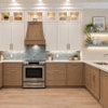
    [traditional kitchen design[(https://www.houzz.com/photos/traditional-kitchen-ideas-phbr1-bp~t_709~s_2107) by los angeles interior designer Charmean Neithart Interiors, LLC.

  • 14 years ago

    Home4all6, I do kind of like both of those - thank you! It's funny - early on in our kitchen remodel, boxerpups posted many backsplash samples for me that I loved the look of and they were stone mosaics too. I guess I'll head back to the tile stores. I am starting to think I need to wear a disguise as I think they probably say to each other . . . "Here she comes again. You help her this time, I did last time". Sorry tile people.

  • 14 years ago

    There is a tile store I went in so many times when doing our bathroom that they had a folder on me. I would walk in the door, someone at the desk would see me, spin thier chair to the file cabinets, and instantly pull my file.

    I did buy alot of tile there.

    So go to those stores as often as you like.

    I might have missed it if you started another thread but how is the search going?

  • 14 years ago

    I am enjoying reading this thread because this is my story to a T! I have been searching for a backsplash for about 7 months now and have gone from stone, travertine, marble, to porcelain and beyond. Nothing is working with my cherry cabinets a Golden Typhoon granite. Glad I'm not alone. Keep going. Eventually we'll find the right thing, right? I agree that the travertines are too beigey pink in color and compete with the beauty of the granite. I see gray and green in your stone. Sometimes the thing that you least expect is the one that will work the best. Good luck!

  • 14 years ago

    I like home4all's choices. They have so many colors that you could get one to tie to your fireplace. I have similiar color tones in my WIP kitchen and I have a FP with grey tones and I'd like to coordinate the look. I haven't really delved into BS yet.

    I saw some nice bs options at the "Tile Shop." Look at their kitchen photo gallery for some ideas, especially looking at bs shown with the medium color tone of your cabinetry. There is one pic that shows a light tone counter (you can't see cabinetry) and a cutting board with some scallions on it with tomatoes to the left and oils and pasta in the background. I think this BS ties to your fp and might work. It uses a variety of shapes and sizes and is a nice cohesive look despite it variation. Sorry I can't link to this exact picture. Its in some kind of slideshow mode that won't let me copy.

    But this particular bs is not modern, which you seem to want.

    Here is a link that might be useful: Tile Shop

  • 14 years ago

    Hi, I see where you're going, and I'm right there with you. This backsplash stuff is the hardest part!

    pixel, it's been over a year that I've been looking for just the right backsplash. Although, it hasn't been a priority, as it's in our vacation/retirement home, so it's not like I'm looking at it every day. (Sure wish I were though!) I also have dark cabinets with TB granite. Love the granite so much, I really want to be careful with the backsplash. It doesn't help that DH keeps saying "We don't need a BS!" Good luck!