Software
Houzz Logo Print
hzdeleted_9268002

proposed backsplash- comments?

18 years ago
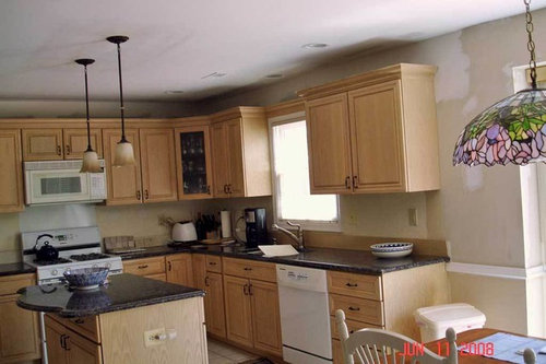
After going back and forth and then some, I keep going back to:

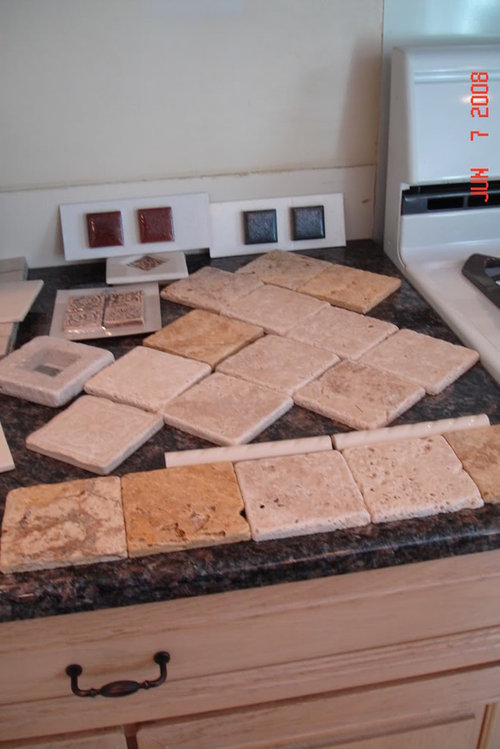
the Home Depot unfilled, unsealed tumbled travertine 4 by 4 tiles, in chiarro mostly and maybe adding in some of the gold or darker brown ones(chiarro is the lighter color but has a fair amount of other "stuff" in it)- and possibly using the blue sparkly tile which also comes in the pencil liner. The liner is 1" thick(and 8" long) which I think might be too heavy so I was wondering about having them split and using it as 1/2" by 8" and then using the 2" blue sparklies randomly scattered through. I just don't know if it will be too dull looking? I have looked and I seem to go with light color creamy tiles (some of them have had more brown/gray but still relatively light in color) no matter what I find.

Here is my kitchen, but silly me the tiles in the kitchen picture are not what I am considering. They were contenders, but in other lighting just looked gray..


This has the tiles - with the 2 colorways mixed in. It does not have the pencil thingy or the 2" sparklies scattered in- they are standing up.

Comments (33)

  • 18 years ago

    i think it will be too dull looking.

  • 18 years ago

    Hmmm? I think I like the lighter ones with the red accents of those you have here. Had you considered bronze as an accent that would match your hardware and lighting fixture? Of course I'm biased since that's what I have! LOL

    I don't think I have seen your kitchen this far along. It looks fabulous!!!!!!

  • 18 years ago

    It'd go well with the cabinets, and be a nice contrast for the Dakota Mahogany, but I wouldn't consider leaving the holes unfilled.

  • 18 years ago

    Just wanted to say I _love_ your cabs! Light but so much warmer than the iceberg look eveyone seems to be doing these days.

    My concern is that the travertine matches them a little too well, both in the warmth of the tone and the color value [light to dark].

    You'll basically have a very light floor and appliances, medium light cabs and backsplash, and very dark counter [it really isn't all that dark, but it's enough darker that it reads almost black in the first photo]. The darker accents mixed with the travertine would help bridge the difference, but you still would have no medium tones.

    I'd use something between the cabs and counters in terms of value, and with a single strong accent color that relates to the granite to 'marry' it to the space.

  • 18 years ago

    I think you need a little more contrast to your cabinets, maybe a noce colored tile. I think with your beautiful dark granite, your backsplash could be darker, which will make the granite and cabinets stand out.

    We finally finished our backsplash which is a similar pattern to what you are planning. But we have darker cabinets and lighter granite. Here is my first attempt at pics! Good luck!

    Here is a link that might be useful: NGNG backsplash link

  • 18 years ago

    I'd go for some good contrast myself - something with some of the blues/purples/greens that are in your pretty light. But then, I'm all about color and contrast and details.

    I just looked at your samples again. I think the extreme texturing in the travertine is too much but not quite matching the details of your granite, so the two appear to be competing to my eyes.

    Speaking of details, I just noticed the interesting curve on your island. It's very cool.

  • 18 years ago

    I know you've struggled with this for a while and I think the travertine with the blue squares would look good. Is there any way you could line them up against the back of the counter with the blue squares on top just to get a better idea of how it would look?

    Laurie

  • 18 years ago

    Thanks so much for all the feedback --
    edalkin, I appreciate your honesty and value your view. I am obviously torn between it being simple and great, and simple and dull.
    Lindy- thanks for the compliments and I have to look again but I thought your kitchen was dropdead elegant so if you think it would work..... well that is a good thing.

    Bill- do you say to fill the holes for the wear? I was only mentioning that it was unfilled to describe it but would certainly follow your suggestion to fill it. And for the record, the granite is acgtually sapphire blue. looks very similar to dakota mahogony I know

    oruboris- I am glad you like the cabs; I loved them when I picked them in 1989(yup we moved in 1990) and I still like them and did not want to replace them.

    Today after I posted this, I thought that maybe I should look again at mixing the light chiaro and nixing the gold, and adding some noce so ngng great minds think alike. Pbris and everyone---
    I agree that I probably need more contrast and also love the colors in that light. I am also trying to balance brining it all together, and making it somewhat "generic" a la resale down the road (very unsure, but we are now empty nesters and the house is rather large. if the market recovers we would probably like to sell in about 2 or 3 years. ) so I want to enjoy it, but mostly I want an updated attractive kitchen and budget is not unlimited.
    I will try to take some photos tomorrow of a better approximation of what I am considering to help me and you.

    And---ngng your album needs a password.I would love to see your backssplash
    thanks everyone.
    sheila

  • 18 years ago

    Sheila, have you considered going in a different direction? I like the sparkly blue (and red -- I'm not a completely one-track mind here) tiles and maybe you could do a white/colored glass mosaic. Alternatively, subway tiles can be simple/classic/boring/good for resale. Or something that is in the white/cream range. Or a medium-dark tile (I'm not sure what kind here). I used to have cabs in a similar color (but not as pretty as yours) and everything in the travertine family was close, in a bad way. HTH.

  • 18 years ago

    Sheila--
    I have your kitchen! Exactly the same layout and similar cabinets. Are your cabs pickeled oak? Can't tell from the first pic but in the second, the cabinet looks just like mine. I used tumbled travertine with a reddish listello for my backsplash. Sorry I don't have a picture. I may be prejudiced but I think the tumbled travertine will look great--it does in my kitchen. It will be a contrast in texture but not color. Your granite is already giving you the high contrast in color. If your cabinets are "dated" like mine, you may not want to make them 'pop' but instead you want them to be a nice neutral background and then you can accessorize with color. I wouldn't mix colorways in the travertine but chose the one that blends with the cabinets the best. Pay attention to the undertone of the cabinet. My cabinets had pinkish and grayish undertones as well as a slight yellowing due to age--very tricky to work with.HTH

  • 18 years ago

    What concerns me is you are showing the tumbled stone with no enhancer on it. Once tumbled stone is enhanced it becomes another color. Most people put a sealer onto the stone, after installation, so no staining occurs and this is known as "sealer" or "enhancer". To see what that would like you could just wet the tiles. What I think you'll see is that the tumbled stone you have chosen is going to be gold. Too much gold. I agree with the post above....try using Noce. That color would blend better with the granite.
    I think you are "trying" to get the basic red/blue tiles to pull the red/blue from the granite and that is what it will look like. That you tried but didn't quite pull it off.
    I would suggest finding some glass tiles and a little metal. Use the copper/bronze metal that is in the cabinet hardware and some glass tiles. Try Sonoma Tile Makers. They have great web site. There are several suppliers of glass tile. The glass is the same sheen as the granite but it's border and properties are that of tile.
    Just my thoughts. A good rule of thumb in design is this....good interior design is a "feeling" you get when you see something or enter the room, etc. If you look at something, like this splash layout and it doesn't "FEEL" right; then chances are something is wrong. You'll know it when you see it

  • 18 years ago

    Try accessing my backsplash pics now, I'm new to posting pics.

    Here is a link that might be useful: NGNG backsplash link

  • 18 years ago

    Ngng- YES! It worked and it looks great. I really think it is simple but finished looking and I like how you did not use tons of the accent tile. I just took pix of the noce, of the chiaro, and another one and will be thrilled with feedback. I will post them momentarily.........

  • 18 years ago

    ok. taking into account a lot of the excellent advice here, here are a whole bunch of what you suggested.
    1. Chiaro travertine with dark blue pencil (but I would like it thinner) and showing the dark blue and dark rust accents. ( I don't think I would use both)


    2. Noce travertine as above. To my surprise, the noce was considerably darker than I thought it would be. I know it varies because it is natural stone,but.


    3. Then another selection which I think goes very well- but still light,but warm. It is more $ than I wanted, but - but not crazy pricey. I also think that the deco tile in it which is a combo of chiaro/noce works well. (that is really pricey)

    They also had a dark blue sparkly tile in a metal frame. I thought I had a picture of it...Hmmm I will post a picture of that in the tile board.
    4. Then I remembered that someone suggested spraying with water to see the enhanced look. THe chiaro did not change at all, but the noce, really got dark. I mushed them together, the chiaro on the right, noce on the left.


    So what do you think?

  • 18 years ago

    I LOVE #3!!!!

  • 18 years ago

    I agree with lindybarts. #3 is very nice. Classy with a touch of character.

  • 18 years ago

    I vote for number three too. You can probably get a similar look with tumbled travertine but I like the less rustic look of #3. I really like the deco but remember that you will probably not use black grout. When it is grouted with ivory or light tan grout, you may lose some of its impact and I really like the touch of black in #3. I think you are almost there, I would look around for an accent tile that has the feel of the deco in #3 but also has a little black in it. I think the solid blue pencil and accent are too heavy. Deco #3 is light and playful.
    Another note--you can get stone sealer that is a color enhancer that will give you the 'wet' look for your stone. You can also get sealers that are not enhancers that will maintain the "chalky" look. When the travertine is grouted, the grout will fill the holes so the color of the grout will slightly affect the final color of the travertine.

  • 18 years ago

    Well, I did actually love #3, but since it is like 3 times the price of the others, I was trying to get the look of it with either the travertine or some such.
    I agree that the blue pencil thing is too heavy, If I use it I would have it split in half(so it would be 1/2" not a full inch).. that is also interesting to note about the enhancer/sealer. I gues that explains why some people said it would darken the color and others said it would not. It was amazing to see that on the light tile, the chiaro, the color did not change one iota but on the noce, it was very much darkened and enriched. If I did use #3 tile, I don't know that I would use any pencil. I seem to have a thing for the deco tiles on the diagonal,so I think I would just have the field tile straight. The tile store I got the sample board from suggested using the dco tile approx. every 18" to 24" or so.
    and I am not sure about that deco althought I love it, I am not positive if I will use it.
    I also wondered about the black lines, and if that was what might be tying it all together (in addition to the very good hues of the tiles on the board) to the dark granite. I wonder if that would look strange to have dark grout in the backsplash? I realize with lighter grout it will lose some impact, but I still think it would work well. But again, does anyone have dark grout in the backspalsh?
    I am supposed to be getting a sample of a very similar to #3 tile but at a lot better price... I am supposed to receive it tomorrow so that should be interesting.
    And finally, In a few minutes, I am going to post the pic of the other deco tile on #3 for your viewing pleasure
    And I don't think I have said this yet on this thread, but the help you guys give is just incredibly thought clarifying so THANK YOU>

  • 18 years ago

    Your kitchen is looking for a backsplash that is fresh and crisp, I'd love to see some glazed tiles up for preview (although perhaps not blue, as blue will pull the orange tones from your cabinetry). I also feel that some sort of staggered pattern or mixed sized tiles will help stop the backsplash from mimicing your floor tile.

    What about a rectagular white glazed tile (there are some beautiful ones out there) with small blue inserts used for accent?

  • 18 years ago

    Here to show the other deco and to show the puzzle I am having. The few tiles laying down are the chiara so I gues I have not entirely ruled those out. I do prefer these 1 deco tiles. Even the blue sparkly which is very similar to the original ones, is a much more irridescent and has a glass frame over a metal frame is that makes any sense. The others were just spray frosty over ceramic tile. They do ahve the same look, but the real deal is really much nicer.
    Here is with the blue sparkly nice one.


    alt="w/both why blurry?">
    Here is all of them...

  • 18 years ago

    I give up as to why they are showing up sideways. I tried to fix that. Also the last 2 were taken this morning, with the lights on, and the others last nite with the lights on. I even did "autofix" to correct color. So I apologize for twisting your heads. I guess I won't be going into photography anytime soon.

  • 18 years ago

    Hmmm I wonder if I should start a new thread? Has anyone used black or very dark grout in a backsplahsh and if ro can you post a picture?

  • 18 years ago

    Ohhh..I like the blue sparkly one alot too. Either of those two decos would look great in my opinion. Still not feeling the red and blue ones laying down. I haven't used dark grout but I'm wondering if it would make it look too busy???

  • 18 years ago

    Either of the two decos, specially the sparkly blue!
    I don't think I like the pencil liner. Don't know about the grout but I think it would look fine specially with the blue accents. It would make everything a little busier though.

  • 18 years ago

    I agree- the pencil liner has been ruled out. And the HD sparkly ones were lovely but after seeing the other one, the HD ones are ruled out as well.
    I am still mulling over which tile... and which deco. I also like them both a lot. THey will be used sparingly.
    But it will be one of those 2 deco tiles and it will ( at least as of this minute) be either the porcelain tile on the board or the travertine in the lighter color(and I might just still sprinkle in a few noce ones, so the good news is I have ruled out the gold.)
    All along I planned to do the bottom horizontal row and then on the diagonal but I seriously prefer the decos to be on the diagonal, so I am pretty sure (hey there might be trend here towards making a decision? )that I will have the tiles straight set all the way through to accomodate my 12 or so deco tiles. Does that make sense?
    I should be getting a nother sample similar to the tile board and will just wait to see that. (it is very close, and half the price...) still trying to figure which works better for me deco wise.
    If I get those new tiles, I will post a pic asap and hopefully try to get a (shhhh) DECISION already. Why do I make these decisions like a career?

  • 18 years ago

    Well they arrived moments ago and here they are. They are darker than the "original" sample board, and I would say they definitely go well with the granite, but they are closer in color to the cabinets. At first I didn't care for it at all, but now of course, I don't know. What do you think? Oh and they are 6", they do not come in 4". OH and I wanted to mention that my cabs are not pickeled oak, they do have similarity, but they are technically ivory mist oak and are just a warm light oak.Shoot and I thought I was nearing a decision.>>


    Here laying against the original samples

    And here with the blue sparkly

  • 18 years ago

    I promise those are my last renditions. liking the new ones(the darker ones) but not sure about the 6" size?
    Again, I still dont know which deco but whatever it will be used sparingly (like the tile store surprisingly suggested using apprx every 2 ft or so. and then maybe 2 or 3 over the stove).. I think I am really liking it... but which field tile (and no pencil) can you promise me I will be happy and not second guess myself? hahahahah seriously though any thoughts? thank you so much.(stbap_sorry to be a pain)

  • 18 years ago

    I like the darker and I think the 6" are fine. (less grout lines!). I hate to through a wrench in the mix; but I'd like to see the noce with the reddish sparkly tile. As much as I'm a fan of blue... I think the red would give it the pop you want. Either way, the blue still looks very pretty.

  • 18 years ago

    Sheila...love the darker tile and 6" looks great too. The blue sparkly sure looks like copper in your photo (which I love) Does it change colors with the light? I really like it and I would go for it....just my opinion of course!

    When we were trying to determine where to put the decos, we used chalk on the wall to draw it out. Then, it was easier to stand back and make changes.

    Good Luck, you're almost there!

  • 18 years ago

    Yes the sparkly does change with light, it has a glass frame on top and sometimes has a silvery gray and other times very deep blue almost black... and yes other times a slight coppery bronze. The reddish sparkly ones look more contrived and just don't seem to work as nicely.
    I do like the large darker ones a lot, but at times they are too close and even darker than the cabinets and I am not sure if it looks strange with my floor.
    THe size as well ... I don't see too many backsplashses with 6 inch tile( and i have tried looking_)..now my thoughts are any of the renditions would probably look very good; I just want the best(understandably no?). I also did try as some mentioned the crisp white subways type, thinking they would work but they absolutely didnt. Having the rough time I do making decisions, I am always happy to be able to eliminiate something.

  • 18 years ago

    Well... guess what?
    I still cannot decide.
    I was really thinking that I would move right along deciding on the backsplash. I honestly believe that either the travertine, the 4" porcelain with the sample board, or the 6" darker porcelain would look good with either of those 2 decos. I really honestly believe it. So why can't I just pick one and go with it?
    And our internet is out at the house I am using the li-berry.
    Boo hoo.

  • 18 years ago

    Sheila, did you try drawing it out on the wall with the 6" size? Maybe that would help you visualize the bigger tiles. I could also try to photoshop it in but I think standing in front of it and looking at the size in real life will help you.

  • 18 years ago

    Believe it or not I actually was able to make a decision -thanks to you guys' help and feedback. I didn't see what Lindy had suggested about drawing out the 6"tiles, but that is sort of what we did yesterday. It did not seem right for the space and while the color was gorgeous sometimes it was questionable.
    I decided on the 4" porcelain tiles on the sample board which always consistently looked great along with the blue sparkly tiles as accents. I placed the order yesterday afternoon. Everything should be here no later than 7/14. It turns out that with the accent tiles, I was planning to order 14. If you order 15 or more, it pays to get the full sheet of 36. So I will certainly use more than 14 though I probably won't use all 36.
    Thank you one and all.
    Yay. Now once they are installed I will fixate on a paint color and then I think I will be done for a bit.