Software
Houzz Logo Print
redhead47_gw

Please help with backsplash choice for Typhoon Bordeaux

15 years ago
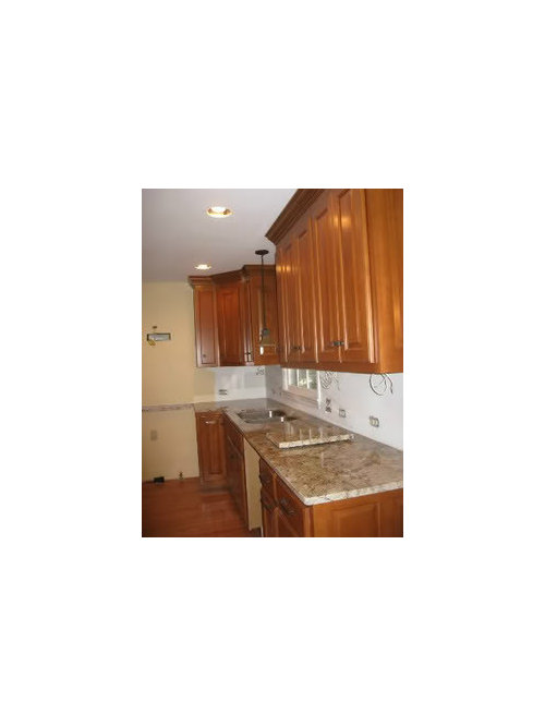
OK, I picked up a lot of samples for backsplash tiles to go with my beautiful Typhoon/Sienna Bordeaux Granite. We think we know which we like best, but I'm asking you all to chime in with opinions & observations we might not have thought of.

Cabinets: a warm maple with teak stain, looks like med. cherry

Floors: oak in a butterscotch stain, a lighter tone than cabinets, although they look similar in the pix.

Wall paint: Behr Calm Air, a warm yellow-beige, like a pale chamois. Really only seen in adjoining areas.

Hardware: stainless appliances, brushed stainless faucets, squarish knobs & pulls similar to ORB, but with coppery tones instead of bronze.

Us: We love warm earth tones (can you tell?) We want easy-care, easy-clean surfaces also.

Generally, I'm not a fan of subway tile (in this setting) or completely solid colors.

My kitchen:

We thought the granite might be too strong for much pattern in the backsplash, but it doesn't seem that way now that it's installed.

Some backsplash choices:

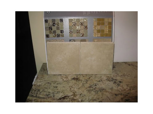
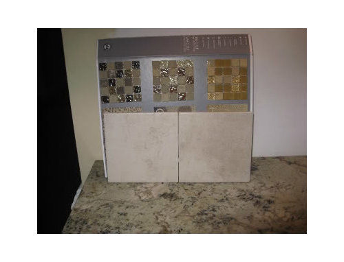
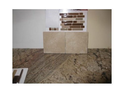
AO Ash Creek Almond with Marazzi Glass/stone mosaic

Sabbia --lighter field tile with same mosaic:

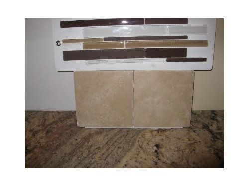
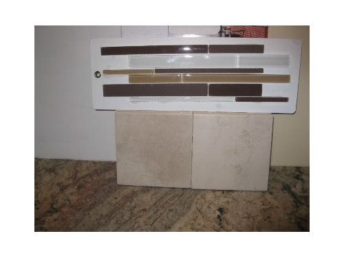
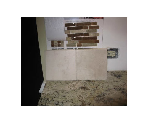
Almond with Mirage Glass Cane Blend:

Same mosaic with Sabbia field tile:

Almond with Legacy glass/stone mosaic:

Same with lighter field:

Another possibility would be to use the 6x6 field tile, either laid offset or on the diagonal, with smaller 2x2s of the same color set differently (maybe in a band) for a contract without extra color.

So, I would love to hear some input from you GW'ers. Which do you like best? Do you have other options to show me?

TIA.....

Redhead

Comments (14)

  • 15 years ago

    I definitely prefer the lighter field tile. For the mosaic I like the top one of the left or the bottom one

  • 15 years ago

    I would tend to agree with peach32 - your granite is lovely and any competition from the backsplash may take away from it rather than compliment it. I notice you have a pendant light with a shade that works very well - it all looks so cohesive right now, it may tip the balance to add other elements.

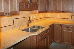
    The colours in your glass work really well with the counter, but if you're committed to adding a glass element, you could consider the pencil glass concept below:

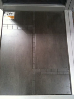
    You could also go with a uniform tile, but change up the pattern to add a less dramatic element:

    I'll be right behind you in picking backsplash, so I'll be very interested to see what you choose!

  • 15 years ago

    Yes, I agree, you don't want your backsplash to compete with your granite but the backsplash is the "jewelry of the kitchen". Redhead - from your choices above, you clearly want something interesting with more punch than merely subway tiles. Personally, I like the darker field tiles and my favorite glass mosaic is the Legacy. However, I wonder - do you want to use the field tiles to reduce cost? Why not just the glass mosaics? That can look busy, I do realize so maybe that is why. Also, what accent color do you want to use? The legacy looks like it has some red/burgundy, which can look great in a kitchen - add some dish towels, a pretty display bowl or plate, etc and it can really pull everything together. If red is not your thing though, I might avoid the Legacy. The other long ones look very purple, which doesn't seem to fit with the warm tones. And the small mosaic on the far right of the first picture are waaaaaaaay too yellow, IMHO.

  • 15 years ago

    I decided against doing all glass mosaics because I think it would look too busy. The field tile would help with that, maybe. We have no objections to red (my husband loves that burgundy color, and every car we've bought in about 15 years has been red). The granite has some burgundy shades in it, but not a huge amount. No room for a display bowl or plate, unless it's doing a job like holding utensils or fruit, IMO -- everything on display has to have a function in this small kitchen. The long glass tiles don't really look purple in real life -- more like a dark brown, I think, although the camera "sees" purple. And totally agree about the yellowish small mosaics. Our granite doesn't have those yellows in it.

    The glass pencil rail is an interesting idea, too. Or the other pattern from BossaNova

    And I'm still thinking about just using the 6x6 field tiles with 2x2s for interest. Maybe using the 2x2s to form a design over the range -- with the rest of the backsplash just diagonal, maybe with a horizontal line of 2x2s about 1/3 of the way up. Or with the rest of the tile set straight but offset, maybe again with the 2x2 band.

    Thanks for all the great suggestions & ideas. Keep 'em coming!

  • 15 years ago

    My vote is Almond with cane.
    Maybe it is my monitor but this looks like a perfect
    match to the granite. I also agree that you want something
    simple. If you use the glass use it sparingly. A pencil
    edge is pretty or maybe just use it in a frame around
    the range area.

    Your granite still makes me smile. Great Choice!

    ~boxer

  • 15 years ago

    Hi Redhead, 2 cents from a fellow TB owner (and BS lurker), I like the almond colored field tile best. I love the idea of adding an accent with different sized tile. Can't wait to see what you choose.

    I had been considering subway, but I'm so up in the air over it all, that we're going sans BS for a while.

  • 15 years ago

    I'm now seriously considering going with all one color tile, either the almond or the lighter sabbia, with a band of interest in different tile size, same color, maybe set on the diagonal. I still want something more than just plain tile.

    Back to the drawing board......

  • 15 years ago

    This is what occurred to me as I was looking at your pictures. Leave out all of the mosaics, and add the beautiful linear contrasting elements elsewhere in your kitchen. Your granite has a lot of line and contrast in it, and the small colorful tile pattern so close to the granite is too intense. I think if you added line and contrast elsewhere in your kitchen that would help balance this strong counter top element and be harmonious. It will give a visual breath to your space.

    I know there are so many opinions on this subject. I think this variety of opinions is great otherwise we would all have kitchens that looked alike. It is so fun seeing a kitchen that really stretches the imagination.

  • 15 years ago

    Thanks for the input.

    I guess I don't understand "if you added line and contrast elsewhere in your kitchen" -- in what way? Can you give any examples of what you mean? I'm just stumped on that & can't get a picture of what you mean.

  • 15 years ago

    Hi Redhead!
    Did you ever get your BS up?? Please post a picture! I'm still with NO BS, but in no hurry.
    Thanks!

  • 15 years ago

    Backsplash will be installed next Monday, grouted on Tuesday (crosses fingers.......)

    I am going with the light Sabbia 6x6 field tile I posted earlier, set diagonally, with a few insets of 2x2 Tantrum accent tiles by Sonoma in Canyon Red. These look like crackled red glass set in a border. The canyon red color picks up a major accent color in the granite. I absolutely love these tantrum tiles!

    I'll be back on Tuesday.......

    Here is a link that might be useful: Tantrum tile -- check the Red Canyon

  • 15 years ago

    I love that Tantrum too! Can't wait to see!

  • 15 years ago

    Did I miss it?? Please post pics.