Software
Houzz Logo Print
hzdeleted_20154839

ikat in the kitchen?

16 years ago

I think I found the cure for my feeling that my kitchen needs something with a bit of color in it...

{{!gwi}}

But, my plans to sew a scalloped country valance for over my kitchen window are shot! What sort of valance would you make with this?

Comments (12)

  • 16 years ago

    What style is your kitchen going to be? I assume this isn't for the plastic dresser. :)

    You actually can make a scalloped valance from the ikat, though it won't look geese with kerchiefs country. You can make a corded edge and add passementerie between the scallops if you want to set off the fabric in an ornate way.

    Just to show the character of the fabric, I'd do either flat (with wadding) on a wooden valance, or straight with a box pleat on a rail.

    Any version, I'd use a red-brown or brown-red cord welt to give it definition and some extra pop.

  • 16 years ago

    Oh! Goes without saying, but then I thought I should say: That's one gorgeous piece of dyework!!!

    And if it's not wood mounted, use an anti-UV fabric liner to keep it looking great.

  • 16 years ago

    What style is my kitchen? Hmm.. My designer described it as "country", but it sure ain't geese (or lone stars and cowboy boots for that matter!).

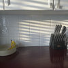
    Medallion Silverline shaker in maple hazelnut, Formica Alaskan Slate counters, matte artichoke large subway backsplash, brushed nickel hardware (Amerock revitalize), schoolhouse light over the island, Kohler Fairfax faucet, white appliances... I'm aiming for warm, casual, and family friendly. Passementerie sounds like a bit much, though a deep red trim of some sort sounds nice. To me, the fabric speaks for itself and doesn't need the dressing up like the pattern I selected before I found the fabric. I wouldn't want all the rings and hardware, something hidden pocket or board-mounted would be right.

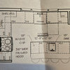
    I think I'm overcompensating now for not being bolder in earlier choices? Neither hubby nor my designer cares for it. My kids love it -- they want some purple and orange after all the "grown up colors" I picked so far. (The kitchen opens to the family room where all their toys are, and that room will get the same or compatible window treatments. Also, the valances are huge -> about 10 feet across the toy room windows, 6 feet across the sliding doors, and 9 feet across the main kitchen windows. (The windows are too close together to dress separately.) We're not talking about one small window here.

    Anyway, here it is, folded to a valance length (maybe a little short) and "pleated", by my backsplash tile and cabinet color chip.

    {{!gwi}}

    It's probably too "edgy" for the traditional look of the kitchen and the rest of the house. (You can see my living room in that other kitchen.) I just want some more color than I have so far, and my other choice just feels boring (though it matches nicely). Also, that fabric is a little too thin, I think.

    {{!gwi}}

  • 16 years ago

    That floral is very pretty. And it does match. And is a total snore given your finishes. Edgy is good, in moderation!

    If your husband hates the ikat, you should listen, of course, but I think it looks great with the rest, and it's absolutely right to choose something you can easily live with and change up for the permanent bits, and use things like paint and window treatments that are easy to change for the wild punches.

    I was kidding about the passementerie unless you had just the right kitchen for tassels, but I do think a corded edge would enhance that ikat in a way that a self welt wouldn't. I don't like the standard pleat. You lose all the boldness. Definitely something flat for that one. And, agreed on the hidden hardware. That's what I was thinking of when I mentioned flat with box pleat.

    What I see as a strike against this choice is the sheer amount of windowage it would be over. You don't want your valances to look like big dashes, or wallpaper borders, and I can't imagine that you want to paint the walls coral. :) It would work with a medium-dark sage, however.

    I would call your kitchen current. Maybe transitional. Not country if I'm imagining it right.

  • 16 years ago

    I like the way the bottom choice matches. You could add some terra cotta in a solid, or striped with the off-white, for a bit of punch. With that much window, you may want more colors that mix but not identical. You may also want separate summer/winter curtains. I would love to hang that ikat in January.

    Drape a big swath of the ikat over a chair and stare at it for a few days. When the original excitement of the color dies down do you still love it? Are you energized by it?

  • 16 years ago

    @p111og- Yep... agreed that these would be very long stripes. Having to paint the walls sage green would not be a problem. DH & I both like green. Thanks for agreeing that the other one is a "snore." Everyone seems to think I'm nuts for not liking it more, but I just can't.

    @lyvia- It's the colors I love about the bold one. The problem is the style... The kitchen/house just doesn't have anything remotely Moroccan about it. I wish there were an easy way to do a small dash of it, but I have a lot of windows to worry about.

    Anybody want to recommend a good decorator fabric store in Seattle? I feel like I've seen everything on the eastside.

  • 16 years ago

    This is almost funny. I went fabric shopping for my tiny bathroom window yesterday. Did NOT come home with what I saw in my mind's eye. Actually, I brought home 3 pieces. One looked YIKES! in the room. The other two are the right color. The one I thought was perfect is only OK. So those two are hung over the rod, one on each side waiting for me to make up my mind. The one I like the best will require the most work (pleats), the second choice can be a flat valance-with the swoop on the bottom, will take me about 3 hours to make. Are you going to make your own?

  • 16 years ago

    Janet, you don't have to have thematic continuity! The kids love the ikat. What if it was big, bright flowers in the same colors? Presumably flowers would go with your house, since they go with most. So the issue is the dyework? The pattern of the ikat is tendrils, yes, some paisley shapes, but also leaves and vines. It's an overgrown garden at sunset.

    So... Still worried that your house isn't Moorish enough? Add a few eclectic accessories, like these from Viva Terra:

    Nightlight
    {{!gwi}}

    Recycled plastics rug

    And Cost Plus:

    Candles
    {{!gwi}}

    Floor cushion
    {{!gwi}}

    The pop bottle rug is a throw away, just because I thought it was cool. But for $100 you could have the pouf, and a some decorative candles, and instantly your decor is transformed.

  • 16 years ago

    Love that fabric.

    Cote de Texas blog just had a post on Ikat and Suzani fabrics.
    Linked below, if it doesn't come up scroll down to the August 25 post. It's a great fabric post and note that the rooms shown have very little "thematic continuity" with the fabrics.

    Here is a link that might be useful: Fabric

  • 16 years ago

    love the fabric, do a flat roman shade, it would look fab!

  • 16 years ago

    Fabric search continues... I just don't think we can commit to the moroccan one... it makes sense in some ways, but in others it's just "too much." Still, I don't want something that's a snore. Anybody care to vote on these?

    This one is a suzani from the Cote de Texas bloc that steff_1 suggested:

    {{!gwi}}

    I love the warmth that this one exudes, but the print is a little large (27" repeat, wouldn't see the whole thing on a valance).

    These are from my designer -- she took them with her iphone so the quality varies. (She actually sent 10 ideas, but we vetoed several easily.)

    Fabric 1:

    {{!gwi}}

    Fabric 3:

    {{!gwi}}

    Fabric 6:

    {{!gwi}}

    Fabric 7:

    {{!gwi}}

    Fabric 9:

    {{!gwi}}

  • 16 years ago

    It's hard to say without seeing the rooms their going in. Fabric 7 gives you the same shock of red excitement with a much more traditional figure. Fabric 9 would be great with a very light (white) wall or a very dark one. It could snooze out with a yellow wall or a medium green.

    I don't like the scale of the others for just a valance.