Software
Houzz Logo Print
geokid_gw

Breaking down and asking for color advice

13 years ago

I've tried to avoid asking for color suggestions because I know paint color is so dependent on lighting and exposure and furnishings, etc. But I need help!

Our open floor plan house was painted builder beige and we repainted when we had to replace the flooring. I fell in love with BM Taos Taupe. I knew it was too dark for the whole main level so I painted the office and the large wall in the LR Taos Taupe and chose the next shade up on the chip, Stone Harbor, for the rest of the space. I really love the colors everywhere except my kitchen. My kitchen has big windows that face NW and the light makes Stone Harbor look too blue. It's too cool. It looks fine in the other rooms, but they don't get the same light.

To make matters worse, we have orangey cabinets that I am trying to minimize. We replaced the brushed nickel hardware with iron and that made a big difference because it brings out the dark grain of the wood. But the blue-tint paint is counteracting that. For various reasons, we don't want to paint the cabinets, but we may glaze them darker as a last resort.

Kitchen and *bright* windows.
{{!gwi}}

My question is: what is a good color to paint a kitchen with bright, NW windows that will go with BM Taos Taupe and Stone Harbor yet minimize the orange in our cabinets? Argh, that's a lot to ask of a paint color! Your help is appreciated!

This is a pretty good representation of the cabinet color in normal daylight.
{{!gwi}}

Comments (21)

  • 13 years ago

    If it were me I'd be craving some color in that beautiful kitchen. Right now I'm loving all the light aqua rooms I've been seeing. But with as much light as you get in there I bet you could get by with some of the darker colors too.

  • 13 years ago

    We have those similar cabinets and for a long time we had a soft complimentary yellow on the walls that worked okay, I was going to go with a shade of green but realized with as much as I like color, whole walls of it got to me after a while. We used Raffia Cream (by Behr) on the walls which has a soft but creamy look to it. It helped to open the space up and to my surprise I really like it. Our house is also open concept and we ended up using it on all but 2 walls in the living room as well as in other areas of the house. It's a great neutral that seems to work with any color we use with it. The ceiling we did in a darker color that compliments the quartzite slate backsplash.

  • 13 years ago

    If you're interested in something that's not grey/beige, RH Silver Sage is really pretty with warm wood tones. It's an interesting color that changes with the light and seems to "go" with just about any color. You might take a look.

  • 13 years ago

    The cabinetry color is strong, so the wall color needs to keep up in intensity so the contrast is lessened. I like the shade of green used on the wall here:

    [Traditional Dining Room design[(https://www.houzz.com/photos/traditional-dining-room-ideas-phbr1-bp~t_722~s_2107) by New York Architect Callaway Wyeth

    Or if you really wanted to go deep, you could go with almost a pumpkin color....but you have to really like that color to go there.

    [Traditional Kitchen design[(https://www.houzz.com/photos/traditional-kitchen-ideas-phbr1-bp~t_709~s_2107) by Portland Interior Designer Emery & Associates Interior Design

    Also, I know some consider it improper to comment on things not asked about, but is there a reason your pendants and chandy are so high?

  • 13 years ago

    I have to say that I actually really like how your cabs look with the current paint colour and don't like the idea of doing a strong colour. I think you should go with something that is very similar to what you have only with a bit of warmth to it. I think the warmth should come from the green direction rather than the pink, but not darker than the shade you have now. I don't have my paint swatches with me at the moment, but i'm thinking something like horizon grey. laisydaisy's suggestion of RH's silver sage might work too, but I'm thinking it might be a bit too green and a bit too dark.

    If you change to the Tuscany colours shown above (which are lovely), you'd be into changing a lot more than just paint and I think you'd have to change the rest of the house to go in that direction.

  • 13 years ago

    Lots to think about. Thank you.

    Honestly, I do like the color, especially after sunset. It's only during the afternoon when it gets direct sunlight that it goes blue. Unfortunately, that's most of the day.

    The picture is a little old. We now have a dark wood round table in the dining area. I also had a bit of fun and painted each of those cheap ikea chairs a different color. I agree with farmchic that it needs color. Maybe drapes? The curtains I have now are plain linen.

    I do very much like green and have a bunch of grey/green sample boards painted up. Our countertops are granite but they are very similar to Cambria's Park Gate. The Cambria paint color match tool suggests BM Meditation. Coincidentally, that's the color we chose for our office and the shade lighter is our whole basement. Also, at Christmas, it's the paint sample my brother liked the best. Maybe I should listen to the signs!

    Annie, the builder installed the chandy and pendants. Their placement does not make any sense as far as I can tell! :) Once we pick out new fixtures that are more our taste, we will reposition them and hang them properly.

    This post was edited by geokid on Sat, Dec 29, 12 at 14:40

  • PRO
    13 years ago

    IMO Nantucket Gray might be a better option than Meditation. There are colors in Meditation that are similar to the tones in the wood. Might not be a bad thing. But I'd want to make sure that those colors/tones aligned with the wood cabinets in all the right ways.

    Also, I question pairing Meditation with Taos Taupe. Nantucket would harmonize with the cabinets and Taos Taupe more easily -- I suspect. Would definitely need to test and see for sure.

  • 13 years ago

    Actually I like the wall color there but I would gel stain the cabinets expresso, and change the drapes either true white or a deeper color, they seem the wrong shade for the room.

  • 13 years ago

    Then I would start with new drapes and treat yourself to some new colorful items for above your cabinets, see where you could add color first and go from there. After all, that's way more fun and way less work than painting : )

  • 13 years ago

    Thanks for the continued feedback!

    I dislike the wood tone of or cabinetry, trim, doors, vanities, etc. It's all the same and not to our taste. If I start gel staining the kitchen cabinets, I'll want to do everything. And that's where my DH rolls his eyes and suggests repainting instead. :)

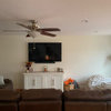
    This is the view of the living room from the kitchen. Taos Taupe is on the wall straight ahead. We are shopping for new furniture. The sofa will stay and the antique filing cabinet will be used too but that's it. Oh, and the dog bed. :) Where the framed pictures are is the future home of our stone fireplace. We have an allowance in escrow from the sellers.

    {{!gwi}}

    Here are my dishes and a pitcher that's on my counter because I love the color.
    {{!gwi}}

  • 13 years ago

    what about SW Grassland or LA Olive 2? I have very similar cabinets and the Olive 2 looks wonderful with them. My MB is painted in Grassland and again have kind of orangy furniture and it too looks great. I went thru so many samples till I realized that a green looks good with the wood tones

  • 13 years ago

    Love your living room (but I think someone shrunk your loveseat :-)

  • 13 years ago

    Hampshire Gray by BM is a green that looks great with orangey wood. Give it a try. It's a historical color.

  • 13 years ago

    sis, you know, that's one of the dozen or so shades of grey-green/greige that I haven't tried. From the chip. I thought it would be too dark, but I like the pics I see on houzz. I'll have to go get a sample tomorrow. I'm trying to avoid the "sweet" shades of green because I don't want the sage green/oak cabinet look that was popular a few years ago. It's not bad, just not my style.

    lukkirish, love your backsplash!

    daisy, lol! Santa brought that for my lab. We are retraining him to stay off the couch. Wish us luck!

    This post was edited by geokid on Sat, Dec 29, 12 at 22:27

  • 13 years ago

    Also consider a warmer color that harmonizes with the Taupe. BM Hush worked with my Birch cabinets and adjacent rooms which were greys and taupes.

  • 13 years ago

    I love your living room too, it just looks so comfortable and inviting, and that little dog sofa is adorable!

  • 13 years ago

    I apologize for primitive ability and software, but just wanted to give you an impression... you can probably do much better using the on line software at a paint site like ben moore or SW.

    And the colors are not right...as funcolors will tell you, I have a lot to learn with dealing with colors, esp on line....

  • 13 years ago

    Thanks! Before we had it installed, I was bound and determined to use a darker green called Grass Cloth (Behr), it doesn't have the olive undertones that your pitcher does, but goes well with the oak floors and worked beautifully with the cabinets. The backsplash has too many blue undertones that it didn't work with it, but I still have it in our mud room and pantry. (btw, love the puppy!)

  • 13 years ago

    I know it sounds like more work to stain the vanities and cabinets, but if those are the source of your unhappiness with the color scheme (and I know they would be for me too) it would be better for the long run to fix that problem rather than try to "tone down" the undertones with wall paint...

  • 13 years ago

    I like the cabinets, when gel staining you'd have to go darker and it is a lot of work. I would wait until after you make some of the other changes before jumping into a project like that.

    This post was edited by lukkiirish on Sun, Dec 30, 12 at 20:24

  • 13 years ago

    lukk, that's exactly DH's argument!

    tinan, we're doing everything slowly and are in the middle of a million projects. I'd love to stain everything right now, but we want to wait until the fireplace is in, the lighting is changed, etc before jumping into a big project like staining everything.

    thanks annie for the mock-ups. I actually like the yellow over the green. Interesting. But it may be because it's the wrong green. :-)

    You can see in the pic of our living room that we have white base moulding. That's because when we had to replace our floors they had to take off the moulding and we figured that was a good time to replace it with what we want. Painting all the window trim BM Mascarpone to match is a project for this summer. I think that will make a huge difference.

    I like to switch out my accessories with the seasons. It was just Christmas so all my green and red and silver is out. In the summer I use brighter colors and autumn is fall colors. I picked neutral walls because of that and I'm kind of afraid to lock myself into a green kitchen. But maybe I just need to do it! I don't know.

    I found out our granite is Tropic Brown and I found this pic on the kitchens forum with a very nice green. It's EK Edgewood Green. Very pretty. Does BM have a similar color?

    I have a lot of samples and one that I really do like is BM Bennington Gray. What about that one, funcolors? Or what about BM Dunmore Cream? It looks like it has green in it. Maybe? I'm terrible at this.

    Thanks all for holding my hand. And thanks for the compliments on my LR. Even with the ratty old recliner that I threw a slipcover on. :-)