Software
Houzz Logo Print
hhulk123

Painted Grey...Looks way too Blue!!!

13 years ago
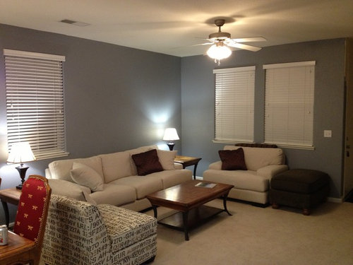
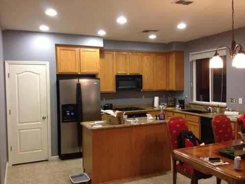
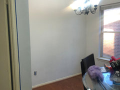
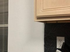
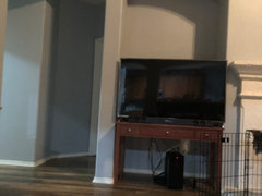
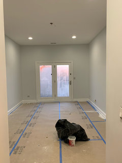
So I wanted to go with a contemporary look and chose a grey tone from Valspar named City Storm. It's a very Grey palette with no blue in the same. The Paint looks very grey, it was grey on my shirt and hands...but once on the wall...it is very blue! Is there anything that caused this or any decorating idea's that can reduce this? I was just shocked. The blue didn't really come out until most of the room was painted. I will be doing a dark grey accent wall opposite of these walls. Not sure if that will bring out the color.

Comments (208)

  • PRO
    7 years ago

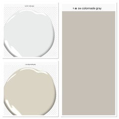
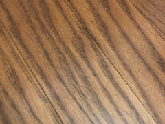
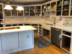
    Your cherry wood floors and cream floor are what have added to making gray look blue...you should choose a warm gray.....I would suggest SW Colonnade gray..or BM Edgecomb gray......here they are side by side look how cool the misty gray is that is why it is looking blue...a warm gray will stand up to your dark cabinets...


  • 6 years ago
    last modified: 6 years ago


    I got Drifting Snow by Glidden and I feel like some walls are pulling more blue than others. The previous color was a weird mauve, but I’m using paint with primer in it. Should I repaint or switch from daylight bulbs?

  • 6 years ago
    last modified: 6 years ago

    do you have proper coverage? certain paints don't have the coverage ability like more expensive brands. Pinks/reds are hard to cover. try another coat. and bulbs in the 3500-4000K range are usually neutral.

  • 6 years ago

    I will add another coat and update. Def agree about the more expensive brands of paint though

  • PRO
    6 years ago

    I had suggested Collonade gray or Edgecomb gray.....

  • PRO
    6 years ago

    HU......did you paint your cabinets? I thought they where Dark Cherry? I see a dark ivory in your image of walls.??.

  • 6 years ago

    the front door is a dark cherry. The cabinets are an ash color of some sort.

  • PRO
    6 years ago

    So confusing?


  • 6 years ago

    Oh! That’s not me. The numbers after HU- are different than mine. I’m goi NT to try to change my username

  • PRO
    6 years ago

    It has been sooo confusing ..Now I see K G?

  • 6 years ago

    Yes, I changed my name. The attached photo is me.


  • PRO
    6 years ago

    Ok so your cabinets are a very ivory/yellow paint color..that is what is making walls go blue..what is your floor color?

  • 6 years ago


  • PRO
    6 years ago

    With warm wood floor and warm painted cabinets gray will go blue so very important to pick a warm gray with a bit stronger of a tint..let get a few colors together.

  • PRO
    6 years ago

    I hate to have you do a second coat of the same color..a new color most likely would only need one good coat.

  • PRO
    6 years ago

    What other colors will be in the room? Table ...chairs..style of lighting?

  • 6 years ago
    last modified: 6 years ago

    I contemplated painting the cabinets, too. I don’t really like the wood it is with the type of flooring. do you think that would help get rid of the blue?

  • PRO
    6 years ago

    It might but that is a big job...misty gray is a cool grey so It will have that cool tone.

  • 6 years ago

    For table, I have a round glass counter-height table. the wood color is espresso. I haven’t decided what decor I want to go there because I was waiting to see how the paint would look.

  • 6 years ago

    Sometimes a primer is necessary so that paint colors are not affected by previous coats of paint. Always paint colors are affected by the colors around them. A client loved the paint color but was so disappointed with how it looked on their wall — until they removed a rug that was “pulling” undertones — once the rug was removed the color was exactly what they wanted. Knowing undertones is critical. The website encycolorpedia is so helpful. Here is what they say about your paint color and why you’re seeing blue “The hexadecimal color code #8f8d8e is a shade of pink. In the RGB color model #8f8d8e is comprised of 56.08% red, 55.29% green and 55.69% blue. In the HSL color space #8f8d8e has a hue of 330° (degrees), 1% saturation and 56% lightness. This color has an approximate wavelength of 510.07 nm.”

  • PRO
    6 years ago

    This post originated in 2012. Is this still an issue?

  • PRO
    6 years ago

    Flo maybe you can help the last poster with wall color.... K G

    yes new gray paint dilemma in her kitchen..I suggested a warmer gray needs to be used......her new paint color is cool.

  • 6 years ago

    We just had the majority of our house painted in SW Lazy Grey. Its very blue (sometimes lavender). We have lots of natural light in the living room/kitchen.


    I can’t afford to repaint, but do plan to get new drapes. I was thinking of navy/white to hopefully darken the grey a bit. I also plan to replace the couch. Thoughts? Advice?


  • 6 years ago
    last modified: 6 years ago

    @Home Interiors with Ease would you happen to be able to assist? We just painted our place sherwin williams nebulous white and our cabinets and trim/ceiling sherwin williams snowbound. Our mantle and under our peninsula seating will be sherwin williams cyberspace. OUR WALLS LOOK BLUE :(

    I also have daylight lightbulbs in all my recessed lighting

  • PRO
    6 years ago

    Hi..yes nebulous White is a very soft pastel gray..that has blue undertone...anything that mentions anything to do with the sky, water, silver and pewter in the name usually will cast a slight blue tone...I have found that out through the years..plus you really need to do your research and order wall samples before taking the plunge...are you wanting To repaint?

  • 6 years ago

    @home interiors with ease I’d really like to not invest in repainting ... :( lesson learned, thank you for the great tips

  • 6 years ago

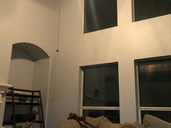
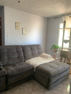
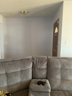
    Another room

  • 6 years ago

    Living area

  • PRO
    6 years ago

    It looks very nice once you add furniture it will be lovely...to keep it from looking too blue..add neutrals stay away from high contrast like black.

  • 6 years ago

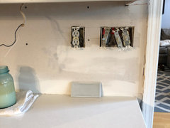
    @Home Interiors with Ease guess what? Another home owner with blue instead of grey...repainting the cabinets is NOT an option - but, I CAN play with the walls, backsplash and flooring (still to be updated)...any thoughts?? Sure do appreciate all the help you give us. **Second photo is the picture of the tile I had planned on using - it is pretty much the same color as the cabinets (which I thought would turn out darker) so not sure if that will give it a nice monochromatic look or if we should try something else. **I didn't want a greige but I wasn't prepared for quite this much blue. THANK YOU!!!


  • 6 years ago

    Holly, I feel your pain. My whole house is done in SW Lazy Gray. My hardwood and white trim are also similar colors to yours. I would love to find some new furniture, but I am stumped for color. Please post what you decide.

    I started looking at older threads and posts, and copied tips to make the room less blue. Maybe these will help. Good luck.

    Orange makes blue more vivid

    brighter blues, greens and purples will make the wall look more gray.


    Lighting will change paint color. The higher the K value the bluer the light. Soft white is more yellow and will tone down the blue in the walls. Daylight is bluer and will intensify the blue in the wall.


    Creamy yellow trim will enhance the blue where bluer white trim will reduce the blue.


    Yellow-toned wood such as oak, yellow upholstery, fabrics or art intensify the purple undertone in the gray paint. Instead, use brown or tan wood in the room to invoke a warmer color on gray walls. Soft white, cream, tan and brown colors on upholstery and fabrics make the wall appear more gray and less purple.


  • 6 years ago

    We’re considering leather couches, the more I play with the color the more I’m thinking the brown leather will bring out the grey (I’m hopeful). I like it better now than I did when it was first painted, but it’s still blue.

    We’re planning to reface the cabinets in white, it may bring out the blue, but that’s okay.

  • PRO
    6 years ago
    last modified: 6 years ago

    Hi Norah

    I would add white backsplash maybe add a gray grout....

  • PRO
    6 years ago

    Nora can you give us a update....by adding dark grey accents or navy blues it actually will help pull the grey rather than the blue out of the cabinets..

  • 6 years ago

    It's moving slow here. We haven't finished the doors and drawer fronts yet. The backsplash will be next (eventually). Our walls are already a dark grey. I was hoping to lighten them to a white with a blue tint to help the cabinets look grey-er do you think that will work? The cabinets were painted Silver Salvia from sherwin williams. Thanks!

  • 6 years ago


  • 6 years ago

    Norah, is that the Nabi Tile? I like it.

  • 6 years ago

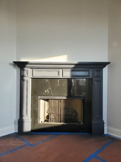
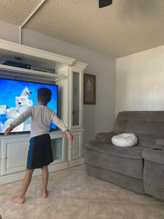
    Hi I just got this app and I would love if someone can help me too. Please help!!! I can’t paint all the wood doors and moldings of the house or chimney and they’re like the door you see and from the comments I’m thinking that that’s what’s causing the blues but I can’t do anything about those. We just painted not too long ago and I don’t like the blue I wanted gray 😢 I also didn’t get the couches too long ago and they don’t seem to help I want to trade those frames for a baby pink, was thinking of adding a blush carpet. Will that make it look even more blue or bring it down to a gray? I might also get rid of the entertainment center because it’s too big and the couches as a combo make it feel extremely tiny. Would baby pink tones make it look more or less gray. I was going for a really bright white and gray and baby pink room but it has turned out blue. 😢

  • 6 years ago

    Think differently: it’s better if you want advice on your home to start a separate dilemma rather than asking here.
    Both Houzz etiquette-wise, and because you’ll do much better! The whole dilemma can be all about your place!

  • 6 years ago

    Oh okay thank you. I’m new to this and saw everyone commenting on here with separate homes so I thought it would be okay. I’ll have to look around the app and see how to do that. Thank you.

  • 6 years ago

    I did just notice someone else did that too!

    It’s fine to pop in with a quick aside, but if you really want to focus on your home, starting your own dilemma is the way to go! Catchy titles, and good pics helpful as well!

  • 6 years ago

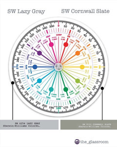
    I had the same problem with lazy grey looking like blue. We also used Cornwall as an accent grey and it is also blue. Im confused what happened and dont know how to fix it. We did two coats and it’s the same. should we have used primer? The original color was like a dark beige. Help!

  • 6 years ago

    I hd the same problem & don’t agree with most of these suggestions! I am 77 years old & have painted many apts & houses in different states & locations and never had this problem! UNTIL, my grandson moved into his new home & has the most beautiful grey walls BUT, when I painted my den walls the same color grey they are very, very blue, not even close to Grey???? THE QUESTION SHOULD BE “WHAT HAS CHANGED WITH MODERN PAINT & WHY? When I go to a paint store & pick out a paint I HAVE A RIGHT TO & EXPECT MY WALLS OR CABINETS TO BE THAT COLOR, so WHAT has changed with paint???????

  • 6 years ago

    Hi - there are a number of different things going on here. If we try and unpick them a little, it‘s possible to have a better understanding of why these colours are looking different than expected.


    1. Homeowners are NOT being helped by the paint companies!


    Were they to share more information about the inherent properties of each paint colour, the need to guess about them would massively diminish. For whatever reason, that vital information absolutely required to conceive, make and match paint colours in the first place, is being lost by the time it gets to the marketeers, front of house, who sell products to you.


    You are not being told this stuff, because the people who sell the products aren’t party to it either! Madness!


    2. The problem you are having with Lazy Gray turning blue?

    What you need to know and you aren’t told, is that Lazy Gray ‘IS’ Blue!


    Admittedly, it’s low quantity of Chroma, makes it a near neutral, but its measured attributes place it into the Blue Hue Family.


    In a room with better balanced lighting, it is likely to read as anticipated - a near neutral gray. In your space, with your lighting, it’s ’blueness’ is more obvious. These are not ‘undertones’ as described by so many, but an inherent part of its colour DNA.


    3. Mentioned in a previous post - Cornwall Slate turning blue?

    The reason is slightly different, although the effect is the same.


    Factually Cornwall Slate belongs to the Green-Yellow Hue Family. BUT - low Chroma colours from this bottom right hand quadrant of the wheel, can notoriously SHIFT blue in imbalanced light. It is an effect of available light quality upon the colour.


    This is why some people will see Cornwall Slate as a darker, near neutral grey. Some people will have more flashes of greenness and others will see it as downright blue!


    You won’t know which aspect of a paint colour’s character will dominate, unless you test in YOUR space with YOUR lighting first.


    But if a colour’s attributes and Hue Family were shared, at least you might know what to look out for. And these near neutrals, which so many of us choose for our homes, are far more likely to be impacted upon by light than more colourful colours.


    3. This one is completely down to us. A fundamental misunderstanding about paint colour.

    Introducing paint colours to the walls, is NOT like adding a new cushion or lamp. If you imagine it is, you are likely to be constantly disappointed.


    *Architectural paint colours aren’t another static object, with which to accessorise your room - they are an EVENT in your space!*


    And just as with any other event, if you change the venue and the lighting, the character of that event changes too. So how a colour reads in someone else’s room, can go only so far to suggest how it may render in your space. This is why it is important to test in your own room.


    Light + wall colour = a phenomenon for your eyeballs and brain.


    p.s. As an example of colour shift, have a look at photos of Sherwin Williams Passive, on here, Pinterest, Homebunch etc. See just how differently the same colour can appear!


    To know in which Hue Family lots of popular colours belong check out the Colorographies at The Land of Color .com


    🌈

  • 5 years ago

    Pjb411. YES!!! I’ve been saying the exact same thing and have also been painting rental homes for 40 years without any issues in color until last 1-2 years. Gray colors are now the worst!


    Plus the LED usage creates a whole different animal where paint color is concerned. 4,000K + really pulls the blue/violet of gray paints with this undertone to where I refuse to use any gray paint colors. If it looks gray in any way, it’s out!


    Someone, somewhere must know what ingredient in paint has been eliminated that is now causing all the issues.


    Side note: recent experiments with making own chalk paint to mix with gray point is showing promise in eliminating the “creeping gray“ the color change we‘ve all experienced.

  • PRO
    5 years ago

    Paint companies have changed their formulations of base paint to meet market demands. As Marylee stated, they are protective and keep this info tightly guarded. However, I sense this is about to change at least somewhat. There is a consolidation of these companies and I am hoping new management realizes consumers are getting smarter and smarter about the color industry. I had my eyes opened about color and a more scientific method when I took Lori Sawaya’s Four Pillars of Color course. Wow! It was intense and changed everything I thought I knew about color. Funny, but this knowledge has been out there for a long time, but it took a pioneer spirit like Lori to educate herself in depth and develop courses to teach professionals this information. There is no such thing as an “undertone” for example. So enlightening. I use that knowledge about color everyday! Take a look at Lori’s website or videos to gain an appreciation of this topic. Prepare to be stunned!

  • 5 years ago

    @Home Interiors with Ease I would appreciate any feedback.

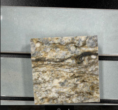
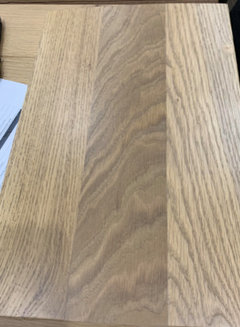
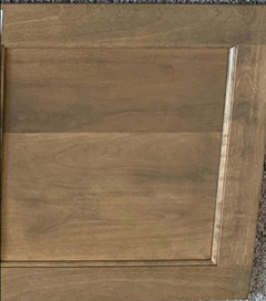
    To start with, we want Blue dunes granite with medium dark brown stained cabinets. I have attached the picture of the cabinet stain color, backsplash we picked out, granite and flooring. We have decided on Sherwin Williams Agreeable Gray on wall color for now. I have been fighting with myself if it is all going together well.


  • 4 years ago


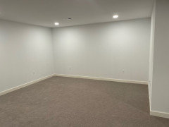
    We just finished our basement and after the carpet was put in, we realized the walls look BLUE. Ugh they are supposed to be white. Any suggestions on how to minimize the blue?

  • 4 years ago

    May I ask what colour are the walls?

  • 4 years ago
    last modified: 4 years ago
    Samantha, if your bulbs are a 5000K or higher, white will appear blue. try dropping it down to 3500

    If you got a white paint w/blue undertones, it may look blue. what color is it?