

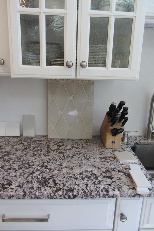
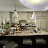
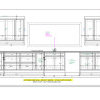
Still no backsplash but getting closer
14 years ago
Sort by:Oldest
Comments (5)
Related Stories
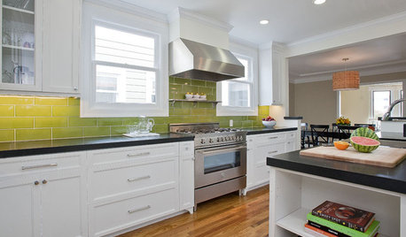
KITCHEN DESIGNCloser Look: Faux Ombre Kitchen Tile
See how this green-apple colored backsplash gets its extra shine
Full Story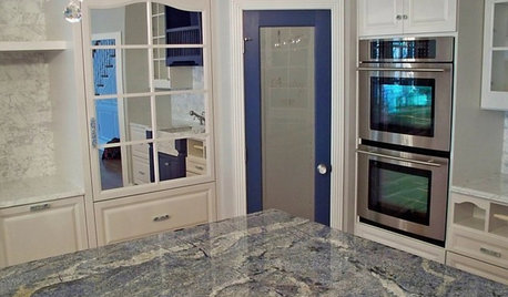
KITCHEN COUNTERTOPSKitchen Counters: Granite, Still a Go-to Surface Choice
Every slab of this natural stone is one of a kind — but there are things to watch for while you're admiring its unique beauty
Full Story
TRANSITIONAL HOMESHouzz Tour: Family Time Gets Top Billing in Suburban Chicago
A home dedicated to bringing a family closer together combines comfort and style
Full Story
REMODELING GUIDESCloser Look: Lindsey Adelman's Bubbles of Light
Unique handblown light fixtures play with shapes of both nature and machine
Full Story
BATHROOM DESIGNShould You Get a Recessed or Wall-Mounted Medicine Cabinet?
Here’s what you need to know to pick the right bathroom medicine cabinet and get it installed
Full Story
BUDGET DECORATING8 Cost-Effective Ways to Get a High-End Look
Don’t discount that expensive material yet. By using a small amount in a strategic way, you can get a luxurious look without the expense
Full Story
KITCHEN STORAGECabinets 101: How to Get the Storage You Want
Combine beauty and function in all of your cabinetry by keeping these basics in mind
Full Story
KITCHEN DESIGNGet a Grip on Kitchen Cabinets With the Right Knobs and Pulls
Here's how to pair the right style, type and finish of cabinet hardware with your kitchen style
Full Story
DECORATING GUIDESA Mobile Home Gets a Bohemian-Chic Makeover
Designer infuses world traveler’s guesthouse with tribal textiles, Moroccan tiles and kilim rugs
Full Story
BATHROOM DESIGN10 Top Tips for Getting Bathroom Tile Right
Good planning is essential for bathroom tile that's set properly and works with the rest of your renovation. These tips help you do it right
Full Story
phiwwyOriginal Author
phiwwyOriginal Author
Related Professionals
Frisco Kitchen & Bathroom Designers · Kalamazoo Kitchen & Bathroom Designers · Traverse City Kitchen & Bathroom Designers · Brooklyn Kitchen & Bathroom Designers · Orlando Kitchen Remodelers · Elizabethtown Kitchen Remodelers · Cherry Hill Kitchen Remodelers · Dallas Kitchen Remodelers · Waterbury Kitchen Remodelers · Moline Kitchen Remodelers · Burlington Kitchen Remodelers · Flagstaff Kitchen Remodelers · Calgary Kitchen Remodelers · Lake Charles Custom Countertops · New Orleans Custom CountertopsphiwwyOriginal Author
beekeeperswife
chloe.chloe