Software
Houzz Logo Print
houzzerpolls

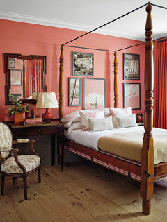
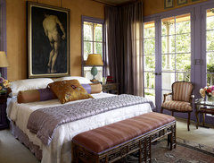
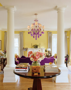
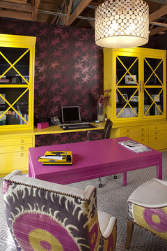
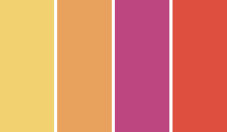
POLL: 4 Hot Color Trends! Which is your favorite?

13 years ago
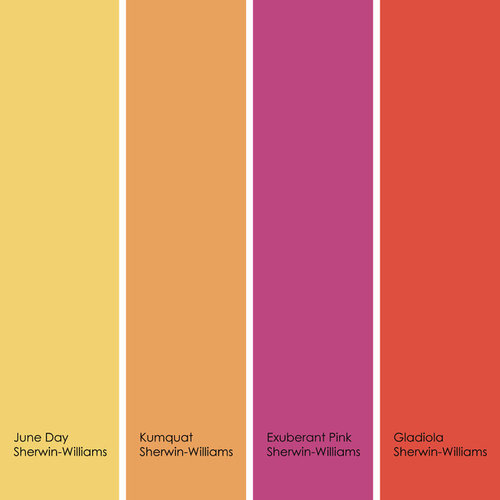
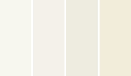
Houzz ideabook, 4 Hot Color Trends to Consider for 2013, explores four hip colors beyond newly crowned color of the year, Emerald.

Do you have a favorite among them? Which one would you like to use?
HotPalette.jpg · More Info


You can check out the full ideabook here: http://bit.ly/SHSLvW

Comments (51)

  • PRO
    13 years ago
    last modified: 13 years ago
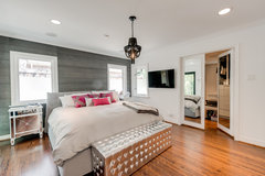
    I am going for pink this year !!! just in small amounts though.

    Finished House · More Info
  • PRO
    13 years ago
    I love Ben-Mo's 2013 color of the year
  • 13 years ago
    I like red... its such a vibrant color and very unisex :)
  • 13 years ago
    last modified: 13 years ago
    Crushed berries....Yummy! But, like Dytecture...just a sampling.
  • 13 years ago
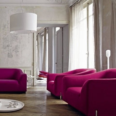
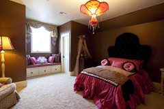
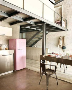
    Easy---PINK!!!
    [houzz=
    Ligne Roset | Stricto Sensu - Didier Gomez · More Info
    ][houzz=
    Gaillardia show home · More Info
    ]
  • 13 years ago
    I missed the whole pink thing as a little girl so I'm looking forward to it in grown-up applications.
  • 13 years ago
    It is pink for me, too.
  • 13 years ago
    My favorite color is a warm full bodied grey.
  • 13 years ago
    What?!? Is pink the new orange?
  • PRO
    13 years ago
    last modified: 13 years ago
    Steven Gambrel Time and Place · More Info
    T8 · More Info
    Corbett Venetian · More Info
    my office · More Info
  • 13 years ago
    I have always preferred oranges because it is just in between the reds and yellows and always lightens up a person's mood.
  • 13 years ago
    reds seems to be so attractive.
  • 13 years ago
    And 50 is the new 30... lucky for me.,..lol
    I guess I will take yellow if I must pick one. The others make me feel like putting on a psychedelic outfit and dancing like Goldi Horn on Laugh In
  • 13 years ago
    It's hard to pick a single palette when there are colours I love (and others I'm not such a fan of) on each palette. I finally settled on red, but if I could pick individual colours it would be: gladiola, sweet melon, strawberry hills, lemon pound cake and feverish pink.
  • 13 years ago
    I love the Peachy Keen by Ben Moore. But peach paint in the can isn't the same as peach paint on the wall! On the wall it always looks muddy.
  • 13 years ago
    I'm with Emily on this. The creamy, buttery yellows get me every time. Like sunshine in the house!
  • PRO
    13 years ago
    Karenpaul,
    You just made me clean my desk, and pick up my sample piles!!!!!. Looooooooooooove your office babe!!!
  • PRO
    13 years ago
    Okay ...... NO !! can do, nor let a client do natural red oak with reds/pinks palette. It makes me cringe. It has always made me cringe. Deep browns, ebony, espresso, light maple, anything but natural red oak. Unless you really love ORANGE, because that is how your oak will read.
  • 13 years ago
    gladiola
  • 13 years ago
    I love yellow. It seem to brighten a room when you add other colors with.
  • 13 years ago
    What might be my favorite color for one area of the house, might not be for another, so this whole "favorite color" thing doesn't work for me! I also found - in a house with lots of large windows - pastels fade out a little, and the colors look different at different times of day. I have BM's "Peach Nectar" in a few rooms, and sometimes it looks more pink than I'd like. I'll agree with Bobbi that what you see on a website doesn't perfectly match the sample sheet they'll send, or what the wall eventually looks like.
  • 13 years ago
    astaea, good point about colors in rooms with large windows. If the foliage color changes throughout the year, that will also have an effect on the perceived wall color.
  • 13 years ago
    I have one window that fills with wisteria's lavendar blossoms in the spring, but in winter the vine's bare & cut back a lot!
  • 13 years ago
    Honestly, I hate the whole idea of colour trends! Call me unstylish, but this giant corporate machine that makes us want to change everything all the time drives me nuts! I have to admit that my style and colour preferences do change over time and I do update and it is, I'm sure, partly based on trends. However, colour and everything else in your home should reflect the people that live there, not what happens to be hot for the moment. I hope I am not offending anyone.
  • PRO
    13 years ago
    I did the golden yellow in my kitchen 5 years ago Tuscan Gold American Clay and it always
    makes me feel upbeat !! Although Pinks are quite good in unexpected spaces.
  • 13 years ago
    I like all of them together the best.
  • 13 years ago
    going for the melony oranges! I do love citrus!
  • 13 years ago
    These colors are gorgeous ACCENTS (i.e. pillows/rugs/etc). Awful as "color schemes." Unless you want your house to look like a candy store or a Dr. Suess cartoon?
  • 13 years ago
    I'd go for any and all of these four over emerald green!
  • PRO
    13 years ago
    Going yellow! My favorite feel good color!
  • PRO
    13 years ago
    It's how one color works with another that excites me, so I can't choose any of the above, except for the combination of colors put together by Jennifer Ott near top of page.
  • 13 years ago
    I used Lowes Mango orange in my laundry room. Love it!
  • 13 years ago
    They all look good against my skin so I guess I could use them all in different spaces.
  • 13 years ago
    I just did orange in my family room. I love it
  • 13 years ago
    Karri Flatla.... your comment cracked me up just now. thanks I needed that.
  • PRO
    13 years ago
    I NEVER follow trends!! I try to keep my work " timeless!! Trends come and go, yet, most people do not decorate every year or every seanson!! I will say, I am sticking to my earth tones with splashes of color here and there!! We must remember, most people re-decorate every 10 years on average!!
  • 13 years ago
    I voted for the oranges, but I am torn by the yellows. My kitchen will wind up being a soft light ochre, grayed counters in Silestone and stainless steel (cooking side) plus white cabs and light ash floors. For my last 3 living rooms, it's been Behr's Warm Terra Cotta walls, looks great with my deep green container plants and white woodwork. Becomes barn red by lamplight.
  • PRO
    13 years ago
    last modified: 13 years ago
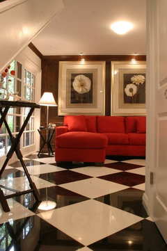
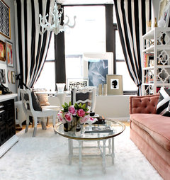
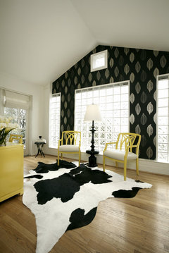
    So now, moving forward, you will be taking these favorite colors and injecting them into the basic black and white scheme. So, it follows, one of the most visually stunning palettes is the jade, black and white from the Darzy (Bloomingdale's) day of yore. You will find that all of the above favorites can be very nicely "eased" into the new (old) black and white scheme. Some photos.
    Drama · More Info
    NYC Fashion PR Firm · More Info
    Pulp Design Studios · More Info
  • 13 years ago
    i like pink 2013
  • 13 years ago
    Aubergine is my most favorite color. It is so rich, full of body just like a really good glass of Merlot. It's a very yummy color ~ just like an unbelievable piece of 72% Dark Chocolate. It makes me feel very comfortable when I'm around it or wearing it.
  • 13 years ago
    Orange is my favorite!
  • PRO
    13 years ago
    last modified: 13 years ago
    Just stole some images from orangecamera's ideabook. Born in October so have good warm feelings for orange. Some of these orange tones are a little too pastel.
  • 13 years ago
    Orange has also become my second favorite color. I love it with purples. I didn't like these colors at all when I was young and now I'm crazy about them. Oh what COLOR can do in so many ways. :)
  • 13 years ago
    yellow goes with any color when you really think about it, so I pick yellow incase my taste changes, I can change without having to repaint a large space ))
  • 13 years ago
    Stone & Land, I'm honored, but I cannot take credit for the photos in my ideabook. The are all someone else's ideas that I'm collecting. I'm glad you're finding inspiration in my collection. :)
  • PRO
    13 years ago
    last modified: 13 years ago
    I know, but sometimes it the easier way to get fast ideas. This site has inspired me so that next year I plan on collecting and uploading photos from my past clients & projects. Sometimes the landscape projects look a little better with a year or two of maturity. Hopefully then people will "steal" from me.
  • PRO
    11 years ago
    I think pinks were a big color trend over the past year or so
  • PRO
    11 years ago
    I do like Strawberry Hills Mythic the best. Dark red looks very elegant.
  • PRO
    10 years ago

    I could see any of these color options in the right house, for the right client, and I could enjoy using any of them.

    Just a note on trends though -- I don't believe in following a trend for the sake of following a trend. Follow the trend if it is something you love and will love for quite awhile. Otherwise, identify what color/s YOU like and surround yourself with them. Your home needs to support you mentally, emotionally and physically . . . using the right colors for you helps to accomplish that goal.