Software
Houzz Logo Print
mgidelet

Where are the chandeliers from?

13 years ago
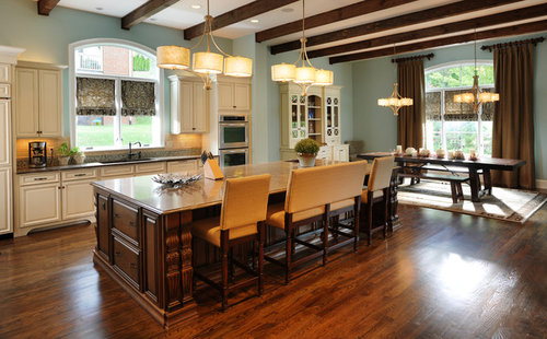
Kitchen Island · More Info

Comments (4)

  • 13 years ago
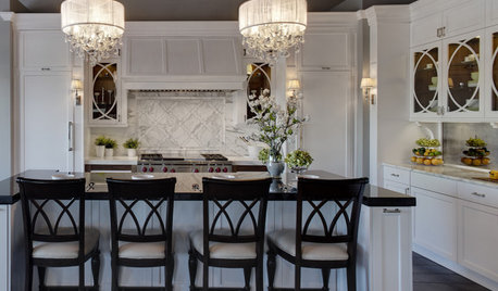
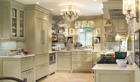
    The light fixtures in this picture are all from Capital Lighting. You can purchase them through local or online lighting stores. Here are the model numbers and links to the products on the manufacturer's website:

    Over Kitchen Island (3937WG-482) = http://bit.ly/xL23xL
    Over Dining Room Table (3936WG-470) = http://bit.ly/yrSIng
  • 13 years ago
    Your house is Beautiful!!! We are building right now and trying to decide on a island and trim/door color. Right now our kitchen is set up just opposite of yours, our cabinets are a dark stain and our island will be the lighter color. Problem is, we can not decide on the color. Our designer is saying do Moderate White on the island and carry it through on the trim & doors. I am just concerned if we do this color we will not have the white trim look were originally were thinking...?? We will have a semi gloss over the color and that may also help it seem a bit lighter. How do you like the Moderate White color? How creamy is it? Does it still pop?
  • 13 years ago
    Thank you for the generous compliment! The Moderate White from Sherwin-Williams does have a certain creaminess to it, but not so much that it "browns" or "tans" out the look. In my opinion, by itself, the Moderate White looks whiter than it does when compared directly next to a stark white. The vanities in our master bathroom are also done in Moderate White, while the window trim and shutters are in a truer shade of white. I would advise looking at those pictures (available on this website) to see the comparison. The other thing I would advise would be to pick up a sample pint of both colors and paint them on a small piece of baseboard or trim (which you can buy from your local hardware store) and compare them in indoor light. The funny thing about paint colors is that they have a tendency to look different than they do on a swatch when applied to different materials and under different lighting conditions. If you would like me to send you a few pictures of places in our house where we have used the Moderate White next to a truer white, I will be happy to do that. Shoot me an email and I will respond. My email address is "bpbenda[at]gmail.com". Thanks again and good luck!
  • 13 years ago
    As for our opinion of the application of our color palette, we are very pleased with our choices. My wife worked on the colors for between 6 months and a year before those choices were needed. Although several of our color selections would require a leap of faith for some home owners, one common theme is that we chose lighter and more muted shades of the colors we wanted. So, we weren't necessarily going for a "pop", but rather a smoother spread of color, if that makes sense. Our ceilings (unless obviously not), baseboards, crown, window and door trim are all a standard white. The kitchen cabinets, master bathroom vanities, and one of our guest bathroom vanities are all finished in Moderate White from Sherwin-Williams. Bear in mind, too, that each of those cabinets that I just mentioned also have a chocolate pen glaze, which should naturally darken their appearance a little.

    We had a true "white kitchen" in our last house. Personally, we think that look is dated. I don't think that means that you can't use a true white anywhere in your kitchen -- you want balance. So, it is impossible for me to say without actually seeing your kitchen and/or selections, but by your description it sounds like the stained cabinets should help create that balance. In the end, remember, it is your house and you have to live in it. You are using a designer because you value his/her input, but if you have a strong concern over a particular suggestion, go with what feels right. The kitchen is one of the most, if not the most, important rooms in your house. Don't compromise if you aren't feeling it. Good luck!