Software
Houzz Logo Print
lisaa007

Tamara & Houzz powers-that-be

11 years ago

As I'm sure you've learned by now, there are many disgruntled GWers here. I have noticed, though, that you are trying to address issues so in that vein, I thought I'd start a suggestion box for GWers to post things they'd like to see happen. There were a lot of things about GW's forums that worked and worked well - and a number of things that didn't. If there's a way to bring back the things that worked, please do so.


I'll start:


Please increase text contrast. The soft contrast is hard to read for many of us, causes eye strain and thus will drive down how much time we spend on the board. In case it's not obvious, we GWers are big on function over form and right now, the forum function is lacking.


Please find a way to show the date of when a thread was started, not just how long ago a recent post was added. It's really hard to tell whether we're opening a very old thread (one surfaced today from '06, another from '09) or a current topic.


Please set it up so that the threads we've recently read show in a different color, same as it did on GW. That way we can tell more quickly which threads we haven't read and which ones we have.


When we open a thread, please have it take us down to the last post we read. This would be a very good thing now that the post cut-off is no longer 150. That's a lot of scrolling we have to do to get to the end.


Please let us post more than 4 photos. This is a biggie when we do reveals. We all want to see what others have created and 4 photos just is not enough.


We are able to edit but once we do, there is no indication that a post has been edited.


Could you please allow unanswered new posts to stay "sticky" at the top for a period of time, as they did on GW. That was really useful.


Can you add the "read me if you're new" thread to this new forum and make it "sticky." I referred new posters to it regularly; we need it back.


If there is *any* way for those of us who kept their clippings private to get them back, please help us! I'm not the only one who lost a lot of information forever.


I'm quitting - head and eyes hurt from this horrible font/contrast format - so I'll turn it over to others to offer suggestions to improve the forum.


Please keep it civil, folks. I know many of us are unhappy, me included, but I'm hoping that the powers-that-be will listen and do what they can to get us mostly back to what we really loved about how GW worked.

Comments (174)

  • 11 years ago
    last modified: 11 years ago

    hv, I liked you and like you.

    It's not hard to teach people to quote properly, GW-ers can do it, I'm sure.

    Problem with most of our requests is, I don't think the Houzz programers have the know how to achieve them. Which is tragic, considering the technology is already out there and available for free.

  • 11 years ago
    last modified: 11 years ago

    I'm happy we're all here, really!! A few things:

    1) I find the text in the threads okay. However the list of forum threads is really pale, really an effort to see. The green? It's terrible. Recently I worked with a company to update a website for an organization I belong to. Same thing, hard to read text (too light in weight as well as color). I told them it needed to be easier to read. They went, Oh?!! They were all young and their eyes were still good. Eyestrain = fatigue.

    2) I'm still waiting to hear from an admin about changing a post I can no longer edit. I put too much personal info on it. Hopefully there's some recourse.

  • 11 years ago

    Hi all,

    We are definitely still reading these threads and working on adjustments daily to make this transition more comfortable for everyone. Hopefully, you've noticed some of the changes since Monday - those were in direct response to feedback we've received via email and on GW. Please stay tuned, as more updates are coming.

  • 11 years ago

    Another thing, besides the snow-blindness I have, I believe the text columns may be too wide to comfortably read. Newspaper columns are narrow for a reason, to read the text easier. Especially with the opening posts in each thread, it is too wide. It is hard for the eyes to relocate the next line, when tracking back to the left of the page.

    also, I am sorry to say, that every time I go to my forum links on the top of my firefox browser, I hesitate and have this feeling of dread when I am about to open GW/Houzz. I think it is the visual experience that is doing this to me. I love the content and all the people so I know that's not it. I believe it is the graphic experience. It is laborious to browse in my opinion.


  • 11 years ago

    Enduring, I feel the same way about coming here now. I know it's going to be uncomfortable.


    Tamara and Emily Hurley, another request. Can you adjust things so that we can post larger images? It's really difficult to see lay-outs clearly to offer suggestions to fellow GWers.

  • 11 years ago

    Yeah, the nice thing about HTML on the old forum was that you had much more control over the stuff you embedded, like images. It would be great if they could bring that back (that was one of my favorite features of the old GW) but unfortunately I think the chances of that happening are very slim.

  • 11 years ago

    Just got a new iPad and I have to say this site looks so much better on it than on my laptop.

  • 11 years ago

    How is it different, Linelle?

  • 11 years ago

    Well, may_flowers, I think the retina display helps a lot. Maybe the text has been darkened by the admins? Dunno, it just looks crisper and cleaner and altogether more appealing.

  • 11 years ago

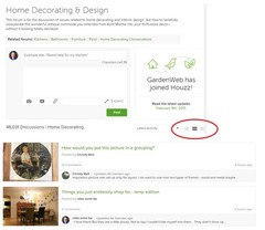
    This has already been mentioned: I really like the middle choice under "Latest Activity" (right upper corner) for viewing posts. This option is only available for page 1. If you click on that choice when you are page 2, it takes you back to page 1. It would be nice to have that view/format for every page.

    Thanks!


  • 11 years ago


  • 11 years ago

    This has been said before, but it bears repeating--If you could just pale the background a bit (to get rid of so much white) my eyes would be much happier. I've tried for the "I'll get used to it" but it isn't happening. My eyes are very tired after Houzz Forum time. FB has a light blue background that mitigates the "snow blindness" someone else commented on. GW was a yellowish background. The stark, bright white is too much for this fair Pacific Northerwesterner's eyes (and, I don't even have old eyes!) Seriously thinking I need a pair of sunglasses for for this site...
    The color scheme works fine on the regular Houzz site because what you are actually looking at is large images. Text on white is really killing my tolerance for forum time.

  • 11 years ago

    I still have some cached pages of the old site and it has a white background for the text area. Maybe it was easier on your eyes because of the photos and various items in the right sidebar. I typically work on my iPad and stretch my page so I'm only seeing the text which has a gray background. For those that are using Firefox, you can choose to use your own selection for fonts and colors by going into your browser settings in the Content section.


  • 11 years ago

    It might look white, but it wasn't. It was a cream/yellow color. And, yes, the side-bars were colored.

  • 11 years ago

    I finally figured out how to dim the screen on my monitor. It helps somewhat. Not so much with the green and too-thin text, but it does help to aleviate the eye strain from the blinding whiteness.

    bbtrix, it seemed like the text on Gardenweb was somewhat bolder, as well as being darker.

  • 11 years ago

    Perhaps the green needs to be a little darker to give more contrast between the title and the text. The white is so very bright.

    bbtrix - you posting that pic of a GW page has left me feeling a little nostalgic and I was doing so well. I miss the blue.


  • 11 years ago
    last modified: 11 years ago

    I open the pages in separate windows, as opposed to “tabs,”
    and I’m able to move the right half of the window off of the right side of my
    computer screen to get rid of almost half of the SNOW that’s glaring me in the
    face. That only works when you’re reading
    or posting on an individual thread, though.
    When you’re on the main forum page for any individual forum you need to
    keep the whole window visible if you want to see the “last update” info since
    it’s SO far off to the right. But as a
    temporary fix that might help some of you with the glare situation till
    it—hopefully—gets fixed. Works on a
    desktop/laptop, don’t know about other “devices.”

    Another short term fix for some of you, as JellyToast just
    said, is to dim, to whatever degree you’re comfortable with, the “brightness”
    of your screen/display. I do that all the
    time anyway, I’ve never had it on “full bright” which would blast me right thru
    the wall behind me. During the day I
    keep it brighter, and when I have low light in the room after dark I dim the
    screen to be “more comfortable.” On a
    mac that’s really easy to do in the preferences, but I don’t remember where it
    is on a PC—but I know you can do it! It
    really does help to take some of the “ouch” out of looking at the forums right
    now.

    As others have already said, it would REALLY help to get a
    bolder typestyle like the Olde GW had.
    And, while this isn’t a problem for me, I’ve read comments that for
    people with color blindness, the green is causing problems (and, having been
    married to someone with color blindness, I can see how that particular green
    would be a problem), so going back to the old blue, or something besides green
    should help some of the people that are having a problem now.

    I’m still really hoping we’ll be able to, at some point,
    post pics thru our hosting sites again.
    With the way it is now, all functionality is lost with the posted
    pics. They’re too small to be useful
    with small detail, which can be really important when trying to illustrate a
    “how to,” and I’ve tried opening them in a separate window and enlarging them
    there, but they, almost immediately, lose too much resolution to be useful that
    way. In the past when I posted pics they
    could be opened in my hosting site in the large version, and then magnified (a
    lot) without losing any resolution at all.
    I could also post “small” or “thumbnail” size pics in the thread to save
    space, but anyone who wanted to could still see the full size image if they
    wanted to. Except for “pretty,” pics
    aren’t very useful anymore the way it is now.
    If this could be fixed—at some point—I know (from reading) a lot of
    folks would be happier [strikethrough] Jumping With Joy!

    Thank you, Admins, for your continuing efforts to get Our
    Happy Home back to a more usable format!
    We really [bold] do [/bold] appreciate it!

    Skybird [still interloping on forums where I don’t
    belong! But this is one of the best
    “help us” threads!]

  • 11 years ago
    last modified: 11 years ago

    I am wondering if Houzz is reluctant to change the green font because of the green color being associated with their site and their logo. For me, green is now being associated with headaches and eye fatigue. Still hoping they reconsider their choice.

    Am I the only one reading text like this ... We really [bold] do [/bold] appreciate it ... or is the word "do" actually bolded on some screens?

  • 11 years ago

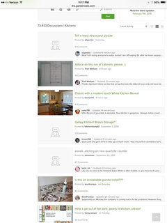
    TOTALLY ANNOYING ... having to look from the post title, with the date of original file, all the way to the right margin for the last updated time.


    Flunks all kinds of usability standards.

  • 11 years ago

    jellytoast, we can't use HTML anymore, so you're seeing it correctly. No more bold, italic, or strike through text. I think some of us may be writing it out as a tongue-in-cheek way of expressing frustration at the loss of this ability (I have!)

    Day two of a mild headache that won't let go. The only thing that has changed for me is this website (I think that is the cause.)


  • 11 years ago

    I know this doesn't help the rest of you much but I find the usability and reading better here than on GW. I also like how much quicker things load. I wonder if some of these issues have to do with which browser is being used? I use Chrome.

    In order to not have to look at the far right to see the date of the last updated time, maybe choose one of the other viewing options. One shows the last post right on the main page. The other shows several of the last posts. The only time I ever even need to open up a discussion is to read the OP. After that, I just keep it on the third option and read all the posts right from the main page. So much quicker and easier, imho.

  • 11 years ago

    Interesting point, funkycamper. I'm also using Chrome and haven't had any problem. I do tend to get computer overuse headaches every now and then. Nothing this week and I've been on more than usual.

  • 11 years ago

    Hmm that's interesting. I'm using FoxFire. Maybe I should try Chrome.

  • 11 years ago

    I think everybody should use Chrome. Love it. :)

  • 11 years ago

    I have Chrome and still had to adjust the brightness way down on my monitor.

  • 11 years ago

    I dissent. I use Firefox under duress. I prefer IE, believe it or not. However, I don't have a week to wait for a page to load, then to have IE blame it on "xx is not responding?

    I do love many things about Firefox and don't have any interest in Chrome. I also just turned down the brightness on my monitor. Admittedly, I use this screen as a night light since it's SO DARNED BRIGHT, but I don't get headaches.

    Things are coming along!

  • 11 years ago

    Hi there,

    We did make a change in the messaging options last night. If you are not able to message a user now, it is because the setting on their profile either allows messages only from those people they follow, or does not allow messages at all. This setting can be adjusted by visiting your profile, clicking Edit Profile, then looking under Advanced Settings for "who can message me" Hope that helps!

  • 11 years ago

    Is there a way to go back to the main forum page without scrolling all the way to the top of a long thread like this one & clicking "kitchens?" At GW there was a link at the bottom of the page that made it really easy to go back.

  • 11 years ago

    Hi Emily. I have changed my settings to allow anyone to message me. I clicked the Update button. When I go to my own page and select Public View, there's simply nowhere to initiate a message. When I return to my Private settings there is a message center which contains 0 messages. So it appears possible to receive but no way to send.

  • 11 years ago

    Linelle I see a message button on your profile page.

  • 11 years ago

    Oooh oooh, and I see one on yours sena01. Could it have been there all this time and I didn't see it? I swear I looked for it, but I've been known to miss something right in front of me. :P

  • 11 years ago

    Hi Linelle, You initiate a message by visiting the profile of the person you would like to message and clicking the message button you see there (assuming they are allowing messages). There is not a way to do that from your own profile, unless replying to an existing message from that user. Sorry for the confusion!

  • 11 years ago

    @Carrie That's good feedback. There isn't currently a link like that as you have discovered, but in the meantime, you can click the back button on your browser and can get there without the scrolling. Hope that helps!

  • 11 years ago

    Thanks Emily!!

    Okay, I see the Message button on sena01's profile page, but not on scrappy's.

  • 11 years ago

    Since this is such a good thread (results!!!), I will ask this here. Please forgive me if it's already been asked a dozen times. If so, just point me to the appropriate thread:

    Is it possible to include the name of the user making the last post? Since there's no longer a time stamp, it's getting harder to pinpoint the exact time I viewed a post. If I made the last post, I can see that and don't need to keep visiting a thread to see if there were any subsequent posts to mine. As it is, the only way I can sort of keep track is note the number of posts when I last viewed it. That usually doesn't stay with me long. :)

  • 11 years ago

    Hi again, There is actually a way to view the forum threads that will give you this information. If you look just at the top of where you see the names of all the threads, on the right side you will see some buttons to select which view you would like. Try the middle button for a little more information visible with the subjects, including a bit of the last comment. :)


  • 11 years ago

    Emily, thanks. I will have to give that view a try.

  • 11 years ago

    Emily Hurley - thank you for fixing the messaging option in the profile.

  • 11 years ago

    For those wanting some semblance of the old gardenweb look back, and for those posting about eyestrain, if you're using chrome & firefox (and maybe others - dunno), here's a great solution:

    http://forums2.gardenweb.com/discussions/2854079/installing-stylish-to-change-houzz-background#14392444

  • 11 years ago

    Wow, thanks rexed! It works and is so much nicer. I chose the morning glory option. Good post.


  • 11 years ago

    Glad you liked it too Deedles - i only cut and pasted from lovely JasmineRoses4u...but she'd only cut and pasted from antiques... But this is how the forum works, isnt it!

    I chose Morning Glory as well and it's made me feel THAT MUCH CALMER about this switcheroo to Houzz... almost like... I might even be able to stay here, afterall....


  • 11 years ago

    Beagles added it to Safari. Maybe there's more info in this post:

    http://ths.gardenweb.com/discussions/2844113/firefox-stylish-add-on-to-customize-your?n=22

  • 11 years ago

    Tamara/ Emily/ Admins, could you tell us how we can report posts/ posters who are Spam? There is a gradual but steady number of posts on this forum which are clearly Spam. Thank you.


  • 11 years ago

    Rexed et al: I downloaded Stylish for Firefox, restarted my computer, and.... nothing. I have a Mac, with Firefox. All looks the same & I don't see Stylish anywhere to make changes.

    Gemcap: I'm with you. This morning's spam, bringing up old threads is awful


  • 11 years ago

    Carrie, I'm not on Mac, but do you see Stylish icon on the top toolbar (S with some colors on the background)? If you click on that and choose Find styles for this site... it opens a new window with styles to choose from. Click on one and then click on the green button + Install with Stylish.

    For spam, did you try the flag on the top right corner?

  • 11 years ago

    Sena - thank you! My "S" was very small, and had no colors in the background, so I didn't even see it. Now that I've clicked on it, it has colors. So much better!
    I also flagged the spam - don't know why I couldn't find the flag the first time I looked.
    Today, you are my favorite.


  • 11 years ago

    Gemcap -- I'm not admin, but perhaps I can answer your question. If you click on the tiny black flag in the top, right-hand corner of any comment, a box pops up that allows you to report it. The comment will then disappear from your screen until admin reviews it.

  • 11 years ago

    @Emily - the "back" button only works to get to the main page if that's the last place you've been. If, for example, I'm following a particular thread & get email notification, and follow the email link to the thread, then "back" won't work. And, often, I'll follow the email & decide that while I'm here, I might as well see what else is being discussed on forum.


  • 11 years ago

    hatetoshop (love your handle ; I view shopping as severe punishment) ; thanks for the tip on reporting spam. Just saw it.


  • PRO
    11 years ago

    Nothing to do with the formatting, but when they decide to "overwrite" our product information to make it nongrammatical and inaccurate . . . (this kind of repeated nonsentence is suddenly all over our site).


Sponsored
Mary Shipley Interiors
Average rating: 4.8 out of 5 stars34 Reviews
Columbus OH Premier Interior Designer 10x Best of Houzz