

incredibly gaudy
11 years ago

Featured Answer
Sort by:Oldest
Comments (11)
 PRO11 years ago
 PRO11 years ago
- 11 years ago
- 10 years ago
- 9 years ago
- 8 years ago
 PRO8 years ago
 7 years ago
 3 years ago
 2 years ago
Related Stories
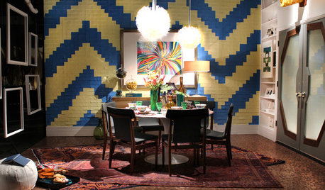
DESIGNER SHOWCASES20 Fantasyland Dining Room Designs That Delight
A wonder to behold, these incredible professionally designed rooms take everyday dining over the top
Full Story
THE ART OF ARCHITECTURE8 Wonders of Imagination in Architecture
Explore what's possible when a soaring architectural vision has a chance to fly
Full Story
ARTWitness a Fantastic Chihuly Glass Sculpture Installation
Ever wonder what goes into a design that includes a major — and highly breakable — artwork? Here's your chance to find out
Full Story
HOUZZ TVHouzz TV: First Comes Love, Then Comes a Wildly Colorful Mosaic Home
This couple spent two decades covering their home inside and out with brightly colored mosaic tile, vibrant paint, small toys and more
Full Story
ROOTS OF STYLEArt Deco, Art Nouveau, Arts and Crafts: What’s the Difference?
If the zigzag and swirly designs of the past leave your head spinning, these descriptions will straighten you right out
Full Story
ARTCollect With Confidence: An Art-Buying Guide for Beginners
Don't let a lack of knowledge or limited funds keep you from the joy of owning art. This guide will put you on the collector's path
Full Story
DECORATING GUIDESA Mobile Home Gets a Bohemian-Chic Makeover
Designer infuses world traveler’s guesthouse with tribal textiles, Moroccan tiles and kilim rugs
Full Story
ARCHITECTUREDutch Architects Balance the Familiar and the Avant-Garde
Peek inside a 2013 book to see bold new designs for modern living that never forget those living there
Full Story
MY HOUZZHouzz TV: Love Letter to a Small Midcentury Find
A 630-square-foot 1956 home captures its owner’s heart. See it when it was new and now
Full Story
UPHOLSTERYFabric Focus: Cozy, Carefree Cotton
Here’s why you should consider making cotton king in your home decor
Full Story
Phi Builders + Architects