Software
Houzz Logo Print
anna_pensgen

Countertops. Contrast? Coordinate? Or neither

11 years ago
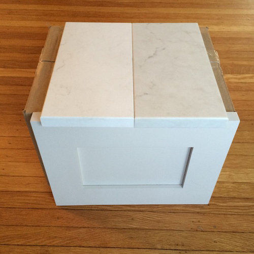
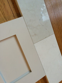
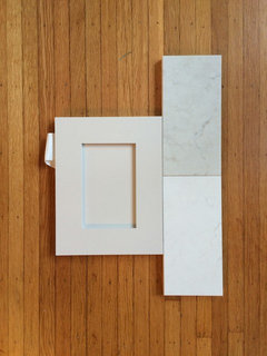
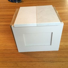
Light gray/Greige cabinets.
Which countertop would you choose?
Contrasting (left)? Coordinating (right)? Or something totally different?

(I did post a similar question earlier... This is just a much better photo to show colors I'm dealing with)

Comments (47)

  • 11 years ago

    Kinda meh. More contrast would warm up the kitchen a bit.

  • 11 years ago
    Whiter, left, or if you want, go a lot grayer, darker than the right one.
  • 11 years ago
    I prefer contrasting and fresh. So the left white one.
  • 11 years ago

    you'll be sorry if everything is the same color/tone. get some contrast. you can always go back toward the gray for your backsplash if so inclined...


  • 11 years ago
    Love the one on the left. Just enough contrast.
  • 11 years ago

    If you want actual contrast, I don't think the one on the left is enough. It could just look like a near miss. Of those two, I would go with the one that coordinates. If you want contrast I would look for something with a bit more actual contrat.

  • 11 years ago
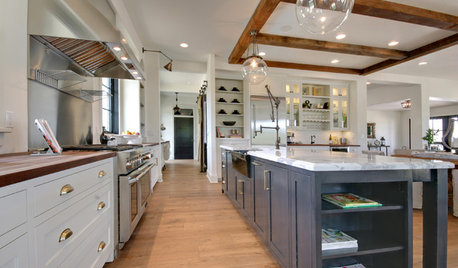
    I do like the soft contrast of the one on the left. This is one of my inspiration photos.
    http://houzz.com/photos/8124017
  • 11 years ago

    The lighter one has a better contrast. Other options with light gray cabinet is a black countertop like soapstone, a dark chocolate brown stone or wood (silestone calypso is really nice) or a bright white - there are some really nice options from caesarstone - pure white or frosty carrina (looks like cararra marble)

  • 11 years ago
    The sample on the left is frosty carrina! :)
    It is the one I am leaning towards. The showroom had a sample kitchen in this cabinet color with dark countertops... And it made the cabinets look kinda blah. I like the clean crisp white pop. My dilemma is that I really really REALLY prefer the pattern on the right side sample. MUCH LORE REAL. London grey) is
  • 11 years ago
    What the heck happened there?? Lol
    Let's try that again...

    It is the one I am leaning towards. The showroom had a sample kitchen in this cabinet color with dark countertops... And it made the cabinets look kinda blah. I like the clean crisp white pop. My dilemma is that I really really REALLY prefer the pattern on the right side sample (London grey).

    Maybe I just need to keep looking...
  • PRO
    11 years ago

    No question, the one on the LEFT.

  • 11 years ago


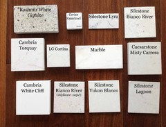
    Have you seen a sample of cambia torquay? Here is a link to a sample board where someone compared options to marble - hope this helps! There are some granite options and some quartzite as well, but searching for slabs can be a lot of work.


  • 11 years ago

    I'm sure that i have.... but I have seen so many white countertops it is hard to remember! So far London grey and Frosty Carrina are the only two that i feel don't look like 'trying to be marble, but not marble' (which oh i would love to be able to use real marble!). They both have nice soft patterns, no heavy dark swirls. no "dots" in the pattern. just simple, soft and clean.

    I think if i were to do stone I would either bite the bullet and do marble, or do a gray soapstone or slate. I did fall madly in love with a quartzite, and then got the quote. ouch. $$$$$$$$$$$$$$$$!

  • 11 years ago
    last modified: 11 years ago

    I went with the honed carrara marble and absolutely love it. No issues and low maintenance from my perspective. The gray soapstone is really pretty also! So many choices...

  • 11 years ago
    the one on the RIGHT
  • 11 years ago
    The lighter one.
  • 11 years ago
    or if u have an island use the one on the RIGHT n then the rest use the one on the LEFT.
  • 11 years ago

    @lizfromWI.... i have a very very very very very messy cook of a husband and three kids. Would that be dangerous? Is your marble heavily used? Do you have photos? I'd love to see!

  • PRO
    11 years ago

    Always think 5-10 years down the road, will I still be happy with this? Or am I just going with a fad, classic will always be in style. You cant go wrong with that.

  • 11 years ago

    Hi Jay! which option do you feel is a fad? the white? which would you choose?

  • PRO
    11 years ago

    I think the one on the right is a Carrera marble or Calcutta? Those have been around in Europe for a very long time and don't think you can go wrong with those.

  • 11 years ago

    The one on the right is a quartz! :)
    Caesarstone - London Grey

  • 11 years ago
    last modified: 11 years ago

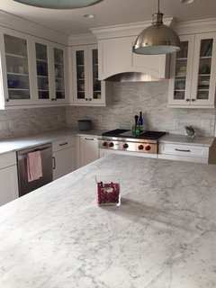
    Anna - we have had the marble for a year with no major issues. Heavy cooking and I am a messy cook as well - all the pots and pans and bowls dirty as well as all the counters! Here are the items that we watch out for: Food coloring (ie cookie decorating, etc) and acidic foods (lemon juice, salsa, etc.) I put down wax paper when using the gel food coloring as it seems like it could stain the counter. Previously used it on a corrian counter and it was very difficult to clean. The acidic foods will etch the stone and we have used a bit of cleanser called "bar keepers friend" a couple of times and this took care of it. On the honed marble the etching is not that noticable so we dont use the cleanser often - maybe 3 times in the last year. Part of having the stone is the patina over time so I am fine with this. Also the carrara that we have has a nice varied pattern so it is forgiving on the patina. Here is a picture:

  • 11 years ago
    Liz that is so beautiful! I just tried to run marble by the husband again and it is a big fat "no". Guess I am back to my original two... Unless someone has another idea for this "off" color cabinetry??
  • 11 years ago

    Soapstone would provide a nice contrast, without making it look like you tried to match. You can keep it gray or wax it to a black, with white streaks running through it-- which you'd be able to see more when waxed. We have soapstone and love it.

  • 11 years ago

    I love the look of the London gray, you can really see the veining and it is very naturalistic. However ... your inspiration kitchen is creams and whites, the London gray is ... gray and so would most real marbles be. So, do the Carrina and the finished product will be more like your inspiration. It really comes down to do you want a creamy kitchen (warm) vs. a grayer kitchen (cold). You already have a light gray cabinets which match that London gray.

    Did you see this story here? http://ths.gardenweb.com/discussions/2411656/new-caesarstone-frosty-carrina-and-london-gray-light-marble-looks

  • 11 years ago

    Have you looked at Pental Quartz "Akoya"? This very light quartz has some contrasting tones in taupe/gray in case you want more contrast. Cambria Torquay is beautiful when you view the entire slab. You might consider making your island cabinetry a dark color and the rest of the kitchen light. This would give you some contrast. Just a thought. . . .

  • 11 years ago

    Here's an idea - the cabinets that you selected are a light gray and they would look really nice with the whiter countertop...If you really like the look of the London Gray - which looks like the marble, then you could opt for a white cabinet to get more contrast - like a Benjamin Moore white dove. (that's what's in the picture attached above) Your flooring is warm tones, so the contrast with the white and then the gray counter would look nice and you can put the same color on the walls as the cabinets. The white dove is a little bit creamy (not a gray white) so it is a bit warmer than a bright white.

  • 11 years ago
    London gray London gray.....I may be biased....but London gray....respectfully Londonvon :)
  • 11 years ago

    What about a white counter and a marble backsplash? That is what I'm doing because I love marble, but I didn't want the maintenance.

  • 11 years ago
    The one on the left
  • 11 years ago
    I love Frosty Carrina. I'm like you, I prefer a soft contrast to give a more calm, casual feel. I have a very similar color concept as you. Off white perimeter cabinets, grey island, all with Frosty Carrina countertops. I'm still looking for a backsplash. You can always have the backsplash add interest such as marble veining or herringbone pattern tiles.
  • 11 years ago

    I love both of them! You can't go wrong with either one.

  • 10 years ago

    Hi Anna, I have the same dilemma. Which did you pick and are you happy with it?


  • 10 years ago

    Hi Calex! We chose London gray because I loved the texture. Turns out the slabs do vary... and our counter is lighter than the sample was. Now I think the whiter option would have been too bright. So that worked out!


  • 10 years ago

    I'll post photos for you..... Hang on a sec!

  • 10 years ago
    Perfection
  • 10 years ago

    HI Anna,

    They look really lovely. I also really like the window behind the sink. You've chosen well.

    What colour cabinets and paint did you use?

  • PRO
    10 years ago

    Oh my, how beautiful! I love London Grey and it looks terrific with your cabinets. Your floors are really nice--what type of wood are they?

  • 10 years ago

    Your kitchen is beautiful - love the big windows by the sink!

  • 10 years ago
    Ditto on the floors. They are beautiful.
  • 10 years ago
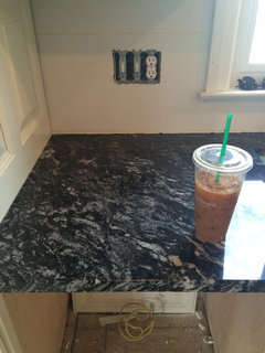
    Something like this silver waves granite would be nice. These cabinets are white, but the top would look equally good with pale grey.
  • 10 years ago

    Thanks Anna P, for letting us all know how things turned out. Your kitchen is a thing of beauty! Whichever choice you made, it was definitely the right one. And I too would like to know the actual name, which one is it? You didn't say.

  • 10 years ago

    Thanks everyone!

    Countertops are Caesarstone London Gray

    Cabinets are Omega, color is Magnolia Maple

    Flooring is reclaimed wide plank oak

  • 10 years ago
    Your kitchen is beautiful!
  • 10 years ago
    AnnaP - I found this post during my search for a countertop to match my magnolia cabinets. I'm wondering what you think of them a couple months later, and also if you have any wisdom to share about the seams in this irregular type Quartz? I have a rather large island and since I can't book match, I need to decide if I can handle a seam or not. How do your seams look in regards to lining up two dissimilar slabs? Are you happy with how they turned out? With granite, I can book match or just get a bigger slab. But I can't find a granite that matches... TIA!