Software
Houzz Logo Print
pattyva

Front door color help!

11 years ago
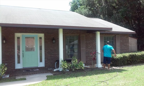
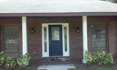
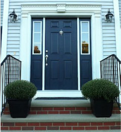
what do you guys think of this color currently its just plain white...

Comments (58)

  • 11 years ago

    How about a dark gray color for both the shutters and the front door?

  • 11 years ago

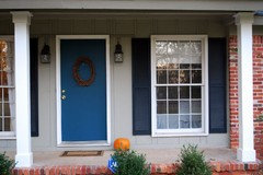
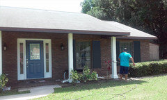
    Please dont shoot me! This is the new front door color old navy by BM....what color for shutters? I love the 3rd pic that groveraxel posted....so what do you guys think and I agree on selecting better shutters

  • 11 years ago

    I would paint the shutters the same color as the door (if you want them to stand out).

  • 11 years ago

    Also the window sashes should be white.
    as Grover say the shutters should be sized to fit the window
    shutter colour could be a shade or 2 darker than the door
    (If you have a garage door it should be the same colour as the front door, if this hasn't already been mentioned)


    ref pic


  • 11 years ago

    What do you guys think of the front door color overall?

  • 11 years ago

    I love the new color!

  • 11 years ago

    I, too, like your new color. Now how about doing what another suggested: paint the shutters two tones deeper than the door. They then would be pretty dark and stand out better. Also, your windows look like my aluminum ones and therefore can't be painted white as another suggested.


  • 11 years ago

    Patty, I love the navy. Try it on the shutters, the new ones. I think it will look great.

  • 11 years ago

    After looking again, I agree with groveraxle! Paint the shutters the same as the door. I thought a deeper color would work, but seeing your white columns and doorframe, another color seems like too much.

  • 11 years ago

    yay! I am glad everybody likes the color I love it too I am going to buy shorter shutters that function with the windows I am still unsure of the shutter color I'm going to go to shades deeper hopefully I can find something would black work

  • 11 years ago


  • 11 years ago

    Thanks Groveraxel! Do you guys think I should do the sidelights and posts a creamier color?

  • 11 years ago
    last modified: 11 years ago

    I think rich teals look much better with greige/beige tones around them than white, in a "natural" context (where real grass is seen, bricks, etc). Are you willing to try changing the door trim and post color to something more like the mortar in the wall? It can do amazing things for teals, make them rich but at the same time not so glaringly jewel-colored. You can try with samples on sheetrock and set them by the door to see.

  • 11 years ago

    I prefer the sidelights to be the same color as the door.

  • 11 years ago

    Thanks groveaxel! What do you think cream or white thinking cream is the way to go...or all blue sidelights...thanks everyone SO much!

  • 11 years ago

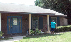
    Patty, I like the cream. It's a bit softer than the white; not so stark. I would do the sidelites cream. Here they are in blue:


  • 11 years ago

    How about checking out the Benjamen Moore palette and see what they have in their exterior choices.......seems that they have the navy paired with two other color suggestions? Just a thought as I personally like the white navy combo with what I think is a white roof, but I can't tell for sure. Good luck.

    pattyva thanked pmhd2
  • 11 years ago
    I think the painter's T shirt is distracting....he needs to color coordinate, too.
  • 11 years ago

    Bright Red.....it would look so British!!!

  • 11 years ago

    This question is for miacometlady. Do you know the color numbers of the 2 garage doors

    shown in teal? I have been following this conversation because I also have a red brick house and white trim. Thank you!

  • 11 years ago
    Would you consider the door, the sidelights and the shutters as one element. While Victorian houses use 5-7 colors, your classic style might benefit from 1-2 colors. I'm learning ant using 1-2 shade lighter/darker than the main element. Although I don't know about your window frame white, the sidelights could certainly be in the same striking navy! Jazz it up with your favorite metallic bling on the door - handsome lock set, or impressive carriage lights, or maybe a knocker. Agree with appropriate proportions for shutters or not at all. Have fun.
  • 11 years ago

    The shutters look like they are actually the correct size for functionality. They appear to be the same length as the window well. So in a storm they would cover the entire window opening. I would buy/borrow a shutter the size you think you want before investing in all new shutters.

  • 11 years ago

    I like your navy door! Nice choice. Now you have spring board on which to play!

    How about adding some more navy to the side lights? I feel it would make your door look more gracious.


    I personnaly would not match the shutters with the door, but rather pick a second color. I want to see the shutters pop more against the shaded brick. I am throwing out "James River Gray", "Templeton Gray", or "Kendall Charcoal"? Or... a crazy idea, what about "Bryant Gold" for the shutters? I love yellow and Navy (regardless, yellow flowers and yellow accents could be a must for your new Navy door!!).


  • 11 years ago

    Perhaps mcc is not looking at the original shutters or reading the comments about them.

  • 11 years ago

    A home should show its welcoming feature first - the front door should be the most enticing color. All else should fall away but be supportive. Your original color is a bit too minty and could be bluer to contrast/compliment the brick tone. If this photo is truly the brick color than these colors should go with it. It appears to be more brownish than red brick.

    The garage should blend with the house not pop like the front door. Ben Moore #861 Shale (probably similar to the grout in the brick) It is a shade darker than the post color I recommend. You would only notice it if you are color sensitive but it definitely makes a difference.

    Your shutter size as mentioned should at least look like they function-yes change the size if you can right away as they drag the house down and detract from the nice big windows. Color # 860 Apparition. will brighten the shutters in the under hang area because it is light and use also on the posts out front.

    Take a look at the light fixtures on either side of the door. They need to be more important (larger) and simple but interesting. Make a nice statement in antiqued pewter color or a bronze.

    The roof is probably the very light gray I see often and actually I changed mine to one of the more mottled colors/style (more irregular/natural in shape and mix of light taupe/black/brown) and it made an incredible diff from the street. When it is time do that consider it. The roof pops and shouldn't.

    Do the door surround in the same color as the garage door #861 Shale so the transition from the blue door to the brick is less harsh. It is a shame but the window frames I agree might be that color from the factory so just leave alone. At best they seem to match the brick and are harder to paint so leave them.

    FINALLY! - this brick color "seems" to have a cocoa color-way and add to that the overhang porch which darkens/shades the front so considering you like the turquoise colors I would consider making the door Ben Moore# 732 Burbank Blue. It is bright but will attract attention and be bright enough under the overhang. The colors suggested above in turquoise, navy etc are great but don't do well under that dark over hang. Check that. A completely different choice which would be #2170-40 Coral Spice which also compliments what seems to be the cocoa color of the brick and also goes very well with the taupe colors for the shutters and garage. It is your alternative to the typical Red colonial door.

    I use Ben Moore but if you have a brand you like they can computer match colors in most brands or at Home Depot/Loew's as you probably already know.

    Sorry but I usually like to look at the whole picture and get carried away!! I do this for a living but have fun checking out this sight!

    pattyva thanked Gina Zegel
  • 11 years ago

    Thanks for all the suggestions! Fido1231, I painted the door Old Navy by BM, the brick is more brown than anything else, roof is gray. Shutters I am going to get shorter, they do weigh the house down a bit.

  • 11 years ago

    I like the light teal, and I believe you definitely need a shutter and door color that is lighter than the brick for contrast. I do believe you should paint the shutters this same light teal and paint the window trim white like the trim around the door.

  • 11 years ago

    Grover, that was amazing.

  • 11 years ago

    Increase contrast definitely. I like the light greenish, but think it is too undecided for this location. I like all the samples given.

  • 11 years ago
    Please stick with white trim. The cream looks "off" in contrast with the roof color.
  • 11 years ago
    Turquoise or a shade of soft blue.
  • 11 years ago

    Do you ever have your front door open in the summer? If so, choose a color for your front door that coordinates with the inside. That way, when your door is open, you're not having to look at a door color that clashes with everything else in your house.


    Your skylights should either match the trim of your other windows or the door.


    If the shutters aren't real, if they're there just for decoration, then get rid of them. That's just my personal opinion. Non-working shutters are a pet peeve of mine.

  • 11 years ago

    Boring! Get some color in there

  • 11 years ago

    The colors I suggested for the trim, garage door, shutters and surround of the front door are two tones of a light gray beige that goes with the roof etc and the door is a bright but soft turquoise. The dark blue might look good on a sweater but in that dark shade of the overhang it is just a bit too dark and does not do the brick or the house justice. Sorry for being honest.

  • 11 years ago

    WE have a colonial with dark red bricks. I like the idea of all the trim white, including shutters, and then a bright burgundy door. Very classic.

  • 11 years ago

    I appreciate all suggestions Fido if I don't want to go a turquoise color on the door what other color would you suggest for a front doorthat would fit those two grays you were talking about

  • 11 years ago

    Front door looks green. Is it white or green?

  • 11 years ago

    Bernadine if you look at the other pictures I ended up painting it navy blue I think you are looking at the top picture

  • 11 years ago

    I find the molding around the door to be too skimpy to be a contrasting color. Either a lighter shade of the new door color (which is a big improvement) to make the door appear larger or if you are partial to the contrast the cream is better than white, IMO. (If that's your husband painting the pillars white, he won't be happy.) No one has asked where your house is; that has a lot to do with color choices. I love black especially with brick, but in FL not so much. I agree re the suggestion of larger light fixtures. Maybe some urns with plants on either side of the door? Good luck.

  • 11 years ago

    thank you for the suggestion I do live in Florida I agree on the light fixtures and yes my husband probably won't be happy lol

  • 11 years ago

    Dear pattyva if you look at my suggestions up above I list another color you can use in combination with the two taupe grays. It is an orange of sorts but has some softness yet brightness to it. It would be your version of the colonial home persons burgundy. By the way your home is not a true colonial I think it is like my rancher which was made to look colonial with brick walks and cupola!!! i got rid of those!! Your house is too brown to use burgundy or true red. That is why I suggest the orange. Coral Spice 2170-40 Ben Moore. Living in Florida the turquoise wouldn't be bad though. Good Luck.

  • 11 years ago

    Oops! You have to know that I suggest the orange color only if you paint the shutters, trim the light taupe and the garage door and front door surround the dark taupe to balance the saturation of color in either the orange or turquoise. Those colors are not very dark at all once they are on. Good night.

  • 11 years ago

    If you stick with the blue door plumbago would look great planted out front. Maybe mixed with the yellow foliage that you have now. Those shefelara are very easy care and can be pruned as a hedge. Plumbago are also easy; mine are growing like crazy. I had to replace my garage door this year (hurricane reinforced) & chose a different shade so everytime I drive in the garage I start repainting the house trim...in my mind! (maybe your husband would like a side job..ha).


  • 11 years ago

    PS, I added larger outdoor light fixtures last year. Big difference.


  • 11 years ago

    I love the color of blue for the door. I really like the picture with the side lights painted the same as the door, with darker shutters and creamy color everywhere else. There you go, done. I'm going to paint my front door a dark blue now. I just love it.

  • 11 years ago

    Change the light fixtures on either side of the door to something in a light color. Put some tall plants on both sides also, in a bright complimentary colored tall pots, depending what color door you decide on. They should be on the opposite side of the color wheel.


  • 11 years ago
    First thing I noticed was how the azure color of the guys tshirt pops against the color of the house. I'd go with that.
  • 11 years ago

    Like the navy and the blue for the shutters. Love the white trim and especially painting the window sashes in white! Will make them pop with the new color on the shutters. Am not digging the cream or the brown window sash. Looks too washed out against the brick.

  • 11 years ago

    I would remove or leave the shutters in the inconspicuous color, because they are wrongly sized.

    I would go with the beautiful, fun, welcoming color of the shirt too.