Software
Houzz Logo Print
lbohde

Wall color for buttermilk cabinets!

13 years ago
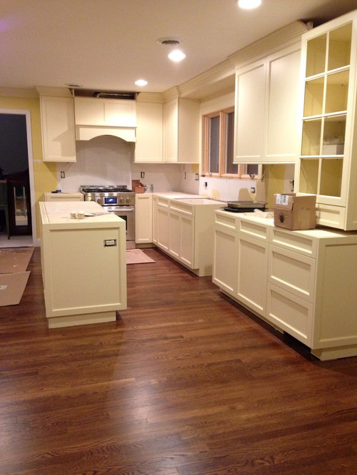
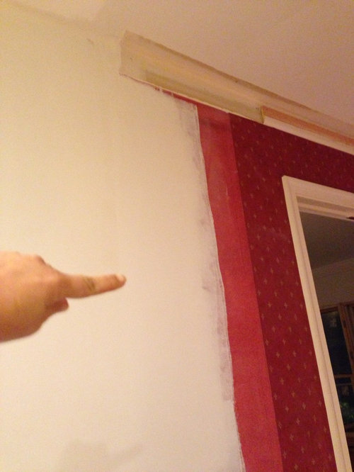
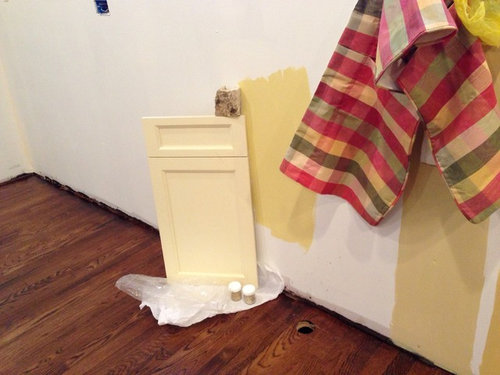
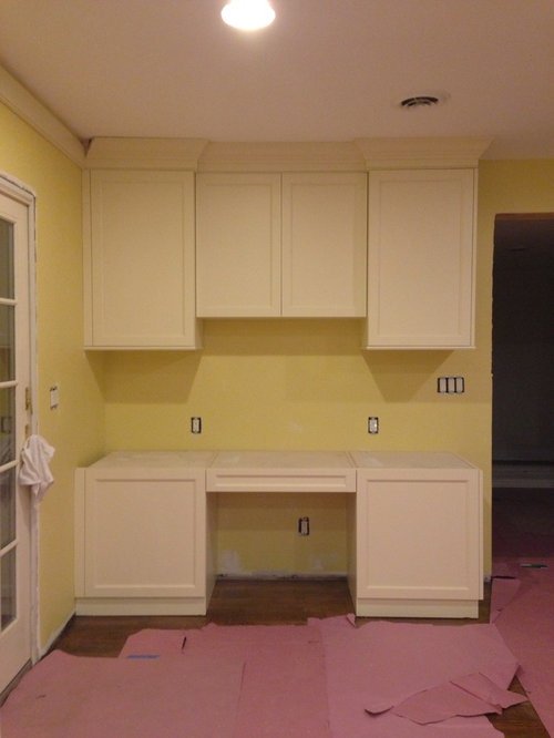
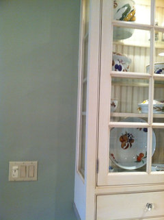
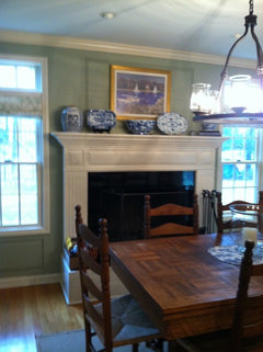
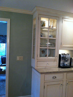
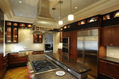
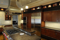
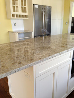
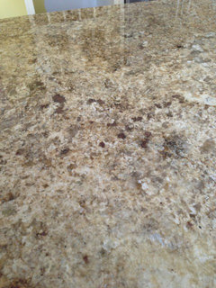
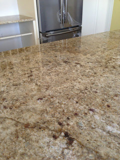
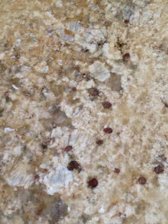
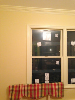
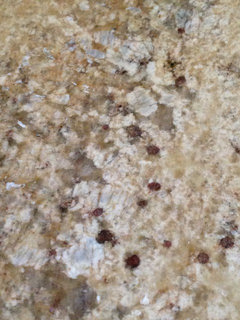
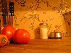
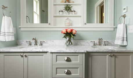
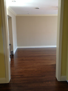
Help! I have a new kitchen and the opportunity to paint the adjoining family room and dining room. I'm a color person and the browns beiges just aren't doing it! Here's my kitchen. The dining room has Benjamin Moore barley for now, foyer is cranberry, and thing of sand for the family room due to newly stacked stone covered fireplace. Help with the kitchen! Granite is creamy brown with maybe a hint of gold and possibly cranberry or more purple cranberry....pic 2 is hall wallpaper pic 3 is valance for dining room for the barley color. Tried yellow but failed (pic 4)

Comments (69)

  • 13 years ago
    The green ideas are all nice to go with your cabinets but if you're already set on the barley/green tone in your dining room that will match that valance you already have...then I'd stay in the golds/beige/caramel color in your kitchen. The other idea is to do the green in the kitchen and a cranberry in your dining room. But I think the red/cranberry dining rooms have been done a lot...beautiful, but not very unique.
  • 13 years ago
    Green in a kitchen can be a real downer, especially in the evening, but guess that depends on the shade. We did a green kitchen thinking we loved the color ended up having to repaint in order for the kitchen to feel more welcoming.
  • 13 years ago
    intoit...it depends on the undertones; warm undertones verus cool undertones. Warm undertones have yellow in them - the sunshine color and always feel welcoming. Cool undertones have blue/gray in them which can feel cold and uninviting.

    Here are two paint colors that are similar, but have differing undertones:

    Warm undertones: http://www.benjaminmoore.com/en-us/paint-color/buckinghamgardens

    Cool undertones: http://www.benjaminmoore.com/en-us/paint-color/centralpark
  • 13 years ago
    Hi- I love your kitchen floors, too! What are they?
    Thanks.
  • 13 years ago
    Thanks janishill. I am an artist and very aware of the warm and cool greens, however, we used a green that was warm like the first link and it still felt dreary to us. I'm sure there are shades of green that would work and maybe our lightening was not good enough.
  • 13 years ago
    beautiful cabinets, what about BM Tuscany (1208). I have it in my living room and people love it, goes well with other rich colors and the paint specialist that recommended it said she has done it in den's and kitchens: http://www.benjaminmoore.com/en-us/paint-color/tuscany as you can see it goes great w/cream, blues and greens.
  • 13 years ago
    Mary M - my floors are white oak and have a mixed stain on them. It is 2 parts Rosewood I believe and 1 part another color (name escapes me at the moment :(..). The floor guy has one more coat to do so I will ask for you!
  • 13 years ago
    All great ideas!! Thank you all!! I'm so bad with color I really appreciate all the specific color responses. My contractor has agreed not to paint the kitchen until the granite is in so I will be painting some more samples. More to come ...:)
  • 13 years ago
    Janishill - how can I see larger versions of the rooms you posted? Only the 1st 1 when tapped on blows up to a large window size photo. Maybe you can post the links?
  • PRO
    13 years ago
    I definitely agree with the Mountain Lane Green from Benjamin Moore- http://www.benjaminmoore.com/en-us/paint-color/mountainlane

    I was actually thinking of that color while looking at your cabinetry and accessories. Good suggestion!

    Good luck!
  • 13 years ago
    Also.... Adding to my confusion is my living room is BM Mint Julep. NG I know (painted a long time ago and always felt too cool) and I'll have to paint that room next, but I'm thinking green in there. Photos to come!
  • 13 years ago
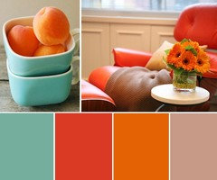
    What would you say to deep turquoise and burnt orange? I can really see a nice deep turquoise on the walls and maybe some dark orange glass backsplash tiles! Copper backsplash would be lovely too :)
  • 13 years ago
    Your kitchen looks amazing! Thanks so much for answering about the floors. They are beautiful.
  • 13 years ago
    It's time to repaint our kitchen (similar color cabinets) and I am sticking to green again, but I'm gonna try a historic color Georgian green. I will probably try several shades of green until I get the right one.
  • 13 years ago
    Here are some photos of my green in kitchen, it's hard with the backsplash to find places where cabinets and wall meet, but we also have a fireplace in kitchen and that shows the color. This is the Tree Moss color
  • PRO
    13 years ago
    Crisp Architects · More Info

    South Tampa Custom Home · More Info


    I love your kitchen!

    I would suggest a green color for the walls. If you are using the valance you pictured, try to match the green in that.
  • 13 years ago
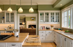
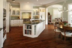
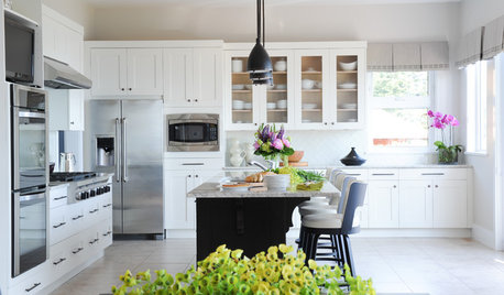
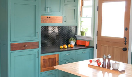
    lbohde...I Googled kitchens painted green and these came up. (and it was a Google search..not Yahoo, etc.)

    Judy M...the tree moss is lovely in your kitchen, but it has cool undertones which would not work with her buttermilk cabinets as they have warm undertones.
  • 13 years ago
    Ibohde...here is the link for the second picture: http://www.cozybliss.com/modern-green-painted-kitchens/
    And here is the link for the third picture: https://www.houzz.com/photos/green-paint-in-kitchen-phbr0lbl-bl~l_44426
    It is one side of the same kitchen (1st picture) that Arranged To Sell, LLC posted
    The Houzz page shows it from several angles.
  • 13 years ago
    I admire people that can tell "cool" from "warm", if my current color is "cool" (and works with my cabinets) and I want to change it, am I on the right track with Georgian green? Tree moss seems to have a gray undertone and to me Georgian green has more yellow, so I am confused on how to lighten the room up a little but still keep it green. I prefer dull, muddy color to bright colors.
    Any advice on sample colors I should try? (Prefer BM colors)
  • PRO
    13 years ago
    Lots of great ides already. The suggestion to use Apricot really intrigues me. You might use Apricot on the walls and paint the interior of your glass front cabinet the same, or a different color altogether. Another thought would be to use white for the backsplash, feature the glass cabinet in Apricot, add subtle interest to the ceiling with a pale grey-blue and combine all in a flat weve area rug, window treatment and accessories.
    Finally, because the valance in your Dining Room is a plaid in Red/Green/Gold/White you could go with something unexpected. A Taupe, Mushroom, or Gray with warm overtones would look rich with the Buttermilk cabinets and read like a continuation of your Dining Room and make the stone countertops stand up. Use Greens for accents and Green/White/Taupe for backsplash materials.
  • PRO
    13 years ago
    Oh, a nice shade of paint for you could be Benj. Moore "Interlude" AF-135, and "Elk Horn" AF-105 would kick booty! Look at the range of Taupes and Mushrrooms in the room and do a test on the wall so you can check it out in daylight and evening. This approach is not for the faint of heart but the payoff will be striking. Good Luck!!!!
  • PRO
    13 years ago
    No one has asked you your style yet. Are you contemporary or traditional? How old are you? If you are younger and more urban, I would go a rich tangerine or cranberry. The greens are more traditional and older... unless you go with a rich forest green.
    Good for the person that recommended turquoise. In the right shade it could look yummy against the cream and pop off the cranberry. Periwinkle is also a foil against all the cream and brown and can look really dramatic.
    I believe strongly in repainting if you don't like the finished result. It's a can of paint, not a marriage to one wrong color.
    ALSO, be sure to look at your colors in all types of light. So many of them muddy and look gray at night. The ones that get grayed out are pale colors, so I would recommend that your choice of hue be more in the midrange of the palette. No matter the color you choose it will have enough oomph to not gray out at night.
    Best to you! DesignOrganize.com
  • 13 years ago
    Yea! We're back to the apricot. Consider an apricot with power and personality, not your Grandmother's pastel. It's the kitchen, you need a tad of energy in there. It's just paint remember, not nailed down or installed like the rest of the room. If apricot doesn't float your boat, go with one of the other perky colors, like the burnt orange or perhaps a melon. I like the suggestion of cabinet interior painting. Try the punch color there if you aren't sure about large doses and use a quieter color like one of the greens in the rest of the room.
  • 13 years ago
    As for the backsplash, after living with mine undecided, and therefore unfinished, for two years, I impulsively covered it one day with washable wallpaper and have loved it ever since! The paper is easily changed if my style changes and adds color and interest without the severity of a tile installation.
  • 13 years ago
    Judy M - Georgian green still has cool undertones.

    Grasshopper is similar in saturation, but has warm undertones: http://www.benjaminmoore.com/en-us/paint-color/grasshopper

    You should purchase a sample pot, paint a foam core board adn look at it throughout the day in differnt light. Move it around and leave it in one place for a day or two then move it somewhere else and look at it. Then you'll know if you are going to like it before a commitment is made.
  • 13 years ago
    Thanks! I have used the foam core board idea before, it is effective. I'll try the Georgian Green and I might try my Current color tree moss at a reduced formula.
    I've done before when I like a color but sometimes they are too dark for my space.
    I've used Shaker beige, hot stone springs and golden straw at 1/2 value.
    My paint store advised this trick.
  • 13 years ago
    I usually add white (or beige depending on the color), stir, paint an area, look at it a couple of days and either go with it or add more of the light colored paint. I have done that for years and have always been able to get the exact shade I want. Not recommended for those that are color challenged! :-)
  • 13 years ago
    I am a young 50 :) and live an hour outside of NYC! I tend to be traditional but have gone "transitional" (I think anyway) with the new decor....
    I love all the suggestions but I fear the turquoise would be too drastic for me! I love the green ideas and the Apricots (can you suggest one that's warm?). My son's idea early on was blue (!) so I may look at those too. (Blue suggestion anyone?)

    The room is north facing so not as much natural light as I would like. Different cabinets with led vs incandescent Lites too! Not as "yellow" with LEDs...

    Thanks again for all the help!
  • 13 years ago
    After much deliberation I just did my kitchen in Benjamin Moore Hawthorne Yellow and its beautiful.
  • 13 years ago
    hi. My kitchen cabinets appear to be a similar colour as yours and my kitchen also faces north. My walls are painter in Home Depot Behr paint, colour " Clair du Lune" #300E-3. It's a neutral with some yellow, but not mustard-y.
  • PRO
    13 years ago
    I think apple green would be fun and cheerful.
  • 13 years ago
    Your kitchen is lovely.....agree that warm colors are a must with north facing windows. SW 6339 is a warm apricot color that would go with the buttermilk cabinets, but I'm sure there are many more.
  • 13 years ago
    Good luck with your decision. I think your kichen is beautiful, Would you mind finding out exact stain mix for your floor? I love the color.
  • PRO
    13 years ago
    Gorgeous room! WIth the fabrics you posted, I would suggest a red or yellow. I love that you're not afraid of color!
  • 13 years ago
    I see a lot of green in your granite and imagine that would be nice and mesh well with the colors you have. In the future, or for a change, you might consider wiping a sheer coffee/tabacco glaze on your buttermilk cabinets to tie into the browns in your granite and floor. I'm about to paint white cabinets a creamy color and do the same.
  • 13 years ago
    last modified: 13 years ago
    My mom did her kitchen in pumpkin orange (attached a photo of the colour). Her cabinets are cream with black knobs and she has an array of brown tumbled marble for her backspash tiles. She has an accent wall in a terra cotta red. It all works great together. Have to add that her living room is adjoining the kitchen and is in a light khaki for the main part of the room and a pale aqua feature wall for her dining room. She's pulled in the art work in oranges and reds on her dining room wall.
  • 13 years ago
    Since you love color, try a version of the cranberry. It is always cheerful and will blend with the rest of your house. If you haven't picked your backsplash yet, go for something fun and bright! How about a mosaic of creams, reds/cranberries,, pumpkin and maybe a turquoise with some stainless steel accents!! Stay away from yellows. Good luck!
  • PRO
    13 years ago
    OK, the suspense is killing me! Have you come to a conclusion?
  • 13 years ago
    Not Yet! LOL - I JUST got home from a business trip in London and the Granite is installed! I can now see what accents are in it and I'm leaning towards cranberry! A new picture about to be posted..... I promise I will post a final picture. I'm not LOVING my new kitchen yet :( I'm just really bad at designing .....
  • 13 years ago
    A few pix of granite:
  • 13 years ago
    I just feel like so far the colors are all too neutral. Neutral can be great for ability to change but its a bit boring to me! Lol here's the family room nearby --> this I love!
  • 13 years ago
    Here's the dining room also adjacent to kitchen with valance. I'm a bit disappointed in how close BM Barley is to the buttermilk crown but with dark cherry furniture I suspect I won't notice..
  • 13 years ago
    More granite- I believe I see cranberry but also goldish orange. Is there enough cranberry to pull it off with that on the walls?
  • 13 years ago
    it looks like there is enough to me! still think a greenish color would have been neutral, but not too neutral!
  • 13 years ago
    Cranberry and cherry furniture?

    I still think green would be the best choice: http://www.benjaminmoore.com/en-us/paint-color/savannahmoss

    or this: http://www.benjaminmoore.com/en-us/paint-color/lichengreen
  • 13 years ago
    Wallpaper backsplash for indecisive people like me to liven up a neutral kitchen with buttermilk upper cabinets and coffee colored lower. The colors are picked up in an area rug under the table and the chair cushions and curtains. Temporary fix that I have fallen in love with!
  • PRO
    13 years ago
    get a few samples of paint up on the walls in about a 1-foot square, use two coats and look at it in daylight and evening. Maybe you cab bring in the Cranberry with accent pieces on the counter and use
    a color from out of the blue on your walls. Green can act like a good foil for anything, so can the right shade of coral (check out Benny Moore "Italianatte" Aura-AF215 or B.M. "Anjou Pear" Aura-AF425).
  • 13 years ago
    Thanks All - I will go back to the paint store and do just that. Janishill, the cherry furtniture is in the dining room, not the kitchen. The kitchen is a rectanglular room in the back (north) of the house, with the dining room visible from the kitchen, on the South side of the house, through sliding pocket french doors. Does that make sense? I don't have a kitchen table that matches or fits yet - if I even get one. I may just use 4 island stools in the kitchen (to be purchased) so can use any wood that matches.
  • 13 years ago
    last modified: 13 years ago

    PS - Green is NOT out of the question :) Janishill - I really like the 4 greens you posted near to the top....
  • 13 years ago
    last modified: 13 years ago
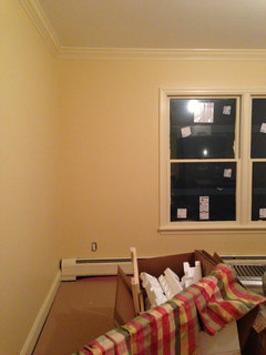
    Thanks Jeffrey! Those colors are quite muted and may be very nice. I need to seem them live I think, the computer isn't doing it :)