

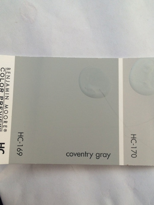
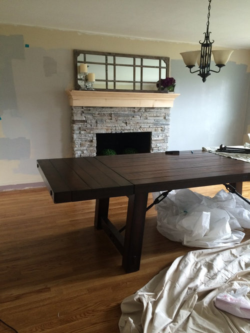
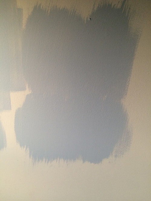
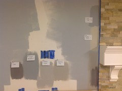
Paint color swatch looks totally different in walls
11 years ago
Featured Answer
Sort by:Oldest
Comments (18)
- 11 years ago
 PRO11 years ago
Related Professionals
Georgetown Interior Designers & Decorators · Lufkin Interior Designers & Decorators · New York City Interior Designers & Decorators · Milwaukee Interior Designers & Decorators · Baton Rouge Architects & Building Designers · Boston Architects & Building Designers · Coeur d'Alene Architects & Building Designers · Bozeman Architects & Building Designers · Ogden Architects & Building Designers · Bronx Architects & Building Designers · Asheville Kitchen & Bathroom Designers · Florence Kitchen & Bathroom Designers · Keene Kitchen & Bathroom Designers · Akron Kitchen & Bathroom Designers · Queens Kitchen & Bathroom Designers- 11 years ago
- PRO11 years ago
 11 years ago
- 11 years ago
- 11 years ago
 PRO11 years ago
 11 years ago
 11 years agolast modified: 11 years ago
- 11 years ago
 11 years ago
 11 years ago
- 11 years ago
- 11 years ago
- 11 years ago
- 11 years ago

Related Stories
BEDROOMSThis Teen Girl's Room Has Total Grown-up Appeal
With a textured blue wall, a mod white bed and even a Lichtenstein, this teen's bedroom draws envy beyond her age group
Full Story
KITCHEN DESIGNKitchen of the Week: What a Difference Paint Can Make
A bold move gives a generic Portland kitchen personality without a major overhaul
Full Story
FENCES AND GATES12 Delightfully Different Garden Walls and Fences
If pickets seem picked over and you shrink from chain link, try these full-of-personality fencing alternatives
Full Story
DIY PROJECTSTint Your Own Paint for New-Looking Walls
Dabbling in mixology means you can use up leftover paint and give your walls a custom look in one fell swoop
Full Story
DECORATING PROJECTSGet a Wallpaper Look With a Hand-Painted Touch
Stencil a pattern for all the beauty of your favorite wallpaper at a fraction of the cost
Full Story
DECORATING GUIDESDecorating 101: How to Use White Right
If you’ve ever been in white-paint-swatch limbo, you know white can be tricky to work with. Here’s how to get the fresh look you’re after
Full Story
ORGANIZINGYour Total Home Organizing and Decluttering Guide
Take it slow or be a speed demon — this room-by-room approach to organizing and storage will get your home in shape no matter how you roll
Full Story
HOUZZ TOURSHouzz Tour: Stunning Rooftop Deck Tops a Totally Remodeled Home
An overhaul of this Berkeley home includes new landscaping, a sunny home office, 2 bedrooms and a rooftop entertainment space
Full Story
PAINTINGKnotty to Nice: Painted Wood Paneling Lightens a Room's Look
Children ran from the scary dark walls in this spare room, but white paint and new flooring put fears and style travesties to rest
Full Story
PAINTINGBulletproof Decorating: How to Pick the Right Kind of Paint
Choose a paint with some heft and a little sheen for walls and ceilings with long-lasting good looks. Here are some getting-started tips
Full Story



cg interiors group