

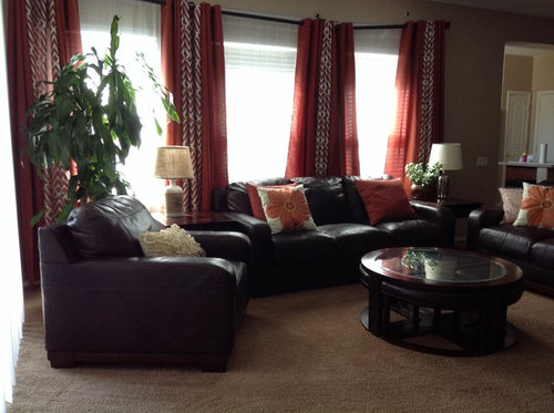
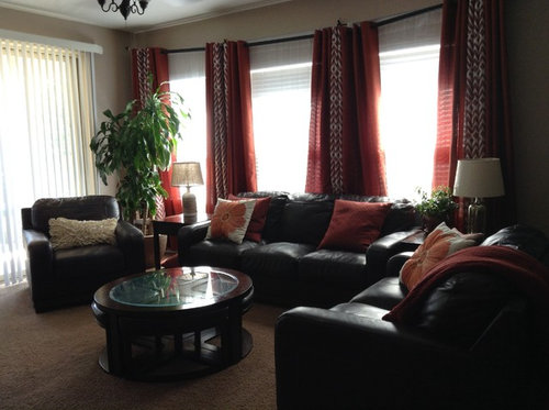
Burnt orange and curtain panels
11 years ago
Featured Answer
Sort by:Oldest
Comments (24)
 11 years ago
- 11 years ago
Related Professionals
Montgomery Interior Designers & Decorators · Clarksville Interior Designers & Decorators · Lafayette Interior Designers & Decorators · Orangeburg Architects & Building Designers · Charlottesville Architects & Building Designers · Petersburg Architects & Building Designers · Toledo Architects & Building Designers · Las Vegas Architects & Building Designers · McAllen Kitchen & Bathroom Designers · Anniston Kitchen & Bathroom Designers · Lafayette Kitchen & Bathroom Designers · Grand Island Kitchen & Bathroom Designers · Utica Kitchen & Bathroom Designers · Rutland Kitchen & Bathroom Designers · Cheyenne Kitchen & Bathroom Designers- 11 years ago
- 11 years ago
- 11 years ago
- 11 years ago
 11 years ago
- 11 years ago
- 11 years ago
- 11 years ago
- 11 years ago
- 11 years ago
 11 years ago
 11 years ago
 11 years ago
- 11 years ago
- 11 years ago
 PRO11 years ago
- PRO11 years ago
- 11 years ago
- 11 years ago
 11 years ago
- 11 years ago

Related Stories
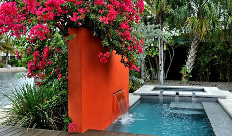
COLOROrange in the Garden: Do You Dare?
Tangerine and other oranges are boldly cavorting from fashionable interiors to outdoor rooms. See some in-vogue examples here
Full Story
KITCHEN DESIGNKitchen of the Week: Orange Splashes Add Personality in Kansas
Bursts of color and a better layout make cookie baking and everything else more fun for a Midwestern family
Full Story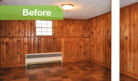
PAINTINGKnotty to Nice: Painted Wood Paneling Lightens a Room's Look
Children ran from the scary dark walls in this spare room, but white paint and new flooring put fears and style travesties to rest
Full Story
BOLD COLORZest for Orange Stays Strong in Fall 2012
From pumpkin to tangerine, this hue is still hot stuff on walls, rugs, furniture and accessories
Full Story
ORANGEColor Guide: How to Work With Orange
Orange is the most controversial color in the spectrum, but its warmth and personality can charm almost anyone
Full Story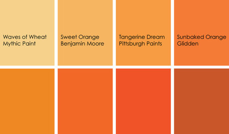
COLORCooking With Color: When to Use Orange in the Kitchen
Try a dash of Cayenne or swaths of Sweet Orange for zesty, high-energy kitchen flavor
Full Story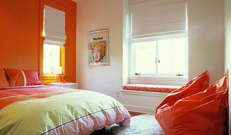
COLORDreaming in Color: 6 Sensational Orange Bedrooms
Orange is looking to be a hot color contender, say the experts. Use it for a dynamic bedroom that's right on trend
Full Story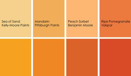
COLORColor Feast: When to Use Orange in the Dining Room
Dial up the zest at mealtimes with doses of snappy orange on dining room walls and furniture
Full Story
DECORATING GUIDESYour Décor: Orange You Glad?
Possibly the happiest color around, orange is amazingly versatile in interior design. Here's how it can make your rooms positively exuberant
Full Story
MOST POPULARFalling for Color: 9 Ways With Pumpkin Orange
From racing stripes to accent walls, see how to work this vibrant hue into your home
Full Story



ashcancholaOriginal Author