Software
Houzz Logo Print
poorgirl

15 years ago
last modified: 15 years ago
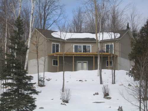
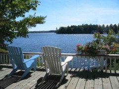
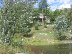
Painting patio furniture: Hi everyone, I have 3 muskoka chairs that I would like to stain or paint for the cottage deck but am lost as to what colour . I have enclosed a picture of the cottage from the water . I have a dark green umbrella that goes on this deck. I don't know if I should stay with a dark brown or do something fun. Everything is seen from the water .
thanks for your help.

Comments (54)

  • 15 years ago
    @uberduperbk : love the pink adironack chair
  • 15 years ago
    d
  • PRO
    15 years ago
    A nice red with brown undertones is Flower Pot by Sherwin Williams. It is a rich color that would compliment your existing colors, and would even work with your dark green umbrella!

  • 15 years ago
    how about a distressed cream color......this way you can change up the colors of outdoor decorative pillows for the different times/seasons of the year. Would look beautiful in the summer with all the trees in bloom!
  • 15 years ago
    Sky blue. :)
  • 15 years ago
    Definitely sky blue!
  • 15 years ago
    GREEN WILL FIT THE NATURE.
  • PRO
    15 years ago
    I would go with the same color as the trim on your windows. Brown or green will not show up. I always think long term and low maintenance. White will look pulled together and then the green umbrella will be seen also. Living by the Gulf of Mexico, I love this look the best. I have considered painting my Adirondak chairs Orange or Yellow for my kitchen porch! Really big right now but I want always lean towards the long term look while trying to think of the best value!
  • PRO
    15 years ago
    Green or Brick/barn red. You need a little splash.
  • 15 years ago
    That PINK is very kool; abit Radical but definately "out there". Chairs of this nature can be painted any or all different types of colours and designs. I have seen some "air-brushed" that look amazing but this method of painting your chairs could be costly. I have seen alot where the Slats were painted alternating colours which was quite effective. For myself, I prefer one SOLID colour defining each separate Chair to "POP" but still co-ordinating with the backdrop colour of your House or Cottage.
  • 15 years ago
    I like the idea of blue too...or more of an aqua color. It would work well with water.
  • 15 years ago
    They are such classic chairs I think it would be fun to paint them an unexpected color. I like the hot pink idea or really any color from the warm side of the color wheel so that they "pop" when viewing the deck from the lake.
  • 15 years ago
    Wow, everyone thanks so much. I love the Red which is my 1st choice, unfortunately the neighbours cottage has red chairs (god forbid I have the same) I love the Pink and Aqua colors but DH would not let me do those colours, I am having a hard time getting him to agree on lime Green for the home chairs. We live in Ontario so we only get to see the chairs for 4-5 months and we don't leave them out in the winter, sitting in 3' of snow does something to the finish . Brookedoll I also prefer a solid chair. White gets to dirty at the cottage with all the stuff coming off the trees. I am leaving the deck with a natural oil on it, by the time we have all the decks done I will have 3 massive decks to maintain so I won't be staining them any other colour. We have a dark brown deck & fences at home that takes alot of time every year to keep it looking nice, I can't do this at the cottage. So.. back to you guy's. Right now the chairs are brown, I will look into the Flower Pot colour and see if it's brown enough . ANy suggestions on which blue.?
  • 15 years ago
    If anyone has time I would greatly appreciate it if you could go on www.flood.com and check out the swf solid stain colors. under "Solid Color Look". I currently have gallons of Oxford Brown which is what my fence and deck at home are done in. If anyone is staining anything out doors this stain is great with 2 coats you can obtain a paint like finish without the pealing.
    thanks again everyone. The flower pot and bravado colours both would work great, but If I can I would like to be different then the neighbours.
  • 15 years ago
    last modified: 15 years ago
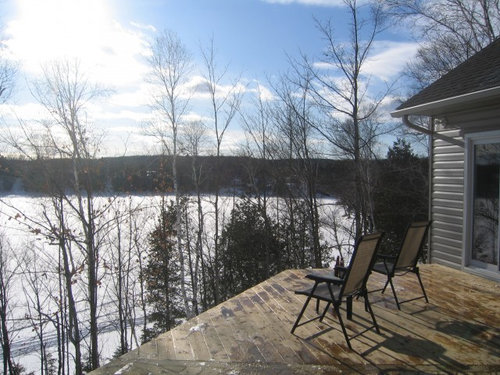
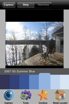
    Just for fun, I used a couple of color-matching apps to match your sky. The first is Sherwin Williams "Blue Beyond" ( http://www.sherwin-williams.com/pro/paint_colors/explore/color/SW6961_blue_beyond/); the second is Benjamin Moore's "Summer Blue" ( http://www.myperfectcolor.com/Benjamin-Moore-2067-50-Summer-Blue-p/mpc0004491.htm)
  • 15 years ago
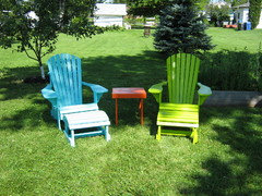
    Well if you have 3 of these chairs, how about a different color each?
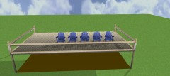
    Attached is a sample using the "Skyblue" suggestion by Sheila.
  • 15 years ago
    How about bringing the inside out ? Pull a color from your interior room, just inside the deck and carry a shade of it to the outdoors. You can go lighter or darker, your choice, but will help the two areas flow. Then, when returning back inside, you'll be taking a bit of nature with you ! I do, however, agree with a blue choice. Cobalt blue ??
  • 15 years ago
    I went with a merengue yellow because I have many yellow blooming flowers (daffodils, lantana, etc) and it contrasts well with red roses. In other words, what color will complement your landscape, if you have hydrangeas-blue, etc. However, I LOVE the blue, it seems to complement the lake.
  • 15 years ago
    sherwin williams urban bronze would ground the furniture and punctuate the monocromatic neutrals of the buliding materials shown in photo. sherwin williams polished mahogany would make a statement, but not too bold. i am currently trying to decide between the two for my front door!
  • PRO
    15 years ago
    First of all, because the entire orientation of your house looks across this deck and out to the lake, you need to take those rooms into consideration. Can you find a chair color that works for all of the rooms? Having said that, though, you definitely need some bright color on the deck, and something strong enough to hold it's own as viewed from below and the lake (as per your photo). Since your umbrella is green, I would use a complementary color to this, probably red (who cares what color the neighbors have used?) or a bright yellow. That will give you the most bang! However, if neither of these are viable, then going with a more analogous color scheme (colors side by side on the color wheel) would also work - that would be using the dark green of the umbrella with aqua and lime green (either one for the chairs). With this, you could also pull in accent colors of your choice: orange, yellow, pink, etc, for pillows, cushions, accessories, for example. Your last choice would be a monochromatic color scheme, i.e. all shades of green.

    A good starting place for you might be to look for cusions and/or pillows that you like, from which you could pull the paint color for the chairs. If you are handy, you could make pillows yourself - there are so many beautiful all-weather fabrics out there now. In any of these schemes, I would also add in a tan as your neutral to pull the house color in. It's a beautiful spot - decorate it brightly and colofully for summer! I hope it turns out the way you want it to!
  • 15 years ago
    My first thought when I saw your picture and your view from the deck was sky blue... so glad to see that I was not alone in that thought. When people are looking up at your cottage from the lake, they also see sky and tree tops, so from their vantage point, sky blue is also a good choice. I like ofir's idea of painting all 3 a different color... or paint 1 chair a creamy white and the other 2 in the sky blue color. Everyone here has given great suggestions, however, so now it's up to you to decide which suits you best!
  • 15 years ago
    My first choice is RED. I agree, who cares what the neighbor has. The blue would be nice with the sky, but I am not sure it would be the spark with the umbrella. How about orange, nothing bright, more like pumpkin.
    You do need something that will dance when you look at the house from a distance. What ever color you choose, consider adding hanging pots under the deck in the same colors as your chairs. The greens suggested would be inviting as well.
  • 15 years ago
    First I would paint the deck to match the color of your roof as you need an accent color for your house. (Main color is tan siding, white trim on windows)so a dark brown like the roof would tie it all together. Then I would paint the chairs creamy white and add a graphic orange pillow. The white will tie in with the house and the orange will pop in a view from the lake or house as well as adding comfort =0) and is in a small dose so you could change up the color scheme whenever you wanted.
  • PRO
    15 years ago
    As a landscape designer, we each have our foibles. Mine is about blue furniture. In each design that I create there is at least one piece of furniture that is blue. Although most appreciate that this is 'my signature piece', others have actually enjoyed the fun-ness of the visual that they have gone ahead and painted a piece to match. I suggest you entertain the thought of this 'signature piece' as well:


  • PRO
    15 years ago
    I looked up the best color match for my 'signature furniture' - Benjamin Moore CC-874 called Mosaic in the Designers Classics Collection.

    This will really pop, compliment your water views, and create some entertainment discussion. Striped or floral seat cushions will further define the overall look, or possibly coordinate with the umbrella.

    Good luck! Lovely spot, lucky you ;)
  • 15 years ago
    Once again everyone has wowed me. we were at the cottage on the weekend and I thought I had my colour picked out which was " Navajo Red" until I came back today. It is a "safe" colour brown/Red .
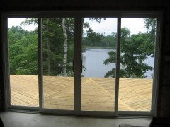
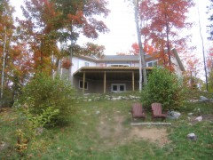
    I have included summer/fall pictures thinking it might change some of the opinions. When I set the table to eat outside the lanterns and, place matts
    are lime green. they receive a Wow when everyone sits down to eat.
    IF i do the chairs in Navajo Red I don't think I will get that reaction. I really like the blue from Bigideas but I don't have anything blue and never have. The inside will not have blue in it , So I think it might be green or yellow.
    You can see 2 more chairs 1/2 way down the hill, do you think these should these be painted the same colour as the ones on the deck.
    BigIdea's I love your blue so I think I will paint 1 chair by the fire pit this colour it's surrounded in green and the sky blue.
  • 15 years ago
    Sorry, I hit the submit to soon, here are a few more pictures, I don't want to beat this to death for a colour, but I am one that colour scares me, I like the lime green and I like the yellow and the red for the deck so I think I will look for cushions and see what I can find. Here is the picture of the chairs 1/2 way down the hill.We will be building a deck almost where the chairs are sitting right now but not for awhile, so if the upper chairs are lime green yellow or red what do you suggest for these 2 chairs.
  • PRO
    15 years ago
    OK, just to confuse you further ;-) how about going with a two-tone chair color? Then you could reverse your color scheme on the ones down by the lake vs. the ones on the deck, i.e. 2 might be predominately lime green with yellow accents and the other two predominately yellow with lime green accents. You could, for instance, paint the seat and the arms differently, or you could do several splats on the back in a different colors (or every other one, for a striped effect). Here's a website for inspiration - I just wouldn't advise doing what the title says LOL http://www.texasmuleartist.com/goofyparrot/chairs2.html
  • 15 years ago
    These chairs are fun looking for sure, I just took your other suggestion and stared looking at fabric, normally these chairs don't require a cushion but there is a lombar cushion that can be made along with a head cushion, I still prefer one colour one chair with some type of cushion http://www.crpproducts.com/adirondack.htm
    have a look at this wbe site, these chairs all look so stunning
  • PRO
    15 years ago
    Well, then, how about doing two chairs in two colors and the other two in a different color and then mixing them on the deck and by the lake? I do still think that adding some fabric to the mix and painting them all one color would be nice! I know they don't need cushions, and you wouldn't leave the cusions out all the time anyway, so just pick a color you love. If you like the lime, I would go with that!
  • PRO
    15 years ago
    Just as an idea, how about this fabric on Ebay; it combines the lime green with other colors in a nice stripe http://cgi.ebay.com/Fabric-Tommy-Bahama-Indoor-Outdoor-Kalani-Fresco-05TB-/270718780383?pt=US_Fabric&var=&hash=item84b79c19d2

    Or, here is another one that would be more monochromatic but would look great on a green chair http://cgi.ebay.com/QCF1046-Brian-Peacock-Outdoor-Cushion-Fabric-/390226350943?pt=US_Fabric&hash=item5adb4d935f

    This is the same pattern as the first, but pulls the house color in, although not as vibrant or as fun! http://cgi.ebay.com/Fabric-Tommy-Bahama-Indoor-Outdoor-Vera-Cruz-Surf-TB11-/380327061053?pt=US_Fabric&var=&hash=item9757f2c8bf

    This is cute, but I wonder how white the white background would stay?
    http://cgi.ebay.com/Waverly-Outdoor-Fabric-Grand-Central-Popsicle-670511-/320483199301?pt=US_Fabric&hash=item4a9e498945

    Lots of others on Ebay - just some ideas!
  • 15 years ago
    one concept would be harmonizing with existing colors in your natural landscape. should you choose a color that is not commonly found in nature, just be aware that THAT THING(S) will be what the eye is drawn to, particularly when viewing your home from the water, rather than the total picture. while bold suggestions can be terrific for regular areas without your scenery, in my opinion, in this instance, bold colors should be limited to cushions, placemats, pots and other accessories sprinkled about to draw the eye from one point to another to take in the entire scene. i have a similar situation with our view of a bird conservatory and the gulf of mexico and found that too bold of colors were jarring, competed with the scenery, and did not foster relaxation. the boldest earthy type color i have been happy with here is a sherwin williams coppery orange named red cent, which looks dynamite with most shades of green!
  • 15 years ago
    I have 5 adirondacks in my backyard -- all left natural cedar. I love the way they blend with the trees and plants, and how you can punch things up with cushions. You may need more weather protection, but the idea of a warm natural base color plus lime or orange cushions (maybe with a little white) sounds fab. (If you have trees and birds around, a darker color will also camouflage the inevitable splotches from above...) I can't wait to see what you do!
  • 15 years ago
    Ok, I have not read all of the replies since your last pictures, so don't know if anyone else suggested this........and is what I think I would do......paint each chair a different color. Red, blue, green, lime, yellow, orange and maybe even a pink one. You will be surprised that everyone will have a favorite. With your lime lanterns and place mats, how fun and festive would that be.
  • 15 years ago
    Thanks so much everyone, I went back home and looked at my colours again and I think I will stick with my original Navajo Red, with a striped head cushion that will hopefully pull all the colours on the deck in, green, lime , brown, taupe and the brick red. As much as I would love to paint the chairs bright colours, We have decided we would prefer not to stand out so much, this was the reason we built in the colour we did, In the long term we will cladd the deck posts in stone and add 2 more decks. I will post pictures once the chairs are done which will be in a about a months time.
    Thanks so much everyone for all your great suggestions.
    Houzz to the rescue.
  • 15 years ago
    extend the living space by using a color from one of the rooms that look onto the deck. I would go with the most vibrant accent color inside or Ol'blue eyes, benjamin moore 2064-30 Cool and relaxing on summer days, warm and inviting in winter.
  • PRO
    15 years ago
    I would paint the chairs an apple green or a sky blue. The apple green will tie into the colours of the trees and the sky blue will tie into the water and the sky colour. Both will work with the dark green umbrella and brighten up your deck. The deck will feel sunny and happy with either of those colours. In fact, if you are planning on buying a couple more chairs I would paint two in each colour!
  • 15 years ago
    I just wanted to update evreyone , I have since finished the 1st coat of stain on the chairs. I ened up going with a WIne colour, deep red with a hint of purple/grey. I had found a blue that I was going to paint the lower chairs in that would have looked great with the wine chairs. But... since then my lower chairs which only were put out 4 weeks were hit by something that went thru there while we were away and blew both chairs up and over into the trees. So they are now fire wood. I I will be replacing them now that I am really wanting them blue.
    I wondered If I could have some comments about staining the deck columns and ledger board a dark brown so they don't look so visible from the water.
    I have a Oxford Brown can of stain that I thought about using.
    Thanks again for all your help. I will post pictures once the weather gets better.

  • 15 years ago
    I would try to stain them so they are a close match to the tree bark color but still close to the colors of your house. Take a bark sample and bring it with you to the store!
  • 15 years ago
    So sorry about your chairs! Glad to see that as a hardy member of the Houzz community you are not letting that stop you. Can't wait to see your pics.
  • 15 years ago
    Thank you for your advise , the stain is the same colour as the roof. Would this be to dark,
    Sheilaschmitz, with so much inspiration and help on Houzz I can't stop now.
    Little bit of a set back but they will get done.
  • 15 years ago
    sorry for your setback. really glad to see the direction you are headed in color choices. what a great idea, i would love to see the columns stained a similar color as the roof shingles. earlier i had suggested sherwyn williams urban bronze for chairs. i take that back - it, or something similar, would be far better used as column color. cant wait to see the photos!
  • 15 years ago
    The roof color is a great color to try and match. It will add alot of diminsion to the house and still look subtle.
  • 15 years ago
    Thanks everyone, it's all coming together, I am going to stain the columns the same colour as the roof. Now we just need some weather, we have been hit with a big snow storm so it's a few weeks away.
  • 13 years ago
    OMGosh - my very favorite photo book is one on the history of your lake chairs! I would look up Lake Muskoka and see what it was all about - this might help you with the colors, etc. What a rich history and the book is full of beuatiful lake house make-overs, historical conservation and re-dos.
  • 13 years ago
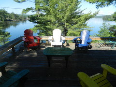
    Nautical primary colours are the best - Great punch on the neutral
  • 13 years ago
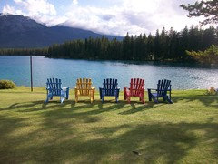
    This is the Jasper Park Lodge spin on colours - not bad view to wake up to either
  • 13 years ago
    We just finished refurbishing these old ones in popsicle colours
  • 13 years ago
    Brilliant!