Software
Houzz Logo Print
rose246

Hutch Re-do in a dark corner

11 years ago
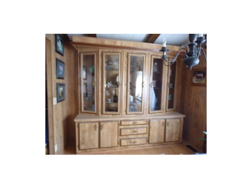
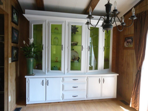
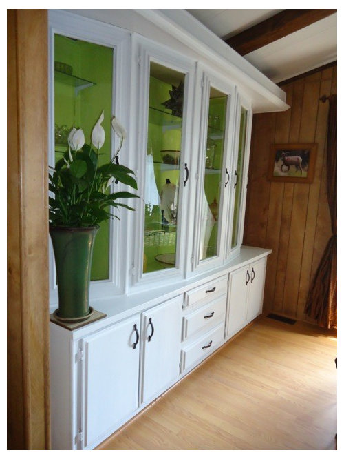
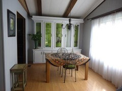
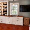
This hutch was outdated and is in a dark corner which could use a window and more light but for several reasons a window was not possible. I wanted to choose colors that would allow the interior to glow almost like sunlight but in a green not a yellow. I chose Valspar STAINBLOCKING BONDING PRIMER SEALER followed by Valspar 2000 celery satin for the interior. On the exterior I used the primer sealer followed by Valspar 2000 Valspar white semi-gloss. Handles were replaced with black handles and the lighting fixure was spray painted black. I used seat cushions the same celery color on wrought iron chairs for a casual eating area.


Comments (102)

  • 11 years ago

    Beautiful transition, I love it!

    rose246 thanked roserustler
  • 11 years ago

    you've done great without any help. your place looks amazingly updated, considering its just paint and a lot of hard work. the more I see of it the more it reminds me of my aunts place. I'm guessing you changed the flooring too. my living room is a valspar color #6005-c called smoked oyster its a kind of gray/brown and I love it, It is a real calming neutral. I was originally worried it would be too dark, so used the next lighter color on the paint card for the hall but wish I would have stayed with that color all through, the hall looks white. I've heard every room should have some black in it. I have black curtains, cream sheers, red couch and accents. my hardwood floors are about the color of yours too.

  • 11 years ago

    Thanks Cheryl, and I did look up smoked oyster and agree it is pleasant and relaxing. You are also right about how I have gone about the kitchen re-do. I have in addition switched out the dishwasher and refrigerator and hope to update the ovens soon. What did not show in the pictures is I switched out a black refrigerator for a white one. I wanted some white on the opposite side and also want to get a white microwave which is black now. I love black and have always used some in decorating but the kitchen was a huge leap. Right now I am working on the new lighting. Still thinking about wall color but am leaning toward a gray as in owl gray or smoke. Lots of time tho...it is a long way to the paint store. :)

  • 11 years ago

    If you go online, the paint manufacturers will sell you small samples and mail them to you. Might save you a long drive or two!

    rose246 thanked Mary Wiggenhorn
  • 11 years ago

    Bless you Mary! I had no idea....Thanks!


  • 11 years ago

    Wonderful job on the hutch and kitchen. I hope you post more photos as you continue your projects.


    rose246 thanked reddhead_jcs
  • 11 years ago

    Hi Rose - Your hutch looks AMAZING :) and I love the colors you chose. I’m thinking about painting the inside of my kitchen cupboards - any tips on painting from your experience? Did you use a roller?

    rose246 thanked Jackie B
  • 11 years ago

    Thanks Jackie,

    I did not use a roller but if you have large expanses without obstacles it certainly would save time. Also they make smaller rollers for narrower spaces. Part of the reason I did not is I tend to paint small areas at a time so clean-up is faster for me with a brush.

    One thing that I did do is set up an assembly line using long 2x4's between two tables with painting plastic covering the floor. This gave me a way to process 7-8 doors at a time as they were the most time consuming. I had to wash each side with awesome orange and then prime each side then paint each side. This was much easier processing several at a time.

    Thanks for your kind words! I am working on the tail end of my kitchen re-do now.


  • 11 years ago
    Rose - there's an Ideabook today in which it appears the home owner painted panelling like yours. Thought it might be useful: https://www.houzz.com/magazine/houzz-tour-restoring-a-neglected-home-to-its-original-1940s-splendor-stsetivw-vs~47472932
    El Camino Del Mar, Laguna Beach · More Info
    rose246 thanked summery
  • 11 years ago

    Summery, the visuals on the link shows how well this can be done. I like the look and am feeling pretty inspired right now. Thanks!


  • PRO
    11 years ago
    Nicely done!
    rose246 thanked Paula Collins
  • 11 years ago

    Rose, I think you are doing an absolutely wonderful job in updating your home. I am sorry about your husband. I am glad to see you pushing through and looking forward to new things. That said, I think your dinning room looks wonderful as it is. I would not paint the paneling, especially for the mountainous area you live in.


    rose246 thanked Alexandra
  • 11 years ago
    Well done.
    rose246 thanked Karine Garcia
  • rose246 thanked Candle Light Interiors Steven Durham
  • PRO
    11 years ago
    Very well done. I especially like the brighter green interior. I do agree with those who suggested updating the paneling on the walls.
  • 11 years ago
    YOU DID A LOVELY JOB.
    rose246 thanked Barbara Brown
  • 11 years ago
    Looks fantastic. Did you sand first?
    rose246 thanked Karen Bo
  • 11 years ago

    Karen Bo, With the Valspar STAINBLOCKING PRIMER SEALER I did not have to sand at all. I used frog tape to mask off the glass on the doors and after cleaning all with awesome orange which is non- toxic and allowing all to dry, I primed all surfaces.

    I removed the doors and placed them assembly line fashion between two tables on long 2x4's. I had painter's plastic below. I used the primer first. Then I applied Valspar 2000 paint. I prefer products that do not combine primer and paint.

  • PRO
    11 years ago

    Wonderful update - great job!

  • 11 years ago
    Thanks Rose! You are inspiring me. Your cabinet is wonderful
    rose246 thanked Karen Bo
  • 11 years ago
    Very nice job on the hutch. Love the green.
    rose246 thanked Kivi
  • 11 years ago

    I would not have thought to use a bold color; this looks great. I may try this idea on a free standing old pine cabinet in the entry. I painted the interior white, but color may be what it needs. Nice update.

    rose246 thanked alwaysdesigning
  • PRO
    11 years ago

    So much brighter!

    rose246 thanked User
  • 11 years ago
    Looks great!
    rose246 thanked fomosodesign
  • 11 years ago

    In your dinning area you could try cafe curtains in the window, the bottom half only. In a green or beige gingham check that would allow tons of light and open up the space visually. I agree with everyone else on lightening up the walls too a bit. Great job!

    rose246 thanked cabbie32
  • 11 years ago

    Thanks for the kind words and ideas! I have since removed the heavier brown curtains and have ceiling to floor white sheers across the entire wall. It looks like a wall of light! I plan to get to the walls next month and am leaning toward Valspar Silver Leaf which is a light gray.

  • 11 years ago

    Love what you did with your hutch. So bold!

    rose246 thanked muranoblue
  • 11 years ago

    Just wanted to post an update. I am now moving forward on the walls of this huge room.The color I picked is Valspar Silver Leaf which is a pale gray. It goes so well with the ultra white ceilings, celery accent in the hutch and the black in the bar area. Later I may add one more color for some architectural detail high on three walls.

    I will post pictures later on but my progress is slow due to other projects that have time limits.

    In the back of my mind I am wondering if for the detail I could bring in a soft orange chiffon.


  • 11 years ago
    I absolutely love what you did with the hutch and your choice of colors. You've given me some inspiration (if only I can get my hubby to agree lol). The choice of paint for the walls sounds lovely, and the orange too. Maybe buy one small accessory piece to test it in the room first? Well done.
    rose246 thanked jilliehj
  • 11 years ago

    I do have a piece of pottery in the room that has a soft orange on it and on the wall there is a reproduction of a painting from Pompeii which has several of the colors in the room plus a soft subdued orange. For sure I do not need another color that is as bold as the celery and the orange I am talking about is both burnished as to go to the brown in places and as soft as melting orange sherbert mixed with vanilla ice cream. It is the softer color I think would go well but will wait until I have more lower walls done to decide. What I am enjoying right now is the subtleness of the silver leaf paint which is whisper quiet and adds a dimension of calm.


    I know that such a subtle color could be boring if left on it's own in large amounts and I am finding ways to not let that happen. My mother who is 92 gave me a small quilted piece from the 1930's that I had restored. I am at this moment making a modern quilt holder to go across the wall of a small alcove that has been primed and is almost ready for a coat of the silver leaf. The quilt is quite geometric and the colors ones you would find in that era which makes it twice as much fun to put in this setting. Among the colors in the quilt is a subtle soft orange and greys, white, and greens along with other colors I am not using as much. It will work well in a room that honors all types of artwork.


  • 11 years ago
    @rose246 that sounds wonderful and I think you're instinctively following all the so-called design rules with your color choices, and introducing them around the room. I would love to see photos of the quilted piece, it's lovely to have something both personal and historical to treasure. And the silver leaf paint is intriguing me!
  • 11 years ago

    Thanks to all who kept giving me reinforcement on this project which has taken me what feels like forever to complete. Lots of helpful ideas came in. 21cylo introduced the idea of using a gray tone on the paneling. It took a few months of thinking about it but I settled on using Valspar's Silver Leaf which is a very light gray. I just completed the priming and painting of most of the room so I wanted to show you all the transformation. I will do this with three separate posts. I am very pleased with the results in general. Will add first a close up of the hutch with no paneling in sight. :)


  • 11 years ago

    I also took down the brown curtains. The long white sheers combined with the Silver Leaf walls has resulted in a light and airy look. Now the floor and furniture does not compete with that dark brown wood tone on the paneling.


  • 11 years ago
    last modified: 11 years ago

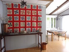
    I mentioned before that I had a quilt refurbished that my mother who is 92 had in the 1930's. Some asked to see how I used that in this room. It's colors adds a lot. The star was hung as it mirrors the shapes in the quilt. This quilt got it's own wall in a small alcove.

    I wanted to add here that I still have two triangular areas that are the panel color in this room and I am getting paint this week to complete those two smaller areas. They will get their own color to emphasize the geometry.

  • 11 years ago

    Absolutely love the transformation! Your home looks updated and fresh, yet you have included personal touches that really make the space say "Rose246" lives here! I am glad you did not paint all the woodwork and beams. I have been painting a lot of woodwork and doors in my house and feel like I almost have too much white now. Natural wood can really warm up a room. You've done a great job.

    rose246 thanked 21cylo
  • 11 years ago

    Thanks so much. Your comments have truly helped me make choices on color. The beauty of Houzz is you can not only share ideas but get help with problem spots. I agree there is a balance with color. It has weight and after every little section was painted I found myself standing back and feeling the change in weight that the color made and changing things like accessories to maintain a certain balance. My next two sections of this room will be adding color on geometric units and I am taking another leap of faith in using the colors I have chosen. I will share all when completed. Thanks again for your help on this project!

  • 10 years ago
    What prep work did you do before painting the hutch?
    rose246 thanked Jacqueline Wright
  • 10 years ago

    I used Awesome Orange which is non toxic to clean the surfaces inside and out. I let that dry.

    Doors were removed and placed on 2x4's between two tables with painters cloth below.

    Handles were removed. Frog tape was used to mask off the windows on the doors.

    All wood surfaces including both sides of the doors and the interior and the exterior of the hutch were given a coat of Valspar STAINBLOCKING BONDING PRIMER/SEALER.


  • 10 years ago
    Great transformation! Have you ever thought about painting the panelling? It certainly would brighten up entire room.
    rose246 thanked beadgirl58
  • 10 years ago

    If you look at the most recent pictures posted you will see the paneling is a lovely silver leaf color. Just look back at few posting above your own comment. It took me a while to get to it but the gray is a lovely color in the room.

  • 10 years ago
    I've been following this post and WOW way to go Rose! Your home looks so bright and cheerful now!
    rose246 thanked tabelle70
  • 10 years ago

    Thanks for the encoragement! It has been a work in progress. Just a few more rooms to go.....

  • PRO
    10 years ago

    Fantastic work!

  • PRO
    10 years ago
    Great color, good job!
    rose246 thanked frenchiegirl
  • PRO
    10 years ago
    Maybe a curtain that would have some green in it to harmonize the area.
    rose246 thanked frenchiegirl
  • 10 years ago

    I really need to do a piece on the adjacent recently done kitchen which has a green curtain that ties all in. Any more green in the living room area would be too much but you have to see the adjacent room with the doorway between to see the balance. You can see the breakfront from the kitchen through a doorway that is on a wall with the same green. Then the curtain repeats it as do accents through out that room. SO yes a green curtain....but in the adjacent room!

  • 10 years ago
    Rose246.......I can't even believe that's the same kitchen!!! GREAT job!!
    rose246 thanked gamalski
  • 10 years ago

    wow your kitchen is amazing and inspiring. It sure is hard to believe that it is the same kitchen. I am debating whether to go white or dark. Are you finding you notice much dust with the dark color?

    rose246 thanked Sharon Wettlaufer
  • 10 years ago

    waterloo 481 and gamaslski,


    Thanks for the kind words of encouragement! Here is another link to better pictures of the kitchen redo:

    http://www.houzz.com/ideabooks/50735858/thumbs/tired-kitchen-update-on-a-budget

    I have not had problems with dust on the valspar black. It is a hearty paint too and

    washes down nicely if you do get something on it. I use both black and white on cabinets in this house and the hutch redo used valspar white. I think it really depends on your room.

    Color has weight and every change can make a huge difference. I often ponder over color choices for months and have used Houzz as a research tool to see how colors look with other finishes. For instance before going with the silver leaf in the living room I put in oak floors with gray walls in a Houzz search and got thousands of pictures to see how that contrast worked. The gray color was suggested by one of the viewers on Houzz and once I saw how well it worked with both the black and the white and the oak floors I went with it.

    Another thing I do is take a picture of the room I want to paint. I then use oil crayons to color in colors I am thinking of using. Often that makes the choice obvious. I did this with the kitchen and in mine the white cabinets which I did consider just did not look as dramatic with the floors. Every kitchen is different tho and in yours you might feel the black does not work at all.

    On the hutch I chose white as that corner was dark and really needed a window but there were reasons one could not be put there. So I tried to create sunny and bright by combining the white with the celery. It truly lit up that corner.

    I thought the black might be too dark but with the lighter floors and white ceilings they work fine. There is also a nice large window over the sink area that lets in a lot of natural light. They somehow are not as dark feeling as the older brown cabinets were. The steel handles help too as do the pendant lights with their large white globes.

    I hope you show your results on Houzz. I would love to see them!


  • PRO
    rose246 thanked Fratantoni Design / Residential Architects
Sponsored
Miller Woodworks
Average rating: 5 out of 5 stars23 Reviews
Franklin County's Trusted Custom Cabinetry Solutions