Software
Houzz Logo Print
lisai75

New backsplash

11 years ago
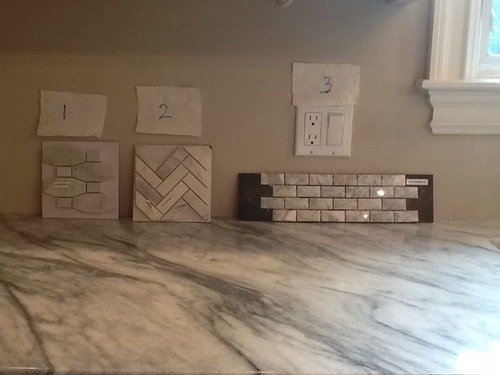
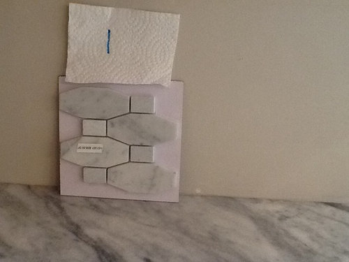
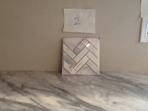
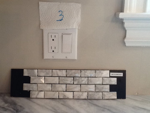
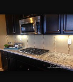
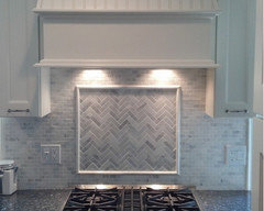
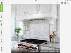
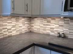
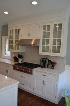
Hi! I would love houzzer's good taste recommendations. Which mosaic tile do you love? My cabinets will be painted dove white by Benjamin Moore. I considered subway tiles but I love the pattern and the interest of the smaller tiles. What do you think?

Comments (91)

  • PRO
    11 years ago

    I feel #2 will look too contemporary in your space. 1 & 3 both work. I lean toward #1. Can you get #3 in a larger size? (they look to be about 1x2 - I think it may appear too busy).

  • 11 years ago

    love love #2 and love the sample pic you showed of another kitchen with it installed.


  • 11 years ago

    i love the countertops. The tile options are all beautiful however they all look busy to me. What about solid subway tiles with an accent stripe of the beautiful trs options?


  • 11 years ago

    sorry - don't like the accent tile idea (personally).


  • PRO
    11 years ago

    If you can't decide, what about a mix? # 3 for the backsplash and # 2 by the range.


  • 11 years ago
    I love number 2, like 3 and would not use number 1.
  • PRO
    11 years ago

    Definitely #2.

  • PRO
    11 years ago

    Hi Lisa! I know you've asked which of the three backsplash choices should go in your kitchen, but opinions are just that -- opinions! What matters more is which one you love. All three are very solid options. You obviously are wanting to do something that resembles your countertops (which are lovely by the way) and at this point it's about the pattern. The best thing I would suggest doing is looking at pictures of backsplashes that would give a similar look to what you are wanting. This will give you a better idea of what they will look like on a large scale.


    At the end of the day, choose one that fits your personality, style and taste. They will all look perfect for the monochromatic style you seem to be going for. Just remember that whichever option you choose that there will be lovers and haters, so just do you!

  • 11 years ago
    Hi Lisa, If you choose number two, I would use a white grout as opposed to a gray grout. It would blend seamlessly.
  • 11 years ago

    Hermitage Kitchen Design has good advice.

    Personally, I would keep the backsplash simple and choose something other than the 3 options you posted, although your color choices are NICE. The small tiles create a busy pattern and compete with the granite.

  • 11 years ago
    Thanks hermitage!!! Well said! know it's hard to see but my kitchen is spacious and I feel the smaller size of the backsplash will not command the room.... These examples are what are really captivating me. It's amazing what some people refer "busy" and what others view as pleasing to the eye!
  • 11 years ago
    Also, should I assume herringbone is contemporary and that it will go out of style? I that that was a classic and timeless pattern.....
  • 11 years ago
    #1 is a great balance between classic and unique. I like how the oval-shaped tiles maintain the soft look of the marble.
  • 11 years ago

    i think what happened is that high contrast mosaics were very exciting when they came out and everyone got them and *then* noticed that they didnt actually look very good with the awesome counter tops they chose, which were also new and exciting. once burned, there is a reflex all the way in the other direction to say no multicolor tile with multicolor counters, even with much lower contrast.

    yes of course, it's your house and you should choose what you like. but if you ask people their opinion, they tend to feel comfortable giving it. the upside is that by asking you can look at choices in a more educated way: 'some people think this is busy. i'll keep that in mind. i think it looks fine'

    dilemma solved.

  • 11 years ago

    (before i did my yellow kitchen with black and white checkerboard floors, i didnt bother asking here at houzz. 99% of the people would have called me crazy to not choose grey walls and hardwood floors.)

  • 11 years ago

    Lisa, please note the countertops in the three examples you just posted. Two are solid and the 1st one is quite calm with its only occasional gray veins.

    I agree you should go with what you love but you posted a dilemma and you also noted that many feel it could get overdone. Just worth a consideration as are all Houzz comments. Some comments will feel right and others you'll just flat out disagree with. Taste is personal. We really just want you to love your kitchen. In some cases, we might want to voice experience from mistakes we've regretted.

  • 11 years ago

    I actually have white cabinets, light quartz countertops, and backsplash very similiar to No. 2. I love it!

  • 11 years ago

    Lisa, I just notice the same thins as Ann...the 3 countertops in those pics have minimal pattern going on. Even though I'm not a fan of the small tiles, those are really pretty examples. In your case, I would consider the opposite...pattern in the granite with subtle backsplash.

  • 11 years ago
    I hope I am not coming across as offended! I am not at all!!! I appreciate the advice:)
  • 11 years ago

    Lisa, your sweet and your appreciation is coming across just fine. Isn't it interesting how opinions can differ? I guess it could be kind of boring if things were different! Houzzers are so helpful!

  • 11 years ago

    I agree with Rache L above.....#1 wins. I've not seen a tile like that. I think it's very soothing and not busy at all. And this from a girl who is in love with a patttern similiar to #2 for the wall behind her powder room pedestal sink!

  • 11 years ago

    Number 2!

  • 11 years ago

    I think that these glass tiles look fab with the marble countertop. I would get some beautiful accessories for a pop of color.


  • 11 years ago

    I like Mark's idea. Your countertops need to stand on their own.

  • 11 years ago
    I love herringbone - my vote is for #2.

    I think you could achieve a very similar feeling to this inspiration pic that you posted!
    http://houzz.com/photos/955867
  • 11 years ago
    I like no. 1 since it has some larger pieces that makes it less busy, but I'm one whose is prone to continue to run the slab up the wall.

    what is the style of your kitchen?

    this also would nfluence my decision.
  • 11 years ago
    Whoa. it seems like Houzz has lowered their photo resolution yet again. I get that it's a busy site, but it's pretty hard to give advice when all of the photos are so low resolution that they're essentially useless. I have very sharp eyesight too!

    Well, I think number three will look too busy and will clash, because they are such small subway tiles. I would steer clear of it, personally.

    I vote #1 or #2 in this case. Someone mentioned flow, and maybe I've been riding my mountain bike too much, but these seem to have it given the small scale tile you're working with.
  • 11 years ago
    And I also really like Mark's idea of larger clean glass tiles.
  • 11 years ago

    I love 2 and 3, I think 2 would be very interesting and create a point of interest in your kitchen...

  • 11 years ago

    I think it's important to this decision to recognize that the quartzite is active and not plain. It's gorgeous, but not solid and plain. So, when looking at Houzz pics with various backsplashes, be sure to compare apples to apples with your countertop to the ones pictured.

  • 11 years ago
    I will go to tile store tomorrow and find some other samples and post them. Stay tuned.
  • 11 years ago

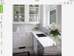
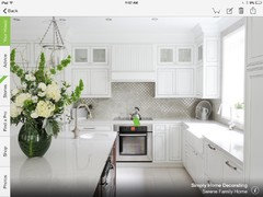
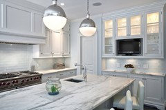
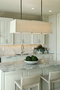
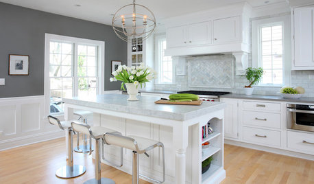
    I saw this beautiful kitchen and it reminded me of your countertop.

    Edina Galleria Residences - Unit 1307 · More Info


    Edina Galleria Residences - Unit 1307 · More Info


  • 11 years ago
    So pretty Emily!!
  • 11 years ago
    I have a similar quartzite in my new kitchen.
    I chose white subway tile with white grout.
    Color comes from accents....mainly red.
    I love the look of clean lines and added contrasts, like tea towels,
    vases, and very green plants. A touch of yellow brightens every room...my clock is that.
  • 11 years ago

    Lisa, maybe you are on the right track for what you are looking for. I think the "Edina" kitchen pics would be very close to the look you'd get with your choices. To my eye, the backsplash in the Edina kitchen detracts from the counter and it's busier than I'd be comfortable with, but sounds like it's a look you like. It is a nice kitchen as the colors work nicely, but I'd prefer one or the other being the star, rather than both. So, it's just a matter of your comfort zone and I do think your choices would produce that type of look. Emily found a great example!

  • 11 years ago

    Lisa-interesting, but I don't see your backsplash choices as too busy with your counters. I think mosaics are only busy when they are glass and have too many different colors in them. These are subtle colors and think they will look lovely with your counters. I think your should go with what you love. Your inspiration photos are perfect.

    I put simple glass subway tiles in my kitchen. While they are very popular now, I see them as being very trendy and think I will tire of them in 7-10 years. Your mosaics look like marble-and marble in my opinion is timeless while glass is more trendy. Go with you instincts. What you have picked out so far is lovely. Good luck!

  • 11 years ago
    I love herringbone but in this case think it will be too busy against your counter so instead I vote for #1 as best look.
  • 11 years ago
    Hi Karen!! What you explained was exactly what I was thinking...The smaller tile is what is throwing everyone off as giving a "busy" pattern. I was thinking of getting marble subway tiles and incorporating them with the smaller tile.... I am heading to the tile store tomorrow to see what else I can find.
  • 11 years ago

    I would suggest a subway tile, but use the herringbone over the stove.

  • 11 years ago

    #2 Herringbone is my favorite. The geometry of #1 does not appeal to me and the multi-dimension tiles of #3 are more apt to capture and reflect light in different directions, which would make the backsplash seem too busy to me. I would choose subway tile (which I don't particularly like) or #2, or the straightforward pattern of #3 with the actual tiles of #2 (flatter and a little larger in size).

  • 11 years ago
    I was thinking the subway tiles and number 2 of the stove!! I looooooove that herringbone
  • 11 years ago
    I think you want the herring bone so do the herring bone...I think if it has a lot of white in it it will look great.

    I originally said although herringbone is my fave it will be too busy. This is because up close your counter appeared to have a lot of dark veins running on a diagonal also, however after seeing your full kitchen your counter doesn't seem as dark as initially thought. 1 & 2 are good choices, I think you are leaning to #2 so go for it or you will forever think about it :(
  • 11 years ago

    In regards to the comments about some patterns being too busy, if you chose a lighter grout or one that blends with the tile, the pattern will appear more subtle. The samples obviously have contrasting grout because they want you to see what the pattern actually looks like, but you have have the subtle elegance of a pattern without it being overwhelming if the grout color matches more closely.

  • 11 years ago
    I agree with herringbone above the cooktop and subway everywhere else. I love that combination, I think I'll be doing the same!! :)
  • 11 years ago

    Subway with a framed herringbone stove section could work well.

  • 11 years ago

    You've probably long since finished this project, but just in case I thought I'd offer up another possibility. There are some amazing mosaics that would let you go with a white that wouldn't fight the counter top, but still give movement, interest, and wow factor. The link below is an example of the type of tile I'd recommend, but check with a tile shop for more styles.
    http://www.artistictile.com/itemdetails.aspx?Pid=1437&Cid=29&Colid=181


  • 11 years ago
    How exciting! Your new kitchen will be beautiful. We are almost done with our kitchen remodel (just waiting for a few cosmetic fixes) but all of the decisions were almost ulcer-inducing! I originally wanted subway tile but we went with a matte quartz countertop so I thought my backsplash should have a little texture...but didn't want it do be too dated 10 years from now. I was soooo nervous but I love the end result. Trust your gut and go with what you like.
  • PRO
    11 years ago

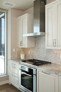
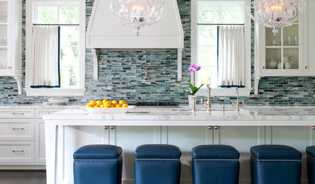
    I am in love with the more subtle backsplashes:

    Howard Avenue, Western Springs IL · More Info


  • 11 years ago
    Have you made a choice yet? I'd love to see what you've decided.
  • 11 years ago
    Lisa I hope you have not changed your mind to subway because "everybody" has to have subway. Get what you like and don't worry about what "is in" or will be "dated" because you will never catch up with the designers and their trends. That's how they make money.