Software
Houzz Logo Print
miketelford

Is this pendant too big for this room?

13 years ago
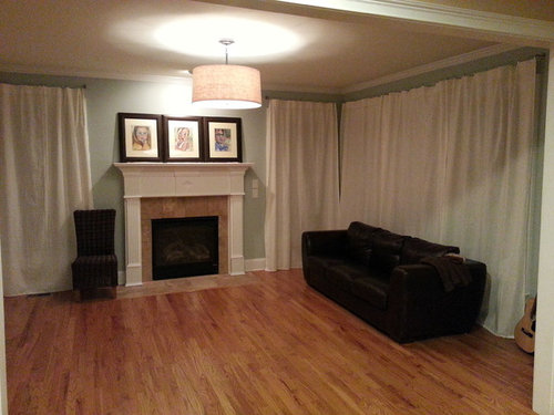
My wife and I are putting this room together and we added a drum shade pendant last night. I think it looks just right but my wife is of the opinion that it is too big.

As always, I am very grateful for your expertise and opinions. Please feel free to comment on any other aspect of the room. This is the keeping room off of our kitchen.

P.S. Sorry for the poor quality of the photo.

Comments (35)

  • 13 years ago
    I like it, but not there. I am sorry but from this view it overtakes the FP...I think something more "see through" is needed/or flush mount....LOVE your room!!
  • 13 years ago
    The size looks good to me.
  • 13 years ago
    too big - would look okay over a dining table tho.
  • PRO
    13 years ago
    I actually love it! It is a little on the big side, but I think that's what I love about it. It makes a statement. I think you'll find that once the room is filled more proportionately with furniture, the light fixture won't overwhelm so much, but will still stand out.
  • 13 years ago
    I appreciate the feedback. For those of you that think it's too big, is it the actual size of the drum or that it hangs too low that bothers you?

    The room will soon have two gray linen wing back chairs opposite the couch, a rug, and a coffee table in the middle. Would this change anyone's opinion? Any suggestions for a rug? We are thinking of something that has a pattern of mustard and white.
  • PRO
    13 years ago
    I think it works. Just needs a coffee table with seating on both sides.
  • PRO
    13 years ago
    Can I ask about the window treatments? Are those temporary curtain panels?
  • 13 years ago
    lol ouch, no not temporary. They are simple linen panels hanging on braided steel cable (Ikea). There are so many windows in that room we didn't want to overwhelm the space with hardware, plus it allows us to pull them all to one end when they are open.
  • 13 years ago
    ^ Agreed about the curtains. I would add natural woven or matchstick type shades for privacy and keep the white panels pulled to the sides to eliminate the drying sheet effect.
  • 13 years ago
    It may be the angle of the pic...not sure..that shot makes it look sort of "clunky"...
  • PRO
    13 years ago
    Currently it is the focal point of your room, however when other elements are added in (depending upon those elements) it will compliment or take away. Maybe wait to make a decision on it until your room pieces are all completed. Then you will be able to see if your eye passes it by as part of the design or migrates to it. Then you have to decided if you want it as the focal point or if you would rather have others notice your rug! The fixture itself...beautiful!
  • 13 years ago
    Yes, I think more seating and a table under it would def help
  • 13 years ago
    Ideas
  • 13 years ago
    This one may be too formal, but it is so elegant
  • PRO
    13 years ago
    last modified: 13 years ago
    If its over the table it's fabulous..if not shorten the stem..
  • 13 years ago
    over the table as in over the coffee table correct?
  • PRO
    13 years ago
    Sorry, I did not mean to insult. They just look kind of limp hanging there flat like that. Will you keep them open more? Do you need to pull them shut for privacy? They definitely could look better pulled open. And I have to agree, they look a little like sheets hanging there. ;(
    On that long window, you have that on a cable with no center support? I would be cautious pulling those open and shut across that wire. Are the brackets installed in studs? I have heard stories about those cables coming loose over time and sagging. If you plan to pull them open and shut consistently, be wary of that. Let's see how your room looks when the furniture is added
  • 13 years ago
    I think it looks fine, when you have the other furniture balancing out the room it will not look so large. The couch looks too pushed against the windows, what if it was facing the fireplace with a sofa table behind it?
    Be sure you buy the rug large enough for the space, the furniture should have at least the front legs sitting on it.
    What is the inspiration for adding mustard to the room? Aren't the walls a blue-grey?
  • PRO
    13 years ago
    Yes coffee table
  • 13 years ago
    JMittman, Please don't apologize, you were absolutely correct! We do keep them open nearly all of the time. We just pull them shut at night. I had similar concerns about the cables and made sure that every support is securely mounted into a stud.

    That being said, the curtains were more or less a temporary solution for privacy. We moved from NYC to Atlanta this summer and more than quadrupled our square footage. We've added these curtains because they were a cheap and easy solution that didn't necessary need to be replaced anytime soon (or so we thought lol). Okay what would be a better window treatment? I like the idea of woven shades, but wouldn't mind keeping the curtains either . . .
  • 13 years ago
    last modified: 13 years ago
    bonnielynn the poor quality of the photo may be throwing off the color on the walls. It is Benjamin Moore Woodlawn Blue, I couldn't get a photo to link for some reason. We thought the blue would go well with the yellow.
  • PRO
    13 years ago
    Room currently has too many visual focal points: the fire-place, the pendant light. they are both fighting for top billing: There is usually one diva in an opera. If there are two, one gets knocked off in the final act.
    Solution: Pick one focal point (probably the FP) and make the pendant subservient to the FP (that probably means make pendant smaller in size and closer to the ceiling.
    Then everything else should fall into place as long as you make the FP the top billing.
    In my experience, it takes quite a deft touch to have everything mesh together visually when everything wants a lot of attention. So, an alternate design solution is to establish a heirarchy of visual importance.
    Good luck!
  • 13 years ago
    Ha ha..this is a site for multiple Divas....LOL!! I am open to suggestion...still feel it's too clunky, although as a fixture, I do like it! Looking forward to seeing the outcome!
  • PRO
    13 years ago
    Nice fixture, but you have the right thought..too large for the room.
  • PRO
    13 years ago
    I was reading the thread and was about to comment that it was just a tad too big for the room and maybe it should be shortened but then you posted the picture above and it looks perfect now!
  • 13 years ago
    Looks fine---put it on a dimmer switch and you're set. CheerS!
  • 13 years ago
    Awesome! Thanks for your opinion!
  • 13 years ago
    I love the light. I think the size is fine. Looks good to me!
  • PRO
    13 years ago
    Wow, looks sooo much better! And your curtains look FAB opened up like that! :)
  • 13 years ago
    It doesn't stand out so much now...looks better!!
  • 13 years ago
    I think it looks fabulous. The room has really come together. Great Job!
  • 13 years ago
    I just saw this tonight, and was going to say I thought it looked good, but maybe others didn't because the room was still kind of empty. Then I saw the pic with all the furniture in. I still think it looks good!
  • 13 years ago
    Thanks everyone!
  • PRO
    13 years ago
    Absolutely not, it looks great!