

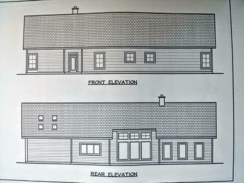
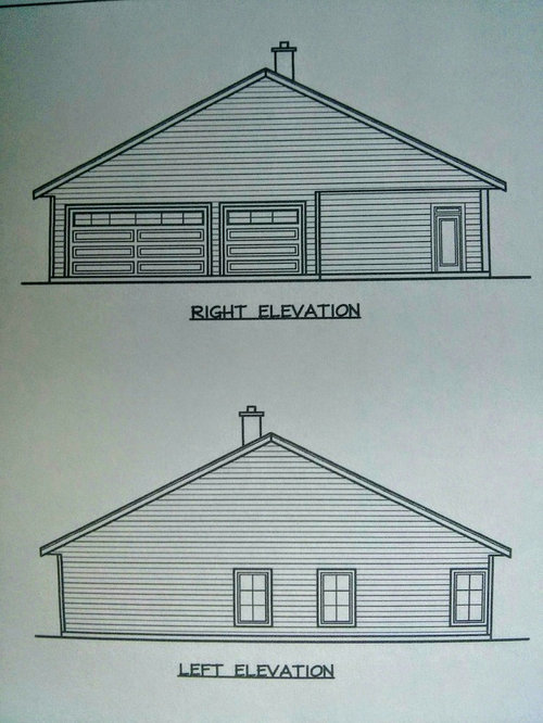
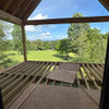
She's not a looker! Experimenting with roof pitch?
11 years ago
Featured Answer
Sort by:Oldest
Comments (10)
 11 years ago
 11 years ago
Related Professionals
Columbus Architects & Building Designers · Fort Worth Architects & Building Designers · Myrtle Beach Design-Build Firms · Amherst Design-Build Firms · Winona Design-Build Firms · Middletown Design-Build Firms · Monroe Design-Build Firms · Indianapolis Home Builders · Baton Rouge Home Builders · Waco Home Builders · Winona Home Builders · Sioux Falls Home Builders · Colorado Springs Home Builders · El Paso Home Builders · Montréal Home Builders PRO11 years ago
 11 years ago
- 11 years ago
- 11 years ago
- 11 years ago
- 11 years agolast modified: 11 years ago
- 11 years ago

Related Stories
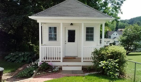
STUDIOS AND WORKSHOPSCreative Houzz Users Share Their ‘She Sheds’
Much thought, creativity and love goes into creating small places of your own
Full Story
LIFEThe Day She Learned the Serenity Prayer for Homeowners
A flooded house and a high school graduation party intersect to teach some life lessons
Full Story
REMODELING GUIDESMaterials: The Advantages of a Metal Roof
Metal reigns in roofing style, maintenance and energy efficiency
Full Story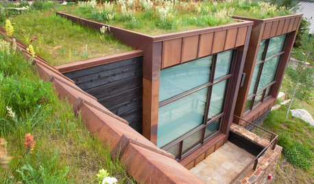
GREEN BUILDING6 Green-Roof Myths, Busted
Leaky, costly, a pain to maintain ... nope, nope and nope. Get the truth about living roofs and see examples from simple to elaborate
Full Story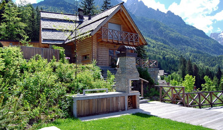
LANDSCAPE DESIGNStyle and Nature Come Together in a Slovenian Landscape Design
Natural plantings and local materials create a memorable outdoor experience in picturesque Kranjska Gora
Full Story
LIFETell Us: Do You Know How to Live With Your Parents?
If you've tried multigenerational living under one roof, we'd love to hear the details
Full Story
LIFEHow to Navigate an Extended Guest Stay
Keep sharing living quarters a positive experience by pondering the answers to these questions in advance
Full Story
GREEN BUILDINGHouzz Tour: Going Completely Off the Grid in Nova Scotia
Powered by sunshine and built with salvaged materials, this Canadian home is an experiment for green building practices
Full Story
TRAVEL BY DESIGNTravel Guide: New Orleans for Design Lovers
Experience the city's energetic rebirth layered with centuries of history, seen in its architecture, museums, restaurants and more
Full Story
EVENTSTour 7 Stunning New York Gardens
See how garden designers landscape a living roof, a farmhouse pool area, small backyards and more
Full Story


chelwa