Software
Houzz Logo Print
xclusive

Need help with backsplash

11 years ago
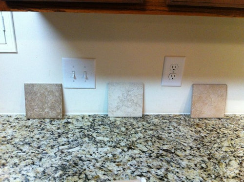
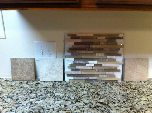
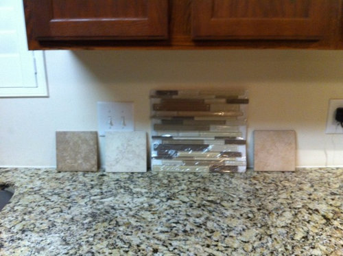
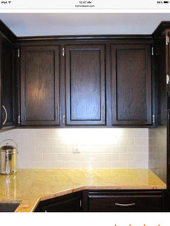
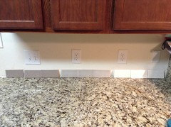
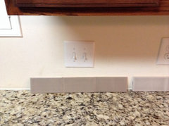
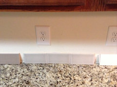
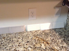
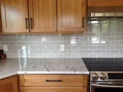
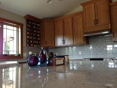
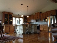
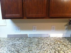
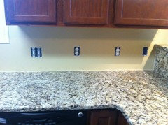
We have NVG granite and are cabinets are a Oak saddle colore We were looking to add a backsplash. We like the look of traverstine but want something that is easy to clean. I attached pics of a couple of porcelain that has a semi travertine look to them. We were debating on which color to go with? Once the color was selected we wanted to see if we should keep it simple just laying the tiles straight or diaganol or adding maybe a 4in decorative tile with the ones we have selected(since NVG seems to be a little busy when selecting a backsplash). . We are also open to suggestions as well. Trying to have a nice backsplash without breaking the bank :) Sorry for the cell phone pics!


Thanks!

Comments (46)

  • 11 years ago
    I don't think any of those tiles look good with your granite. IMHO, your granite is so busy that the only thing I can imagine looking nice with it will be a plain, no pattern, white or off-white tile...most definitely not a mosaic.

    xclusive thanked dcward89
  • 11 years ago

    I agree with dcward. I could see a plain off white, maybe beige or light tan tile. Very simple ceramic or glass.

    xclusive thanked Carrie B
  • 11 years ago

    I agree with countryatheart and the others. I have giallo ornamental like countryatheart and remember how very hard picking a backsplash was. I loved travertine but almost all didn't look right with my granite and GWers advised to continue to hunt for tile. Don't give up. Persevere.

    I wanted a quiet peacefull atmosphere in my kitchen. My subway are pillow tiles with some variation but subtle and not shiny.

    xclusive thanked tea4all
  • 11 years ago

    I agree with the others about the tiles in the top picture. I just wanted to post that we had a real travertine backsplash in our previous home and it wasn't hard to keep clean at all.

    xclusive thanked sjhockeyfan325
  • 11 years ago

    Your granite is a very intense pattern. You really can't add another pattern to it. Even a 4" plain tile presents a pattern when you add the grout lines to it.

    It doesn't mean you have to go with white though - you could try different greys or the beige-gold or mocha which might tie in with your cabinets.

    xclusive thanked blfenton
  • 11 years ago

    Go simple! Of the ones you've shown, the one on the right looks too pink, the one on the left looks too tan and the glass is just too too much. So the whitish one would be best of the ones you've shown, but even simpler would be better, to my eye.

    xclusive thanked LE
  • 11 years ago

    Thank you everyone for all the suggestions. OK, back to the drawing board. Its funny because I really never thought NVG granite was that busy until you start trying to match something up with it. I will search HOUZZ for more options and report back for opinions :)


    Thanks


  • 11 years ago

    I agree with the comments that plain would be better with that NVG granite. That said, IF I was forced to choose one of your options, I think the middle one goes best of the three. I think the white/ivory color family seems better than the brown or orange-y-brown ones.

  • 11 years ago

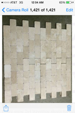
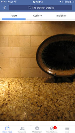
    Ok I'm back with new suggestion. I really didn't think I wanted traverstine but it seems most people say they dont have a problem with keeping them clean. Anyways here was my next suggestion, opinions?? :)


    I know, I know...more cell phone pics lol These I dont have sample of yet but can get a great deal on them on CL.

    Thanks!

  • 11 years ago

    We really need to see a sample in your space before giving an opinion.

    xclusive thanked dcward89
  • 11 years ago

    Agree with dcward. The above photo looks like you've got the right general color(s), but no way to tell without it actually up against your granite, and, preferably, with your entire kitchen, cabinets, etc. It also looks like it could be too much variation & in color & pattern.

    xclusive thanked Carrie B
  • 11 years ago

    I've seen dozens of photos of NVG and similar gold-toned granite with travertine tiles. It was *the* look in the 90s when Tuscan was all the rage. It is SO dated! Red-stained cherry cabinets completed the look, as if cherry isn't red enough on its own.

    I would go with a traditional look for your kitchen. I see white shutters on your window. The kitchen is probably modest in size and design, probably in an older home. I would look for a solid creamy color tile that matches the light tones in your granite. It will give an area of calm between the patterns of the granite and the strong grain of the oak cabinets. Ceramic tile suits oak imo.

    I think the stick mosaics are too contemporary for your classic look so I wouldn't use that shape as an accent. You could use square mosaics or something like a double row of 2 x 2"s if you want to bring the granite color up to the backsplash. You don't want to go too fancy with oak cabinets. No marble, no mother of pearl, etc. I'd be looking on Houzz for inspiration for ceramic accent tile. Most people on GW hate accent tile but there are some really nice examples on Houzz. It doesn't need the accent, but you might be someone who won't be happy with a plain tile. But the plain tile is where you should start.

    xclusive thanked User
  • 11 years ago

    We have a lot of movement in our granite. We picked marble for our bs.

    Older kitchen.


    xclusive thanked amykath
  • 11 years ago

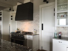
    The 2nd pic is NVG with polished botticino marble tile.

  • 11 years ago

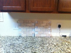
    Ok I went and purchased some samples :)

  • 11 years ago

    The color looks good to me, but there's too much variation for my taste.

    xclusive thanked Carrie B
  • 11 years ago

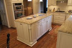
    This pic is not your cabinet color but it is NVG granite shown with a creamy glossy tile.

    Timeless Elegance, Cozy Traditional · More Info

    xclusive thanked romy718
  • 11 years ago

    It not right to me...the color on my monitor looks off but as we learned on Carrie B's threads it is impossible to pick colors like this as everyone sees it differently. From my monitor right now the tiles have sort of a pinkish cast. I also agree with Carrie B that the variation in the individual tiles is too much. The pic romy posted looks perfect...quiet, calm color but you get some interest/texture in varying the shape of the tile.

    xclusive thanked dcward89
  • 11 years ago

    My monitor also shows a decidedly pink tone in the tiles OP posted above.

    xclusive thanked User
  • 11 years ago

    The granite is REALLY BUSY with speckles, and you are adding small squares with the mini-subways. It's like polkadots and plaid - hard to pull off.

    I'd do plain cream subway tiles (go larger rather than minis if you don't want the usual 3x6) with matching grout to make the backsplash minimal.

    xclusive thanked User
  • 11 years ago
    last modified: 11 years ago

    I went through the same process. Tumbled or travertine is dated. And, it was on the way out when I remodeled almost 7 years ago.

    It is tricky to work with. You don't know what you will get as all batches are different. It can look muddy or lean toward pink. This is probably why it is no longer popular.

    I agree, a simple creamy ceramic tile will not compete with the counter.

    xclusive thanked eld6161
  • 11 years ago
    last modified: 11 years ago

    You need to keep with a quiet backsplash. That is why everyone is suggesting a quiet ceramic. Your granite is very busy and adding another busy element with travertine will be too much. Yes the color in the travertine may work, but too much patterning.

  • 11 years ago
    last modified: 11 years ago

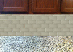
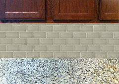
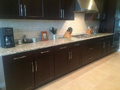
    I pulled a Jeffrey Court subway tile from the website and photoshopped it into your photo with the granite and cabinets to give you an idea of what it would look like with a ceramic tile. The color is Spanish Moss. Here's the link: Jeffrey Court Spanish Moss

  • 11 years ago

    i also think its leaning toward pink and has too much variation...with that counter u need to keep the b/s simple. if u don't want to do a shiny tile, go with a matte tile...i would do a larger size tile like 6x6 or a larger subway tile...the smaller the tile, the busier it will look...

    xclusive thanked sprtphntc7a
  • 11 years ago

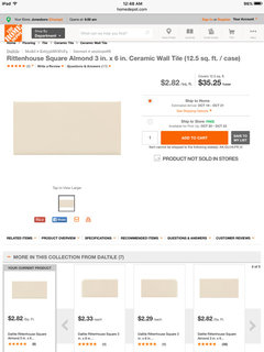
    Found a simple subway tile online. They don't stock them in the stores and will have to order yo get samples. Opinions?

  • 11 years ago

    It might work. You do need a warmer off-white, but it could be a little too yellow. It's impossible to tell from photos. I do know the Rittenhouse Square Arctic White is popular in bathrooms and people have been happy with the quality.

    Do you have a tile store or home improvement store other than HD in your area? Daltile is pretty common.

    xclusive thanked User
  • 11 years ago
    last modified: 11 years ago

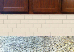
    Xclusive, this is what I posted for you yesterday. It is a Jeffrey Court tile which is sold at either Lowes or HD too. It's a crackle tile and I personally think the color works better with your cabinets and granite than the Rittenhouse Almond. In the second photo, I photoshopped in the Rittenhouse Almond so you could compare the two. I feel the almond fights your granite because it has too much pink on it.


    xclusive thanked cpartist
  • 11 years ago

    The almond subway looks pink to me as well. I think closer to a pure white or maybe even a subtle grey tone would look better.

    xclusive thanked dcward89
  • 11 years ago

    One looks gray green and the other looks pink or yellow. But that's the nature of viewing colors online. I would bet money that neither tile looks anything like these photos.

    If you go white, you want a warmer white. Though there may be cooler tones of pure white in the granite, there's also warmer creams and gold, so they blend together, making the granite read warm.

    Use a tile appropriate to the style of the home and other elements in the kitchen. Remember that all granites have a pattern and most wood has a pattern, oak being one of the more heavily-grained. You've already chosen pattern in the granite and cabinets, so you need to minimize pattern in the backsplash. Even plain tile has a pattern in the grout lines.

    xclusive thanked User
  • 11 years ago

    Ok brought a few more samples . From left to right : chocolate, pearl and fawn.

  • 11 years ago

    I recognize those tiles! Allen and Roth from Lowe's, right? I'm using the Chocolate in my shower.

    I definitely don't like the chocolate for you, I like the Pearl and the Fawn. We've learned that color is tough Online, but I think that even if we can't really see what the true color is on our monitor, we can get a pretty good sense of what colors go together & which do not. I have a slight preference for the Fawn, mostly because it's lighter and you have dark cabinets so I think the contrast will be pleasing, and it would help to lighten up your kitchen.

    xclusive thanked Carrie B
  • 11 years ago

    I like either the chocolate or pearl. Would have to see them in your kitchen light but I'm leaning toward the pearl. I think it looks good with your cabinet color & granite.


    xclusive thanked fldirt
  • 11 years ago

    Here are a couple of pics of Carol.33's kitchen with the Allen & Roth Pearl. The Pearl reads grey to me in these pics & I don't see grey tones in your granite. Can you get more tile samples (buy a box & return it?) i'd do a larger sample board with doublestick tape with the colors that you think blend with your granite. You're on the right track.

    xclusive thanked romy718
  • 11 years ago

    romy718

    Here are a couple of pics of Carol.33's kitchen with the Allen & Roth Pearl. The Pearl reads grey to me in these pics & I don't see grey tones in your granite. Can you get more tile samples (buy a box & return it?) i'd do a larger sample board with doublestick tape with the colors that you think blend with your granite. You're on the right track.

    You re correct! I do like the Pearl but it is reading more grey which I don't have in my countertop. Whewww who ever knew (I had no idea) picking a BS was so much trouble. I guess back to drawing board. I guess I am looking for a warmer tan possibly.

  • 11 years ago

    I think your paint color looks really good with your granite. Could you take a paint chip tile shopping & try to find a similar color?

    xclusive thanked Carrie B
  • 11 years ago

    I think these samples ignore the gold. Gold is hard to ignore. It's pretty tile though.

    Are you still getting the Rittenhouse Almond sample? I think I saw one called Biscuit you might also try.


    xclusive thanked User
  • PRO
    11 years ago

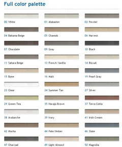
    Hi, we think the simpler the better because the granite is very speckled. An off white or light grey rather than the dark grey would match better with the granite. The running bond subway tile is a good choice. We are not sure if you have existing lighting under cabinets, but we recommend task lighting. Strip LEDs are more common now because their low profile. You have a number of switches and power receptacles on that wall, so be sure to try and match the faceplates as closely as possible. As for the grout color we recommend a light finish. http://www.mapei.com/US-EN/coloured-grouts-list.asp

    xclusive thanked Building Center No.3
  • 11 years ago

    Grazia Rixi in Crema might work.

    xclusive thanked eld6161
  • 11 years ago

    Ok I have to many projects going on right now in the kitchen (running wire across attic for undercabinet lights, installing retrofit 4in LED cans and inceiling speakers, crown molding and painting)! :) Really wanted to have a backsplash picked out before I started painting so that I would have less area paint but I never knew picking out one would be so hard. We started off with the builder grade color Little dove and I ended up painting our 1st floor SW Whole Wheat. I am liking the Whole Wheat with our granite. Would it be too simple just to take a paint sample to the tile store and try to match up some type of subway tile in the same color?

    Little Dove

    SW Whole Wheat

  • 11 years ago

    I think it might be hard to match it *exactly*, and that matching it almost could look like you got it *almost* right. I'd take your samples to a tile store & find something that looks good with everything. Perhaps a shade lighter or darker than your paint sample will look good.

  • 11 years ago

    Yes, try that. Whole Wheat has gold/tan tones. In your photo the paint looks light yellow, so you can see we can't help pick tile from your photos. Unless you pick a gray tile that ignores those strong gold tones. ;)


    SW 6121 Whole Wheat Paint · More Info

  • 11 years ago

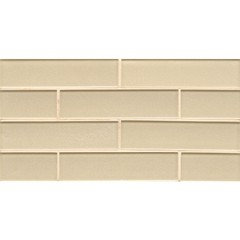
    Another tile I was going to order a sample of but wanted to get opinions first. Pics are from Lowes website. Appears to be a little more than I wanted $22 sq ft but Im ready for the BS saga to end... lol http://www.lowes.com/ProductDisplay?productId=4743391#BVRRWidgetID In the meantime I have finally finished painting, ran low voltage wiring for undercabinet lights today (Armacost) and finish my fireplace stone veneer and mantle. Now that is done I can turn my attention to running crown molding this weekend. Would love to get this backsplash issue out of the way asap! :)


  • 11 years ago

    I think that looks nice. You won't be able to tell if the color works until you have a sample, but I think you may be on the right track!

  • 11 years ago
    last modified: 11 years ago

    I wouldn't use glass with oak cabinets. Oak is kind of rustic. Glass is kind of modern. While your granite has determined the color of your tile, your cabinets have determined the style. In the $22 range, you can look at some handmade tiles like Sonoma Tilemakers in their ceramic Stellar line. There are dozens of neutral colors and three different glazes. I would do a matte tile, which has a beautiful satin glaze.

    https://www.sonomatilemakers.com/Palette.aspx?prod-line-id=6&IsColorPalette=True

  • 11 years ago

    I know you probably don't want to hear it but I would pick the lightest tile in a solid color, that was not bright white, and use grout of a matching color. There's just too much movement in the granite to have any kind of detail in the backsplash. If you want detail, I would consider pillow tiles, but I would not introduce color or pattern.

Sponsored
AIS Renovations
Average rating: 4.5 out of 5 stars15 Reviews
Custom Craftsmanship & Construction Solutions in Franklin County, Ohio