

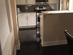
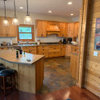
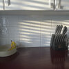
Help! Does Backsplash Match?
11 years ago
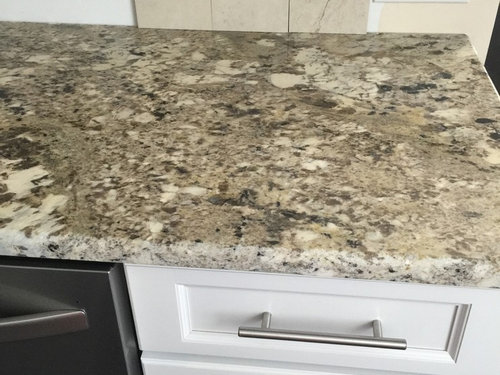
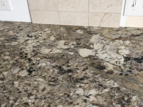
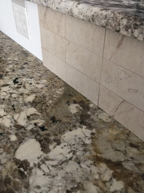
Featured Answer
Sort by:Oldest
Comments (27)
 11 years ago
- 11 years ago
Related Professionals
Washington Kitchen & Bathroom Designers · Sarasota Kitchen & Bathroom Designers · Rolla Kitchen & Bathroom Designers · Waterloo Kitchen & Bathroom Designers · New Bedford Kitchen & Bathroom Designers · Liberal Kitchen & Bathroom Designers · Oklahoma City Kitchen Remodelers · Nashua Kitchen Remodelers · Trenton Kitchen Remodelers · Santa Fe Kitchen Remodelers · Provo Kitchen Remodelers · Cumberland Custom Countertops · Hackettstown Custom Countertops · Leamington Custom Countertops · Sarnia Custom Countertops- 11 years ago
- 11 years ago
- 11 years ago
 11 years ago
 11 years ago
 11 years ago
 11 years ago
- 11 years ago
 11 years ago
 11 years ago
- 11 years ago
- 11 years ago
- 10 years ago
- 10 years ago
 10 years ago
 10 years ago
- 10 years ago
- 10 years ago
 10 years ago
 10 years ago
- 10 years ago
- 10 years ago
- 10 years ago
- 10 years ago

Related Stories

INSIDE HOUZZHow Much Does a Remodel Cost, and How Long Does It Take?
The 2016 Houzz & Home survey asked 120,000 Houzzers about their renovation projects. Here’s what they said
Full Story
KITCHEN DESIGNCountertop and Backsplash: Making the Perfect Match
Zero in on a kitchen combo you'll love with these strategies and great countertop-backsplash mixes for inspiration
Full Story
REMODELING GUIDESBathroom Workbook: How Much Does a Bathroom Remodel Cost?
Learn what features to expect for $3,000 to $100,000-plus, to help you plan your bathroom remodel
Full Story
KITCHEN DESIGNHow Much Does a Kitchen Makeover Cost?
See what upgrades you can expect in 3 budget ranges, from basic swap-outs to full-on overhauls
Full Story
BATHROOM DESIGNHow to Match Tile Heights for a Perfect Installation
Irregular tile heights can mar the look of your bathroom. Here's how to counter the differences
Full Story
WORKING WITH PROSInside Houzz: An Interior Design Match Made Right Here
See a redesign that started on Houzz — and learn how to find your own designer, architect or other home pro on the site
Full Story
COLOR11 Terrific Paint Color Matches for Wood Details
Pair your wood trim and cabinets with the right shade of wall paint to bring out the beauty in both
Full Story
KITCHEN CABINETSKitchen Confidential: 7 Ways to Mix and Match Cabinet Colors
Can't decide on a specific color or stain for your kitchen cabinets? You don't have to choose just one
Full Story
KITCHEN DESIGNMix and Match Kitchen Materials for a Knockout Design
Give your kitchen unexpected flavor by combining wood, stone, glass and more. Here’s how to get the mix right
Full Story
BATHROOM DESIGN9 Tips for Mixing and Matching Tile Styles
Get acquainted with the basics of combining shapes, colors and finishes for a symphony of tiles
Full Story

badgergal