

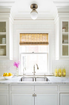
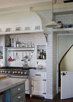
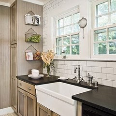
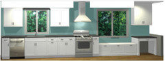
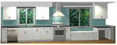
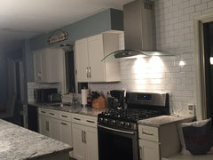
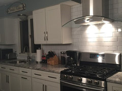
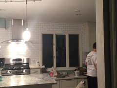
Tile whole wall or half?
10 years ago

Featured Answer
Sort by:Oldest
Comments (20)
 PRO10 years ago
- 10 years ago
Related Professionals
Spring Interior Designers & Decorators · Stamford Interior Designers & Decorators · Montrose Interior Designers & Decorators · Elko Interior Designers & Decorators · Portland Interior Designers & Decorators · Mobile Architects & Building Designers · Baton Rouge Architects & Building Designers · Fayetteville Architects & Building Designers · York Architects & Building Designers · Sierra Vista Architects & Building Designers · Tucson Architects & Building Designers · Ashland Kitchen & Bathroom Designers · Covington Kitchen & Bathroom Designers · Oneonta Kitchen & Bathroom Designers · Milwaukee Kitchen & Bathroom Designers 10 years ago
- 10 years ago
 PRO10 years agolast modified: 10 years ago
 PRO10 years ago
 10 years ago
 10 years ago
 10 years ago
- 10 years ago
 PRO10 years ago
 PRO10 years ago
 9 years ago
- 9 years ago
 9 years ago
- 9 years ago
- 9 years ago
- 3 years ago


Related Stories
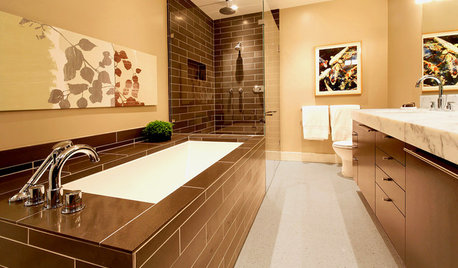
BATHROOM DESIGNDesigner Trick: Take Your Shower Tile to the Ceiling
Tile the whole wall in your shower to give your bath a light and lofty feel
Full Story
BEFORE AND AFTERSSee a DIY Powder Room Transformation for $1,100
Determination, DIY skill and a stunning tile feature wall helped make this formerly dark and gloomy powder room feel spacious
Full Story
COLORPick-a-Paint Help: How to Create a Whole-House Color Palette
Don't be daunted. With these strategies, building a cohesive palette for your entire home is less difficult than it seems
Full Story
REMODELING GUIDES10 Tips to Maximize Your Whole-House Remodel
Cover all the bases now to ensure many years of satisfaction with your full renovation, second-story addition or bump-out
Full Story
HOUZZ TOURSHouzz Tour: Whole-House Remodeling Suits a Historic Colonial
Extensive renovations, including additions, update a 1918 Georgia home for modern life while respecting its history
Full Story
PATIO OF THE WEEKPlaytime for the Whole Family
With a climbing wall, a fire pit and low-maintenance lushness, this remodeled California patio has something for everyone
Full Story
Houzz Products: Get a Whole New Look — Without New Furniture
With a fresh-looking decor trio (rug, light fixture, wall covering), they won’t even notice that same-old sofa
Full Story
BATHROOM DESIGNHouse Planning: 6 Elements of a Pretty Powder Room
How to Go Whole-Hog When Designing Your Half-Bath
Full Story
TILETile From Around the Globe Adds Out-of-This-World Panache
Go ahead, let color and pattern run wild in your tile. Your walls, floors and countertops will say "thank you" in a whole new language
Full Story
BATHROOM DESIGNRoom of the Day: Basement Bathroom With Nautical Flair
Coastal-inspired details and a one-of-a-kind tile floor tie together this Pennsylvania powder room and changing room
Full Story


Rawketgrl