Software
Houzz Logo Print
izeve

Dining room on a dime - continued...

10 years ago
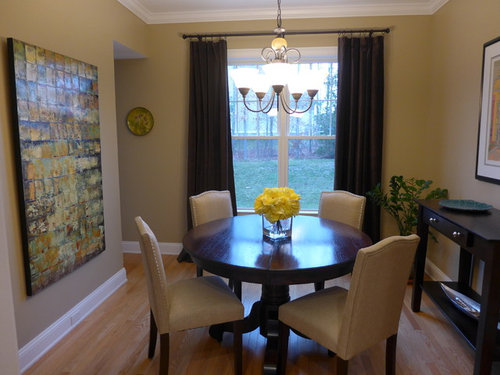
My old thread became too long and convoluted so starting a new one.

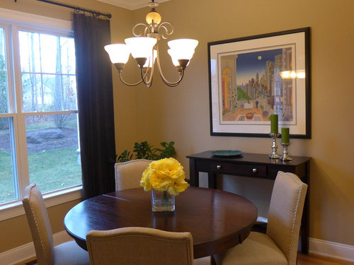
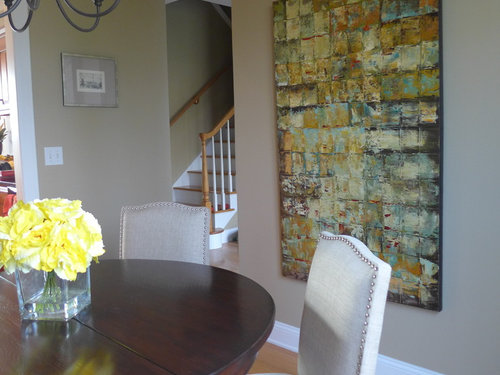
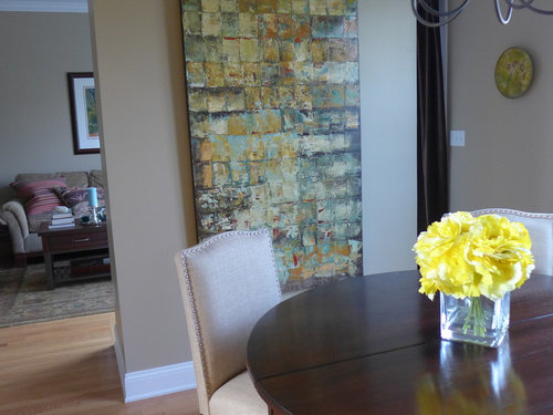
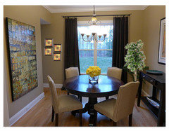
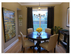
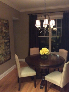
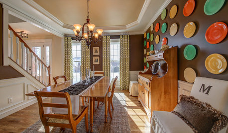
I am trying new wall art in the dining room. Does it work? The chandelier will be changed in the next couple of days and, for now, I have decided against a rug.

Thoughts? How high should I hang this canvas?

Comments (94)

  • 10 years ago
    last modified: 10 years ago

    In the second photo I can almost see what you mean about warmth... :) and I mean as though I was there in person.

  • 10 years ago

    Excellent.

  • 10 years ago
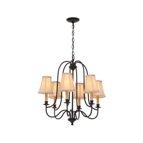
    The pictures really don't do the chandelier justice. The shades are beige silk and look much warmer and softer than they came out in the picture. I didn't even realize how harsh the light was from the old chandelier.
  • 10 years ago

    I wish I didn't feel so unsure about lighting - must be an experiment a lot of homeowners have to do on their own, by bringing it into the house... just wish installing it wasn't so much trouble. Good for you!! :)

  • 10 years ago
    Yeah, it was a pain in the neck to hang it ;-) And you really don't know if it will work or not until it's up and the lights are on in the evening.
  • PRO
    10 years ago

    Looks very good. I wish we could convey to all these posters that use those pendants with the up lights how very different and better a room can appear with a chandelier with fabric shades. Forces most of the light down and really enhances the appearance of the table, the food and the people around the table. It's still a soft light and not harsh.

  • 10 years ago
    Very pretty, including the chandelier!
  • PRO
    10 years ago

    The idea of putting work of art in the dining room is pretty
    awesome. I however would hang the canvass a bit higher so people could have a
    better full view of the painting .

  • 10 years ago

    Thank you all who commented and gave advice!

    Hopefully I will be able to take some better pictures tomorrow in the daylight!

  • 10 years ago

    I love your chandelier! Where did you get it?

  • 10 years ago
    Thank you. The Chandelier is from Home Depot on line.
  • 10 years ago
    Yes! You chose the chandelier I would have chose. It is proportionate to the space. That looks fabulous too. But do something about the plate on the opposite wall near the window. It doesn't work. Too small.
  • 10 years ago
    Auto correct. Yuk! The art is fabulous!
    izeve thanked bud04
  • 10 years ago

    izeve thanked susan2494
  • 10 years ago
    Susan, I think an odd number of items would be better. Three on one side (the left) and two on the other side (the right). I'm not liking the tree. It is too much.
  • 10 years ago

    No art on the window wall. It's too much.

  • 10 years ago
    last modified: 10 years ago

    Room looks nice.

    Don't rule out a modern ceiling fan with light for over the table.

    Not particularly a fan of abstract art and I readily acknowledge that I know very little about it except that some I like and most I don't. The other large art piece in your dining room is a "landscape" rather than a "portrait" shape -- hung horizontally rather than vertically. It occurs to me that your feeling that something is not quite right about this room might be about symmetry -- that two seriously large art pieces should be hung the same way when in the same room. Instead of hanging the abstract vertically, you should at least try it horizontally at eye level and see if that changes your "feel" of the room. Maybe swap the side of the room they're on, if need be, in order to accomplish this. ( Just thinking... with abstract, art, shouldn't the preference of the owner mean more than any supposed intent of the artist as to how it's hung.)

  • 10 years ago

    Thanks for the additional comments and suggestions. Definitely no art on the window wall, Grover :-)

    Susan2494, I am actually thinking of replacing the existing plate with a new picture but I was thinking a single picture in a black frame. The chandelier is black and I feel like I need another black element in the room. I have a lot of brown and green. So instead of the plate, how about a picture with a black frame and white mat?

  • 10 years ago
    I love it just the way it is.....but it needs a rug
    Is it loud when you get a few people in there laughing and talking?
  • 10 years ago

    Thank you. I've decided that the room is too small for a rug. No issue with acoustics at all, I think the curtains are enough to take care of that.

  • 10 years ago

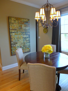
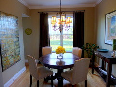
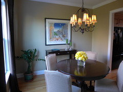
    New pictures:

  • 10 years ago

    I thought you just said no art on the window wall? LOL. The best way to draw attention is to put something there that no one likes :>)

    Black would be good, but how about just some black metal sculpture

    izeve thanked susan2494
  • PRO
    10 years ago

    It looks good! A small rug or carpet would complete the look though!

  • 10 years ago

    Haha, I meant "no" to the other side of the window as someone suggested. I'll take the plate down and see if I like it better without anything. I may try a new picture or a metal sculpture.

    That poor plate has been banished from the living room, now it's being kicked out from the dining room... We need to find a home for it :-)

  • PRO
    10 years ago

    i like the light fixture. its modern and traditional much like the room.

    izeve thanked User
  • 10 years ago

    It would look good if you had a couple more to add to it. Plates are great in dining rooms. It is just lonely and wants company :>)

  • 10 years ago
    last modified: 10 years ago

    If you ban the plat from the window wall ... what next ... the hall?

    Since the wall on the right is a more narrow space than the wall to the left of the window, why not just move the plate a bit to the left, leaving the same amount of space on each side of the window -- the plate would be more under the cased opening and you'd have more symmetry.

  • 10 years ago

    The plate on the wall is just a distraction. Unless there's something special about it, I'd banish it again. I like the window wall bare.

  • 10 years ago

    It was a gift and I like it but I don't have super strong feelings about it, so it may go...

    The room could use another black element, though, and I don't know what it should be and where. The pictures don't show it well, but the chandelier is pure black while the curtain rod is dark brown (bronze?). The McKnight is framed in black so that works but I feel like I need another black element in place of the plate. Any suggestions?

  • 10 years ago
    You may not be ready for a rug but it doesn't take long for moving chairs to mar the nice wood floor.
  • 10 years ago
    last modified: 10 years ago

    I remember that plate!!
    And once again, the plate isn't the problem. Having it sit all alone on a wall (where nothing is needed really) is the problem.

    Next time, choose a better spot and give it some company:)

  • 10 years ago

    Too funny!! I just don't have any other plates that would go with it. And in any event, I'm not really into plate arrangements on the wall, so I don't even know why I keep on trying to use it... All right, it's coming down as soon as I get home tonight ;-)

    But, please Houzzers, put your heads together and suggest something black.

  • 10 years ago
    last modified: 10 years ago

    I received a plate for wedding anniversary that I don't much like, but the thought at times has warmed me. Maybe if you 'swing with the idea' and buy another blending color and place somewhere anyway... heck will the décor police come if you place it over art somewhere?

  • 10 years ago

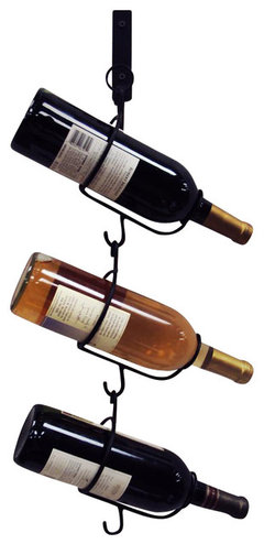
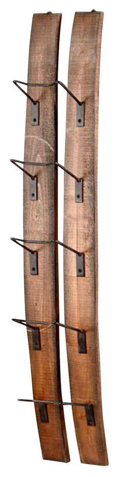
    Searched for black wall wine holder, and:

    5 in. Wall Hook with Bottle Holders · More Info

    Cyan Design Small Fresno Wall Wine Holder - 04902 · More Info

  • 10 years ago

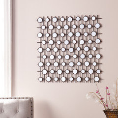
    Black frame with mirror circles 27x27'

  • 10 years ago
    last modified: 10 years ago

    Just throwing out things that you might like. What about a metal sculpture? In black of course.

  • PRO
    10 years ago

    the window wall looks good just with the curtains, there are enough things in the space, let that space stay simple.

  • 10 years ago
    I thought something could go where the plate was? But maybe just leave as is for now and see how it feels?
  • PRO
    10 years ago

    yes it looks great as is!

  • 10 years ago
    @izeve

    Where is the art from ? Love it.
  • 10 years ago
    Plate is off the wall and I do like it gone. I think it was distracting from the large canvas.

    The abstract art is from Pier 1.
  • 10 years ago
    Still think you need a nice warm rug.... It will soften and warm it all up!
    Otherwise i like it....
  • 10 years ago
    I was initially thinking about a rug, but now with the large scale art, I think a rug may be too much for the room. Unless it's just plain sisal or something like that.
  • 10 years ago
    Can't find the art on pier 1 website ? Please help find it .
  • 10 years ago
    It's called Global Squares. It looks a lot more golden yellow on line and they show it hanging horizontally not vertically like I have it.
  • 10 years ago

    A great lesson in design learned: less is more! I have removed the plate as suggested by some of you and left the wall empty. And I have to say that after a week now with the empty space, it was the right decision. The room really doesn't need anything more.

  • 10 years ago
    last modified: 10 years ago

    I rather like the abstract painting, but the "cityscape" print doesn't help help the room. Since you already have a big work, consider a cluster of smaller pieces. Also, you may want to move your larger, more impactful or evocative art piece (the big abstract) to the wall where it will be facing you as you enter the room, in other words, the wall across from where it is now. The wall between the doorways should have smaller pieces that one would view closer-up, since it's an area where guests (or family) would be more likely to stand.

    Since most of the architectural features in the room are vertical (doorways, windows) you should consider hanging the big abstract piece horizontally. Or if you know the artist, ask them what way it was meant to be hung.

  • 10 years ago

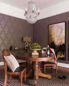
    Hi keenplanner, the wall with the abstract is actually the wall you first see given the traffic pattern in my place. The abstract can be hung either way but a horizontal position would require something underneath it to ground it and I really wanted to avoid that. Here is the inspiration for my room:


    Grant Park · More Info

  • 10 years ago

    That's a cool spot to enjoy...

  • 10 years ago
    Looks much better without that plate. Maybe you will find something later you like. Remember that decorating that evolves is always much better.