Software
Houzz Logo Print
savannahraedesigns

Please Help With Master Bath Paint Color

10 years ago
Hello Friends!

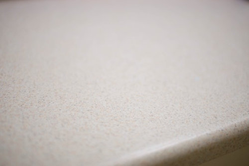
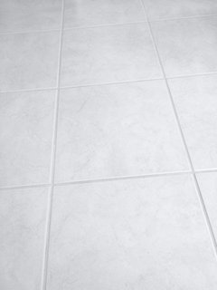
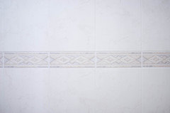
I'm working on a new project that I've been putting off for quite some time. I am trying to decide on paint colors for my master bath. My countertops have taupe and dark gray in it on an off white base. My floor is off white with gray veins and my master bath shower is off white with taupe, sand and gray detailing.

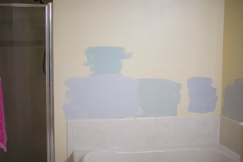
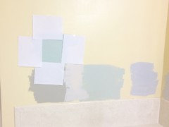
I really like the gray sample I painted but wanted opinions on how it looks. Does it flow with the tiles?

My window in the bath faces south so I get very warm light but prefer a cooler look in there.

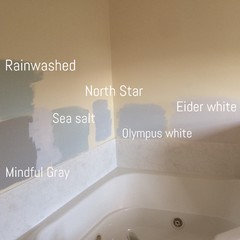
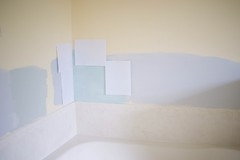
In one of the pics you'll see rainwashed, North Star, and sea salt (all Sherwin Williams colors) painted on the wall, but I don't think I want a green bathroom. I have rainwashed in the guest bedroom and I love it but it's too warm in this room. The North Star which is gray with blue base looks more purple which I didn't like. I love my blues and grays.

I used the white paper so the pale yellow wouldn't affect the color.

Thanks for all your help.

PS - I prefer Sherwin William colors because it's within walking distance from my house. Since we only have one vehicle and hubs work everyday, it's easier for me to get things done. Thanks everyone!

Comments (27)

  • 10 years ago
    Allowing that my monitor does not represent the reality of your paint, I like the taupe that is adjacent to tub. But I would go lighter by half. The bathroom is one place- for me- that I do not want saturated color on the wall.
    Ashley Palmer thanked miacometlady
  • PRO
    10 years ago

    If you are going to test a paint color on a wall, that is not white, I recommend that you paint the sample color onto white card stock (available in art stores or Office Depot/Staples etc. Otherwise the current wall color will come through and affect your sample color - you will not get a true idea of the color. For the color choice, I strongly recommend against a blue gray in your case. You need a gray with brownish undertones that will harmonize nicely with the soft tans you have going on in the countertop. I recommend Benjamin Moore Baltic Gray - color number 1467 or just one step lighter, Benjamin Moore Smoke Ember - color number 1466. All of the wall colors you are showing in your sample are really fighting your countertop color.

    Ashley Palmer thanked Lifestyle Color Consulting & Decorating
  • PRO
    10 years ago

    Sorry I originally missed your note on the Sherwin Williams preference - still use my basic advice but here are a couple of SW colors to consider: Requisite Gray - color number 7023 or Mindful Gray - color number 7016

    Ashley Palmer thanked Lifestyle Color Consulting & Decorating
  • 10 years ago
    last modified: 10 years ago

    @C F Thanks for taking the time out to comment. I painted two coats but not "properly". Some spaces I skipped paint all together. I just "slapped" it on the wall. I painted two coats on the sea salt sample though.

    @ miacometlady which taupe? I didn't paint any taupe samples? By the way, thanks for helping.

    @Lifestyle Color Consulting I painted a sample with mindful gray (I have that downstairs) but it's too dark and too muddy in this room. I even tried eider white but it was too light.. The bathroom gets so much warmth as it is (southern exposure, florida sun, etc...), I'm trying to cool it a bit :). I'm definitely open to other suggestions. Maybe a blue or a cooler gray. My counter looks so much lighter in person and you can see more gray in it than showing in the pic. I painted my entire house without sampling paint but i really want this space to feel cool and calming. I love the feel of this room...

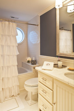
    Transitional Bathroom · More Info

    Thanks for taking the time to comment. :)

  • 10 years ago
    last modified: 10 years ago

    Here's the mindful gray and eider white sample taken with phone in the late evening.

  • PRO
    10 years ago

    Ashley this is a great photo and gives a much better idea of the colors you tried. What about Tradewind - SW color number 6218. It is slightly more blue than Rainwashed but still is of the Blue-Green color family - very soothing and it would work well with the grays, tans and whites you have going on in the bathroom. It is the same color saturation level as Sea Salt and Rainwashed.


  • 10 years ago
    In seeing your shower tile it looks like you have warm beige type colors. Anything too cool or bluish could fight with the other things you already have in there. I like the bottom middle color because it's the warmest color you have as an option. Be sure you consider your floor color too. What do you have?
    Ashley Palmer thanked livinginsb
  • 10 years ago
    I haven't tried it. If it's any help, heres my floors. The veining look more gray in person. And this is an iPhone pic at night. I'll try to take better pic in the morning with my camera.
  • 10 years ago
    Just read about you floor. I still like my original pick
    Ashley Palmer thanked livinginsb
  • 10 years ago

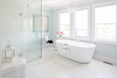
    Hi Ashley, Your bathroom is nice and neutral but does have several different colors of white which makes things a bit more challenging. When you find a paint that works you will know it. I really like your inspiration photo. I found a couple of blues that look good with tans/beige's. I agree with the above; paint the samples on white paper and tape them up looking at them in different lighting/times of day and it will help you decide.


    Ashley Palmer thanked Rawketgrl
  • 10 years ago
    Have you considered SW: Silverplate. We are painting our home office this color.
  • 10 years ago
    last modified: 10 years ago

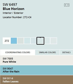
    @rawketgrl Yeah thats the problem in there... too many whites, grays and taupes...lol... I love the way blue horizon looks. I held it up in my bathroom and that is very close to my inspiration image. Ill grab a sample of that too along with tradewind and bathe blue. thanks

    @livinginsb the bottom middle in the original pic or the one with the names? The bottom middle in original is sea salt.

    @rjexit5 i dont think i tried that one... I have to dig out my chips and take a look at it... thanks

  • 10 years ago
    last modified: 10 years ago

    here's my shower tiles. I tried to get the best representation of it... its hard at night. Its gray veining with beige, taupe and charcoal pattern in the "accent" piece.

  • 10 years ago
    If your heart says blue, do it. Start with a small can then adjust the color if you need it. I like to do a large area and live with it for a day or two because what I pick is what I'll live with. I HATE to paint.
    Ashley Palmer thanked livinginsb
  • 10 years ago
    The husband loved the rainwashed sample(all the white paper) and the mindful gray sample (beneath it) the most. Maybe I'll get over my not wanting green. I'll paint a larger sample of rainwashed tomorrow.

    Again this was taken with my phone so lighting was horrible. My wall is pale pale yellow but it looks super warm in this image. Everything looks warmer in this image.
  • 10 years ago
    After really thinking about what was said, although I might want one thing, it's best to find what looks good even if it's a muddy gray or a green hue. What are your thoughts on mindful gray sample? Will it be too dark? Or will it compliment the colors in there?

    Thanks again.
  • 10 years ago
    last modified: 10 years ago

    IMHO The yellow is throwing everything. It might be hard to decide until that room is white. Maybe paint over the yellow with a white primer (since you will have to do that anyway) and then do this again.

  • 10 years ago

    Hi---

    Check SW'S Modern Gray.

    Benjamin Moore's Smokey Taupe would be better.

    Hope this is helpful. Good Luck!

    Modern farmhouse dining room · More Info

    Vizzini · More Info

  • 10 years ago
    ***UPDATE***

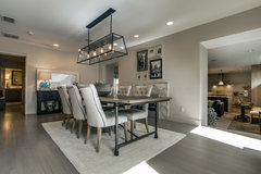
    I want to thank everyone who took the time out to comment and help me through this process. I've decided to paint it tidewater by Sherwin Williams (see image 1 with the paper around the color). The pic doesn't do it justice.

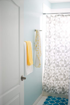
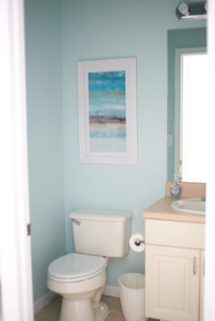
    I've used this color in both my daughters bath (see image 2 and 3) and my half bath (see image 4) as well as my office and decided to give it a try in a south facing bathroom since each one looks totally different from the next. When I say I knew this was the one, I mean from the first stroke of my brush I said this is it.

    I'm excited to paint it hopefully tomorrow. I will definitely update y'all with pics once finished!
  • 10 years ago

    That's a good choice for you Ashley, as it appears you favor that color palette. Best to go with what you like. Good Luck!

    Ashley Palmer thanked Natalie
  • 10 years ago

    Can't wait to see the pictures!

    Ashley Palmer thanked Rawketgrl
  • PRO
    10 years ago

    That is a gorgeous color for the bathroom and will work with the whites and tans you have in that room. Selecting the perfect color is a process and it sounds like you did it well!

    Ashley Palmer thanked Lifestyle Color Consulting & Decorating
  • PRO
    10 years ago

    You mention "off-white". IMO, you need to go dark gray.


    Greenwich Modern Tudor · More Info

    Ashley Palmer thanked JudyG Designs
  • PRO
    10 years ago

    Sorry, didn't read your "update"...room looks good.

  • 10 years ago

    ***UPDATE #2 (Progress Pictures)****


    Hey everyone, boy has it been one hectic week (hubs had surgery, daughter and i wound up sick and her birthday is tomorrow).


    Anyways, when I showed the hubs the sample on the wall for tidewater, his reaction was, "isn't that the same color in the other rooms?" I said yeah. He basically didn't like that I was going to use this color yet again.


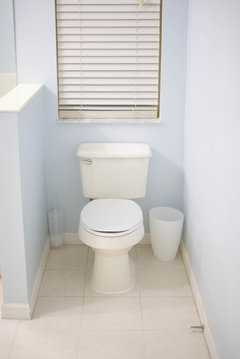
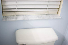
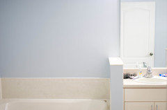
    So the hunt began and I finally decided on sherwin williams hinting blue and I LOVE IT.


    Here's a few quick pics I took. Please disregard the yellow in the window (that was the old color) and the dingy baseboards. Those will get a fresh coat of white paint when I get some free time.


    Also I have to add some finishing touches (like towel bars, toilet paper holders, bath mats and drapery)... I just couldnt wait to share the progress pics with you. T


    he color is a pale blue with purple undertones. I took these images at night. I will take more when the room is finished and when its daylight out because that's when the color truly shines.


    Anyways, thanks again for everyone's help. I truly appreciate it. :)


  • 5 years ago
    last modified: 5 years ago
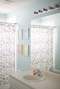
    Found your post because I am looking at North Star. I love your Hinting Blue. It looks peaceful. I'm wondering what is the gray color surrounded by white paper in your first photo?